
How to Build an Interactive Map Powered by a Google Sheet
Harnessing User-Friendly Technology for a Custom Data Visualization
This is a companion piece to our previous post, Examples of Interactive Maps on Websites. If you’ve decided that an interactive map is right for your project, read on for tips about using a Google Sheet to bring your vision to life.
For organizations large and small, interactive maps can be an excellent way to display data, office locations, or the reach of a particular program. They’re dynamic and engaging, and they’re quick to attract the attention of site visitors.
There are many different approaches to building an interactive map, but we’ve found that one of the most effective methods is to use a Google Sheet to manage and power the data. This makes the resulting maps both cost-effective and user-friendly. In this post, we’ll explain how we used a Google Sheet to create an awesome interactive map for our nonprofit website design client, MiracleFeet.
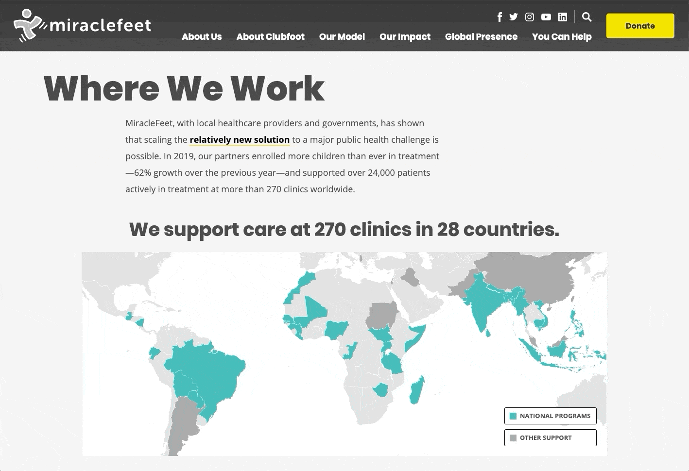
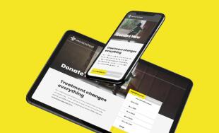
MiracleFeet is a North Carolina-based nonprofit that works internationally to treat children born with clubfoot. The interactive map is just one part of a larger project, which you can read more about in our case study of MiracleFeet's website redesign..
Why This Approach Worked for MiracleFeet
When working with MiracleFeet to imagine their new website, they knew early on that an interactive map would be a great way to highlight the countries where they work and associated program statistics. Not only would the map be fun and easy-to-use, but it would also clearly present the organization’s wide reach and impact.
MiracleFeet was already using Salesforce to manage a lot of different data points, so they were initially interested in using their existing setup to power the interactive map. However, the risk of delayed reporting from partner clinics meant that a Salesforce-based map might not always be up-to-date. Additionally, the volume of information managed in MiracleFeet’s Salesforce could add confusion or additional steps for the administrators who planned to update the map’s data.
To address these concerns, we moved away from Salesforce to instead build the map with a connection to Google Sheets. Google Sheets is an intuitive online spreadsheet program, so MiracleFeet’s staff would be able to access the spreadsheet regularly to update the numbers as reported by their in-country partners. It’s also a free program, so MiracleFeet wouldn’t have to worry about ongoing costs or recurring monthly payments.
Once we agreed that a Google Sheet was the best approach, we moved on to the next step: thinking through the map’s design.
Developing a Consistent Design
The design of your interactive map is an important factor that will determine much of its ultimate value. If it looks confusing or doesn’t match with the rest of your site, visitors may be less likely to engage with it.
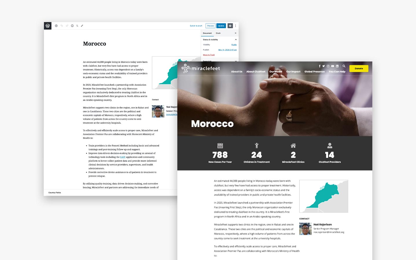
For MiracleFeet, we brought in the organization’s signature colors, fonts, and shapes to ensure a seamless transition between the map and other site pages. The map is also quite minimal – only a handful of shades and a simple key – which makes it approachable and intuitive to explore.
In terms of interaction, we kept it pretty simple. One click on a country brings up a pop-up, and another click makes the popup disappear. Interactive maps can also be paired with lists, search functions, and other features, but the straightforward pop-ups were the best fit for what MiracleFeet was looking for.
Building the Map Graphic
After finalizing the design vision, it was time to create the graphic that would appear on the page. To do this, we found an SVG map that could be customized with MiracleFeet’s colors and styling.
A Scalable Vector Graphic (SVG) is a type of file that can be used to display shapes, lines, and text online. They’re not based on fixed dimensions, so SVGs are extremely flexible and won’t become pixelated at larger sizes. SVGs also work well with animations, so they’re a perfect match for illustrations that move.
Once we had selected and customized the SVG map, we were ready to start preparing our Google Sheet.
Setting Up a Google Spreadsheet
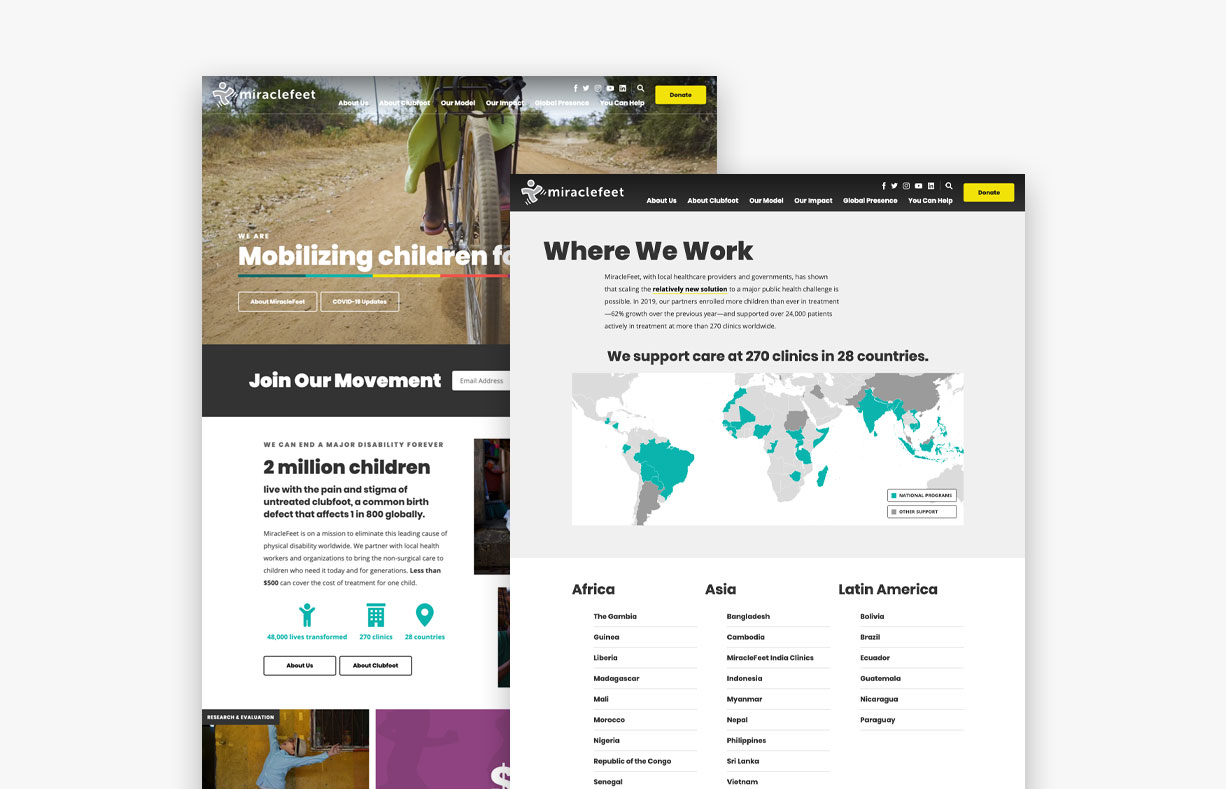
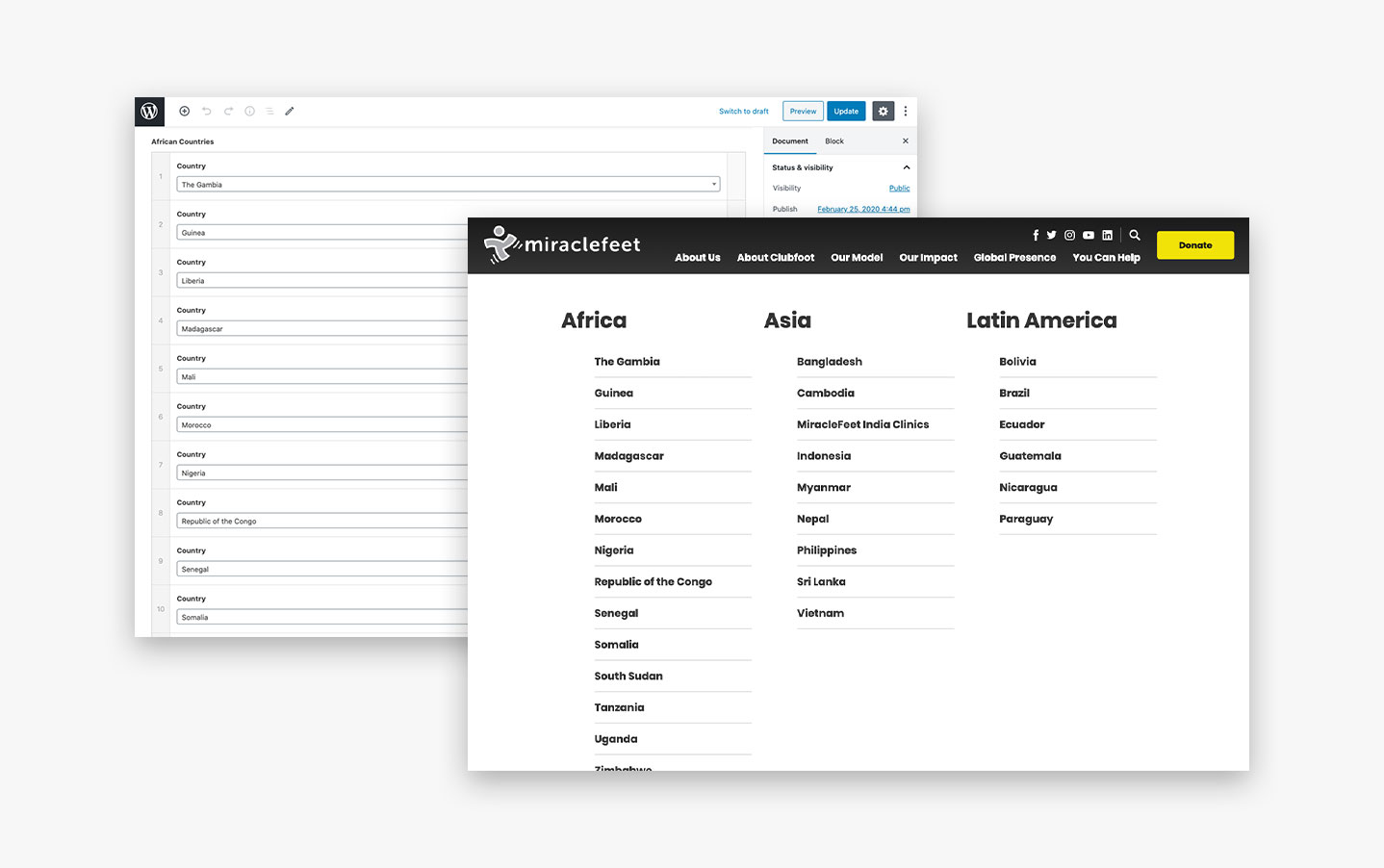
This part of the process was one of the easiest steps. Working together with the MiracleFeet team, we created a Google Sheet that organizes the data into the fields that appear on the interactive map: the country, the number of clinics, and the number of children enrolled. For other maps, these categories could include anything from store locations to project sites.
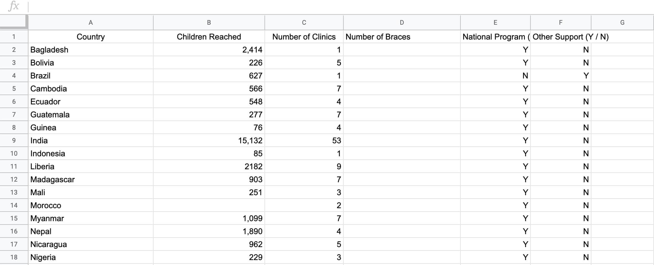
One huge benefit of the Google Sheets approach is its flexibility. Since the fields are added as columns, the organization can include as much information as they’d like. For example, an interactive map that displays office locations could include fields for phone number, address, email, hours, and other location-specific details.
After making sure that MiracleFeet’s spreadsheet was ready to go, one of our in-house developers connected the Sheet so that it would supply data to the SVG map.
Connecting the Map to a Google Spreadsheet
MiracleFeet’s interactive map is organized by country, so we began the integration by adding all of the country names (from the Google Sheet) as pages in our WordPress content management system (CMS). Even though the map’s data was actually going to come from the Google Sheet, this was an essential step because it provided the names that the Sheet data would match up with on the finished map (i.e. Bangladesh’s data entries would come up under Bangladesh on the map).
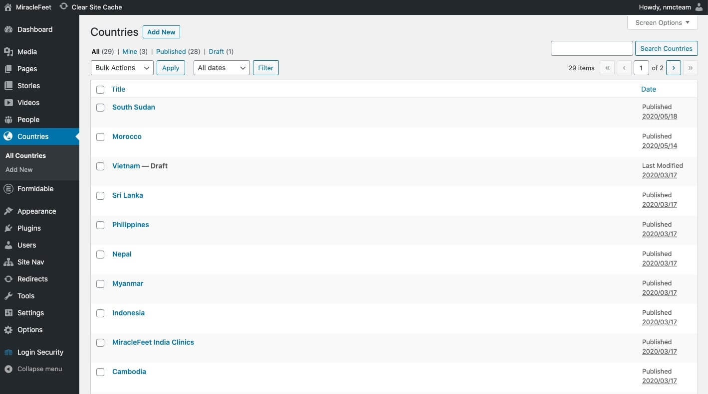
The country pages also serve the purpose of housing additional information about each country. MiracleFeet had prepared content and statistics about their programs ahead of time, so we filled in these pages with all of the relevant information. This way, map users would be able to easily click a button to learn more about any given country.
Next, we created the page where the map would eventually appear. Since we built out the country pages beforehand, we quickly pulled them in and organized them by continent. This generated the lists that appear below the map.
After everything was ready on the CMS side, we used the Google Sheets API to access the Sheet data as JSON (JavaScript Object Notation). JSON is a file format that rearranges data so that it can be read and consumed by a script. In this case, we wanted the site to gather information from the JSON file and put it up on the interactive map.
The ever-helpful Sheets API brought all the pieces together. It pulled data from the country spreadsheet into the template, where it then looped through to render the markup for each pop-up on the map.
With the integration complete, MiracleFeet’s staff can access the Google Sheet at any time to make changes that will appear on the interactive map within minutes. And as long as they have the spreadsheet’s URL, they don’t even have to log into a Google account!
A Successful Result
MiracleFeet loves their new interactive map, and we’re really proud of the way it turned out. It’s dynamic, engaging, and truly informative to site visitors who may have been otherwise unfamiliar with MiracleFeet’s extensive work abroad. And as we had hoped, the map has already become a focal point of the website.
MiracleFeet’s work is far from complete, so the map is set up to grow with the nonprofit as they continue to expand. Whenever a new country needs to be added, MiracleFeet will simply enter the information on the Google Sheet, create a new country page in the WordPress CMS, and watch as the data automatically feeds between the two platforms and onto the interactive map. It’s really that easy!
Final Thoughts
Interactive maps are undeniably powerful tools, but they’re so often defined by complicated management systems or expensive upkeep fees. By using a Google Sheet to organize and inform the map, you can keep costs low and simplify the process for keeping your data current.
If you’re interested in exploring how an interactive map could work for your organization’s website, reach out to us and we’ll work together to find the perfect solution for you. For now, feel free to leave any questions or feedback in the comments below!

Comments
App entwicklung
Grdat post.สล็อต แตก ง่าย
I know this website gives quality dependent content and additional information, is there any other site which gives these kinds of data in quality?Leave a comment