Web Design and ADA Accessibility Best Practices
It’s common to think of the web as a land of opportunity. It allows students of all ages to take courses online. It brings telehealth to patients who can’t make it into a doctor’s office. It connects loved ones separated by oceans and time zones. It places your favorite shops at your fingertips.
But while the web increases opportunities for many users, it’s important to note that disabled populations (26% of adults in the US!) are often excluded from its full array of offerings. This is where web accessibility comes into play.
Most people are familiar with accessibility as it relates to physical spaces – think wheelchair ramps, buttons with braille, automatic door openers. These things make it easier for people with disabilities to get around and make use of public areas. Web accessibility does the same thing for websites by employing tools and strategies that allow disabled people to navigate online platforms with ease.
Read on for an overview of accessible web design, why it’s important, and how we create websites with accessibility in mind.
Web Accessibility Explained
At the most basic level, web accessibility ensures that disabled users can access websites in a way that works for them. For some, this may mean using a screen reader to read content out loud. For others, it could mean navigating with a keyboard instead of a trackpad or mouse. To understand it best, we like to split web accessibility into two main categories: technical features and design elements.
Technical features center on the behind-the-scenes setups that support the examples we mentioned above. To facilitate a smooth screen reader experience, for example, a site’s developer needs to code in instructions and descriptions for buttons, images, and icons. Keyboard navigation similarly requires development work to make all site elements reachable through standard arrow keys. We’re not going to dig too deep into the technical stuff in this post, so feel free to reach out to us or leave questions in the comments below.
Now over to the design side – this is what we’re going to focus on today. Contrary to popular belief, an accessible website doesn’t have to look radically different from any other digital design. It doesn’t have to be less creative, less colorful, or less innovative – it just needs to be a little more mindful of things like contrast, sizing, and labeling. Stick with us...we’ll talk about these elements and more later on.
Can’t wait? Jump ahead to our Accessibility Design Tips.
Why Accessible Design is Important
Accessible web design is a win-win for everyone. Most obviously, it promotes inclusion for the millions of disabled individuals who use the internet every day. Additionally, it helps the countless others who find themselves with temporary or situational limitations. If you’ve ever had your eyes dilated, lost your glasses, or tried to read a screen through the harsh glare of sunlight, you’ve probably benefited from accessibility features like enlarged text or high-contrast colors. Thinking about it this way, you may start to understand that accessible web design is important because it actually serves everybody.
Accessibility is also important because it’s the law. When the Americans With Disabilities Act passed in 1990, it prohibited discrimination against people with disabilities in public places like businesses, workplaces, and schools. Although the ADA does not specifically mention web accessibility – it was written as the World Wide Web was just taking off, after all – modern interpretations hold that websites are covered under Titles II and III, the sections that address business operations. That said, businesses that don’t have accessible websites could face lengthy lawsuits and fines.
Before you begin to question the enforcement of web accessibility, be warned that violations are regularly reported and litigated. Business giants like Beyonce, Amazon, Burger King, and Dominos have all been called out in the past few years for non-compliant websites.
Web Accessibility Design Elements
Now that we’ve established what web accessibility is and why it matters, it’s time to get to the good stuff: how to design with accessibility in mind.
Since all websites ultimately need to have accessible designs, we like to build in the following features from the very beginning of the creative process. Addressing accessibility upfront puts our work on the right track and lessens the amount of time that we spend revising our designs after they’re completed. Read all of our tips or jump ahead with the shortcuts below.
Color Contrast
Thoughtful Button Design
Identifiable Links
Strategic Text Formatting
Mindful Form Design
Alt Text for Images
High Color Contrast
When it comes to design accessibility, color contrast can make or break your concept. Contrast refers to the difference in tone between two colors. A combo like black and white has higher contrast, whereas a softer pair like yellow and white has lower contrast.
High contrast is obviously essential for creating readable text, but it’s just as important when designing other elements like dropdown menus, buttons, and navigation bars. If any of these things blend in with their background color, site visitors may not be able to find the visual cues that they’re looking for.
Some color combinations are clearly low contrast, but others are more difficult to identify. We like to use Stark’s free contrast checker to test whether or not our colors will be readable to everyone.
Things can get tricky when overlaying text on an image or pattern. In these cases, we usually apply a transparent black overlay to the background before adding the text in a bright color like white.
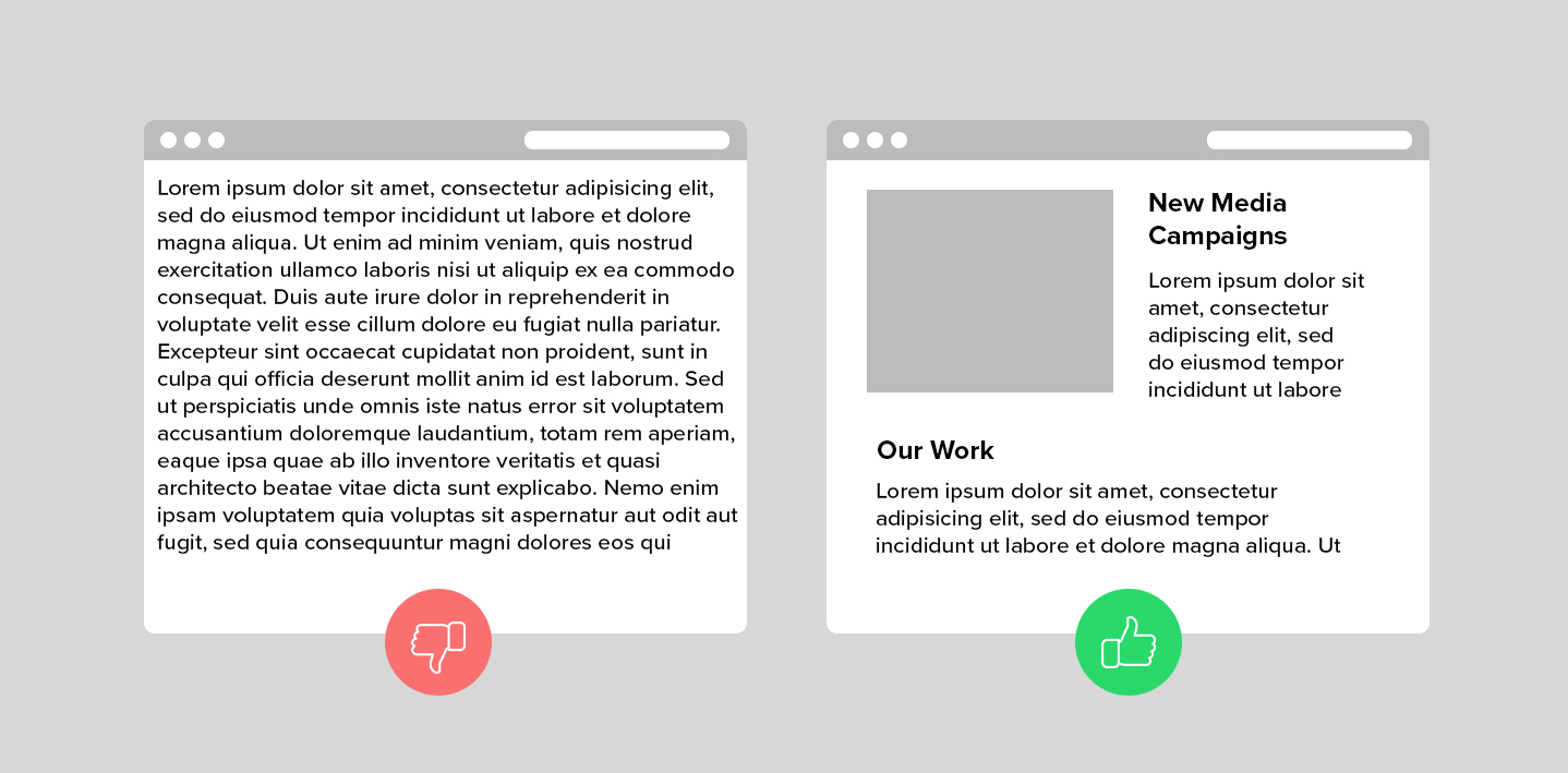
Thoughtful Button Design
As mentioned above, buttons must be designed with enough contrast to make them distinguishable from their background. In addition, they need to have specific labels that explain their function. In the image below, you’ll see that we compare a “Learn More” button with a button that’s labeled to match the content.
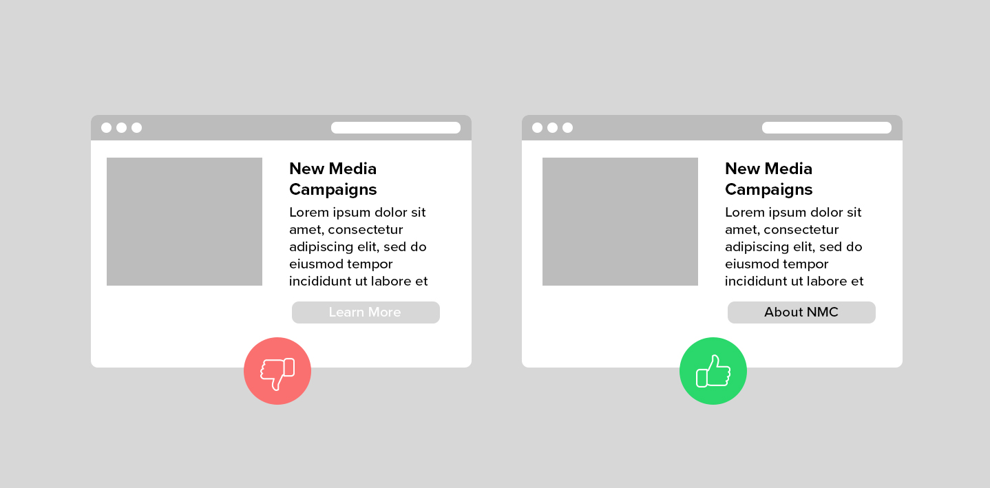
The “About NMC” button is more effective because it clearly explains the action that users are taking when they click on it. There’s no need to evaluate context clues, or really, to read the content at all. The specificity makes the button clear, skim-friendly, and generally pretty easy to use.
Identifiable Links
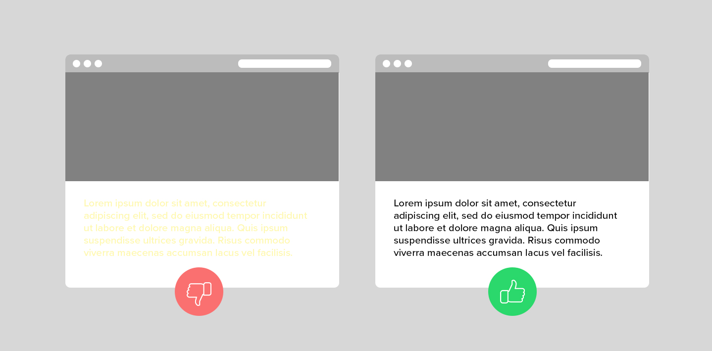
Button design principles also apply to hyperlinks that are integrated into site content. As users read through website pages, they typically scan the text for visual indicators of a link to another resource. Links identified by color alone may do the job for some people, but it’s far easier to pick out a link that’s also pointed out by a non-color cue like an underline. Take a look at the example below.
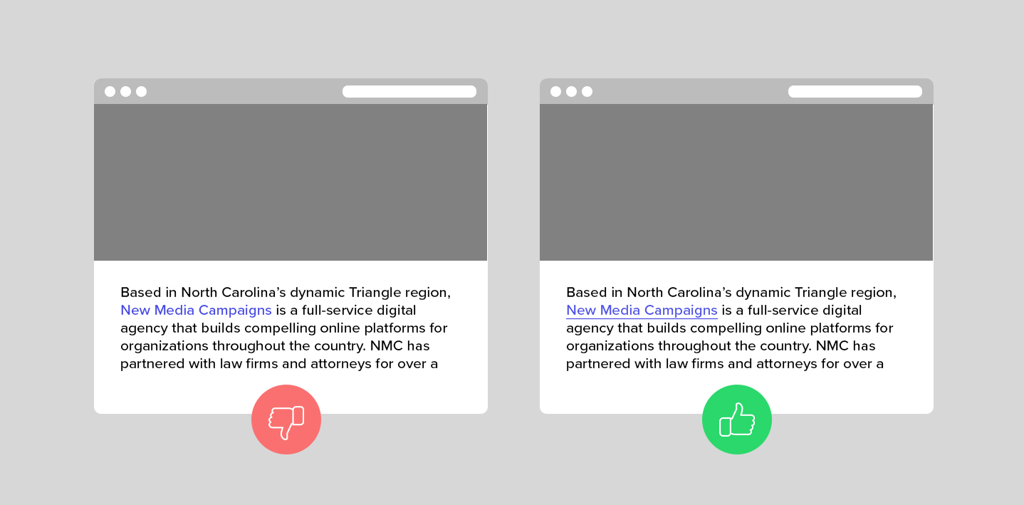
As you can see, the link that utilizes color and underline stands out much more than the color-only link. This boosts accessibility by clarifying which phrases are links and which are not.
Strategic Text Formatting
Text placement and formatting can mean the difference between an effective web design and one that immediately causes visitors to lose interest.
To ensure accessibility, it’s important to separate content with appropriate headings and make sure that it doesn’t stretch too wide across the screen. Wide blocks of text can quickly overwhelm site visitors and be fatiguing to read, so we give our text blocks a maximum width of around 770px.
In terms of text sizing, you want to keep things efficient yet readable. For body text, we use 16-18px depending on the font used and the overall site design.
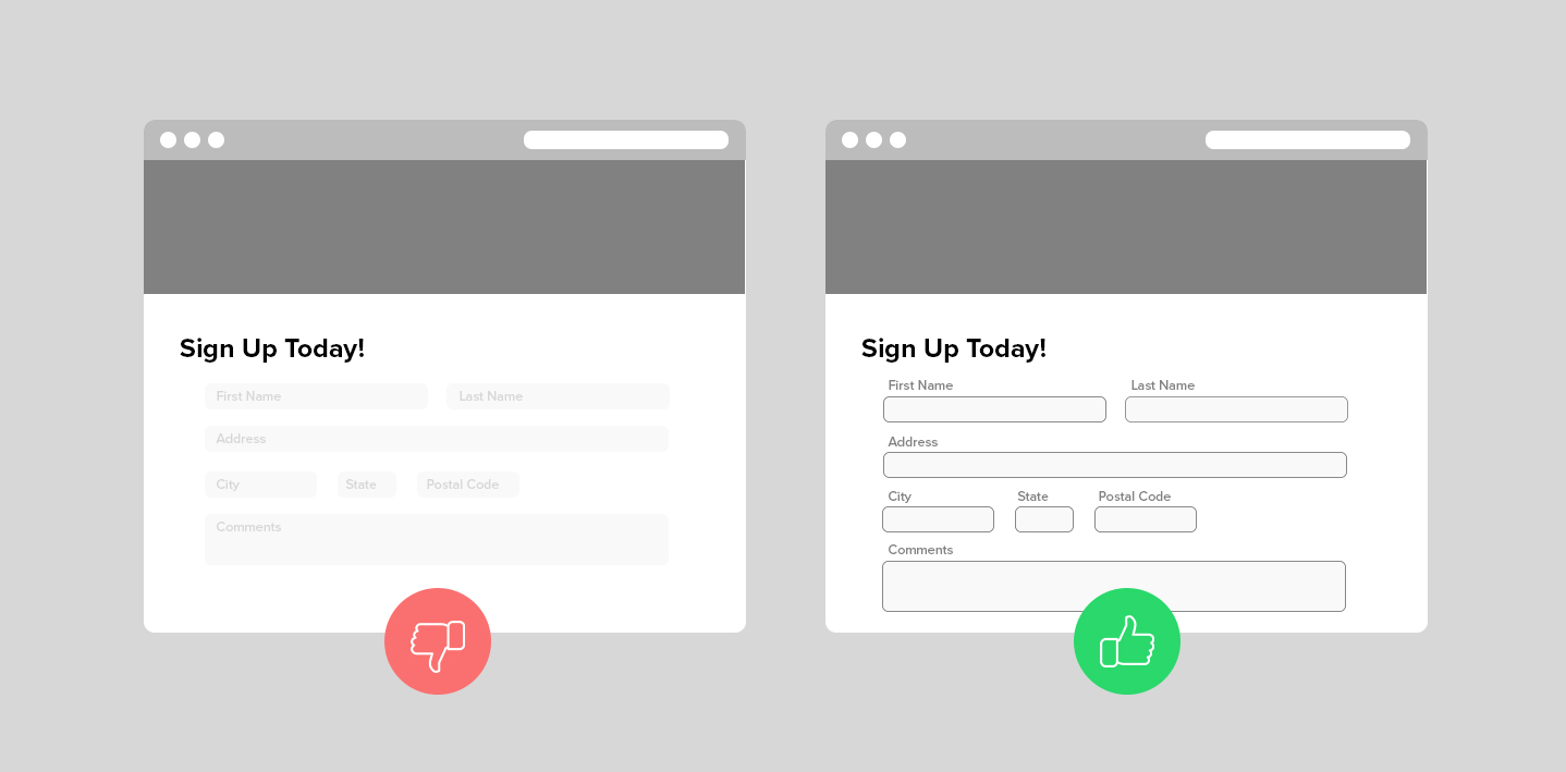
Mindful Form Design
Forms bring together a number of different design elements – things like buttons, labels, colors, and formatting – to perform the important task of gathering information from site visitors.
In order to design them accessibly, you’ll first need to think about clarity. Make the fields easy to identify with colors and outlines, and position the “Submit” button in a place that makes sense and stands out.
Next, plan out your field labels so they’re always visible to users. Placing labels inside the field is a tempting way to streamline the look of your form, but it can be confusing when users begin to type and the prompt disappears. It’s best to locate the label above or below the response box so that users always know what information they’re supposed to be entering and where. If you must use disappearing labels, make sure that your developer adds screen-reader-only text that explains what each field is asking for.
Lastly, think about the error message that pops up when a required item is left blank. If the field is highlighted in color only (i.e. the type turns red), people who are using screen readers may not be able to tell which area they filled out incorrectly. You can address this by including a second error cue like an arrow or a “this field is required” message.
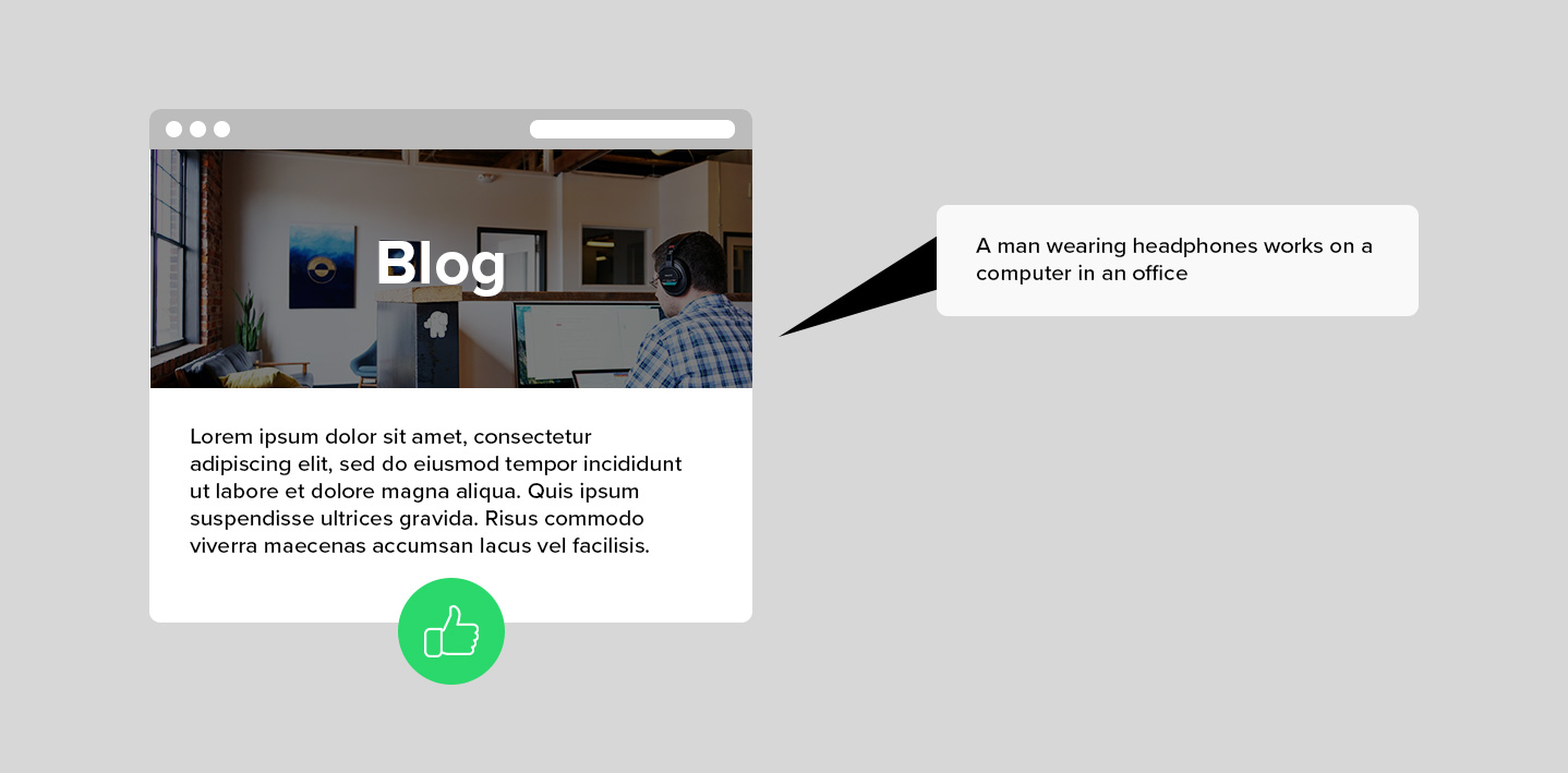
Descriptive Alt Text for Images
Alt text – alternative text, in full – is a brief description that’s attached to the code for an image or video. It’s a bigger part of the technical side of web accessibility, but it’s helpful to think about when selecting visual assets for your design.
Alt text can be read aloud by screen readers to help users with visual challenges understand what’s happening on their screen. It also pops up if an image doesn’t load properly, so like many accessibility design elements, it’s actually helpful to everyone.
The best alt text is concise, descriptive, and avoids the obvious. For example, there’s no need to describe something as “an image of _____.” Screen readers and their users already know that they’re consuming something visual, so it’s best to describe the activity, object, or person who appears in the photo or video.
Motion Control
While motion and animation can bring a website to life and enhance the user experience, it can also hinder the experience of users that may be sensitive to motion. There are a few ways to give the user more control of their experience on your website.
One way is to use prefers-reduced-motion CSS feature in your site. This feature is used to detect if the user has requested that the system minimize the amount of non-essential motion it uses.
Design-wise, we can bring play/pause indicators up front and center in the design itself to reach users that may not have their browser set to reduce motion. Adding simple "pause" buttons over automatic playing videos provides the user with a quick way to reduce the motion that they are seeing. An alternative to that is utilize a site-wide "Turn Off Animations" toggle that will stop all animations from playing automatically. This toggle is generally placed in the header or footer of the site so that it is universally accessible on all pages. You can check out an example of this in action on Netlify's Million Devs page.
Addressing Accessibility with Clients
So as you can see, accessible web design really only involves a few tweaks and adjustments to the design work that you’re doing already. But the payoff is significant. Accessible designs make the web a friendlier and more welcoming place for everyone – regardless of whether they’re consuming content visually, through a screen reader, or with the help of another type of assistive technology.
Creating accessible websites is unequivocally the right thing to do, but some clients may not yet be aware of basic accessibility standards and best practices. Even as recently as a few years ago, many of ours weren’t familiar with web accessibility at all. In these cases, we love to take the opportunity to educate clients on the accessibility features and strategies that we’re incorporating into their project. Not only does this raise awareness for ADA-related legal implications, but it also begins a larger conversation about accessibility and its importance online.
Questions about accessible web design? Important features that we missed? Let us know in the comments below!


Comments
Master Computers
Hi,Really happy to say your post is very interesting to read. I never stop myself to say anything about it. We are one of the top IT solutions companies in Abu Dhabi, you can be confident with our IT services so that you can concentrate on your core activities. Check our page, "https://www.macouae.com/". Expecting more blogs.
info bytes
great posthttps://info-bytes.com/hardware-networking/
Holly
You talk about links in articles to be a different color underlined but you did not do that in your own article. Why?Leave a comment