
Designing a Stand-Out Website for a Global Health Organization
A Case Study on EngenderHealth
Since its founding in the late 1930s, EngenderHealth has evolved in name, mission, and global reach to become the robust organization that it is today. Through partnerships with donors, local staff, and existing systems, the nonprofit has implemented programs around sexual and reproductive health in more than 100 countries across Africa, Asia, Europe, and the Americas.
After decades of growth and several rebrands, EngenderHealth’s original website no longer reflected the organization’s true vibrance and impact. With an engaging new website in mind, they connected with us to lead a nonprofit website design process that would produce an engaging digital presence and set the stage for their bright future.

Facilitating an Intentional Creative Process
In order to get a sense of EngenderHealth’s goals and vision for the site, we conducted a comprehensive discovery phase that began with our standard nonprofit creative brief. The creative brief is a document that gathers input from various stakeholders on target audiences, must-have features, design inspiration, and more.
To take the creative brief a step further, we spun the information into a polished slide deck that project leaders could present internally to ensure that the entire organization would have a voice in the process. This is an extra step that we sometimes take when we need to streamline the overall concept for large organizations or teams with multiple groups of decision-makers.
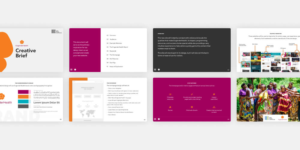
With the creative brief serving as a big-picture outline for the project, we next moved to wireframes for the site’s homepage. Wireframes are grayed out layouts that help show which elements should be prioritized within a design. Since the homepage determines the direction for any site, it’s usually the perfect place to begin.
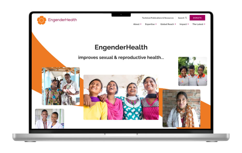
EngenderHealth knew that they wanted a homepage that would instantly grab users’ attention – something totally unique that could serve as a differentiator from other gender-focused nonprofits and advocacy groups. With that goal in mind, we came up with a unique free-flowing layout and iterated on the homepage wireframe until we had something that was just right.
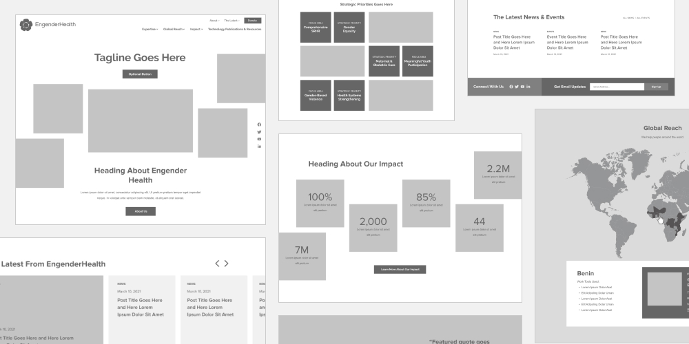
The finished homepage design combines custom graphics, photography, text animation, and an interactive map into a bold layout that embodies EngenderHealth’s chosen adjectives for the site’s aesthetic: engaging, captivating, compelling, human, powerful.
EngenderHealth’s existing brand standards guided the design and lent themselves well to the modern and innovative look. We were even able to pull logo elements into several patterns and textures that add to the site’s visual appeal.
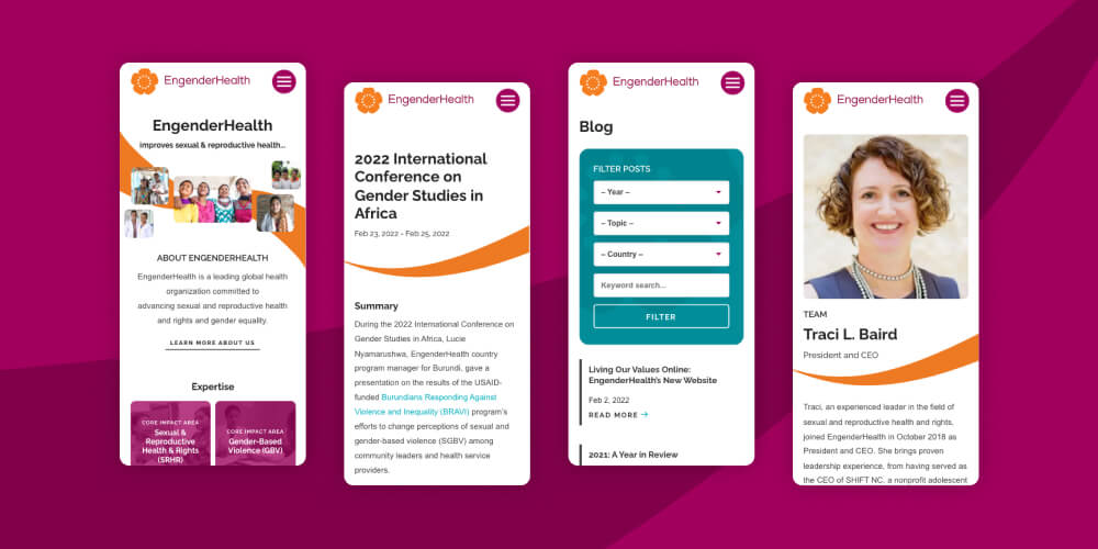
Once the homepage was complete, we translated the style into a suite of custom interior layouts. We incorporated nonprofit website design best practices like prominent calls-to-action, clear storytelling, and quantified impact throughout.
Designing a Dynamic Nonprofit Website
The site’s features are just as dynamic as the design. We worked closely with the EngenderHealth team to add the following thoughtful details:
- Custom Graphics. One of the site’s most recognizable visuals is the large ribbon that snakes down the homepage. The ribbon adds a fresh and unexpected twist that is carried through interior layouts.
- Sticky Nav & Social. As you scroll down the page, you’ll notice that the top nav and social (on the right side) stay locked in place. These “sticky” elements are great because they ensure that users always have access to important links – no scrolling around to get back to the main menu.
- Rotating Homepage Headline. On the homepage, the main headline text rotates through a few different statements that convey the scope of EngenderHealth’s work. In addition to allowing the organization to showcase multiple parts of who they are, this effect adds a dynamic touch to the masthead area.
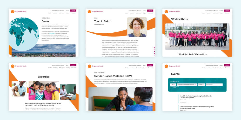
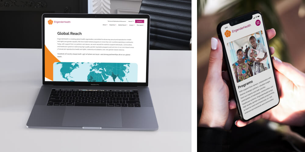
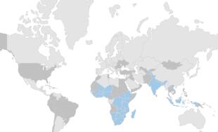
- Interactive Map. Further down the homepage, an interactive map highlights the countries where EngenderHealth currently works. Users can click on an area to view the country’s featured program and several key links. Interactive maps are an excellent tool for displaying reach in a way that’s visually interesting and easy to understand.
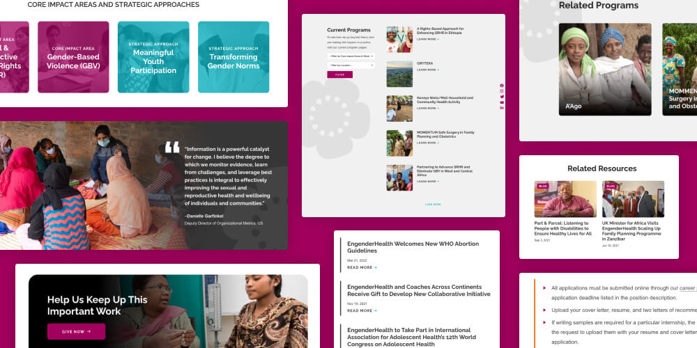
- Unique Interiors. The site’s interior layouts are highly customized to gracefully display information about EngenderHealth and its work. Individual country pages do this with an eye-catching globe masthead graphic, multiple calls-to-action, and dedicated blocks for related impact areas and resources.
Core impact area hubs similarly pull in relevant content like related programs, resources, and countries. One especially unique feature is that each impact area includes a smaller interactive map where users can jump to specific country pages. - Numerous CTA Styles. For almost any site, calls-to-action are an essential element for driving users towards a desired action – whether that’s making a donation, signing up for emails, or downloading resources. EngenderHealth let us know that they wanted to place a strong emphasis on donations and email signups, so we incorporated prominent calls-to-action for both items into the site’s header and footer.
In addition to those core CTAs, the site features a number of flexible layout blocks that can be used to add action items on interior pages. Individual event pages, for example, can be customized with buttons that link to additional details or a ticketing system. - Filterable Feeds. As a part of their awareness and advocacy work, EngenderHealth regularly publishes news articles, blog posts, and event listings about gender-related issues and opportunities. Each of these feeds is filterable, making it easy for users to browse and sort content based on their interests.
Positioning EngenderHealth for Ongoing Growth
Built on a scalable WordPress CMS, EngenderHealth’s new website is set up to grow smoothly as the nonprofit expands their work. Site admins can log in at any time to make copy edits, upload new content, replace images, and more.
And creating entirely new layouts is just as easy. The WordPress setup includes a series of custom designed blocks that match the site’s overall look and feel. These elements can be combined into totally unique layouts based on the content and assets that EngenderHealth has on hand – all without the need for separate development work or technical hassles.
Post-launch, we’re thrilled with the way that the new site reflects EngenderHealth’s passion and impact, and we look forward to watching as they leverage the digital presence in their work towards future goals.

Leave the first comment