HTML Forms: The Right Way(s)
I recently stumbled upon a Reddit discussion thread on the proper way to write an HTML form. First, there is no one right way to code an HTML form. Well, I should say there is no one right way to code an HTML form assuming you are using semantic and accessible markup. Here are several methods I use (or have seen others use) when writing HTML forms.
Method 1: Semantic Nirvana
<form>
	<fieldset>
		<legend>Legend Name</legend>
		<label for="name">Name</label>
		<input type="text" name="name" />
	</fieldset>
</form>
This example is self-explanatory and employees the recommended form elements provided by HTML. The form element contains a fieldset with a legend. The fieldset contains a label and an associated input field. This method is the purest state of a semantic HTML form, and I encourage you to implement this structure whenever possible. However, if your design requires more structural flexibility, I encourage you to explore the definition list approach.
Method 2: Definition List
<form>
	<fieldset>
		<dl>
			<dt><label for="name">Name</label></dt>
			<dd><input type="text" name="name" /></dd>
		</dl>
	</fieldset>
</form>
This example encapsulates the form and its elements within the context of a definition list. One could argue the semantic accuracy of this approach, but I believe there is some semantic truth to this scenario. A definition term (the "Name") is defined by the user input. This method also remains accessible to assistive technologies by providing a label for the associated input field. Label's allow assistive technologies to associate the label with a form input field. Label's also provide a larger, clickable "focus" area for a form field; when a user clicks on a label, the associated form input field is focused. This method also degrades nicely in text-only web browsers or hand-held devices.
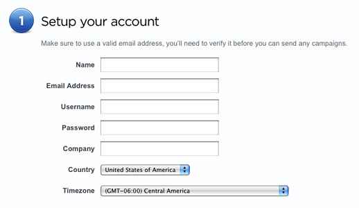
I often use this method when I create forms with labels to the left of their associated input fields, similar to the Sign Up form on Campaign Monitor's website (see Figure A). The DT elements are floated left and assigned a common width. The DD fields are floated right and assigned a common width. The DT fields will clear any previous DT or DD elements using CSS.

Figure A
One might consider ordered or unordered lists to accomplish this same structure. However, such an approach would require the markup developer to attach custom class meta information to each LI element to indicate which LI element contains the label and which the form input field. I believe the definition list provides more accurate semantics without additional meta information.
Overall, I prefer this method when I require semantics and design flexibility. This method provides plenty of elements to work with out of the box: form, dl, dt, dd, label, and input. CSS developers will have plenty to work with without extraneous markup.
Method 3: Paragraphs galore!
<form>
	<fieldset>
		<p>
			<label for="name">Name</label><br />
			<input type="text" name="name" />
		</p>
	</fieldset>
</form>
I mention this method only because I see many developers abuse it too often. This method encapsulate a label and its input field within a paragraph. The result is a pleasant visual separation when rendered in most desktop web browsers like Firefox, Safari, or Internet Explorer. However, the good ends there. This method is semantically flawed; a form and its elements are not a series of paragraphs. Also, one should not mix markup with presentation (as this method does). After all, not everyone uses visual web browsers (Google bots and screen readers come to mind).
Method 4: What about columns?
Many HTML forms are presented in a column layout. This is an example where aesthetics take precedence over semantics. Which is fine. Semantics are only rules, and rules can be broken, right? In this case, I encourage you to at least try to maintain some form of semantic value.
Method 4a: Use DIVs with appropriate class meta data
One method to implement a column layout is to use DIVs.
<form>
	<fieldset>
		<legend>Legend Name</legend>
		<div class="left-column">
			<label for="name">Name</label>
			<input type="text" name="name" />
		</div>
		<div class="middle-column">
			<label for="email">Email</label>
			<input type="text" name="email" />
		</div>
		<div class="right-column">
			<label for="phone">Phone</label>
			<input type="text" name="phone" />
		</div>
	</fieldset>
</form>
Each DIV may be floated left to simulate columns, and the class attributes convey the intended semantics.
Method 4b: Tables: Those are bad, right?
Tables are great, assuming you use them to display tabular data. Tables were given a bad reputation when print designers first started developing websites in the late 90s and early 2000s. Print designers used tables for lack of better layout tools.
If you have no other option, one might argue that a form could be a table (try not to smirk when you explain this to your resident web standards evangelist). Such a form may look like this:
<form>
	<fieldset>
		<table border="0">
			<thead>
				<tr>
					<th>Column 1</th>
					<th>Column 2</th>
					<th>Column 3</th>
				</tr>
			</thead>
			<tbody>
				<tr>
					<td>
						<label for="one">One</label>
						<input type="text" name="one" />
					</td>
					<td>
						<label for="two">Two</label>
						<input type="text" name="two" />
					</td>
					<td>
						<label for="three">Three</label>
						<input type="text" name="three" />
					</td>
				</tr>
			</tbody>
		</table>
	</fieldset>
</form>
At this point, the form markup is becoming convoluted and less semantic. Consider this method a last resort, and only if you require a form with multiple columns.
So which method do I choose?
There are many more ways to write HTML forms. As I said before, there is no one right way to write HTML forms. If your form is structured with semantic and accessible markup, you can't go wrong. For further reading on this subject, I strongly encourage you to pick up a copy of "Web Standards Solutions: The Markup and Style Handbook" by Dan Cederholm (Apress, 2004; ISBN 1590593812).


Comments
neelaadritrueframe
Discover effective HTML form techniques in this concise guide. Learn best practices for creating user-friendly, accessible forms that enhance your website's functionality and user experience. Improve your web development skills today.Peter
Thank s for this piece of code. However, I tried to replicate the row and fields and it is difficult to align the fields after all.Can you please help me out.
Mark
thanks Josh - I was just confirming the div - form- fieldset - input relationshiop (that I thought I have been doing wrong for so many years)! Impressed by your website.Ian P
Method 4a seems like it'd be easiest to style, whilst not bringing in too much mark-up 'mess. Howeever, if you're going to name divs things like "middle-column" then surely it's not fair to say that such a disregard of separation of content and style is truly 'semantic' (if we're being fussy... which we are ;-) )Tables
I can still see tables as a good option if used in for "property sheet like forms :
<table>
<tr>
<th><label /></th>
<td><input /></td>
</tr>
<tr>
<th><label /></th>
<td><input /></td>
</tr>
<tr>
<th><label />name</label></th>
<td><input /></td>
</tr>
</table>
Chris M
Personally I prefer the ordered list as it emulates steps and sets the ordering of the elements.
<pre>
<ol>
<li><label for="name">Name:</label><input ../></li>
...
</pre>
Temecula Developer
I think the best way is to have label, input, textarea and select display inline-block. Then set the labels to an equal width around 90px and the text inputs and textareaa to an equal width around 180px. Give your fieldset or div a fixed width that'll account for the width of one label and one textfield. No non-semantic markup needed.
websphere developer
Nice systematic approach to the web forms programming. I've discussed with my colleagues the best way.. The first example seems more convenient and flexible. But only for conservative web designers. I'm glad to see broad-minded approach in web design in this post.
websphere developer
Nice systematic approach to the web forms programming. I've discussed with my colleagues the best way.. The first example seems more convenient and flexible. But only for conservative web designers. I'm glad to see broad-minded approach in web design in this post.
uPVC Windows
Good article, as you say, there's no right or wrong way, but it's always nice to see another perspective!
Chris Hiester
Here's an interesting article about form label placement and its effect on how quickly a user can fill out a form, http://www.uxmatters.com/mt/archives/2006/07/label-placement-in-forms.php
opl
Definition lists over paragraphs? Errr ... nevermind. John Doe isn't a definition for the word "Name" but "Any word or phrase which indicates a particular person, place, class, or thing." is one.
As of tables, they can be used for complex designs as long as they linearize well (no input on a cell below the label, always on the right or better in the same cell).
Clinton Montague
I'm an input/label combo person. I also like to add a rule in the CSS for the label to make the cursor the 'pointer' so people know they can click it to highlight the form element.
CraigO
I use an and group each label/input combination in an . Then if you need a two column form, just float:left each set and put the whole thing in a fieldset overflow: hidden to clear the float :)
Diego
nice post
Jon
I would never use tables for form layout. I've yet to come across a form I couldn't style with relative ease. If people are using tables it just shows their lack of CSS knowledge.
Daniel
Good Post.
boiss
I use label float left, clear left with a width, input float left
bleh
bleh
bleh
bleh
Can't be easyer!
Panel
Table layout is easy to manage for forms
J
What sort of CSS would be used to make method's 1 and 2 fairly pleasant looking (like that campaign monitor form). I'm talking layout wise, not styling wise.
alex
FIELDSET is for grouping. It's not every form need it. You can wrap around a group of INPUTs (like Address) or radio button/checkbox.
I would suggest to use TABLE layout for form, because it is easy to deal with column width -- I don't need to write tons of style sheet and less browser bugs need to conquer.
Josh Lockhart NMC team member
@ben Yes, you could easily extend Method 2 by appending class meta data to simulate columns. As I said at the end of my post, there are certainly many more ways to write forms :) The ideas in this post, I hope, provide some separate approaches that may be mixed and matched as you need.
@dave Your method would work, too. I don't think it is as flexible since it uses absolute positioning, but it could certainly work in the right situation.
@azmoo The table example I provided above was just an example. Sure, it may not be tabular data in the example, but it does successfully show how one could use a table to structure a form with tabular data. Which is all I intended to show. But you are correct. If you do use a table for a form, hopefully you are using it because you are structuring a line-item list of tabular data (or something along those lines).
Thanks for the great feedback everyone!
AzMoo
How is example 4b tabular data? One may argue that a form can be tabular data (for example, batch input of records), but in your example it most certainly isn't. There's no reason that you couldn't use 4a to achieve the same effect.
test
test
Dave
You don't sanitize your input for HTML? *gasp* What shall I do next...?
Dave
And what about just a normal list with some CSS positioning?
.list li {position:relative; line-height:24px;}
.list li input {position:absolute; left:100px;}
Name:
Email:
Ben
Hi,
I very much like your idea in method 2 (definition list). never thought of it.
You could implement method 4 (columns) by extending method 2 and giving your dt tags the column classes instead of using divs, couldn't you?
dude
Thanks for the very interesting comparison! I must point out, though, that the code is approach unreadable with the random/>4 space indents. Perhaps just stick with something sensible such as 2 spaces?
Cheers!
Leave a comment