Verizon Droid: iDon't Understand Microsite Search Engine Optimization
I've been waiting for Verizon to announce a competitive smart phone for a quite some time. With a barely functional, 3 year old Motorola Q you better believe the first time I saw the much talked about "iDon't" commercial running during a ballgame I to ran to grab my notebook to check out the campaign's microsite: DroidDoes.com.

Big Red is flexing its marketing muscle to hype its self-proclaimed iPhone killer on all major mediums: TV, direct mail, Google ads, you name it. "Everything iDon't Droid does." Like the TV ad, these other pieces drive users to the microsite, too. With this big of an ad spend and a first-class partnership with Google you would think the microsite would be out of this world good.
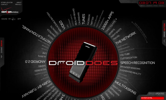
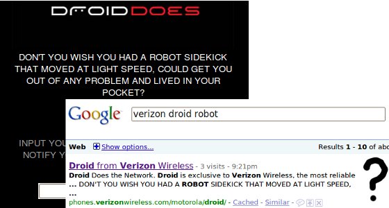
As far as microsites and marketing landing pages go, DroidDoes.com is out of this world bad. Google should be embarrassed of how their Android Experience phone is being marketed. Not only is DroidDoes.com 100% flash but the flash itself isn't being indexed by Google, the content behind the flash is embarrasingly bad (pictured below), and you can't link to features you've navigated to within the microsite.

"Don't you wish you had a sidekick robot that moved at light speed?" This is what Google (via Google cache) sees when it visits DroidDoes.com and its indexing algorithm tries to figure out what the Droid is about. Google doesn't care about the fancy flash techniques or the robovoice saying "droid". Google cares about content, not flash.
When Google has access to meagingful content it can read, i.e. plain old "semantic" HTML, Google does a lot of work on your behalf. Check out what you get when you search for 'iPhone':

Not only do you get a link to the web site, but Google provides links to the other places on the iPhone website a visitor is likely to want to go and brings them directly there. This is possible because Apple's iPhone content is properly crafted using semantic HTML. Apple also used a meangingful meta description allowing Google to succinctly describe and position the iPhone.
Contrast this with the official result on a search for 'Droid':

Because subpages don't exist, Google can't do a better job linking you to the things a Droid-seeker is looking for: how to buy, features, support, apps, etc. The DroidDoes microsite is one gigantic flash file Google can't link to. The DroidDoes.com website team should be even more embarrassed of their meta description which doesn't describe what Droid is, at all. Upon further inspection there is more to the meta description than meets the eye:
"Get to know Droid a little better. Droid Does the Network. Droid is exclusive to Verizon Wireless, the most reliable network available. Droid Does Android 2.0. Droid contains a new exclusive version of the OS. Droid Does Multitasking. Make a call, answer an email and launch multiple apps simultaneously. Droid Does 10,000+ Apps. Gain power with every app. Droid runs multiple apps simultaneously. Droid Does 5 Megapixels. With a built in flash and 5 megapixels of detail - enhancing resolution, you can capture low light, fleeting moment in detail."
What DroidDoes.com doesn't know is that Google caps meta descriptions at around 160 characters. The DroidDoes microsite's description is 550 characters. No one will ever see the meat of their description because it is too long.
Everything DroidDoes.com uShouldn't on a Microsite
Most of us don't have multi-million dollar budgets to launch and hype advertising campaigns on the scale Verizon has taken its Droid campaign. For all the money they are throwing at consumers they are losing valuable, targetted inbound traffic because of the many poor technical decisions making up DroidDoes.com. With tighter budgets the rest of us can't afford to make these microsite mistakes. Here are a few high-level lessons to take away:
- Do not build 100% flash based microsites
- Especially if the flash file is not created carefully for Google to index
- Especially if you can't link directly to locations within the Flash file
- Always have meaningful HTML content for search engines to index
- Meta description should be less than 160 characters long and descriptive
- Use language and keywords that people search for to find your microsite (i.e. not 'always wanted a pocket robot?' when you're selling a phone)
- Content for all images and flash should also be in HTML
The Droid is going to be Verizon's most compelling smart phone. It's Google's most complete Android phone and first in the Android 2.0 line. Yet the Droid's promotional microsite is underwhelming, clunky, and out-of-touch with the internet of 2009. If your marketing budget isn't that of a Fortune 500 company you can't afford to make the same inbound marketing mistakes with your microsite as the hotshots at Verizon who decided to promote an internet phone that can't play flash videos using only flash video.


Comments
Gina
Stacy
You worked at Moxie? I know people there. Their work is exceptional and I don't believe they did this particular site.
Stacy
Verizons largest marketing company they contract with is Moxie Interactive based out of Atlanta. moxieinteractive.com is the website for the company. I am not sure if they created this site, but they were constantly having issues when I was an employee there. They couldn't ever seem to get things just done, and/or done right...I'd say 80% good and 20% crap came out of that office due to poor management...it wouldn't surprise me if Moxie Interactive designed the site...
John
This is a great bit of information and well researched. Thanks!
- John
Kendall
What I thought was amusing was that any iPhone owner interested in switching to the Droid will find they cannot pull up any details on the phone...
Rachel Nabors
The "droid does/iDon't" campaign reminds me of the Sega advertising slogan of yore: "Genesis does what Nintendon't." Are we repeating ourselves with age?
Rich Ski Bum
I'm glad that they did the micro site the way they did. I put up some Droid sites that are doing excellent. By not using there own SEO best practices has put us in a great position. In combination with the honeymoon period has powered us forward as never before.
I hope we get past the honeymoon and stay strong, but I will take the holiday shopping period if that's all that happens.
Daryn St. Pierre
I love my G1 and I love Android, but the entire Droid marketing plan is bad. The iPhone is awesome and I'm a Mac user at both work and home, but I tie all of my daily information to Google. My calendar, email, contacts, collaborations, voicemail. For me, Android lacks in places that I don't really care about. I don't use a lot of apps and I don't play games on my phone. If I want to store a ton of apps on it, I'll root it and store all of my apps on the memory stick.
cak
This is advertising 101. Who cares about content, as long as it look pretty. I have thought against this attitude for far too long. Nobody in advertising understands complex issues like search, good html, all they care about is how pretty it is.
Tracey Smith
That is why blogs are cropping up by the second:
http://www.droiddoesnot.com
http://www.droidwont.com
to help dispel the poor marketing and the mistake Google has made with this strategy
Daryn St. Pierre
How do large companies get contracts like this and then write some of the worst HTML I've seen?? The company or in-house team they're working with did a decent job on the Flash. It's somewhat interesting. They threw everything else out the proverbial window though. Usability - fail. Searchability - fail. Clean, valid HTML of any sort - fail. The site even uses inline styles and font tags in parts, on top of inline javascript that could've been easily placed into a js file and linked to the page.
Everything about this screams amateur and/or lazy. It's garbage and someone got paid a whole lot for it.
Alhan Keser
This always happens! Is it their in-house team, is it an agency, who does this? Is there not a single person on the team who considers what the sequence of events is following an advertisement? People don't just go out and buy the product - they Google it.
Tony Wright
The site is one thing - a self-gratifying guitar solo for a graphic designer / marketing team somewhere. It's so NOT user-centric it hurts. From the flash intro (Really? In 2009?) to the radial navigation to the total punt on standards and SEO to the scant information full of marketing lingo at the expense of clear communication.... I am pretty excited about the Droid, but this site definitely cooled that enthusiasm a bit. Someone needs to tell the team behind that site that flashturbation like that is best done in private. SHAME!
Carl Fyffe
Google can't win on this one. I bet they basically have a very hands off approach to how the websites are built. If they tell the developers how to raise the profile of the site in the search then everyone will copy it and the spammers will get stronger. Which in turn will cause more head-ache for Google. Also, if Google helped with the site it could be seen as anti-competitive and would get the lawyers riled up for a fight. Also a head-ache for Google. I think in this scenario the best thing for them to do is to sit back, let Verizon do it's thing, and see how it goes. Google has patience, you have to give them that.
Cool captcha btw...
Leave a comment