12/4/2020 Update: If you’re curious about what we think is coming next, make sure to check out our new post, 2021 Web Design Trends!
Here at NMC, we love to use the new year as an opportunity to reflect on the work we're most proud of and anticipate the design trends to come. By exploring trends as they emerge, we’re able to hone our skills and continue to deliver top notch designs to clients.
As we head into a new decade, we expect to see websites that increasingly utilize interactive elements, bold graphics, and innovative uses of space. These are trends that we really believe in – things that we see as more timeless than momentary fads.
Below are some of the trends that we’ve seen bubbling up on projects of all types. In 2020, we think that these trends will continue to grow and become mainstream elements of web design.
Reinventing the Hero
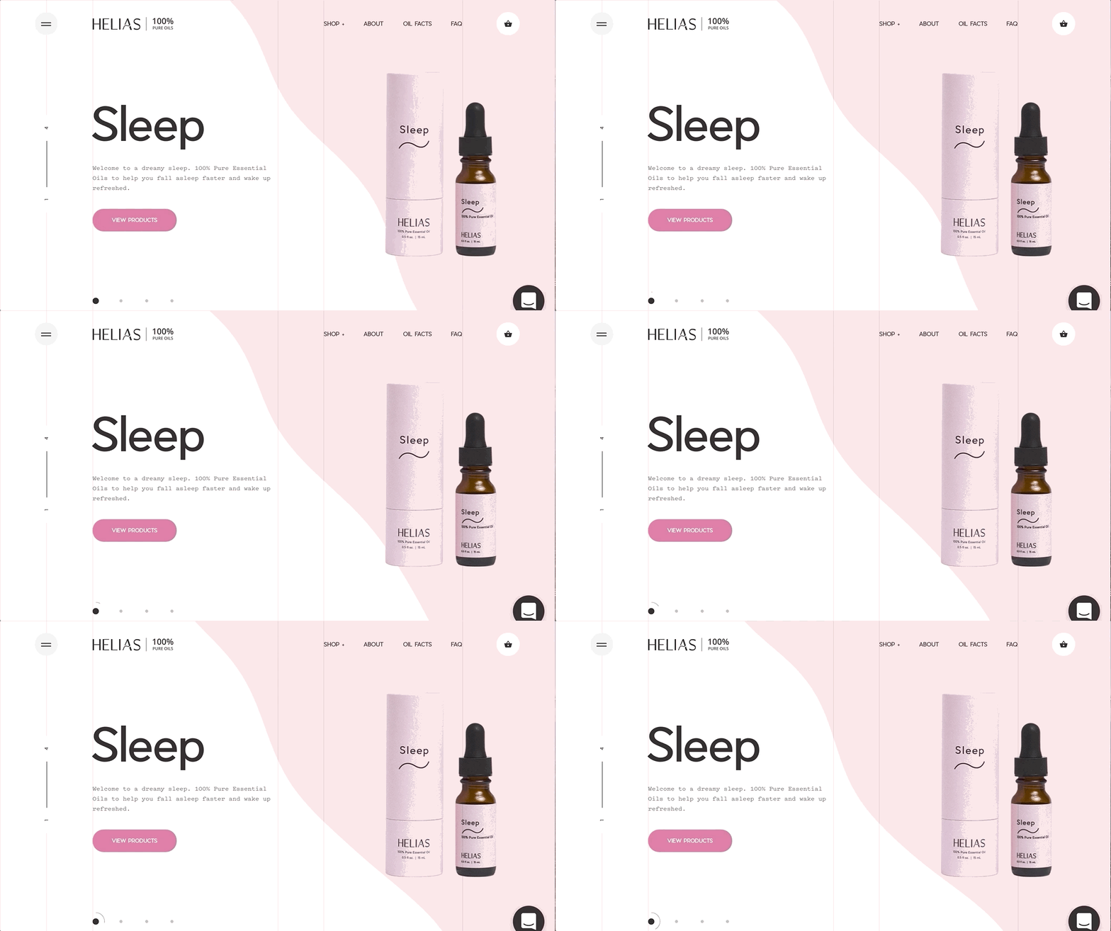
In the past, website heroes – the banner section under the header – have included large images and generally static elements like text and buttons. Over the past few years we’ve noticed that this space has become a lot more fluid. Looking ahead, we expect to see designers incorporating half-width images, illustrations, and eye-catching graphic elements that capture attention and make the space more dynamic.

Rounded Shapes
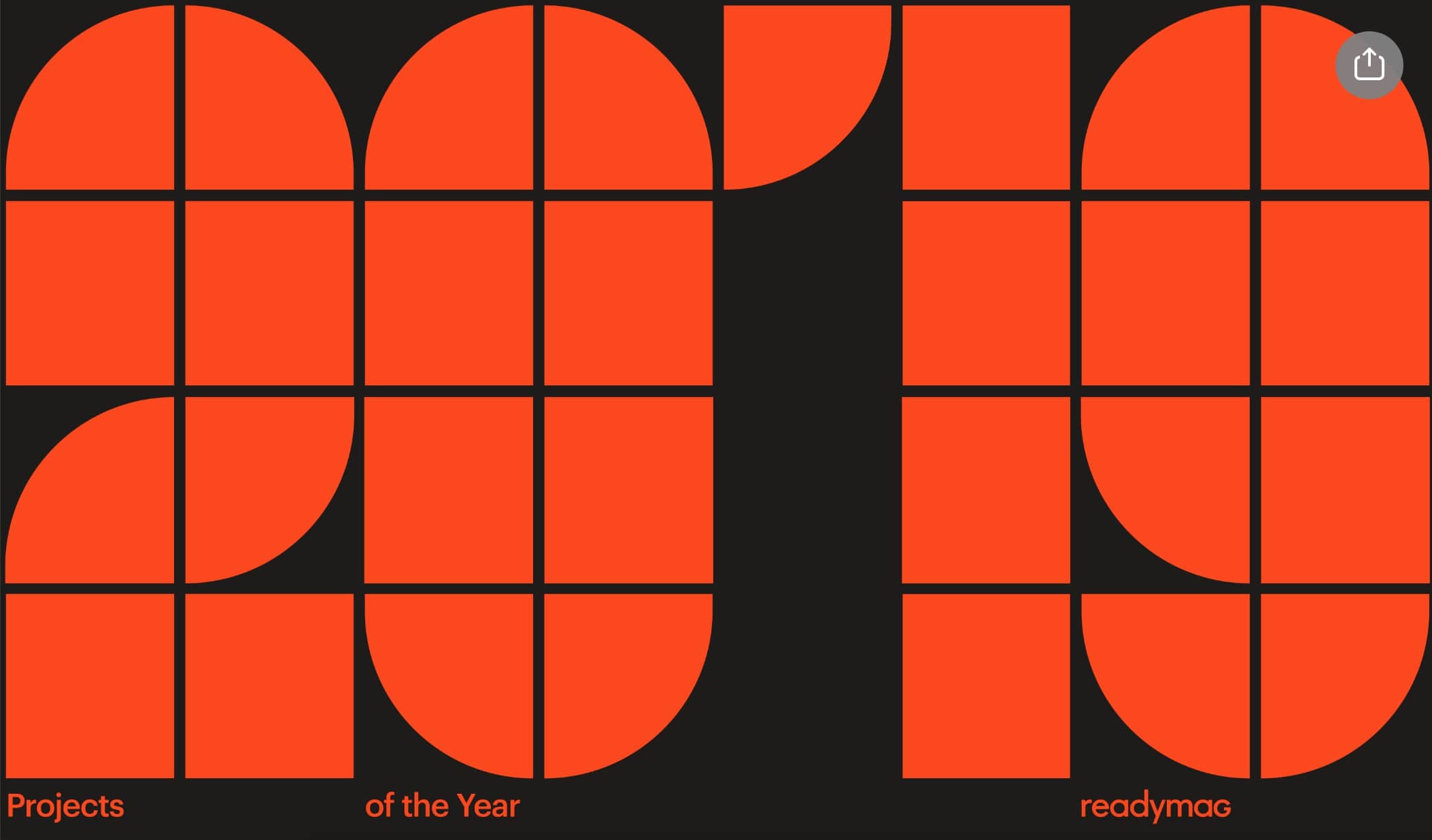
In hero design and beyond, we’re anticipating more flexibility in designers’ use of shapes. Rounded elements diverge from the traditional default to squares and rectangles, building a feel that’s fun, visually interesting, and reminiscent of modern art. These shapes can be carried through a site’s design in a variety of different ways.

Graphic Text
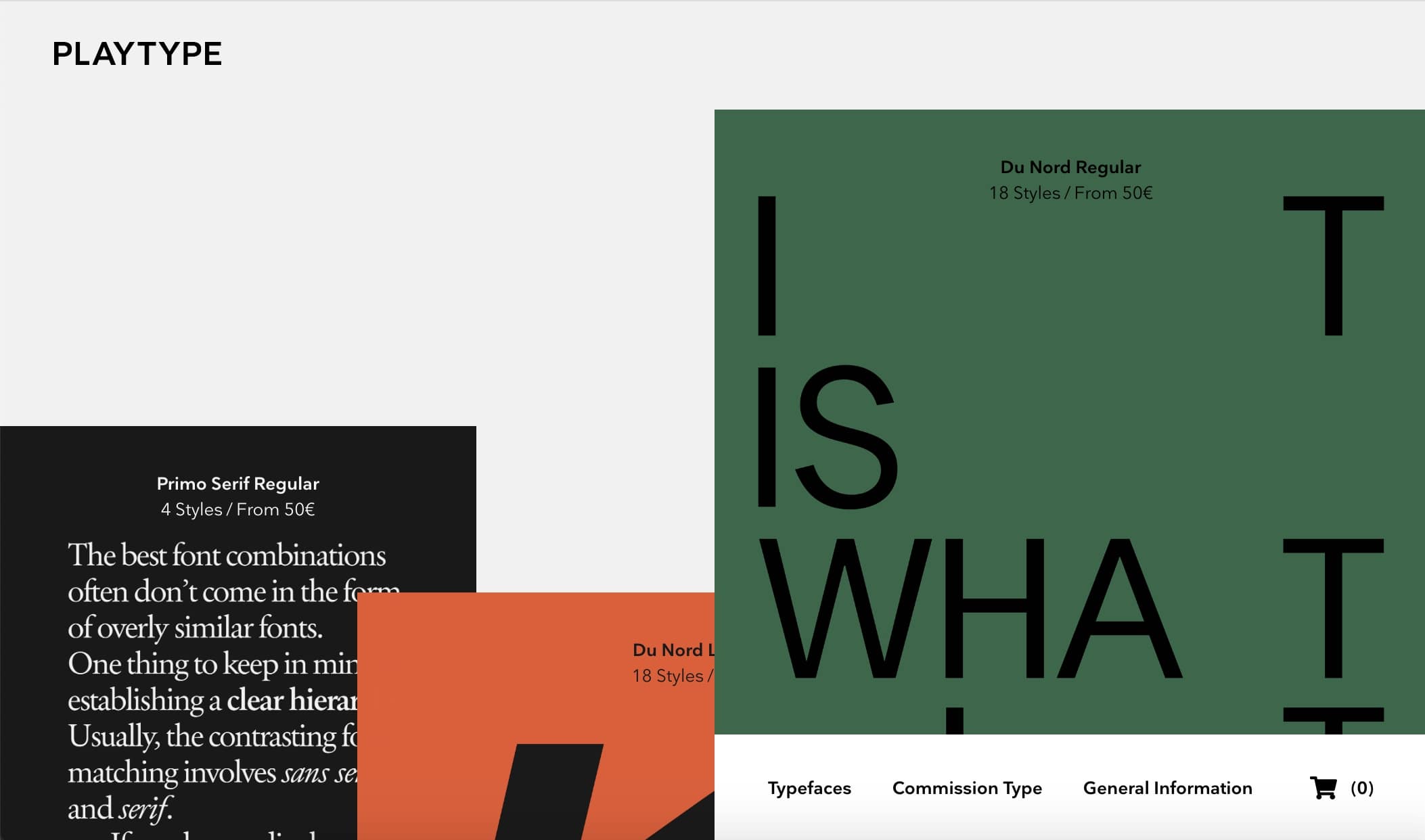
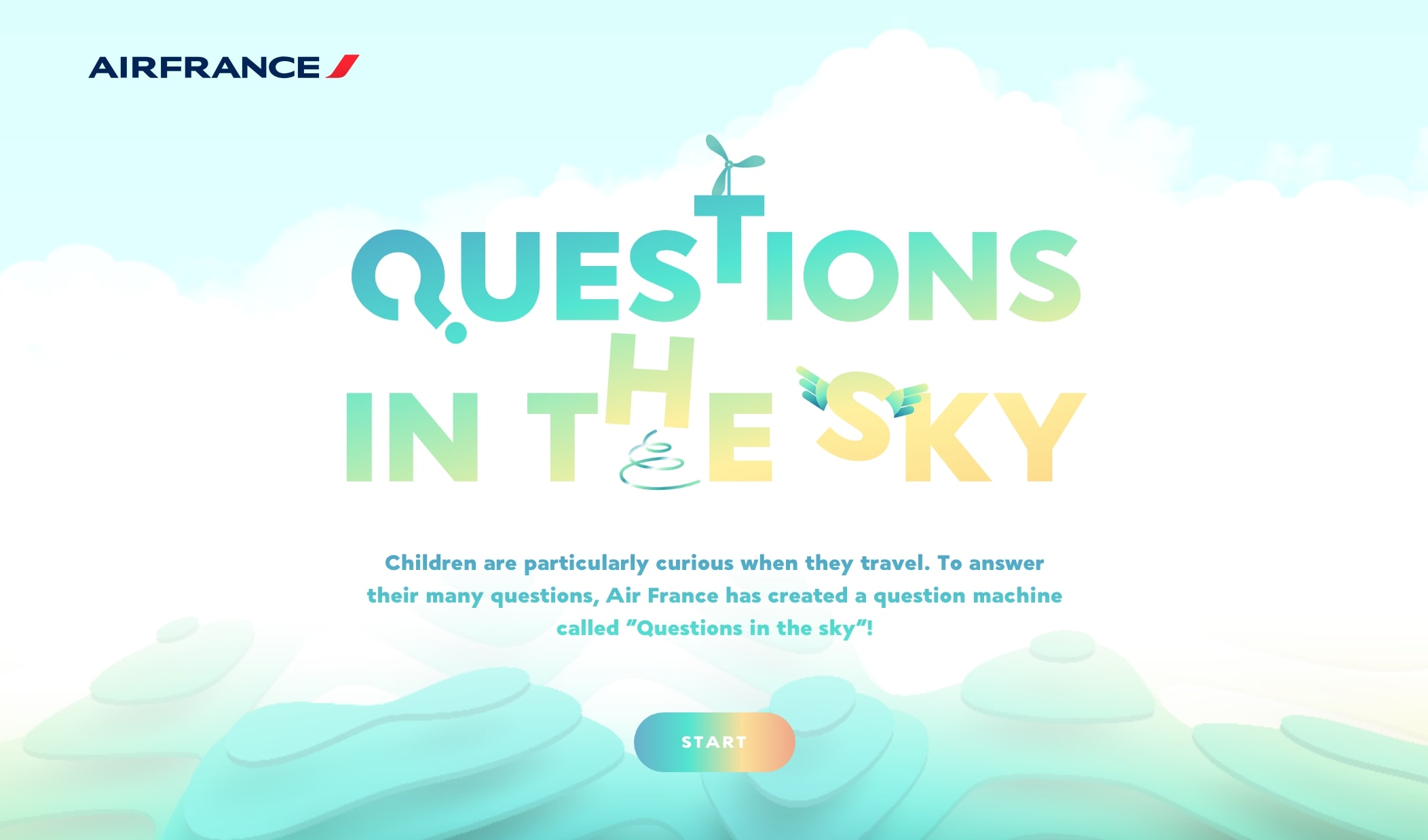
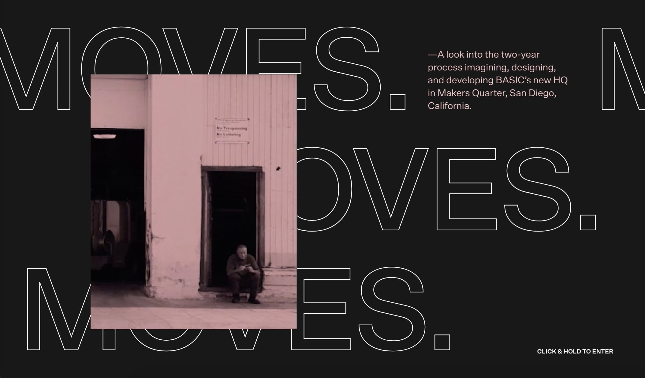
With shapes leaning more modern, typography is also growing as a medium for creativity and expression in web design. Decorative text and bold fonts have risen in popularity over the past few years, and this year we expect to see even more designers pushing the limit when it comes to word-based graphics.
Sliders
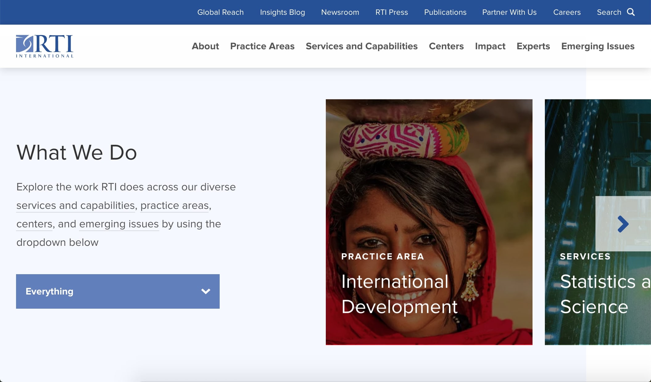
Though they’ve fallen in and out of favor over time, we’re seeing an increase in the use of sliders with arrows. These are often placed on a site’s homepage, and can be helpful by showing off multiple projects or products without requiring a visitor to consult an internal page.
Outside of the main feature area, we’re also seeing an increase in the use of sliders throughout the homepage. Due to the ubiquity of mobile use, visitors are already used to the swiping interaction that sliders rely on. Sites are taking advantage of this familiarity by using sliders further down page to allow visitors to continue to interact with the content.
Sliders are a very basic way to encourage visitor engagement, and we expect to see them utilized on even more sites in 2020.

Sticky Elements
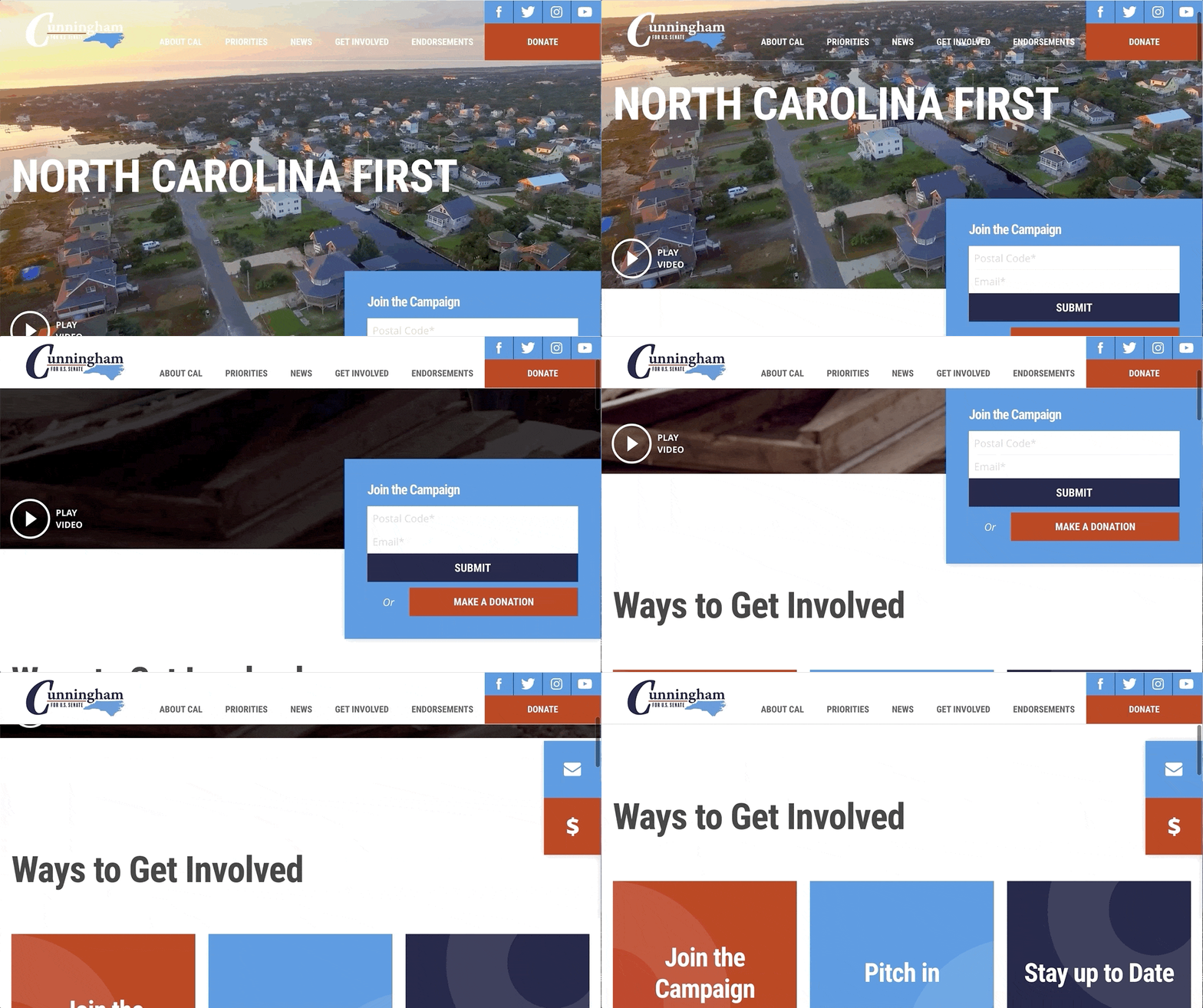
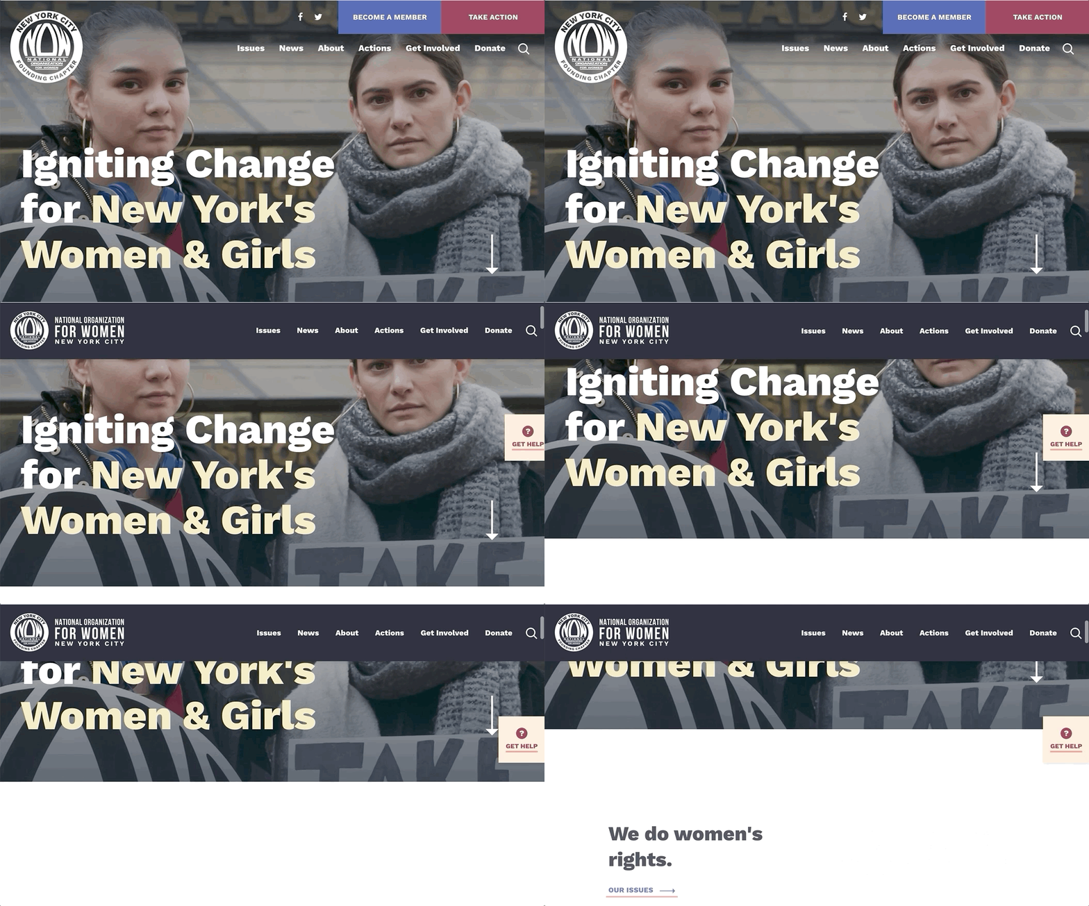
With the rise of tablet and smartphone use, it’s safe to say that most site visitors arrive on a webpage ready to scroll. To match this, designers have begun to incorporate elements that are “sticky” – that is, they stay attached to the same place on a page as a visitor scrolls through. Sticky elements can highlight valuable information and calls-to-action in a way that can’t be ignored. We expect to see this trend used to emphasize donation portals, email signups, and other key information.
Subtle Animations
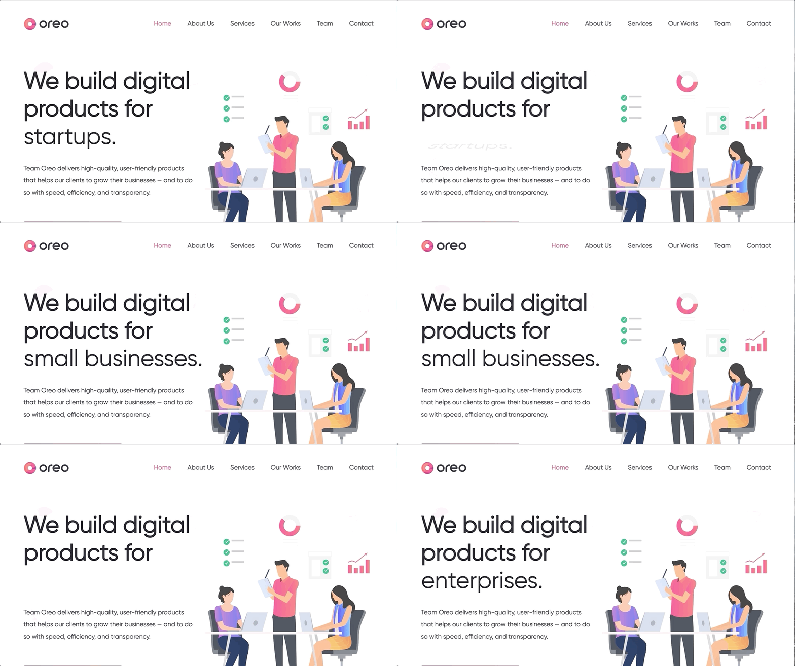
We covered the surge in animation use in our 2017 design trends post, and we’re excited to see that the trend is here to stay. Small elements like icons and statistics can be brought to life with a little animation, and we predict that most websites will adopt some form of movement as we move ahead this year.
Animated Previews
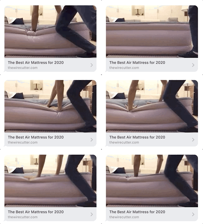
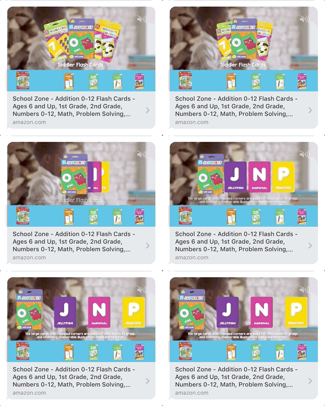
Similarly, some sites have brought animated previews to links shared via message or social media. This allows companies to attach a GIF or short video to what would normally appear as a static link or image. This trend will almost certainly grow as more companies find ways to incorporate multimedia elements on their sites.
Full Width Pages
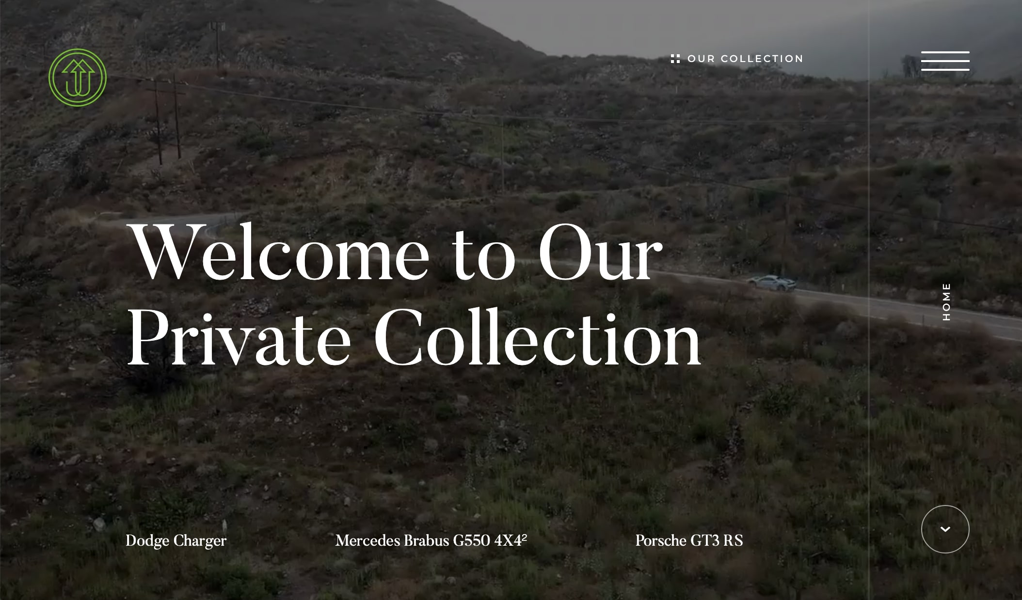
As we mentioned in our 2018 design trends roundup, full width pages are becoming increasingly popular as screens widen and edge-to-edge mobile devices become the norm. Because full width pages have the space to display so much content, we think that designers will continue to take advantage of the opportunity to create an engaging experience for site visitors.

Conclusion
As an artistic medium, web design continues to evolve and change in a way that’s exciting to us and our clients. We’ve highlighted just a few trends here, but we’re also excited to see what other new directions this year will bring for our work.


Comments
Andre
How the industry has evolved!Websites should become more visually attractive and user focused, currently people are still following bad practices.
I remember the days where the web design industry was booming.
Now unfortunately it has become very saturated, ruined and cheap.
Leave a comment