Here in Carrboro, we’re surrounded by world-class universities. Many NMCers graduated from UNC-Chapel Hill, and Duke and NC State are conveniently located just down the road. As a result, we’ve taken on a number of higher education website design projects for these great schools and others across the country.
Along the way, we’ve picked up on some trends and patterns that set the best higher ed sites apart from the rest. Whether you’re looking for a robust university website or a digital platform for an academic department, the following tips offer some great starting points that are sure to elevate your organization’s online presence.
Use the shortcuts below to skip ahead, or read the whole post for all of our thoughts on higher education website design best practices.
- On-Brand Design
- Interactive Elements
- Rankings & Stats
- Detailed Program Pages
- Latest News
- Easy Conversion
On-Brand Design
Most of our higher ed clients come to us with an established visual identity. They rely on familiar school colors, logos, mascots, and motifs to cultivate a highly recognizable look that’s consistent across platforms and marketing efforts. In many cases, this means that target audiences can recognize the university connection without even reading the words on the page.
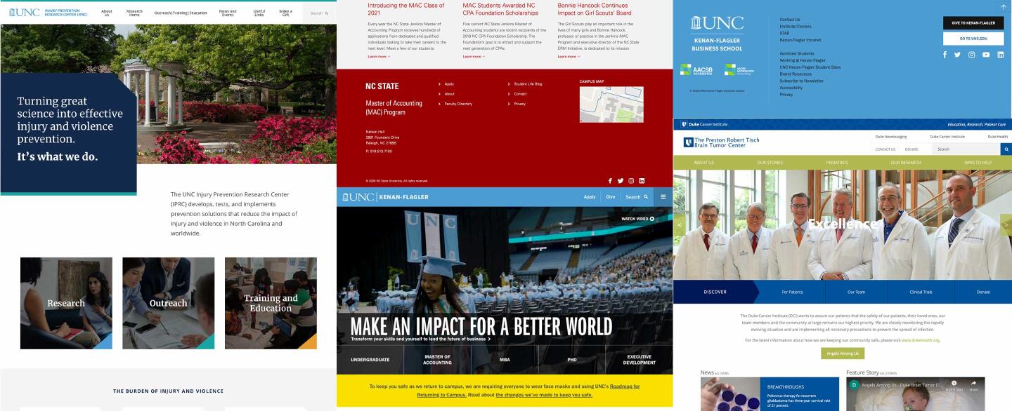
This seems like a given, but we’ve found that the best higher ed websites don’t stray too far from their school’s existing brand. For our UNC-Chapel Hill projects – especially UNC Injury Prevention Research Center, UNC Kenan-Flagler Business School, and UNC Campus Rec – this can be seen in the consistent use of the school’s signature shade of Carolina blue. The blue signals to each site’s visitors that they’re looking at a platform with a strong connection to UNC.
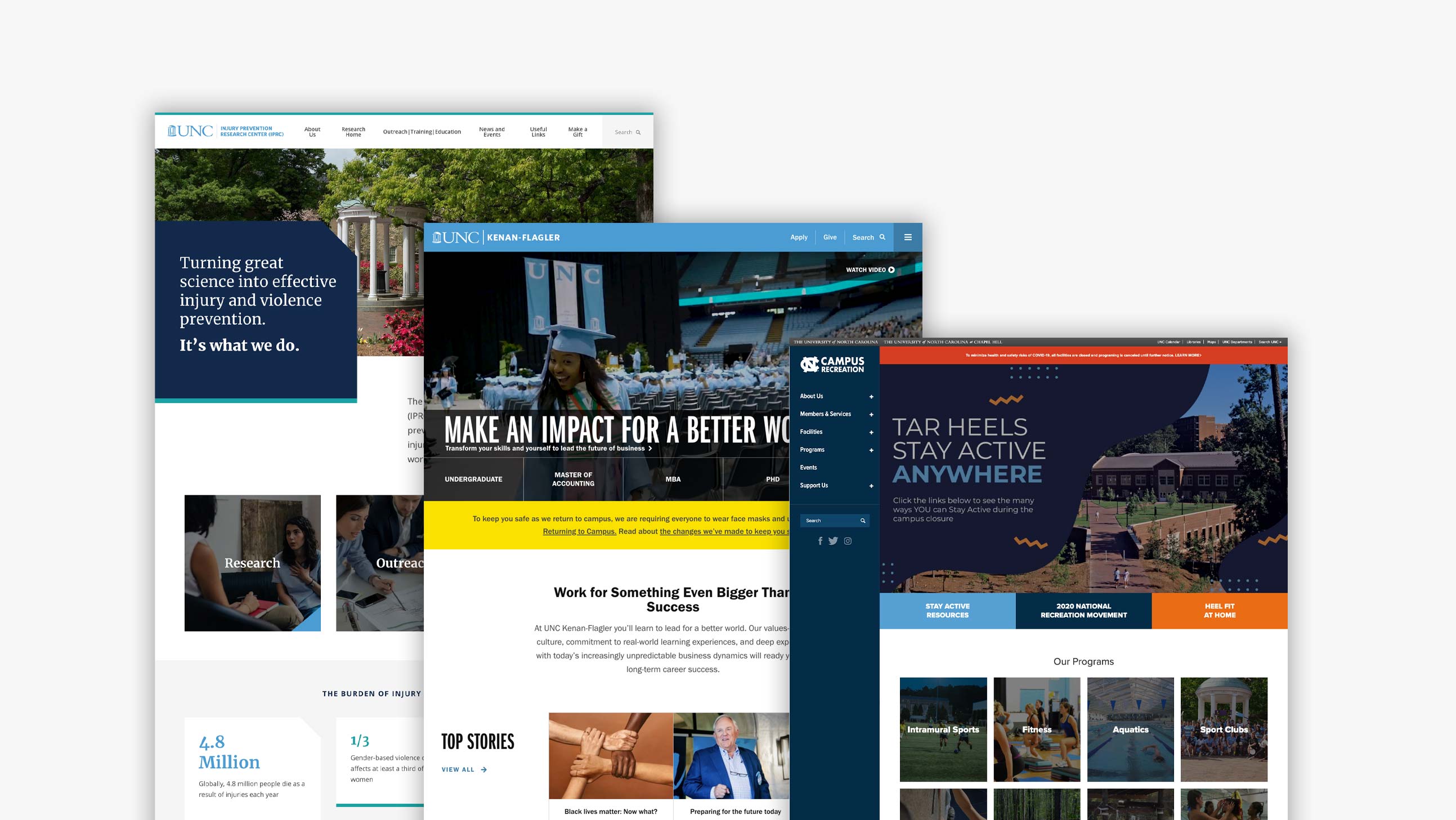
Notice, however, that some of these sites bring in additional accent colors to define their own unique identities. For UNC IPRC, this is evident in the pops of teal and orange that appear throughout the design. Although the two colors have no connection to the school, they’re effective because they add character without upstaging the main blue/white color scheme.
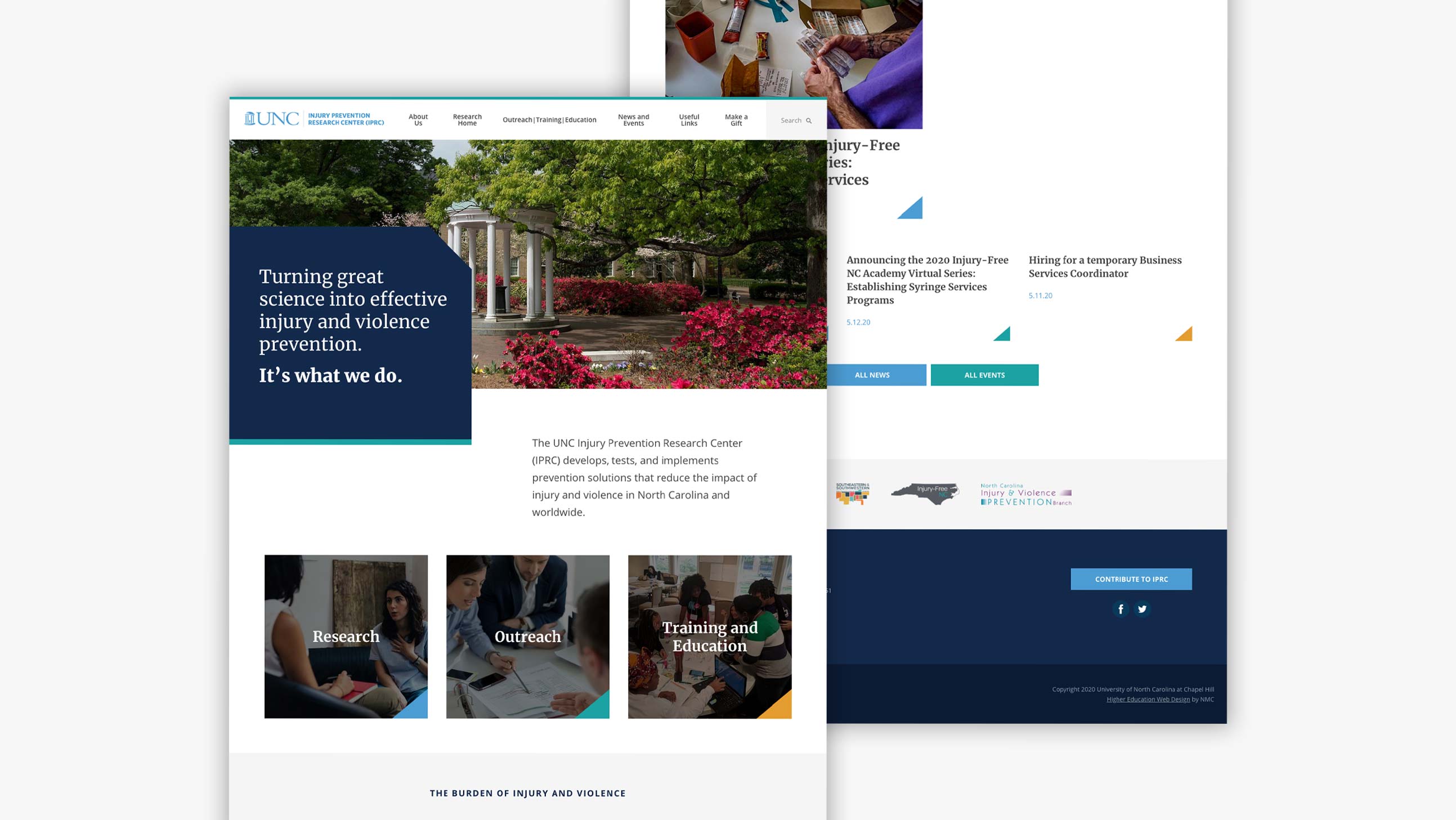
It’s important to note that some universities utilize set style guides to ensure that their platforms are consistent in look and feel. We’ve worked on several projects where this was the case, and we’re always happy to help our clients create a site that they love that stays within their given guidelines.
Interactive Elements
As you’re thinking through your website’s design, we recommend looking for places to incorporate interactive features and tools. Elements with movement capture visitors’ attention and bring your school, program, or department to life.
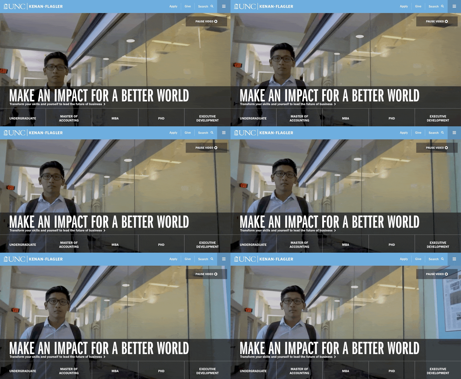
Many of our clients (across industries!) add interaction with ambient video. On UNC Kenan-Flagler’s website, the homepage video offers a glimpse of day-to-day life at the business school. We love how it introduces dynamic energy and alludes to the school’s forward momentum.
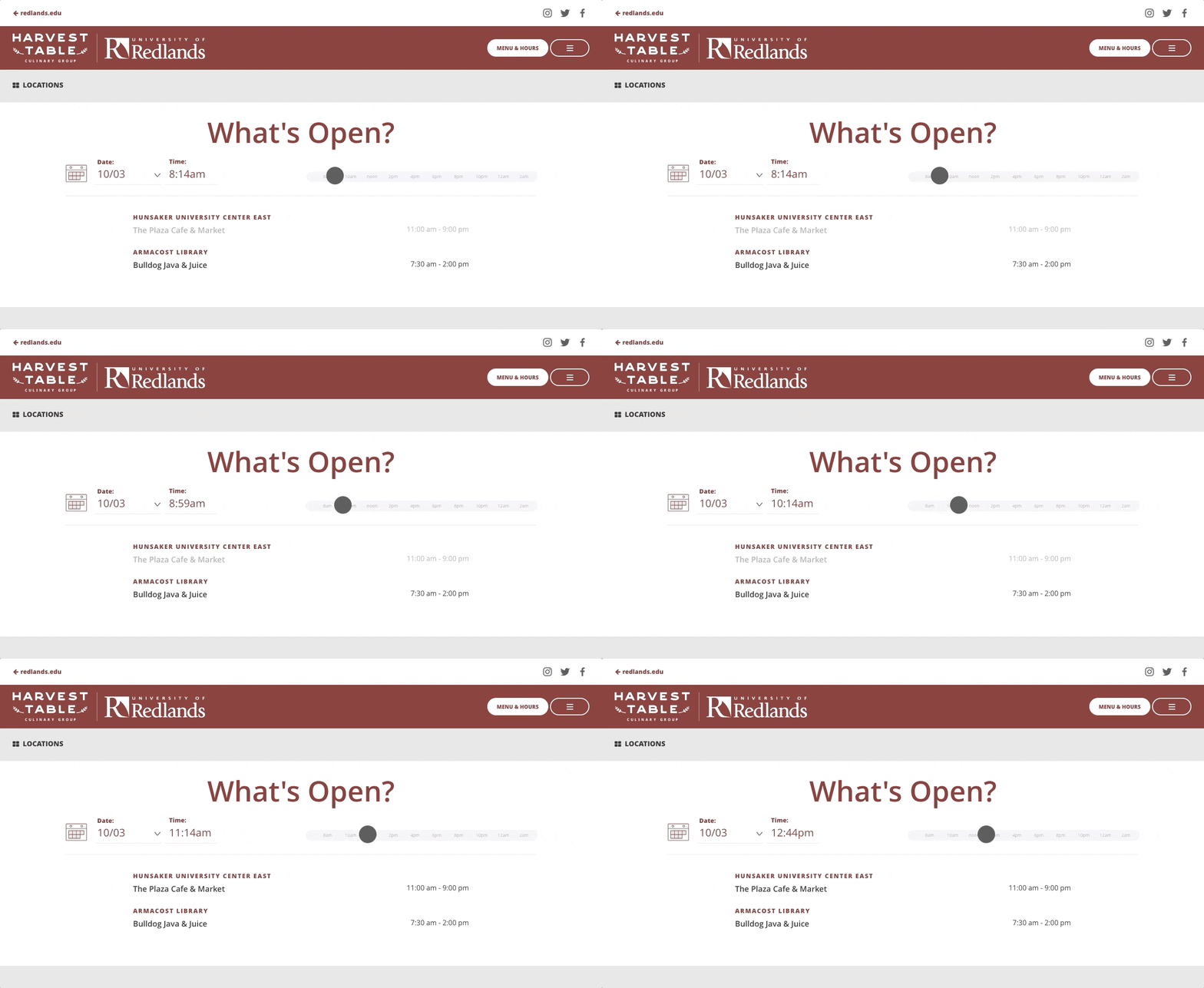
Other higher education websites make their platforms interactive by building in user-friendly tools. University of Redlands Dining, for example, includes a neat What's Open? feature on their website. Here, students can input a date and time to see which dining facilities are open and what’s on the menu at each location. The feature engages site visitors while offering valuable information about dining options.
Rankings & Stats
You can also engage visitors by highlighting impressive statistics about your university or program. Do you have a high percentage of international students? A top-ranked academic department? A stellar amount of post-grad job offers? Considering that key numbers often get lost in reports and brochures, it’s a great idea to use your website to reinforce your stats in a way that can’t be missed.
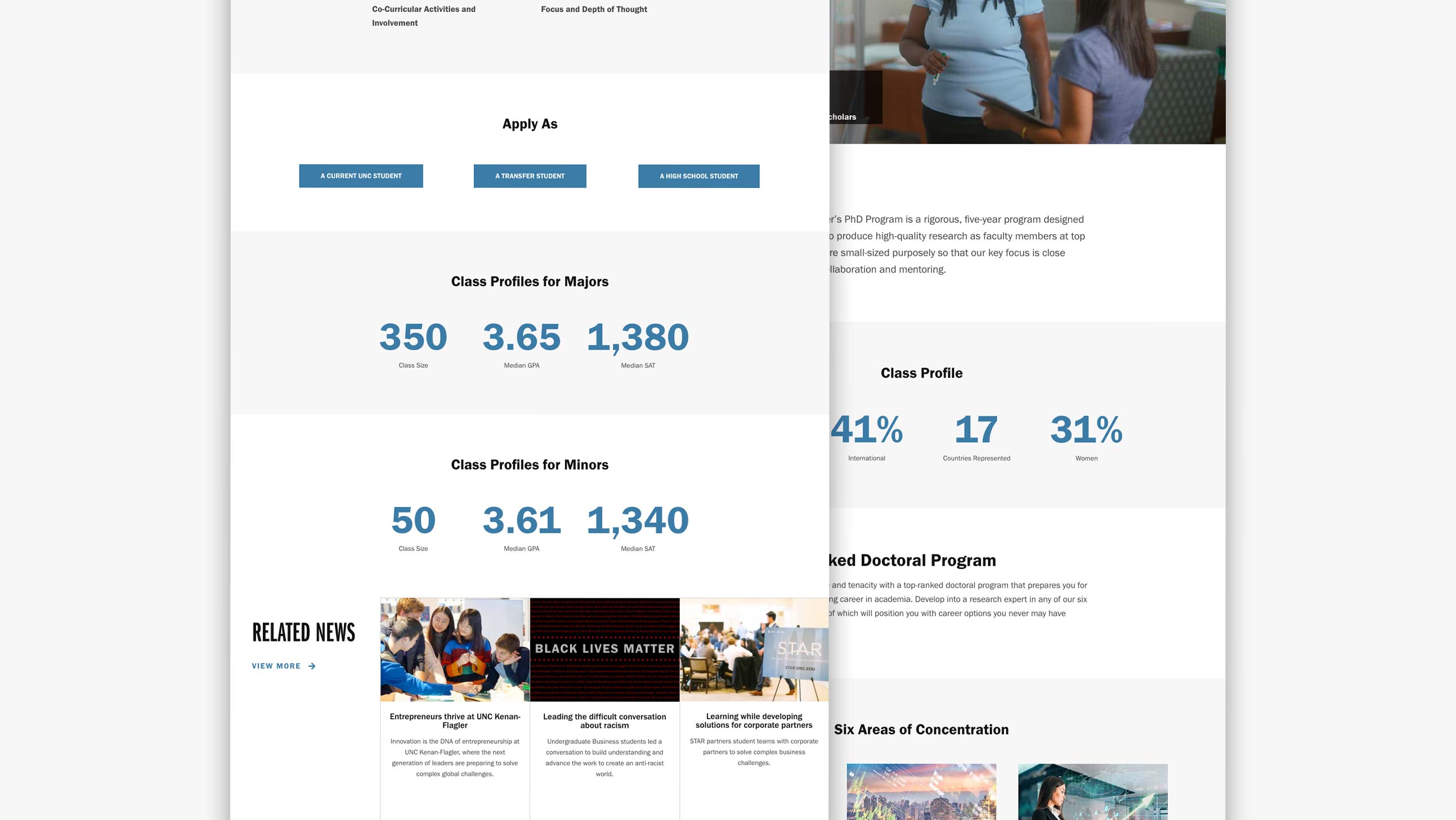
UNC Kenan-Flagler does this by strategically featuring stat bars on several of their program pages. The stat bars are minimal – they typically only show 3-4 relevant numbers – which increases the impact of each fact and ensures that the data doesn’t overwhelm site visitors.
Detailed Program Pages
In addition to implementing a design that’s dynamic, engaging, and interactive, it’s essential to fill your site with the content that your visitors are looking for. For higher education websites, this means in-depth information about program offerings and options.
One way to do this is by organizing content into comprehensive information hubs. Centralizing all program or course details makes it easy for prospective students and other stakeholders to quickly and easily explore everything from professors to admissions requirements.
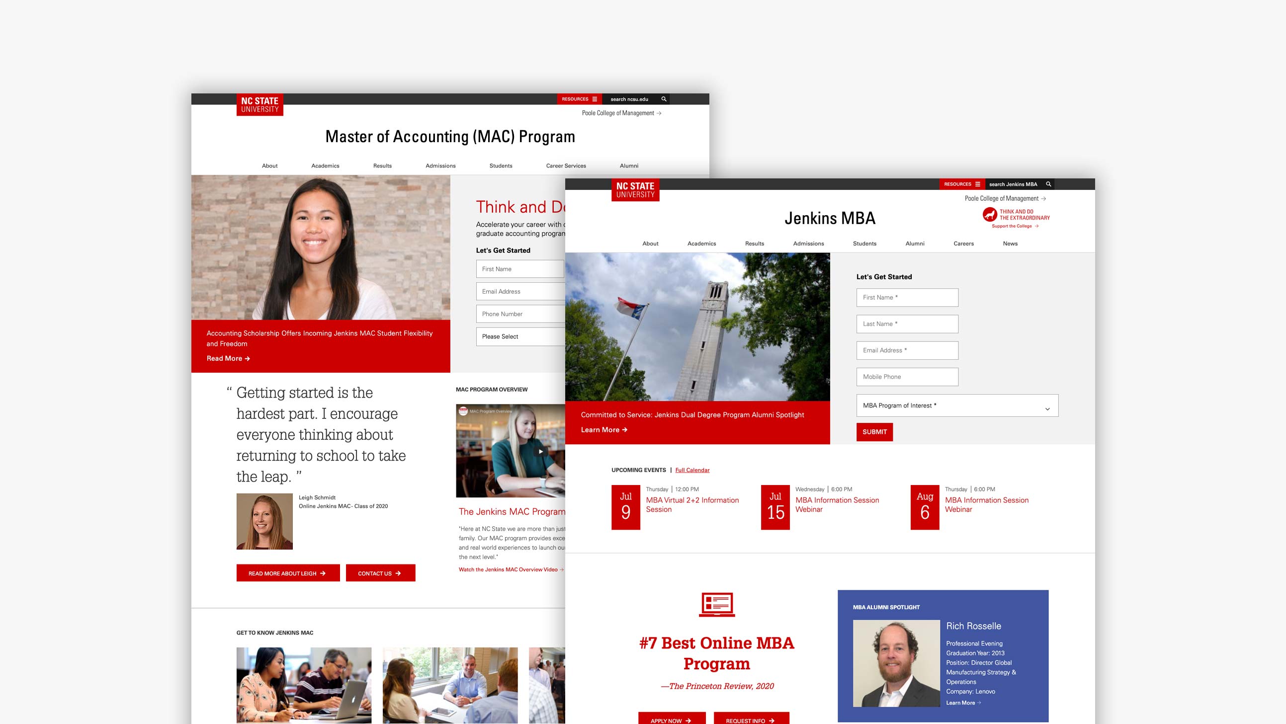
We really like how NC State’s Poole College of Management allows each graduate program to take on the feeling of a stand-alone website. For programs like Master of Business Administration and Master of Accounting, this organization strategy enables clear navigation through program-specific topics like Academics, Results, and Admissions. And if a visitor wants to return to the Poole homepage? They can always click on the arrow at the top right corner of each page.
Latest News
It’s natural to update your site with the latest information, deadlines, and forms, but we’ve noticed that the most successful higher ed websites also show off exciting developments in a dedicated News or Blog section. Since these sections are refreshed with new content regularly, they offer visitors a true to life look at your school’s culture and character.
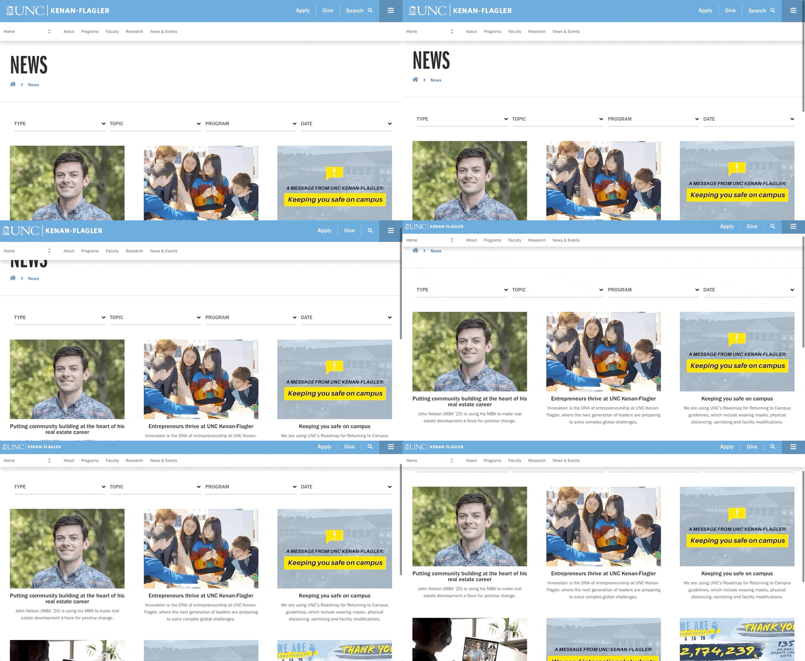
By offering a mix of content about students, alumni, and degree programs, Kenan-Flagler’s News section does just that. The content is particularly effective because the variety of topics appeals to multiple target audiences.
Easy Conversion
Once you’ve convinced site visitors that your university has a lot to offer, streamline their process for taking the next step. This can be done by sprinkling contact forms and application links throughout your site’s content. Think about it this way: visitors should never be left searching for a way to transform their interest into action.
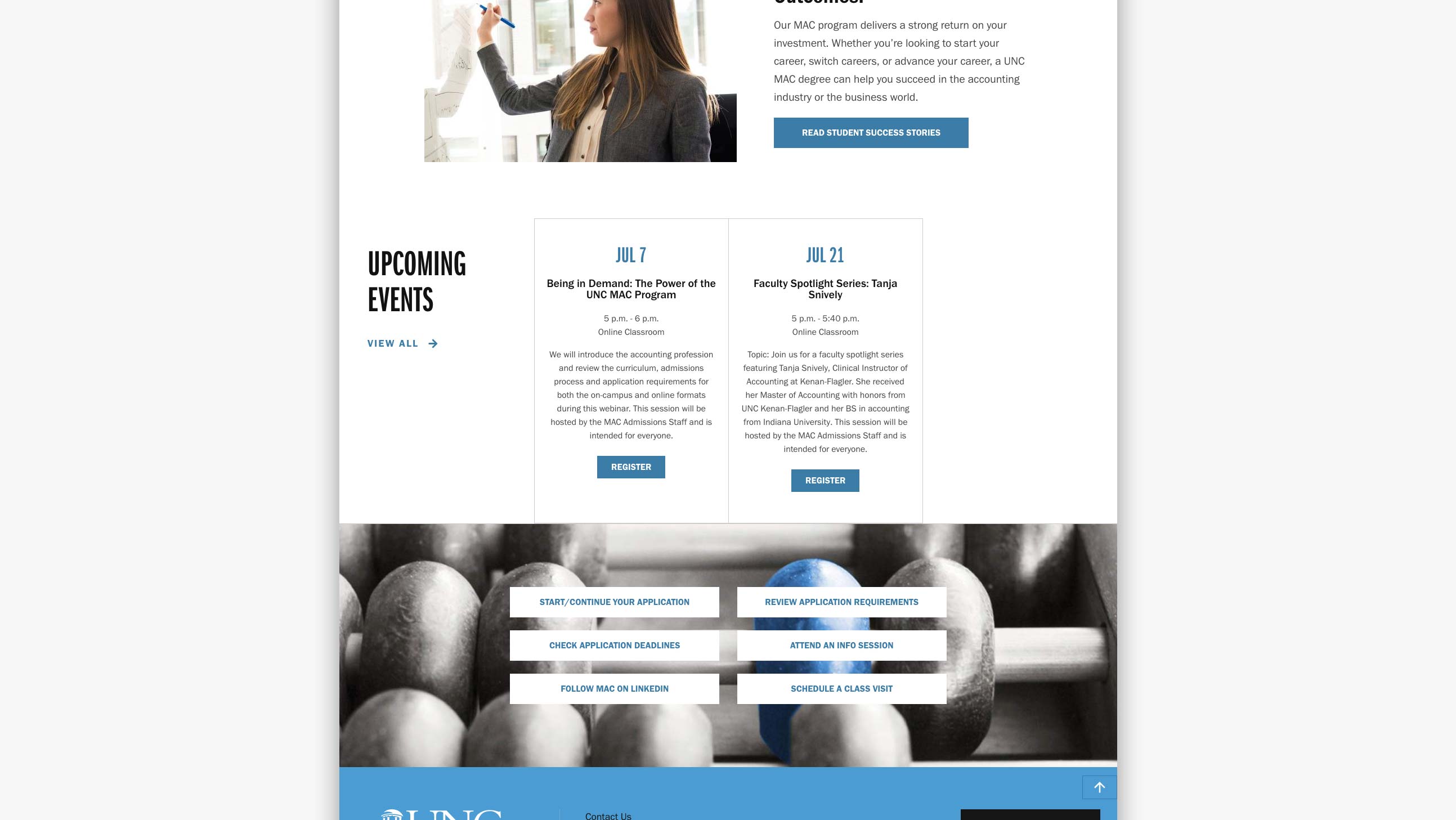
Kenan-Flagler and Poole College of Management both promote effortless conversion with integrated interest forms and fixed “Apply” buttons. And for those who may not be ready to apply yet, Kenan-Flagler’s Master of Accounting page even highlights a variety of next steps that range from following the program on LinkedIn to scheduling an online or in-person class visit. These elements ensure that site visitors are always able to move ahead in their research or pursuit of admission.
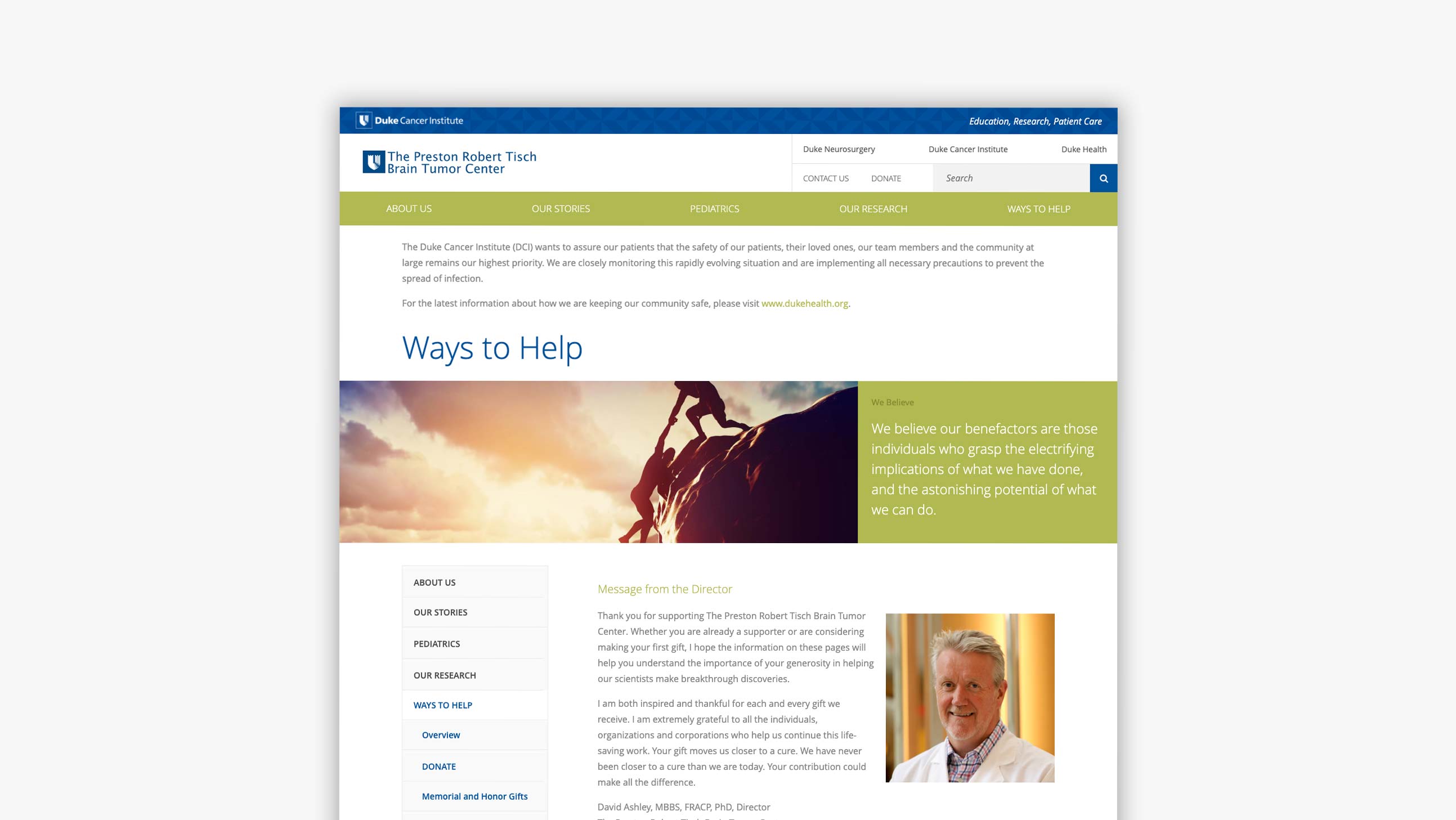
So far, we’ve talked a lot about higher ed websites that are actively seeking applications for academic programs. However, we also work with plenty of higher ed clients who aren’t operating in the classroom setting. For example, Duke University’s Preston Robert Tisch Brain Tumor Center came to us for a website that would showcase their research while educating patients, families, and donors.
For the Brain Tumor Center, conversion meant encouraging site visitors to donate money, explore board opportunities, and participate in fundraising events. All of these options are outlined in a detailed Ways to Help section on the website. Like the other conversion features we’ve mentioned, the Ways to Help content makes it easy for visitors to find a way to get involved.
Conclusion
By carefully considering your site’s design, features, and content, you’ve already taken several important steps towards a higher education website that excites prospective students and attracts interest online.
Looking to make your ideas a reality? We’re ready when you are. Reach out to us and we’ll work together to create the website of your dreams.


Leave the first comment