Across industries, most design-related projects begin with a creative brief. Generally speaking, a creative brief is a planning document that outlines the purpose of the project, specific goals, target audiences, success indicators, and key elements or features that should be part of the final deliverables. The purpose of a creative brief is to ensure that the entire team – including the client and any vendors or partners – is on the same page in terms of expectations and objectives.
A creative brief can be presented in a variety of different formats, ranging from a simple text document to a styled one-pager or presentation. At NMC, we lean towards the latter and typically translate our creative briefs into polished slide decks that combine the usual content with discovery research findings and initial style directions. We like this approach because it produces a tangible “guidebook” that can be consulted throughout the project by the client and other stakeholders.
While the creative brief process is mostly accepted and understood, it’s not uncommon for clients to be eager to jump right into designs. And we get it! Reviewing designs is a lot more exciting than thinking through target audiences or breaking down a sitemap. But putting time into the creative brief process is more than worthwhile – a strong creative brief creates a clear path forward that reduces the chances for misunderstandings and surprises later on. It's very similar to writing a good website Request for Proposal (RFP) where doing a bit more upfront work and thought will yield substantially better results.
Interested in what goes into our creative brief process? Keep reading to find out what we include and importantly, why.
Using the Creative Brief to Highlight Research and Discovery
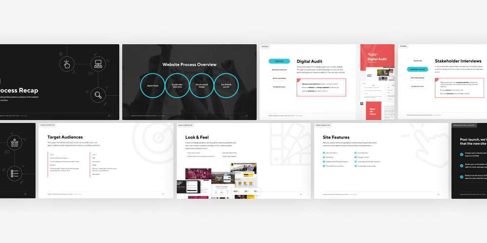
In most cases, we start a creative brief presentation by summarizing and explaining our research and discovery findings. We always include a project purpose statement, goals, and target audiences, and depending on project scope, we sometimes layer in additional insights from stakeholder interviews or an SEO audit of the existing site.
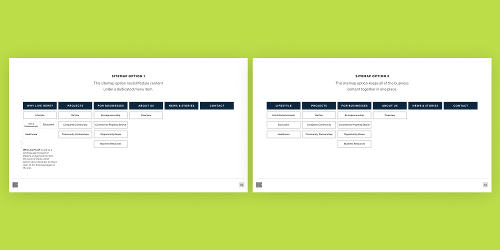
The next big item that we cover is the sitemap. In addition to being a huge(!!) factor for user experience, planning and outlining a good website sitemap is important for determining the build and design structure for the project. Which pages are the highest priority? What will need a distinctive design treatment? Are there areas of the site that will grow significantly over time? All of these questions help us develop a sitemap recommendation that makes sense for the project and aligns with overall business goals.
Outlining Features and Integrations Based on Specific Goals
Once we’ve established the big picture project summary, the creative brief turns more specific. We use the client’s overall goals to narrow down a list of essential features that will enhance the site and address key objectives. For example, if showing national or global reach is an important factor, we might recommend an interactive map or infographic where users can explore locations or case studies. Other features that often come up during this part of the brief process are filterable news/resources, custom-designed forms, and use of video.
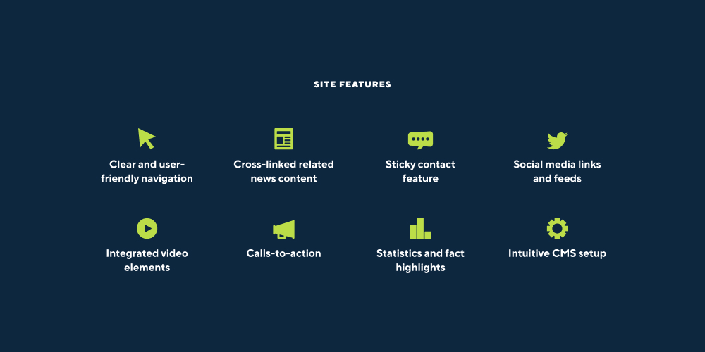
Along with features that we recommend, we also expand on any must-have elements from the request for proposal or earlier discovery discussions. This is the time to start thinking about those special features and how they will be implemented. We may share details about the development approach or any third-party integrations (like donation integrations for nonprofits or a Salesforce integration with your website) that will be used to bring the ideas to life.
We spend time defining key site features because we want to make sure that everyone is on the same page about how the site will work after it has been built. If we’re missing a piece of the vision at this point, it’s very easy to make additions or changes to the plan.
Thinking Through Foundational Design Elements
Here’s where things get more visual! Our creative briefs all have a robust design section that covers several subtopics: the existing brand, any adjustments for the web, design inspiration, and concepts or moodboards.
We like to include the existing branding – mainly focusing on logo, typefaces, and colors – to provide context and highlight elements that will be carried throughout the website. If any adjustments need to be made to make the brand web-friendly, we’ll also highlight those recommendations in the creative brief. Some examples of common adjustments are updating colors for accessibility and finding alternatives for fonts with restrictive licenses.
To get a sense of the design vision, we ask for a handful of inspiration sites that exemplify the desired look and feel. We know it can be difficult to articulate a design vision – especially for non-designers – so we find that this is a helpful step where clients can show us the types of elements that resonate with them. They may select a site that uses a unique photo treatment, or a site that takes a bold approach with color usage. We incorporate the inspiration sites into the creative brief by highlighting the standout elements that will serve as inspiration for the website project.
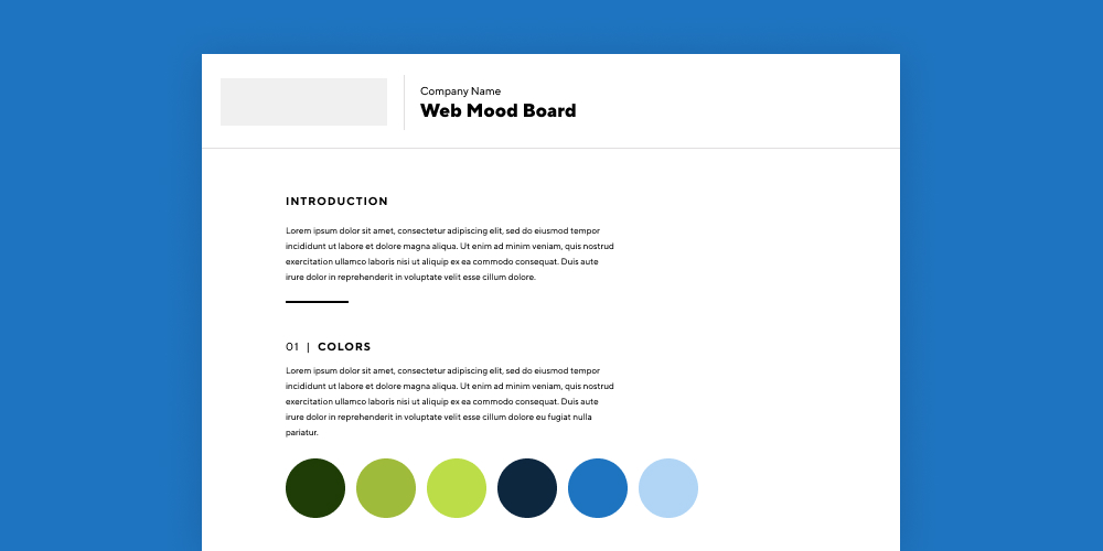
For large or complex projects, we sometimes expand the design inspiration section to include a moodboard or initial concepts. Showing a few ideas builds excitement about the project and shows how abstract thoughts might be translated into real designs. While designs from the moodboard or concept stage may or may not be used in the final project, they can serve as a starting point and spark helpful feedback about the overall design direction.
Our Tips: Making the Most of the Creative Brief Process
To set the stage for a successful project, it’s important to fully commit to the creative brief process. Sure, it might take a little time and effort, but the creative brief is the foundation for every part of the website – design, build, features, and so on. The up front time commitment is very worthwhile!
Below, we’ve put together a list of creative brief tips based on general best practices and our experience over the years.
- Spend time on the initial questionnaire. In many cases, your agency partner will start the creative brief or discovery process with an initial questionnaire or worksheet. This isn’t just busywork! Get together with your team – all of the decision-makers who will be involved in the project – and put together a detailed and specific answer for each question. Try to add the nuanced insights that your partner will need to understand your business and goals for the project. Remember, you’re the expert on your organization, and it’s up to you to communicate those key points about your priorities and needs.
It’s best to take a stab at every question on the list, but if you absolutely need to skip an item, do your best to explain why you’re unsure or what additional information you need to formulate a response. At NMC, we’re always happy to talk through any points of confusion or help strategize about the best way forward. - When discussing design inspiration and examples, be prepared to explain your likes and dislikes. It’s helpful to explain the specific elements that you like about the examples that you’ve gathered – is it the colors, the features, the typography? – and why a similar approach might work for your project. Your partner isn’t looking to copy your inspiration examples, but instead to understand the types of design treatments that resonate with you.
In addition to the positives, spend some time considering whether there are certain things that you’d like to avoid. Maybe you tried a feature or graphic element on a past version of your site and it didn’t work for your audience. That type of information is helpful to pass along to your partner as they begin to think through options for your project. - Don’t be shy with feedback. If the creative brief process includes a back and forth period where you have the opportunity to share feedback, don’t hesitate to voice your opinions. Trust us, your partner would rather know that you don’t like that idea/font/color up front versus later in the project’s timeline. It’s much easier to make changes to the plan – the creative brief – than a site that has already been designed or built.


Leave the first comment