Each year 175,000 children are born with clubfoot, a treatable birth defect that causes the feet to twist upwards and inwards. Because the condition makes it difficult and painful to walk, children born with clubfoot are often subject to discrimination, abuse, and neglect in many low- and middle-income countries around the world. MiracleFeet is a North Carolina-based nonprofit that works internationally to eliminate these consequences by increasing access to clubfoot treatment, education, and ongoing care. In 2019 alone, MiracleFeet provided care for 23,202 children with clubfoot in 28 different countries.
After a decade of growth, MiracleFeet had outgrown their original website. In order to keep pace with their building momentum, they approached NMC for a complete nonprofit website redesign that would reflect the scale of the work, the organization's reach, and their proven global impact. MiracleFeet is very much defined by their international focus, so they naturally sought to position themselves for success in larger nonprofit spaces and on the global stage.
In this post, we’ll offer a case study on the MiracleFeet project that touches on goals, process, site features, and early outcomes.
Growth-Driven Objectives
From the beginning, MiracleFeet made their priorities clear. They wanted the new site to project the strength, passion, and leadership that goes into their work and to energetically communicate their goal of transforming children’s lives. To do this, we approached the project with the following objectives:
- Bring in high quality photos and videos to highlight MiracleFeet’s work in the field
- Introduce dynamic and interactive elements to increase site visitor engagement
- Drive donations with an attractive and user-friendly donation platform
- Emphasize flexibility for site administrators with an easy-to-use Content Management System
Together, these objectives built the foundation for a strong digital presence that has launched the organization into a better-than-ever second decade.
Inspired by Success
As we entered the creative phase of the project, MiracleFeet looked to larger nonprofits like International Rescue Committee and ONE for inspiration. With these nonprofit website examples in mind, our team developed a new vision for MiracleFeet that showcases design elements like large featured images, defined call-to-action boxes, sidebar content, and crisp color blocking.
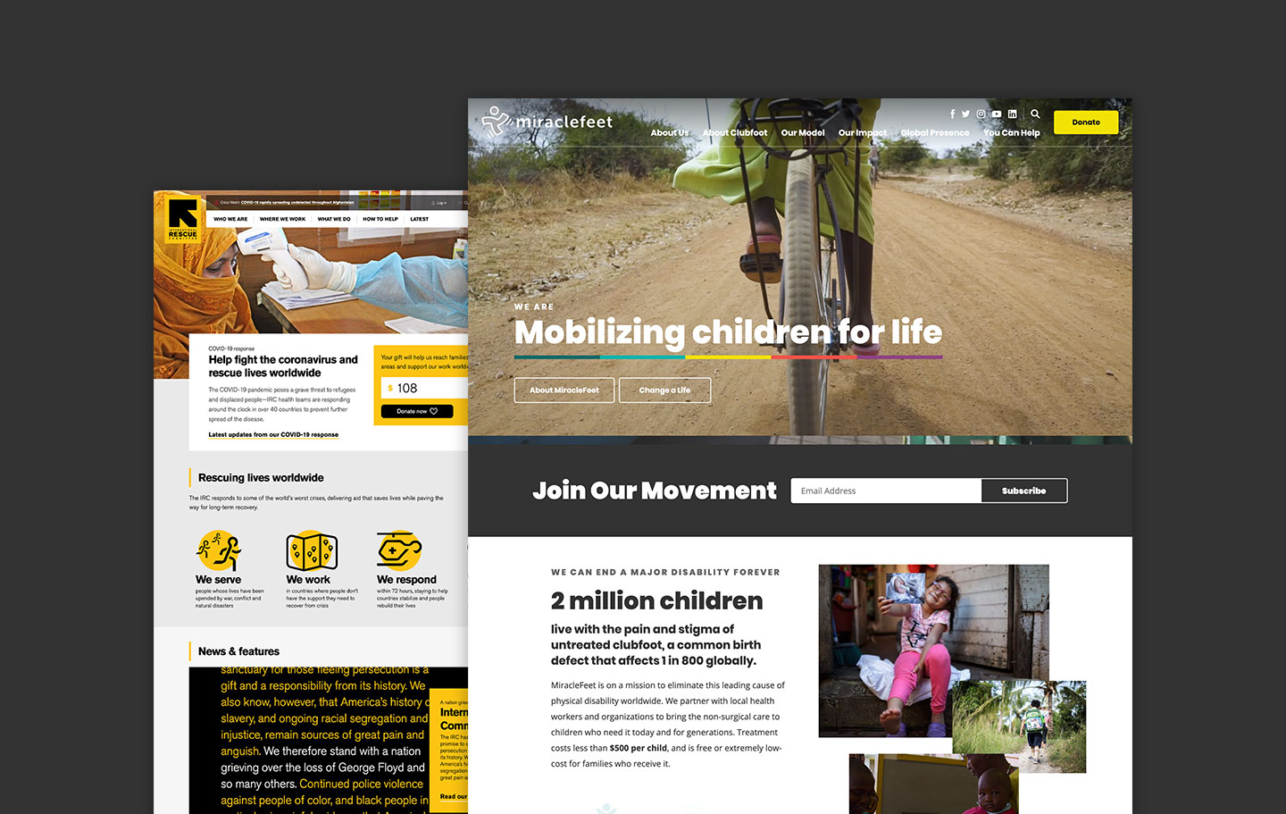
An Image-Forward Design
The finished site highlights MiracleFeet’s character and purpose with abundant imagery, striking colors, bold statistics, and interesting layouts.
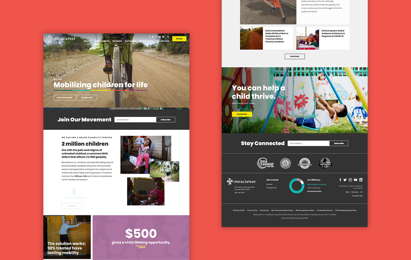
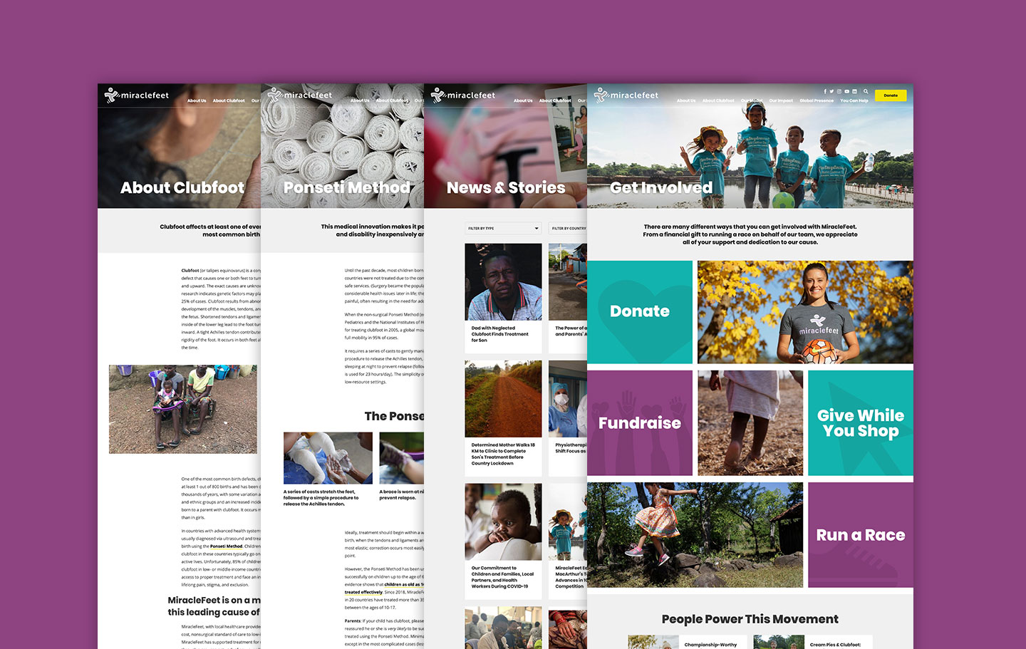
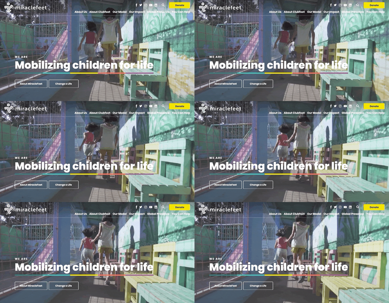
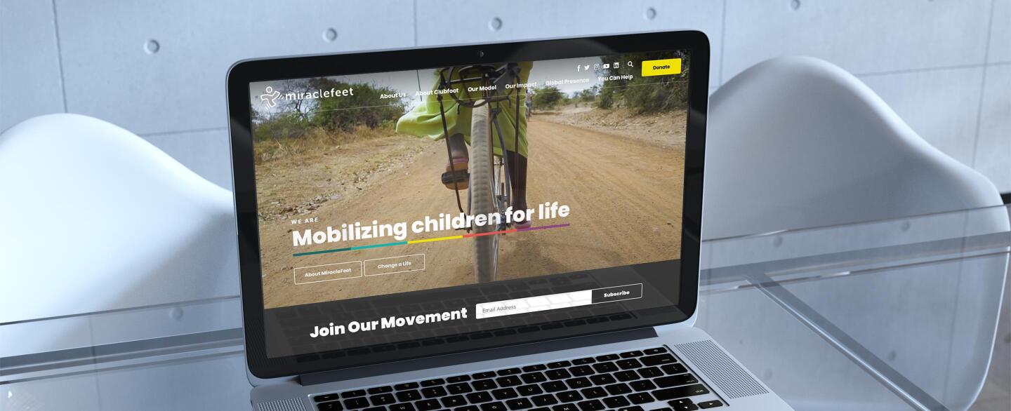
Beginning on the homepage, site visitors are engaged by a full-width ambient video and the assertive slogan, “Mobilizing children for life.” Here and throughout the site, visitors are immediately called to action with prominent buttons that offer opportunities to either learn more about the organization or make a donation online.
Further down the page, visitors encounter an attractive grid layout that combines ambient video with links to Patient Stories, Video Stories, and the interactive Where We Work map. Great visual communication was a huge goal for the project, so we felt that it was only fitting for the homepage to share a photo narrative about the people and places that experience MiracleFeet’s work firsthand.
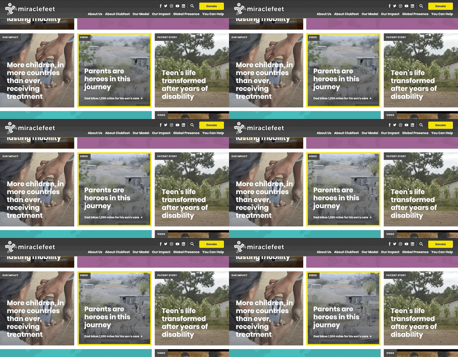
Interior pages carry through the photo and video elements while presenting helpful information about clubfoot and MiracleFeet’s mission. Some of these pages, like About Us, include still images that come to life when hovered over by a site visitor’s cursor. The continuous use of video assets makes MiracleFeet’s work feel dynamic and real to visitors who may not be as familiar with the challenges of clubfoot.
All in all, the site’s dynamic and modern feel accomplishes MiracleFeet’s goal of positioning their organization as a leading nonprofit and a champion for change.

Visualizing Data with an Interactive Map
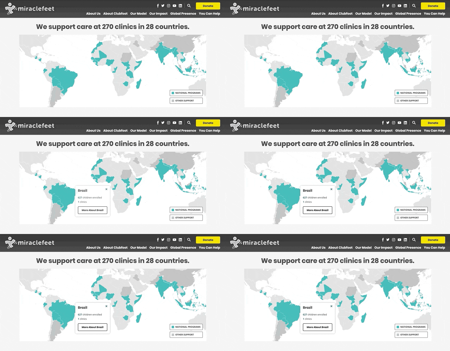
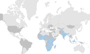
One of the site’s most unique features is the interactive map that displays key information about the countries where MiracleFeet works. We’ve designed and built interactive maps for a number of our clients, and for MiracleFeet, the map was the perfect way to communicate the nonprofit’s truly global presence. In addition, the map encourages visitors to explore in-depth country pages that detail program specifics and statistics.
The map is powered by a Google Sheet, making it exceptionally easy (and cost-effective!) for MiracleFeet to change and update the data as needed.
Donation Integration
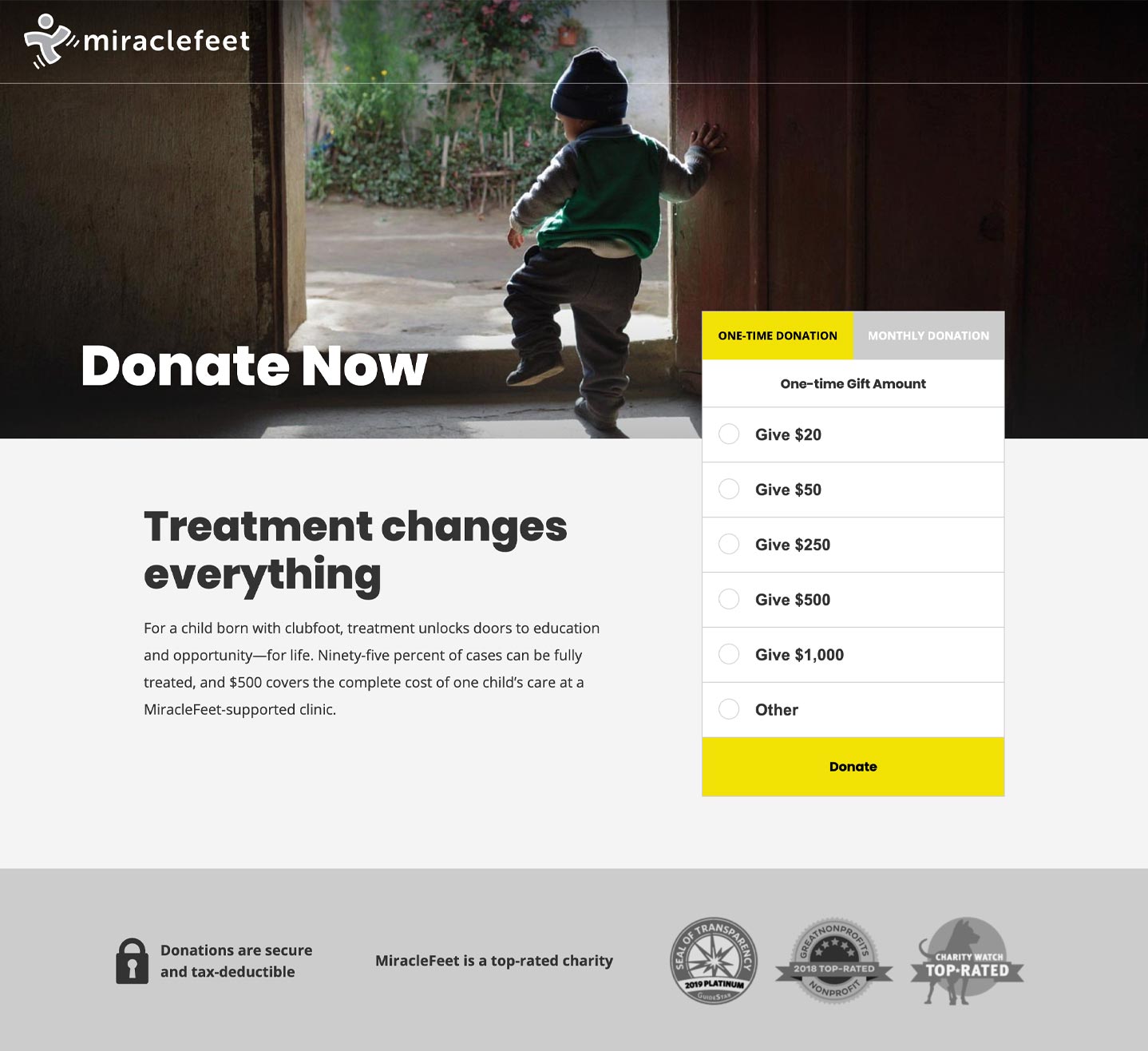
To address the goal of driving donations, we incorporated links to the Donate page throughout the site. So whether a visitor is exploring ways to Get Involved or browsing through Clubfoot Resources for Parents, there’s always an option to support the cause by giving to MiracleFeet. Including the Donate button in multiple locations increases the potential for conversion and ensures that visitors are never left searching for a way to contribute.
The donation page is managed through integrations with Stripe and Wufoo. The appearance of the page was very important to MiracleFeet, so we used this combination of programs because both allowed for the maximum amount of design flexibility. By creating and implementing a custom form design, we were able to ensure a consistent donation experience that mirrors the look and feel of the rest of the site. Additionally, Stripe offers industry-best rates, helping MiracleFeet keep their cost of donor low. The organization plans to scale to a more full service platform in the future, but the design flexibility, low fees, and quick turnaround made these two programs a great fit for launch.
If you're interested in learning more about how we set up MiracleFeet's donation page, take a look at our blog post, How to Use Stripe and Wufoo to Process Donations.
Easy Upkeep
Throughout the design and build, the MiracleFeet team emphasized their desire for flexibility when updating content and creating new pages. To meet this request, we built the site on an adaptable WordPress base that gives administrators access to an intuitive Content Management System (CMS).
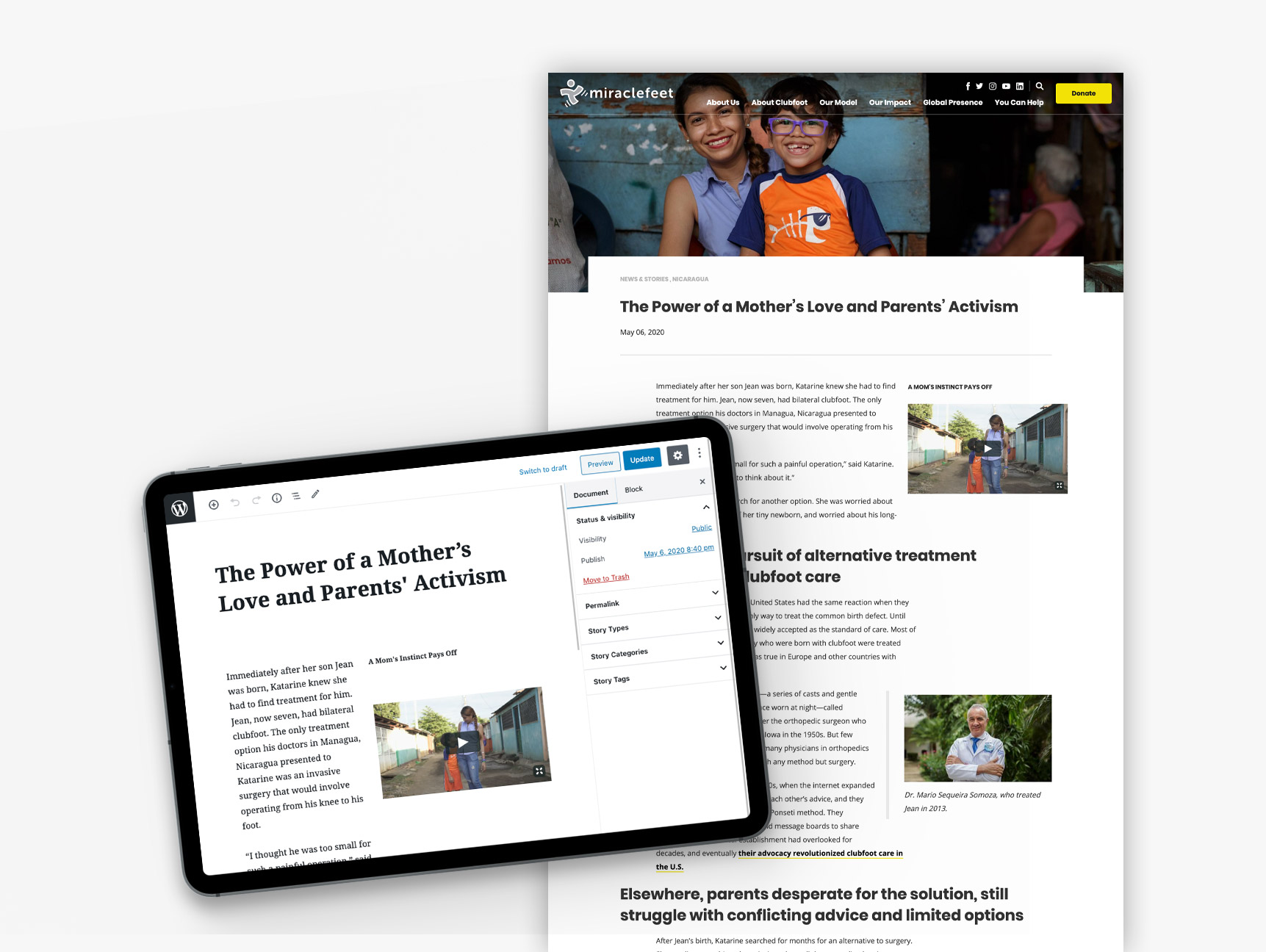
In the CMS, WordPress’ Gutenberg editor allows administrators to build out new pages using a library of content blocks. The blocks bring in standard site elements like text, photos, and headings, along with custom NMC additions like grids and stat bars. They can be used to create flexible layouts on any page, anywhere on the site.
The Gutenberg setup is ideal for MiracleFeet because it gives administrators a significant amount of control over the formatting and appearance of their content. As seen below, the streamlined editor view closely reflects what site visitors see when the page is live.
Initial Outcomes
Upon launch, the site won rave reviews from the MiracleFeet team. They immediately fell in love with the modern, polished look, and were pleasantly surprised by the amount of management flexibility allowed by the intuitive WordPress CMS. They’re thrilled with the result, and so are we.
One month post-launch, the site has already proven its worth as a powerful tool for driving organic traffic and attracting online donations. The average session duration is already up 88%, meaning that users are spending more time browsing through the site’s informative content. In addition, the number of pages per session has increased by 34%. Taken together, these statistics are an encouraging sign that site visitors are engaged by MiracleFeet’s new website.
Looking ahead, MiracleFeet has already planned additional work with our team to build on the site’s initial success. We're proud to have partnered with an organization so committed to making change in this world, and we look forward to continuing the partnership for years to come.
Leave the first comment