Simple Single-Level Mobile Nav
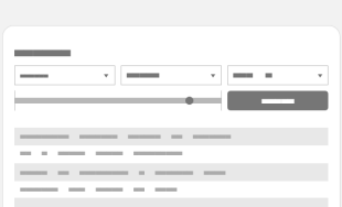
 There are dozens of ways to handle responsive navigation, some more complicated than others. I usually try to stick with simplicity if possible, both in how it's built and how it's used. One of the more simple setups I like to use involves a single menu button that triggers the single-level navigation menu to slide into view from offscreen, either from the right or left. I used this approach recently for electmabra.com.
The markup is a simple unordered list with an ID attribute that we can use as a selector for the needed jQuery. This covers all of the structure we need to build our navigation except for the button that triggers the animation, which will be taken care of with CSS.
The Markup
<nav id="primary-nav">
	<ul>
		<li><a href="#">Nav Item</a></li>
		<li><a href="#">Nav Item</a></li>
		<li><a href="#">Nav Item</a></li>
		…etc
	</ul>
</nav>
The only Javascript needed is for the purpose of toggling a class on the nav element so we can use CSS to style the opened and closed states. Notice that the click event is fired when you click on any part of the #primary-nav element. I did this rather than targeting the pseudo element button (see CSS below) because of the issues with using a "CSS generated" element to fire an event.
The jQuery
$('#primary-nav').addClass('closed').on('click', function(){
	$(this).toggleClass('open closed')
});
Even though jQuery makes this a little easier, it's not required. You could also accomplish this using Javascript:
    function changeClass() {
		if ( document.getElementById('primary-nav').className.match(/(?:^|\s)closed(?!\S)/) ){
			document.getElementById('primary-nav').className = 'open';
		} else {
			document.getElementById('primary-nav').className = 'closed';
		}
    }

    window.onload = function() {
    	document.getElementById('primary-nav').className = 'closed';
        document.getElementById('primary-nav').addEventListener( 'click' , changeClass );
    }
The last piece of the puzzle is the CSS. Since this post is about the mobile version of the responsive navigation I will leave out all of the styles for the desktop version, which can be whatever you need it to be. The requirements for the mobile version are:
- A toggle button is needed
- The menu starts offscreen
- The menu slides into view when the button is clicked.
Explanations for the CSS are in comments below.
The CSS
/*
Fix the navigation to the top so the user never has to
scroll to get to it. Set z-index to keep the nav on top.
100 may not be necessary, but it depends on the other
elements on the page. The fixed positioning has potential
to cause issues if the navigation gets too long.
=========================================================*/
#primary-nav {
    position: fixed;
    top: 0;
    z-index: 100;
}

/*
The toggle button is created using the before: pseudo element
and is fixed to the top as well.
=========================================================*/
#primary-nav:before {
    position: fixed;
    top: 0;
    right: 20px;
    content: "Menu";
    padding: 10px 15px;
    color: #fff;
    text-align: center;
    background: #2E679A;
}

/*
This is an active state so the button is a different color
when the navigation is visible.
=========================================================*/
#primary-nav.open:before {
    background: #1C405F;
}

/*
The unordered list is the main element of the navigation.
Initially it is positioned absolute far enough offscreen
to not be visible. It should not be positioned too far out
(e.g. 9999em) because the transform that will bring it
back into view will have to happen so quickly to cover that
much distance that the slide-in effect could be lost.
=========================================================*/
#primary-nav ul {
    position: absolute;
    top: 44px; // So it appears below the button
    right: -500px; // Just far enough off so it's not visible to begin with
    z-index: 100;
    padding: 15px;
    width: 200px;
    background: #2E679A;
    border: 1px solid #5F9ACF;
    -webkit-box-shadow: 1px 1px 5px 0 rgba(0, 0, 0, 0.3);
    -moz-box-shadow: 1px 1px 5px 0 rgba(0,0,0,0.3);
    box-shadow: 1px 1px 5px 0 rgba(0, 0, 0, 0.3);
    -webkit-transition: .25s;
    -moz-transition: .25s;
    -o-transition: .25s;
    transition: .25s;
}

/*
The open state of the unordered list simply applies a
translate3d to move it back to it's "right: 0" position.
Notice above that the transitions did not specify what CSS
style attribute would be transitioned, so it defaults to
'all'. The purpose of that is to account for the browser
that does not support translate3d. Using translate3d
results in smoother animations on mobile devices compared
to transitioning the "right" style attribute.
=========================================================*/
#primary-nav.open ul {
    -webkit-transform: translate3d(-500px,0,0);
    -moz-transform: translate3d(-500px,0,0);
    -ms-transform: translate3d(-500px,0,0);
    -o-transform: translate3d(-500px,0,0);
    transform: translate3d(-500px,0,0);
}

/*
Since IE less than IE10 does not support translate3d, we'll
simply transition the "right" attribute instead
=========================================================*/
.lt-ie10 #primary-nav.open ul {
    right: 0;
}

/*
This sets the nav items in a single column format,
primarily an overwrite of the default styles
=========================================================*/
#primary-nav li {
    margin-bottom: 16px;
    display: block;
}
The downsides
- It does not provide animation for browsers that do not support CSS transitions. Is that a problem? Well, that's up to you and your client. For those browsers the navigation snaps into place rather than slides. I don't see this as being a usability issue to the user of the older browser, and may even add to his or her motivation to upgrade.
- It really only works for fairly short, single-level navigation. If there are too many nav items, or it goes into a second level, it becomes difficult to work with on the smaller screens. This approach works best when the entire navigation can fit on the screen at one time.
The upsides
- It's simple to implement.
- It's simple and intuitive to use.


Leave the first comment