During our 13+ years in the business, we’ve been fortunate enough to take on scores of economic development website design projects across the country. The ED vertical is a diverse one – every place has a unique story to tell – but we’ve picked up on a handful of common features that have brought our ED clients the most success.
In this post, we’ll walk through six popular features of an economic development website design and what makes each one a great choice for a growing town, city, or region. Jump ahead with the shortcuts below, or read the whole post for a comprehensive look at our thoughts on ED best practices.
- Dynamic Design
- Rich Content Narrative
- Employment Resources
- Business Relocation
- Interactive Maps
- Engaging Data
Grab Attention with a Dynamic Design
One of the single most important factors is your site’s appearance. Whether you’re trying to attract tourists or permanent residents, it’s absolutely essential to use your site’s design to communicate who you are as a community. Use color, fonts, graphics, and images to bring life to your site and illustrate what makes your area special. A site with personality is much more compelling than a template that could be used anywhere.
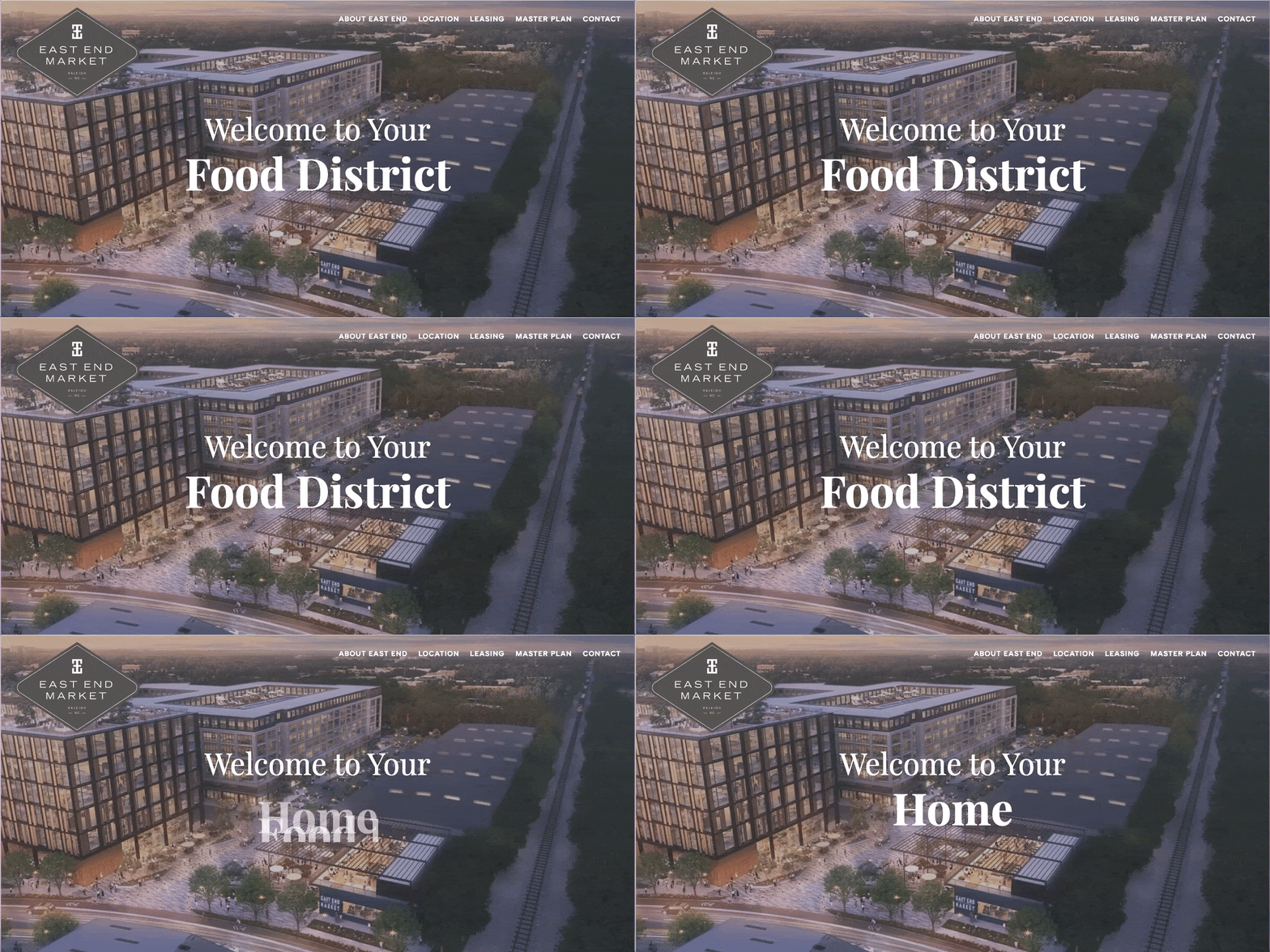
For East End Market, an economic development site we created for a forthcoming development destination, this means using animation and bold typefaces to convey the neighborhood’s hip energy, forward momentum, and excitement-driven lifestyle.
Research Triangle Regional Partnership cultivates a similarly distinctive sense of place by using ambient video. The video relates directly to what the region has to offer – striking natural surroundings, buzzing restaurants, a passionate college sports scene, and an abundance of local character. The ambient video makes the site’s design ultra-effective because it immediately exposes site visitors to experiences that are typical of life in the region.
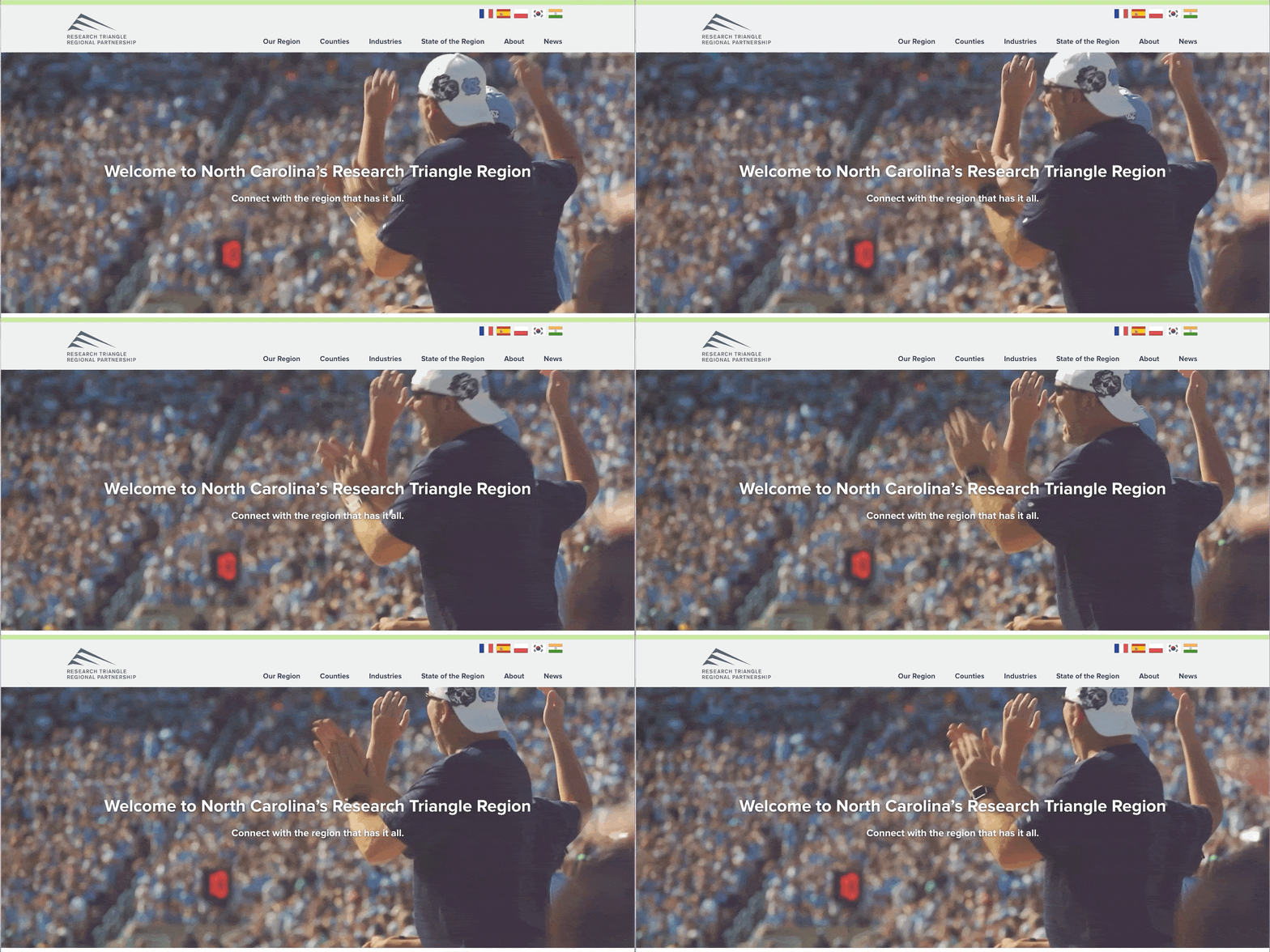
Depending on your site’s goals, ambient video can be used in a lot of different ways. For more examples, take a look at our blog post, Examples of Ambient Video on Websites.
Develop a Narrative with Lifestyle Content
In addition to telling your region’s story through your site’s design, it’s also valuable to spell things out for your visitors through informative content. Show off a little! Do you have a thriving arts scene? A top-tier university? A champion sports team? The most successful economic development websites include a significant amount of information about what it’s really like to live and work in the region. Some of our clients have done this by including video interviews with locals, information about the climate, and overviews of various cities and neighborhoods.
Convincing people and businesses to visit your area is largely about pulling together the resources that they’ll need to make an informed decision themselves. You can make this easy by compiling lifestyle information in a section like “Community” or “About the Area.”
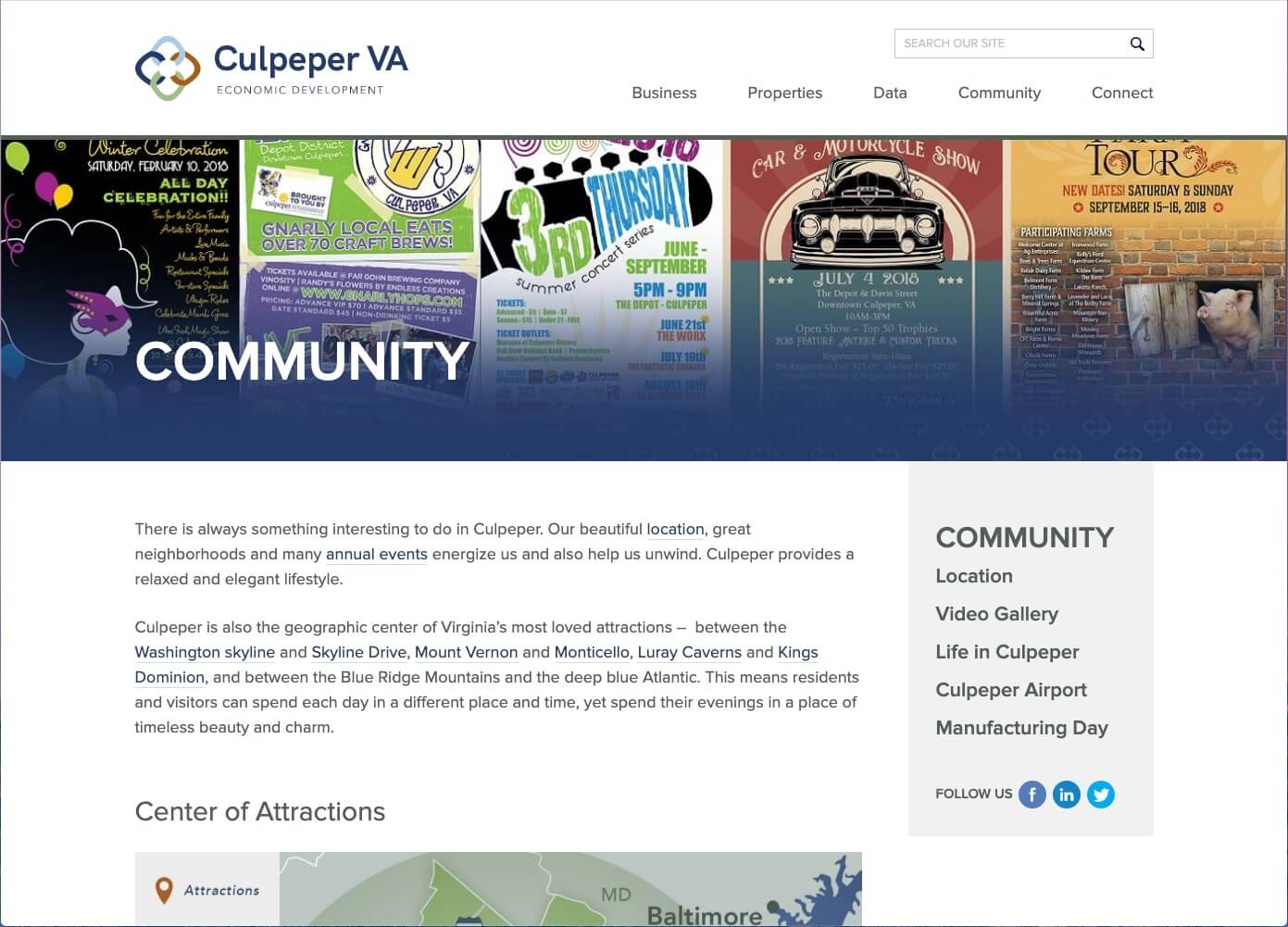
We did this on the economic development website we created for Culpeper County, VA. By accessing Culpeper’s Community page, site visitors can read about local attractions, the Culpeper airport, housing costs, and more.
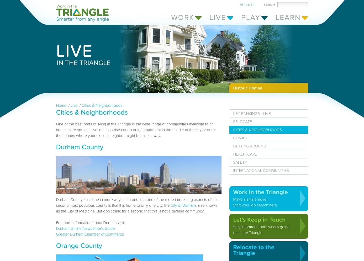
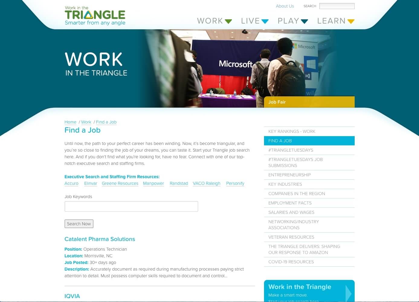
The same can be said for Work in the Triangle, an ED site that promotes relocation to North Carolina’s Research Triangle region. The site helpfully divides lifestyle content into the prominent sections at the top of the screen: Work, Live, Play, Learn. Here, site visitors can explore all sorts of content about recreation, education, and day-to-day life in the area.
Highlight Helpful Employment Resources
So you’ve convinced your site visitors that your area is a great place to live and explore. In tandem, you’ll need to offer resources that explain why it’s a worthwhile place to work. This can include pages on key industries, featured companies, and exciting developments in your region’s business world.
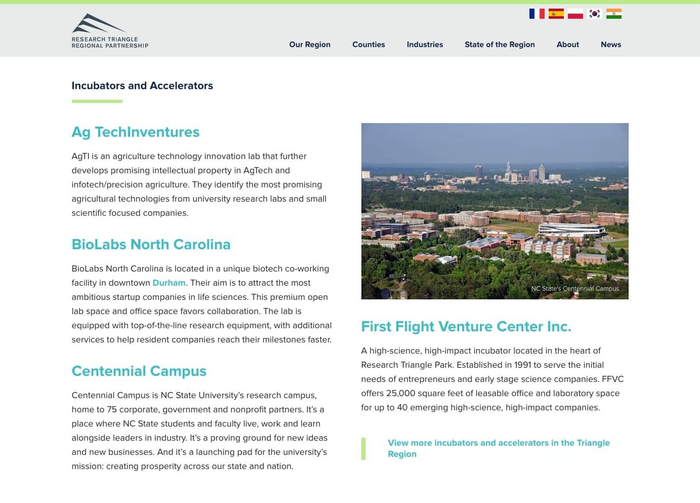
We love how Research Triangle Regional Partnership pairs their top industries with statistics, leading companies, and recent news articles. Bundling all of the information into one place anticipates visitors’ needs and streamlines their research process.
Some economic development websites take things a step further by including job listings and an integrated search feature. On Work in the Triangle, site visitors can search for available jobs that link out to live postings on Indeed. Visitors can also explore Networking/Industry Associations, and Key Rankings.
Attract Business Relocation with Convenient Tools
In addition to encouraging individuals to work in your area, great economic development websites also offer resources that help businesses to evaluate relocation. Business relocation not only creates new jobs for your residents, but also increases the tax base and strengthens the local economy.
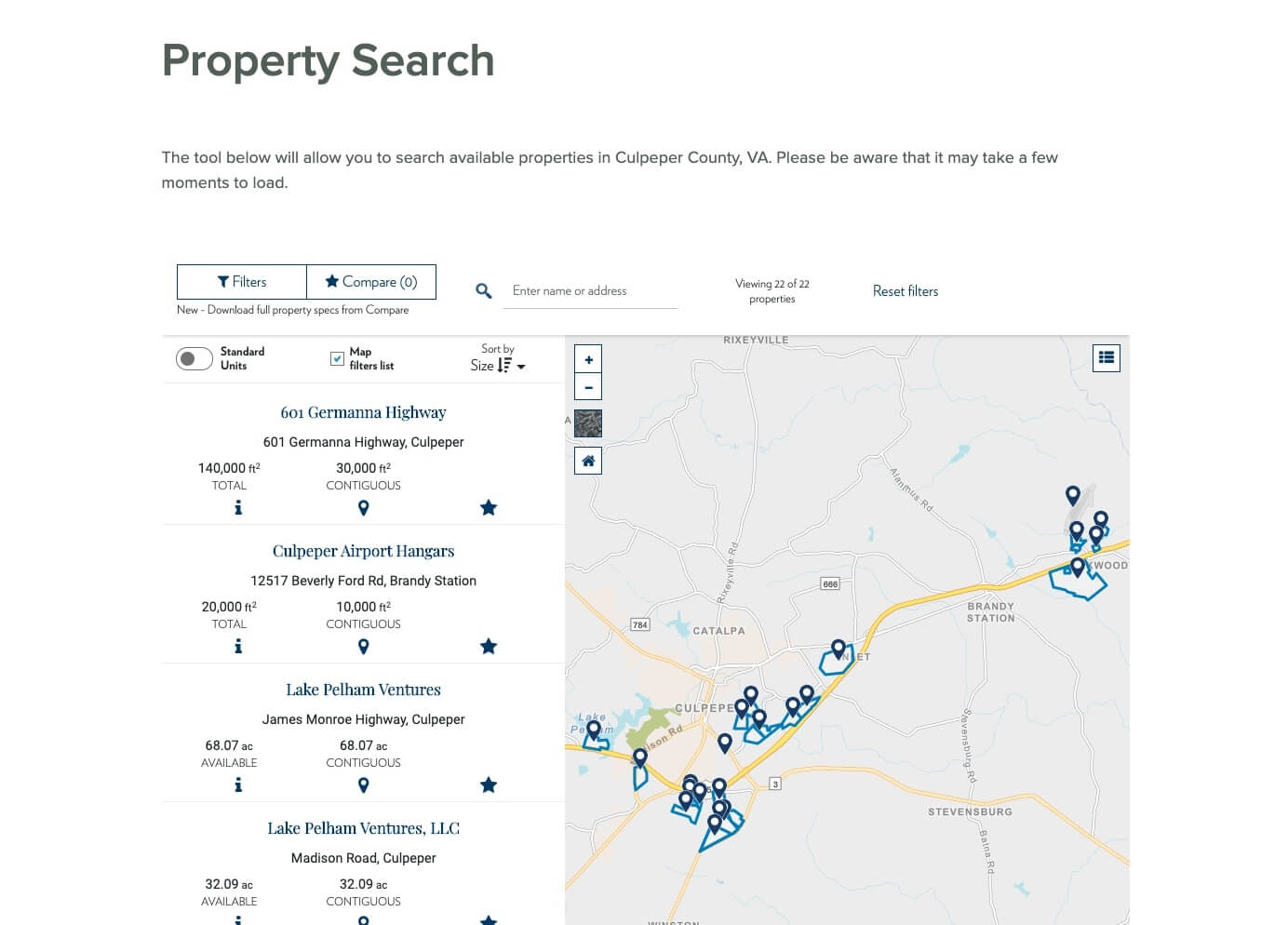
Culpeper County does a great job of appealing to businesses by incorporating an interactive Property Search tool. The tool allows visitors to filter and compare all of the available properties in the area.
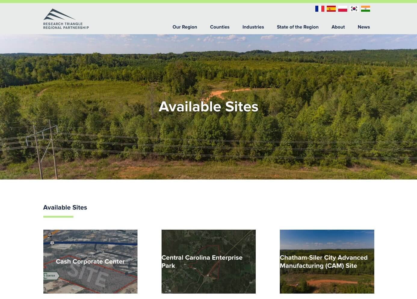
Similarly, Research Triangle Regional Partnership showcases available sites and related specs, documents, and location information.
Use Interactive Maps to Grab Attention
Encouraging engagement is an important part of any website, and we’ve found that interactive maps do a great job of grabbing and holding visitors’ attention. They’re dynamic, approachable, and genuinely fun for visitors to explore.
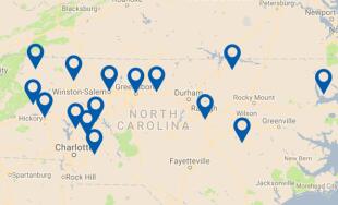
For economic development website designs, interactive maps can be used to show counties, states, and towns alongside relevant statistics, facts, or points of interest. Research Triangle Regional Partnership takes this approach on their Counties page by highlighting each member-county on the map and linking to detailed interior profile pages.
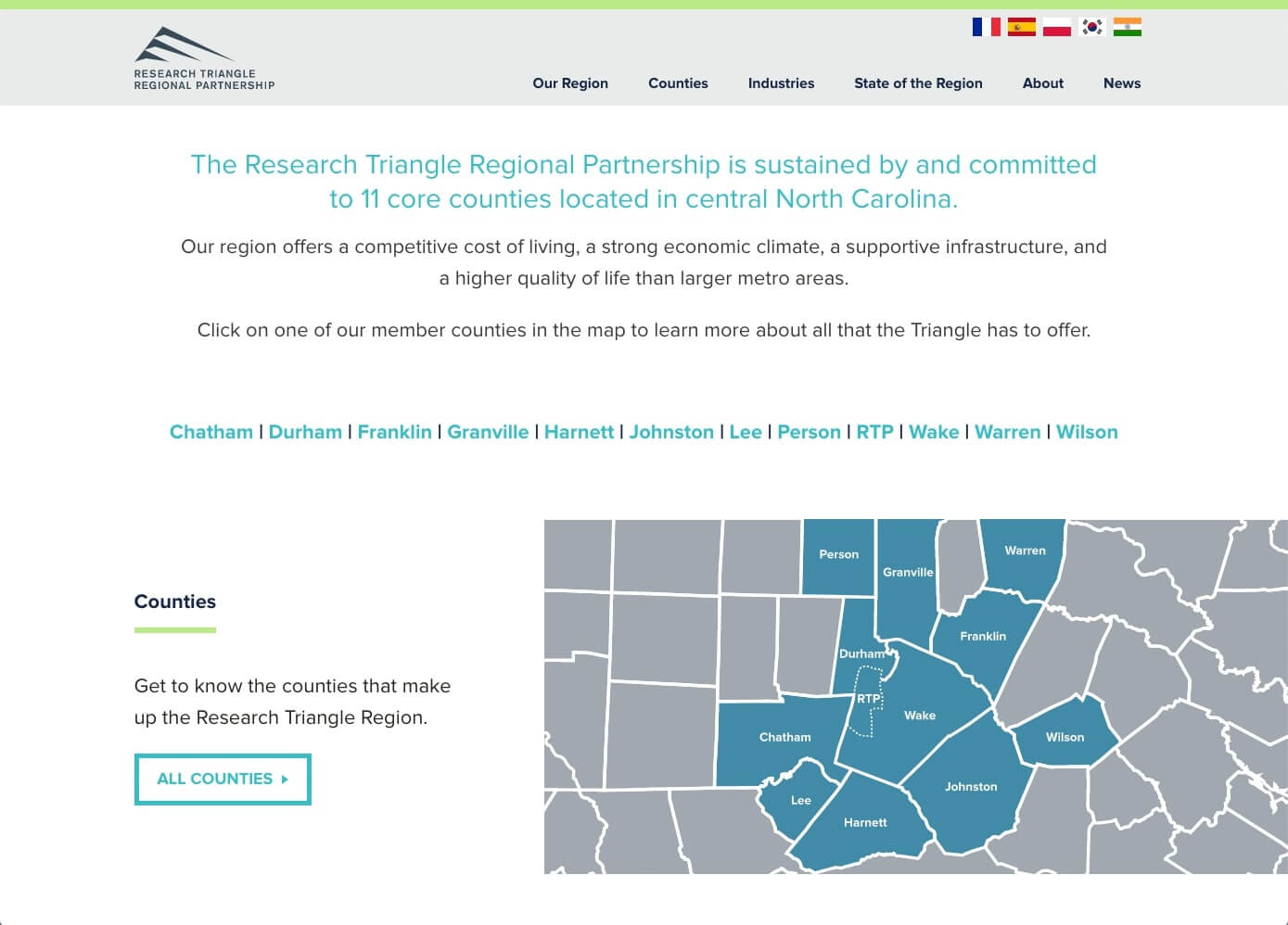
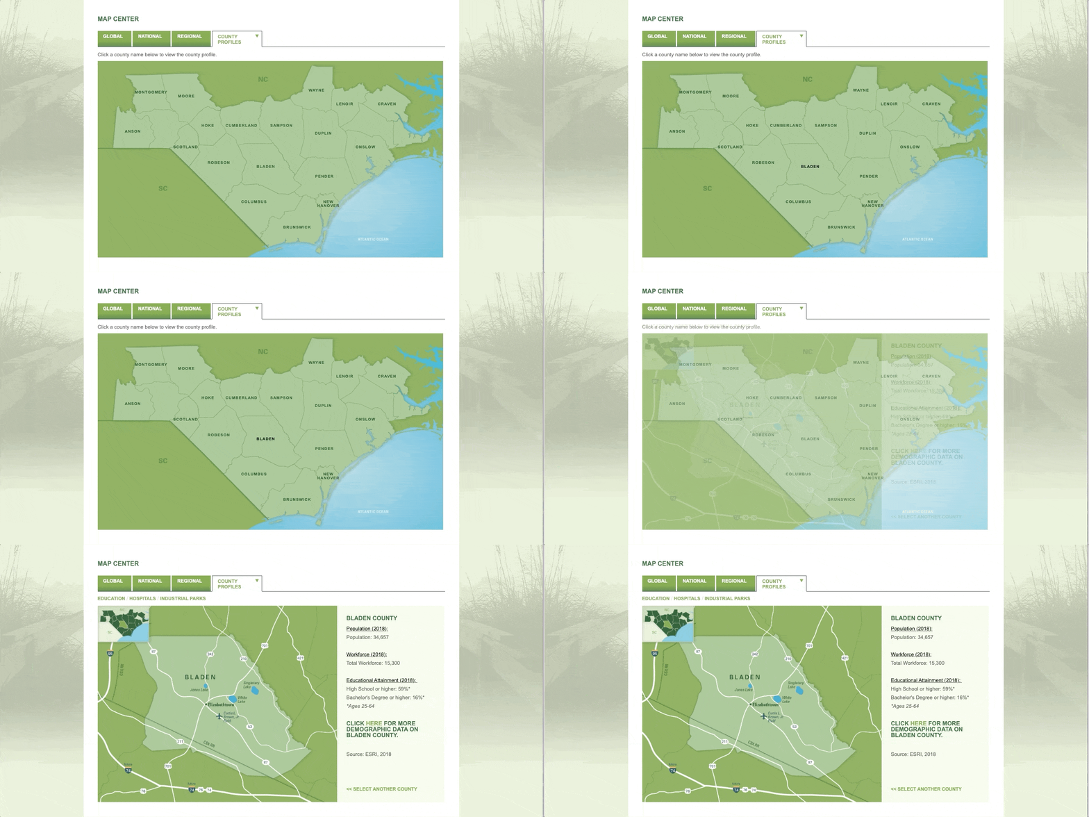
Similarly, our ED site for North Carolina’s Southeast utilizes an interactive map to pair each county with fast facts about population, workforce, and educational attainment. We really like how both maps make it easy for visitors to visualize each region.
Check out more examples of interactive maps in our blog post, Examples of Interactive Maps on Websites.
Present Engaging Data Visually
Most economic development websites need or want to display data about their region. Lists and tables might seem like a natural way to approach this, but the reality is that site visitors are likely to overlook key numbers when they’re surrounded by other text.
You can make your data jump off the page by presenting it visually, either through a stat bar, graph, infographic, or a bold featured block. This sets your data apart from other content and ensures that site visitors won’t miss it.
Culpeper County offers a great example of data that stops visitors in their tracks. On the homepage, the site prominently features a “Local Data” section that highlights three important statistics. The design’s use of icons and colors adds visual interest to the numbers, and visitors are encouraged to follow a link to a more detailed page on the county’s Demographics. Here, site visitors encounter more examples of visual data and a cool chart about local industries.
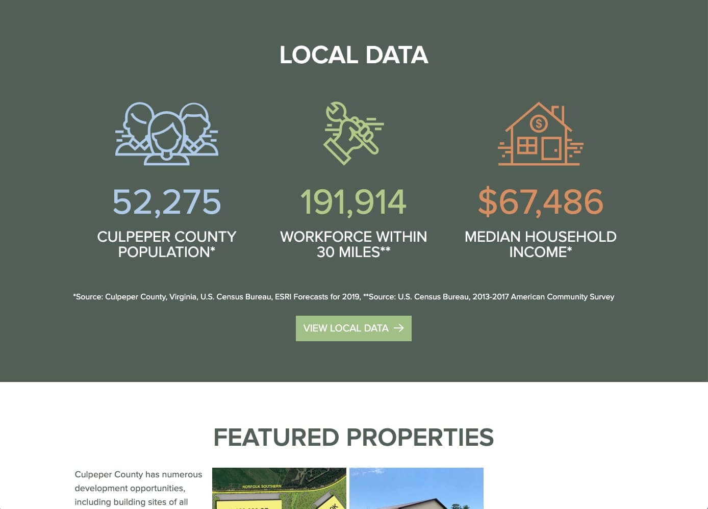
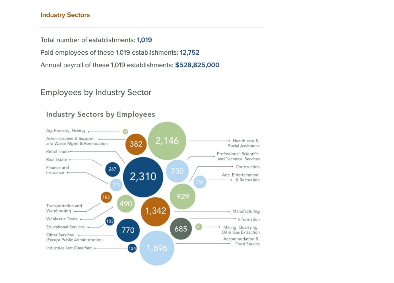
Breaking data into visual, bite-sized pieces quickly engages visitors and increases the impact of your selected stats.
Conclusion
By thoughtfully considering your site’s design, content, resources, and tools, you’ll be well on your way towards an economic development website that excites visitors and effectively conveys the opportunities of your region.
Ready to take the next step and realize the ED site of your dreams? Reach out to us and we can work together to create something awesome! In the meantime, feel free to leave any questions in the comments section below.



Comments
Ella
In the Philippines, the adoption of ambient design principles is on the rise, with businesses recognizing the value of creating immersive user experiences to enhance their online presence.Leave a comment