We had the opportunity to work with Aramark and Elon’s Dining team to reimagine a modern University’s dining locations web site. We built a custom Ruby on Rails web application to better address the needs of Elon’s students, faculty, and staff.
New Features
Mobile Friendly
Elon’ previous dining site was built for laptops, not phones. It was difficult to navigate, slow to load pages, and was not built responsively so that it scaled down for mobile-phone usage. Today’s students live in a mobile-centric world. A smartphone or tablet is always within reach. Our top priority was making sure this web application was tailored for students on the go.
The key to designing a great user experience is empathizing with the user. Who are they? Where are they? What are their expectations? What are they trying to accomplish?
The project team got lucky on this one: we all distinctly remembered the pain of getting out of class, walking to a dining hall, and finding it closed. Or worse, paying for a meal only to realize there were no options available for specific dietary limitations. The site’s driving purpose became to quickly answer these two questions for Elon’s students, staff, and faculty:
What is open right now / later today?
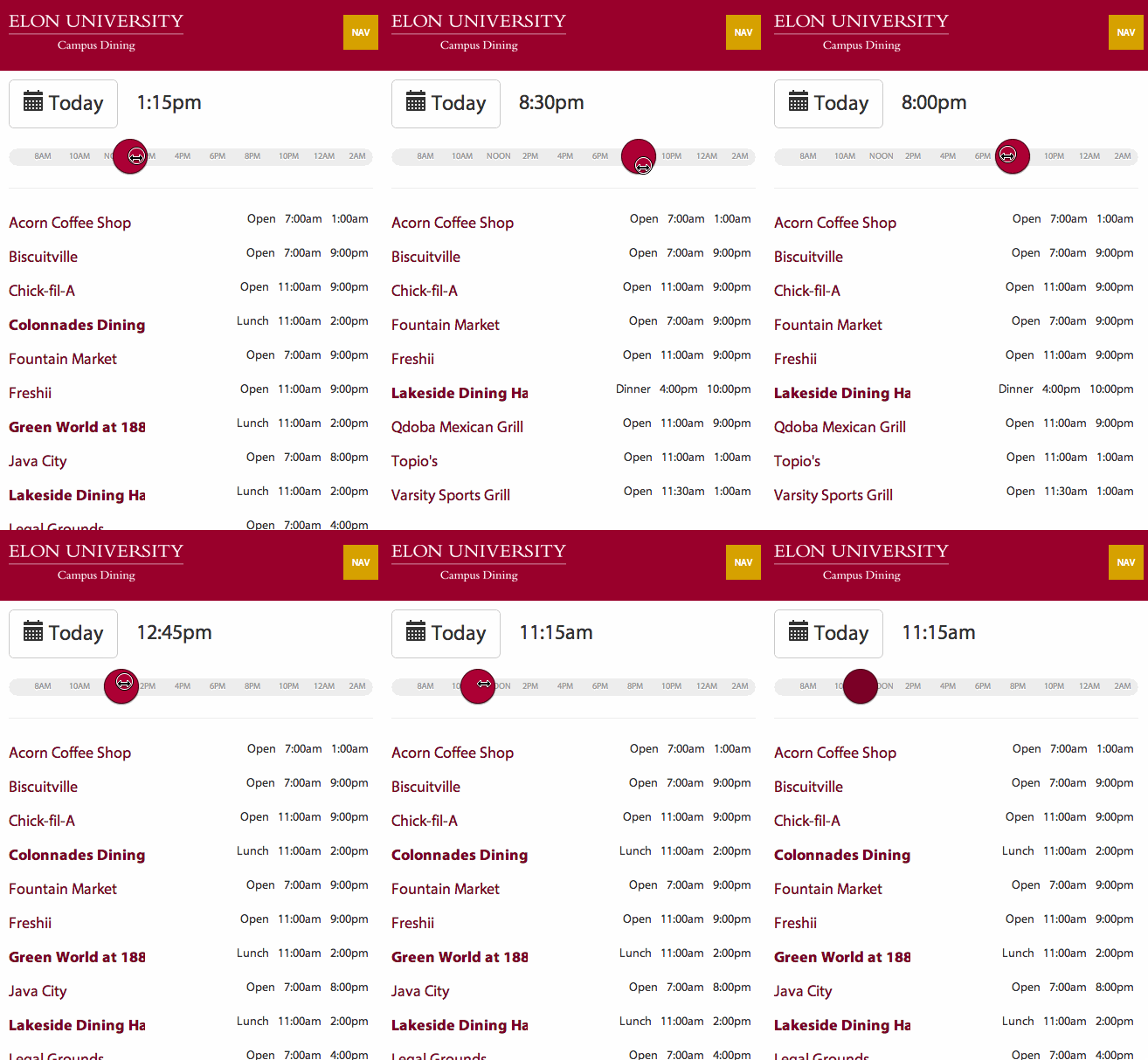
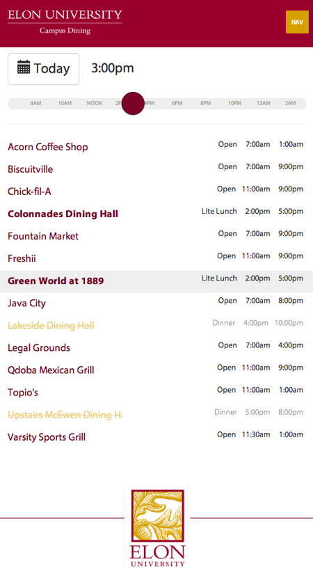
As soon as the locations page loads, the number one question, “what is open right now?”, is answered immediately. Any dining option that is closed fades into a lower contrast color. The number two question, “what is open later today?”, is answered with a quick drag of the thumb or mouse. A slider allows the user to control the time of day, and the information updates in real-time as you slide it around.

What can I eat with my dietary restrictions?
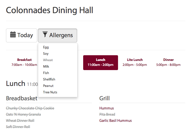
When viewing a menu, the user can indicate any allergies they have, and items containing those allergens are crossed off when viewing the menu. These selections are automatically saved to the user’s phone, so when opening the site tomorrow or browsing other dates and locations, all of your allergen filters are applied without any additional effort.

Quick and Simple
Quick to load.
One major problem with the previous site was that students could wait for over 5 seconds for pages to load. Studies have shown that load time is an extremely important quality in keeping visitors happy. Our goal was for pages to load in under a quarter of a second. We achieved this through a combination of server-side caching using Rails’s nested dolls technique with memcached and best practice client-side techniques.
Quick to understand.
A table of 14+ locations with 20 or so hour ranges takes time to scan and is hard to recall. We put a lot of effort into only showing relevant information for a specific time of day. When the page loads, the current time of day is selected. Locations that are closed now, but will open later in the day, are grayed out and show the user when they’ll open. Locations that are closed for the day are hidden altogether. Residential dining halls are bold and indicate which meal they’re currently serving. As time passes, the table updates in real-time.

Quick to navigate.
Changing the time of day or date, jumping to a location’s details, and filtering allergens are all quick interactions away. For the most common interaction, changing the time of day, the page loads with all the data it needs to display any time of day; as a result, a change in dining options that results from a time change is reflected instantly. When a user clicks on a menu item, nutritional information pops up in a modal that returns you to your original screen once it is closed.


Leave the first comment