The majority of nonprofits have similar needs on the web. In almost all cases, a nonprofit's website design should make it easy for visitors to learn more about the cause, quickly donate and become more involved. According the NonProfit Quarterly, nonprofits overwhelmingly (88%) said their most important communication tools were email and their websites in 2014.
As more and more Internet traffic is coming from mobile devices, mobile giving and one-step conversions have become increasingly important for nonprofit websites. And because the site is often a potential donor or future volunteer's first interaction with the organization, engaging with visitors early and often to tell the organization's story is also key.
A modern, attractive, compelling web design will boost visitor engagement regardless of the industry, but this is particularly true for nonprofits. While budget limitations may prohibit every organization from refreshing its website every two years, there are a number of nonprofit website design trends that will help the organization be successful online for years to come. If you're considering a website redesign for your organization in 2015, here are some design trends that will lead to increased donations, better involvement from supporters and increased visibility and awareness for the cause.
Lower Barriers for Donation
1. Quick donate from the action area
Although many families still plan and budget for annual giving to their favorite causes, it's becoming more common for people to give one-off smaller contributions to organizations. Nonprofit websites that give users the ability to quickly select an amount and hop straight to a credit card processing page directly from the homepage lowers the barrier to donating significantly. It also reinforces to people that small gifts make a big difference.
2. Mobile-friendly donation
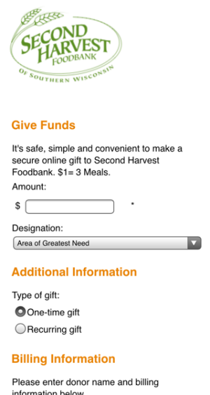 Mobile traffic now makes up 30-50% of all internet traffic. Responsive design has become a staple for effective websites, and the majority of new websites being built in 2015 (should) be responsive or mobile-friendly. Nonprofits often partner with a 3rd-party vendor to accept online donations, but the resulting Donate page doesn't always work as well on mobile as the main website. This can be jarring for users who are expecting a seamless transition, only to arrive at a Donate page that doesn't quite work on mobile, or is long and cumbersome to use.
The Second Harvest Food Bank of Southern Wisconsin utilizes a donation template in Blackbaud that targets different devices. Desktop users see a version of the form with more robust giving options (like allowing users to select how many meals they want to donate) while mobile users see a stripped-down version of the same form. The mobile version not only looks great but works great in that it drives potential donators quickly through the donation process by removing nonessential options.
3. Emphasize 'donate' using a different color
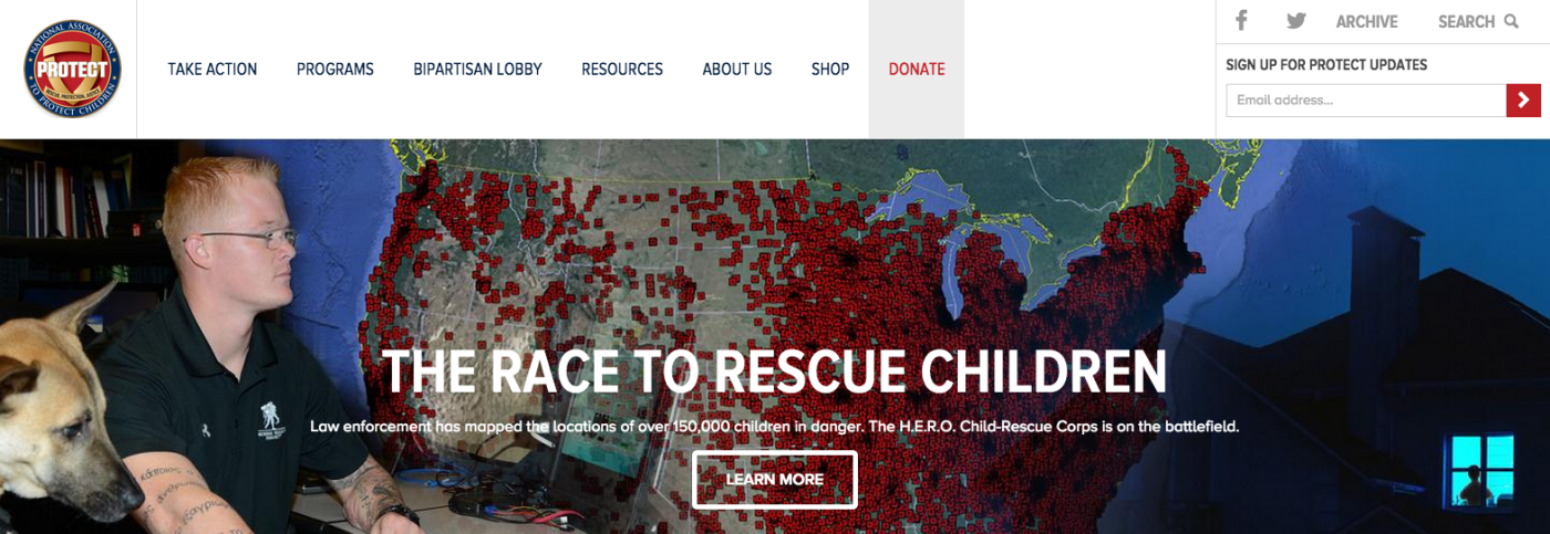
For the vast majority of nonprofit organizations, the pinnacle of online engagement is a donation. Users should know immediately how to access the Donate portion of any nonprofit's website. There's no better way to draw attention to the website's Donate button than making it stand out from other buttons or navigation items. This can be easily accomplished by using an accent color for the button.
Drive Users to Desired Actions
4. Include an email signup in the feature area
If donations are the top desired action on a nonprofit's website, data capture is usually a close second. Some websites will have email signup fields hidden in the footer, or somewhere else that users have to seek out if they want to be added the organization's mailing list. A great nonprofit website design will encourage users to signup for updates using their email address in the feature area or another prominent location in the design. It's also helpful to limit the number of required fields (First Name/Last Name or Phone Number) required for sign-ups, which will decrease the abandonment rate and lead to more emails captured.

5. Highlight key actions
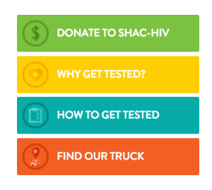 Have you ever visited a website and thought, "I wonder if they take volunteers?" Or, "Where can I buy tickets for their next event?" One of those most important functions of any website is to drive visitors to key actions, which is usually accomplished in the design through an action center. Including an action center on both the homepage and the interior page templates will help direct users to the most important areas on the site, such as applying for a grant or registering for an upcoming event. These very well may not be 'Donate' and 'Volunteer' for every website. For example, UNC SHAC offers mobile HIV/AIDS testing, so website users need to be able to quickly find where the mobile testing truck is parked for the day. Regardless of what they are, key actions should be easily accessible.
6. Encourage people to connect via social media.
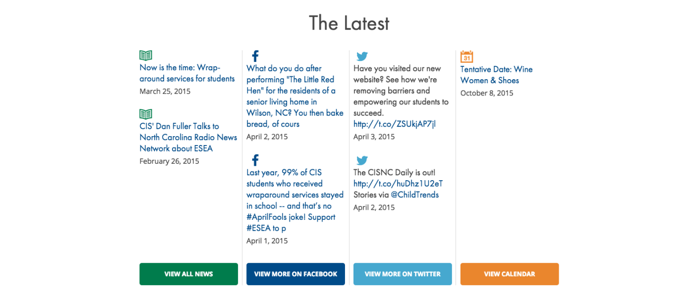
Now that we're in 2015, most nonprofit websites include Facebook or Twitter icons that link users back to the organization's social media properties. While displaying these icons is a solid way to let the community know you have social media properties, great nonprofit websites will pull updates from various social networks directly onto the site and encourage people to connect with them. Not only will the organization's website visitors be more likely to connect via social media, but this also helps the website look fresh and dynamic as new social media updates are posted.
Show the Organization's Story
7. Compelling feature images
Users are much less likely to engage with your organization and offer up support or monetary donations online if they don't immediately connect with the organization. Nonprofit websites need to quickly communicate the organization's story to site visitors. A great way to immediately captivate users is by using big, high-resolution, impactful feature images on the homepage. A picture really is worth a thousand words. Showing the organizations's story and impact rather than telling it can be really powerful. From a visual standpoint, having large images with people's faces will draw the user's eye on to the page, and then (hopefully) the design will lead them to look at the action center or a sign up form.
![]()
8. Highlight stats on the homepage and interiors
One of the best ways a nonprofit website can share the organization's story is through statistics. People want to see real results. How many families have been fed this year through contributions from people just like them? The website can make the organization's impact clear and help paint a more vivid picture for users.

Remember, as users are scrolling through the site, they may not take the time to read a short paragraph or a bulleted list of your recent achievements. Use big, powerful numbers to illustrate the organization's impact.
9. Add in fun, illustrative and interactive elements
Nonprofits are serious organizations advancing critical causes, but their sites should inspire rather than depress. So, we recommend that nonprofits show some personality and flair through fun, illustrative or interactive elements. These help people identify with the organization and makes the organization seem more relatable. Think NC First accomplishes this through a filterable database of shareable stats about how competitive North Carolina is.
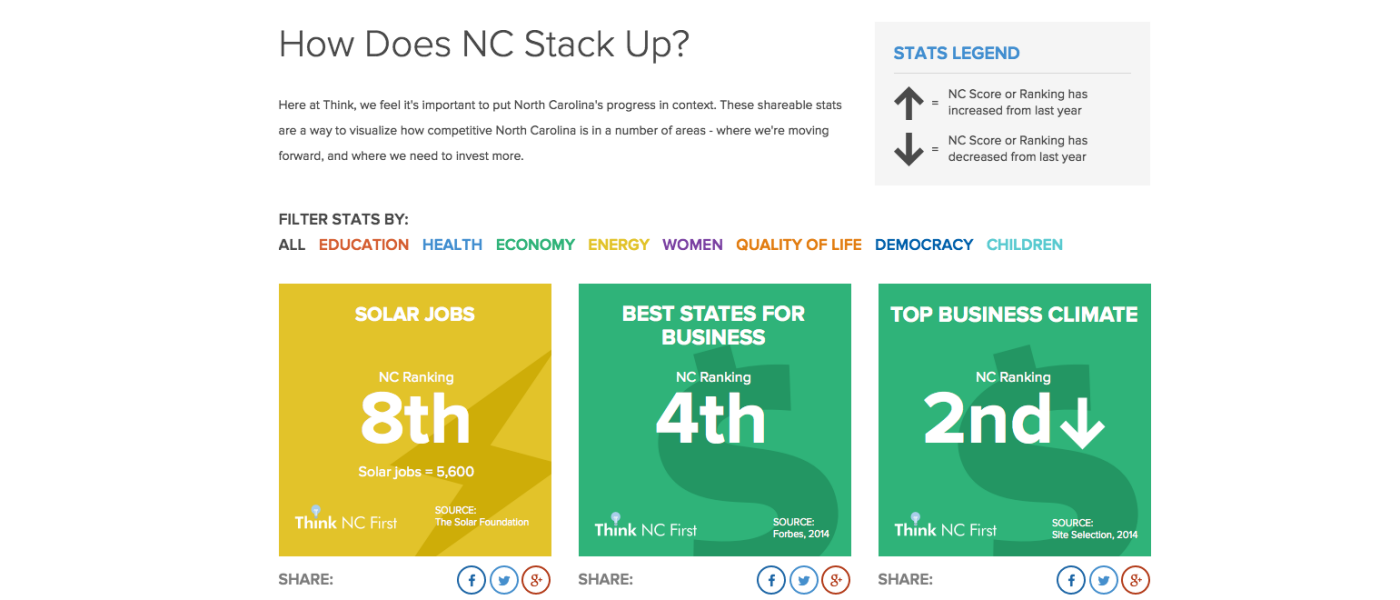
If your organization is considering a website redesign in 2015, be sure to keep these trends in mind to ensure your new site is engaging potential donors and effectively telling your organization's story. Can you think of any other great nonprofit web design trends we'll see this year? Let me know in the comments!



Comments
saampradaya
That is nice article from you , this is informative stuff . Hope more articles from you . I also want to share some information about Best Digital marketing service in indiaskyhit media
That is nice article from you , this is informative stuff . Hope more articles from you . I also want to share some information about Best Digital marketing service in indiasaampradaya
That is nice article from you , this is informative stuff . Hope more articles from you . I also want to share some information about Best Herbal products in Indiaskyhit media
That is nice article from you , this is informative stuff . Hope more articles from you . I also want to share some information about Best Digital marketing service in indiasaampradaya
That is nice article from you , this is informative stuff . Hope more articles from you . I also want to share some information about Best Herbal products in Indiasaampradaya
That is nice article from you , this is informative stuff . Hope more articles from you . I also want to share some information about Best Herbal products in Indiaskyhit media
That is nice article from you , this is informative stuff . Hope more articles from you . I also want to share some information about Best Digital marketing service in indiaRobin Jennings
I really like the Habitat for humanity site- the icons look fantastic and its very easy to navigate and understand what the site is about.Leave a comment