For more than a decade, New Media Campaigns has been working on nonprofit website designs that engage and inform each organization’s stakeholders, moving them up the ladder of engagement from casual visitors to fierce advocates. When creating these sites, it’s essential to express key information quickly and consistently throughout the content. This means describing who you are as an organization, what you do, and why your work matters – a method we call The Three W's of Nonprofit Websites:
Effective use of this concept activates visitors and sets the stage for further engagement. In this post, we’ll discuss the three w’s of nonprofit websites and why they’re critical for success.
Who You Are
Before all else, a nonprofit website must communicate who you are as an organization. This can include information about the people involved in the effort, the founding of the nonprofit, or anything else that tells a story about the group behind the website. Visitors may not be familiar with the organization before their first interaction with the site, so a clear introduction can add legitimacy and quickly build understanding.
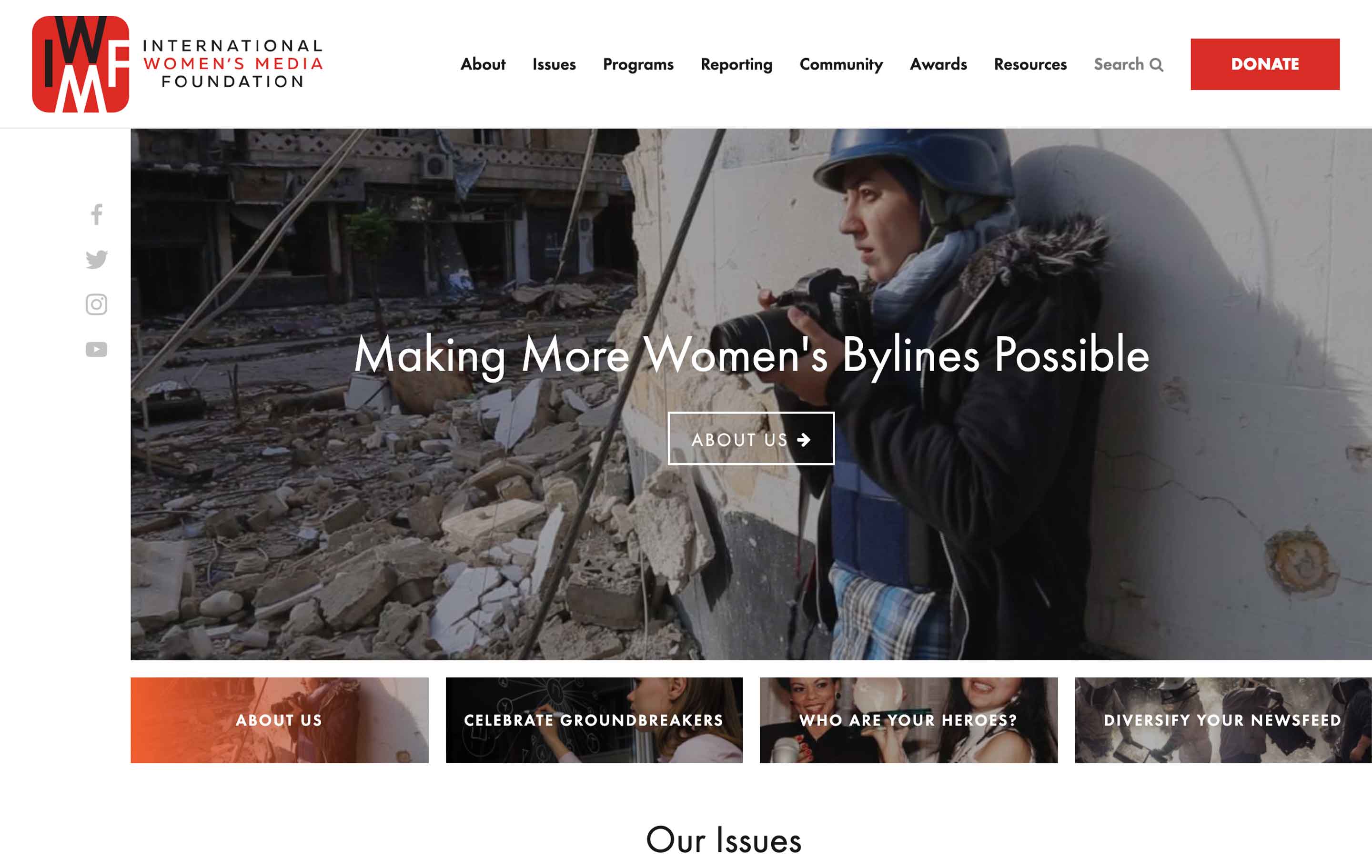
While the “who you are” narrative is often relegated to an About page, it doesn’t have to be. Ideally, this information should be presented on the homepage and carried throughout the site. International Women’s Media Foundation, an NMC client that supports and empowers female journalists around the world, does this well. On their homepage, they include a handful of image slides that cycle through featured topics. One of these slides is an image that links directly to their About page. This makes the information quickly accessible and directs visitors to a place where they can learn more.
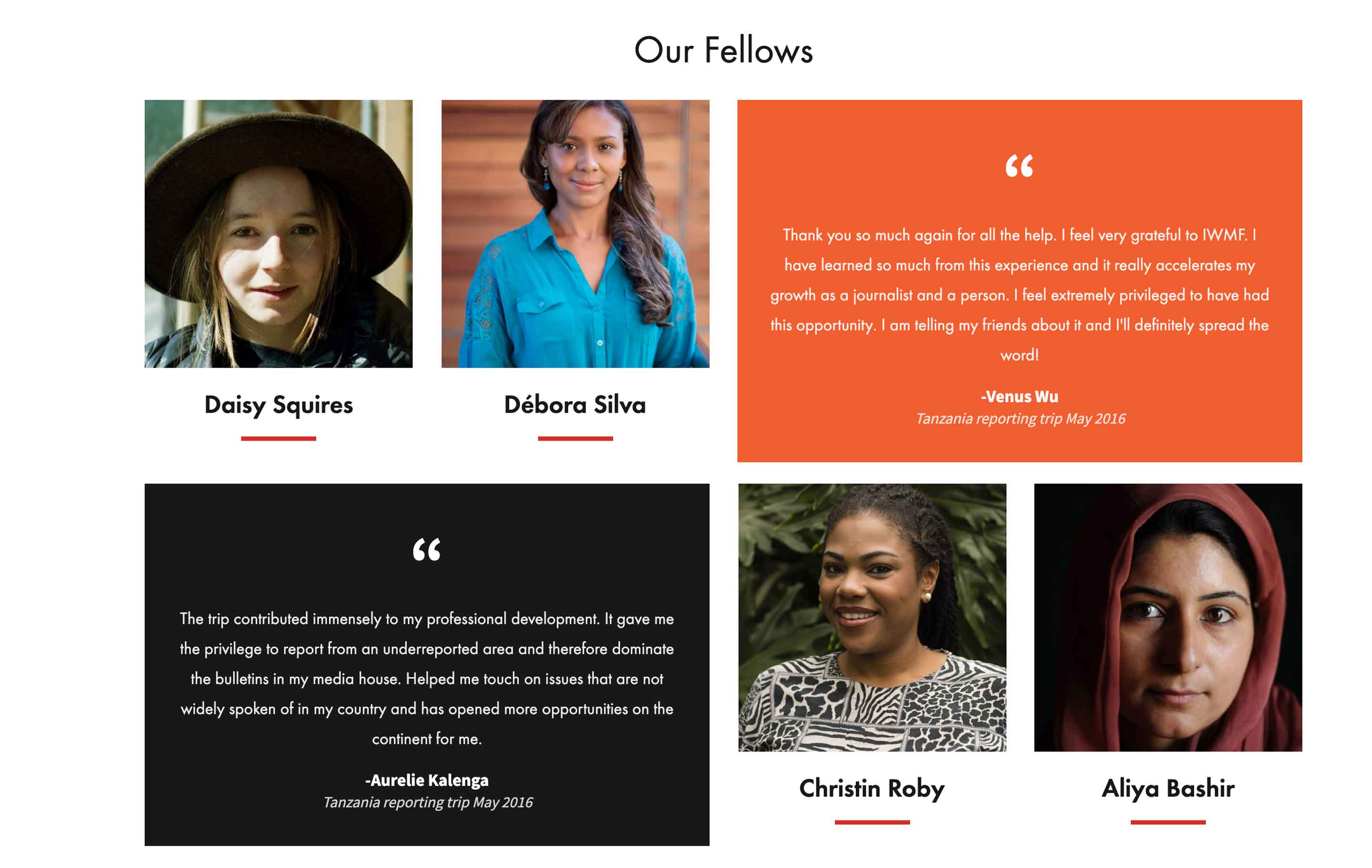
Further down the homepage, IWMF highlights several women who are involved in their programs. This adds a personal element and deepens the organization’s construction of their narrative.
Establishing your organization’s identity – who you are – is an easy first step to creating a website that effectively supports and promotes your nonprofit.
What You Do
After solidifying your organization’s “who,” it’s important to clearly spell out what you do. By emphasizing your mission, goals, and programs, you’ll make it easy for visitors to understand your cause and how you address it. Down the line, this detail will increase the likelihood of gaining support. Visitors have likely sought out your site for a reason – perhaps to learn more about the nonprofit or to explore opportunities for involvement – so your “what” should anticipate their questions and offer a concise explanation of your purpose.
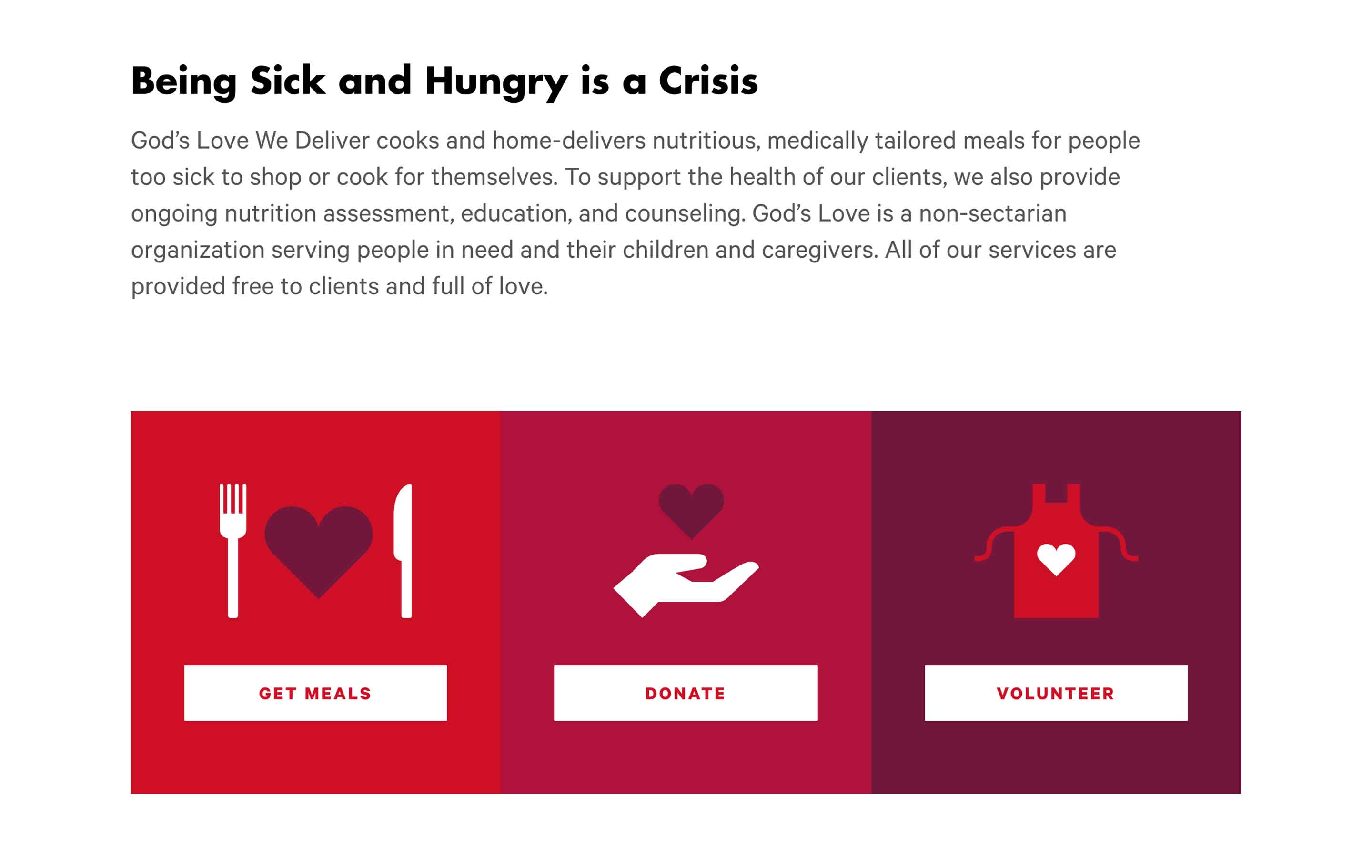
Your “what” can be incorporated into your site in several different ways. One way is through the inclusion of key points on your homepage. Because the homepage is likely the first thing that a visitor will see, you’ll want to take advantage of the opportunity to catch their attention by featuring easily digestible information about your nonprofit. God’s Love We Deliver, an organization that tackles the food insecurity that can come with chronic illness, calls out their purpose with the bold heading “Being Sick and Hungry is a Crisis.” This is coupled with a brief summary of their purpose and the option for visitors to take the next step – getting meals themselves, donating, or volunteering.
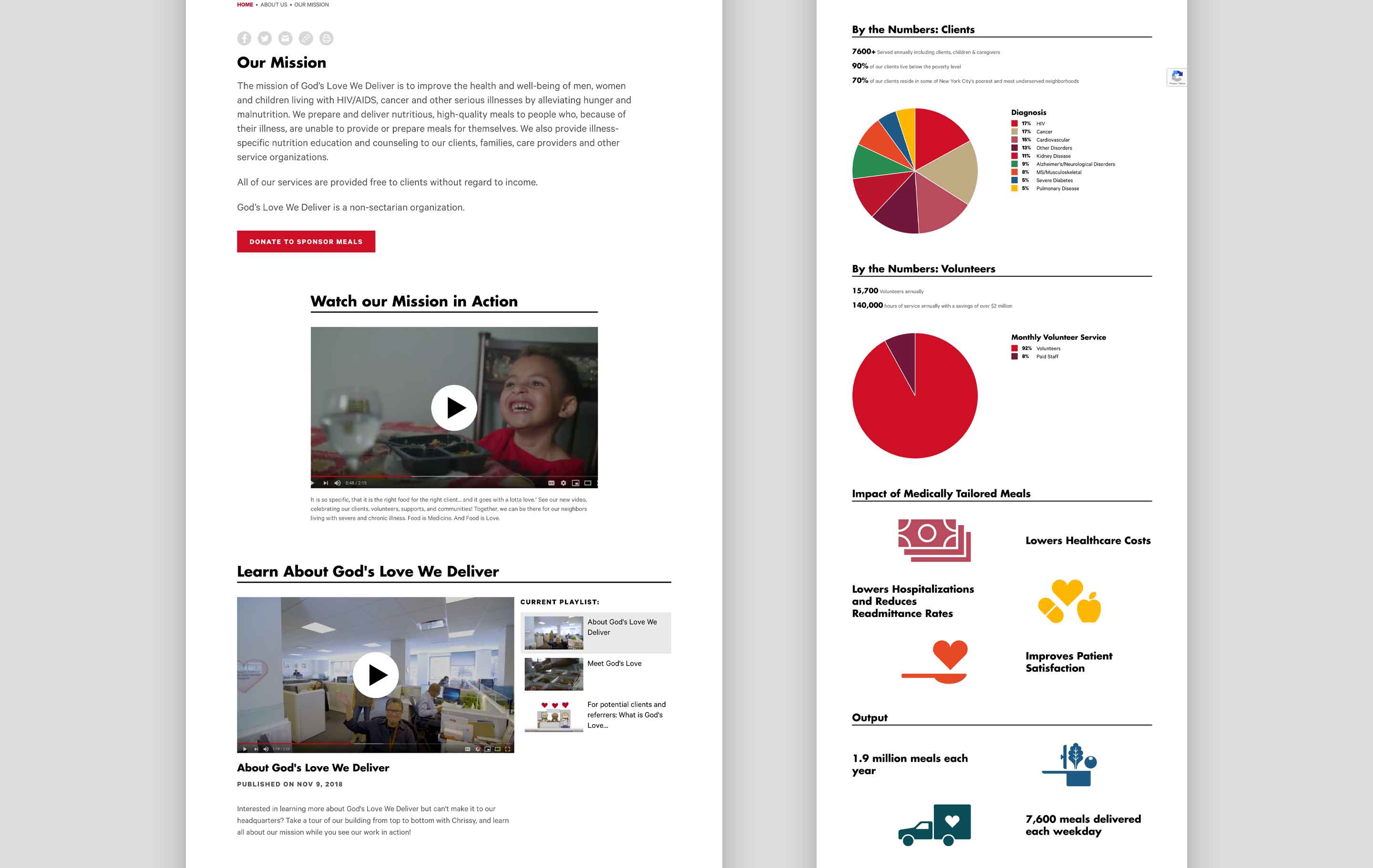
The organization’s “what” is also reinforced throughout the site’s interior pages. For visitors who are interested, the site offers detailed information on GLWD’s mission statement, their impact, and the way that their services are carried out in the community. Because some visitors may be directed to interior pages through a Google search or email blast, the continuity of your “what” allows them to understand your organization from wherever they may start on your website. This is a successful strategy that informs site visitors and develops a cause that they can get behind.
Conveying your nonprofit’s purpose can be done through informative text, images, or even video. But no matter how you get your “what” across, it’s essential to consider its clarity and continuity throughout your site.
Why it Matters
Once you’ve established who you are and what you do, the next step is to convince visitors of why your work is important. Your “why” matters because it explains your nonprofit’s motivation for doing what you do. It shows the impact of your work and illustrates why your cause is worthy of visitors’ time or money.
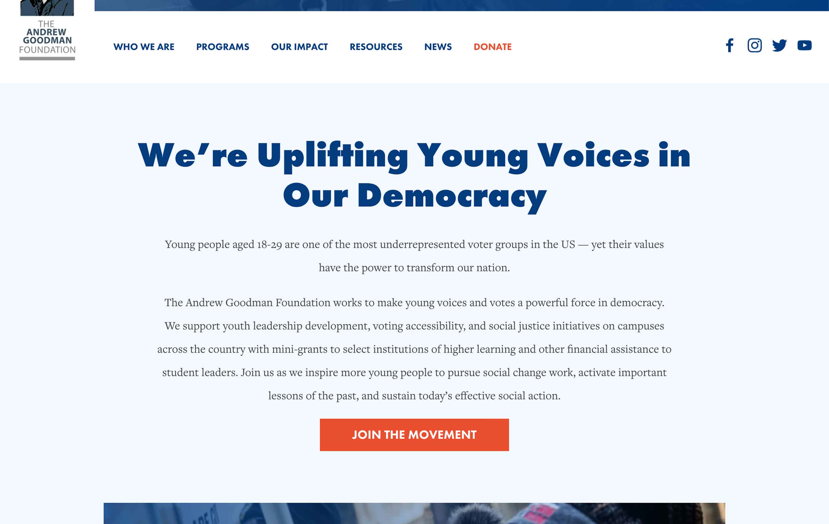
The Andrew Goodman Foundation, a nonprofit that supports young adults engaged in civic activism, introduces their “why” on the site’s homepage. In the brief blurb, the organization uses simple language to convey the ambitious goal that drives their work: transforming the nation. This is followed up with a short summary that details what they do and how. More information about their “why” can be found throughout the site on pages that discuss individual programs, their impact, and the nonprofit’s history.
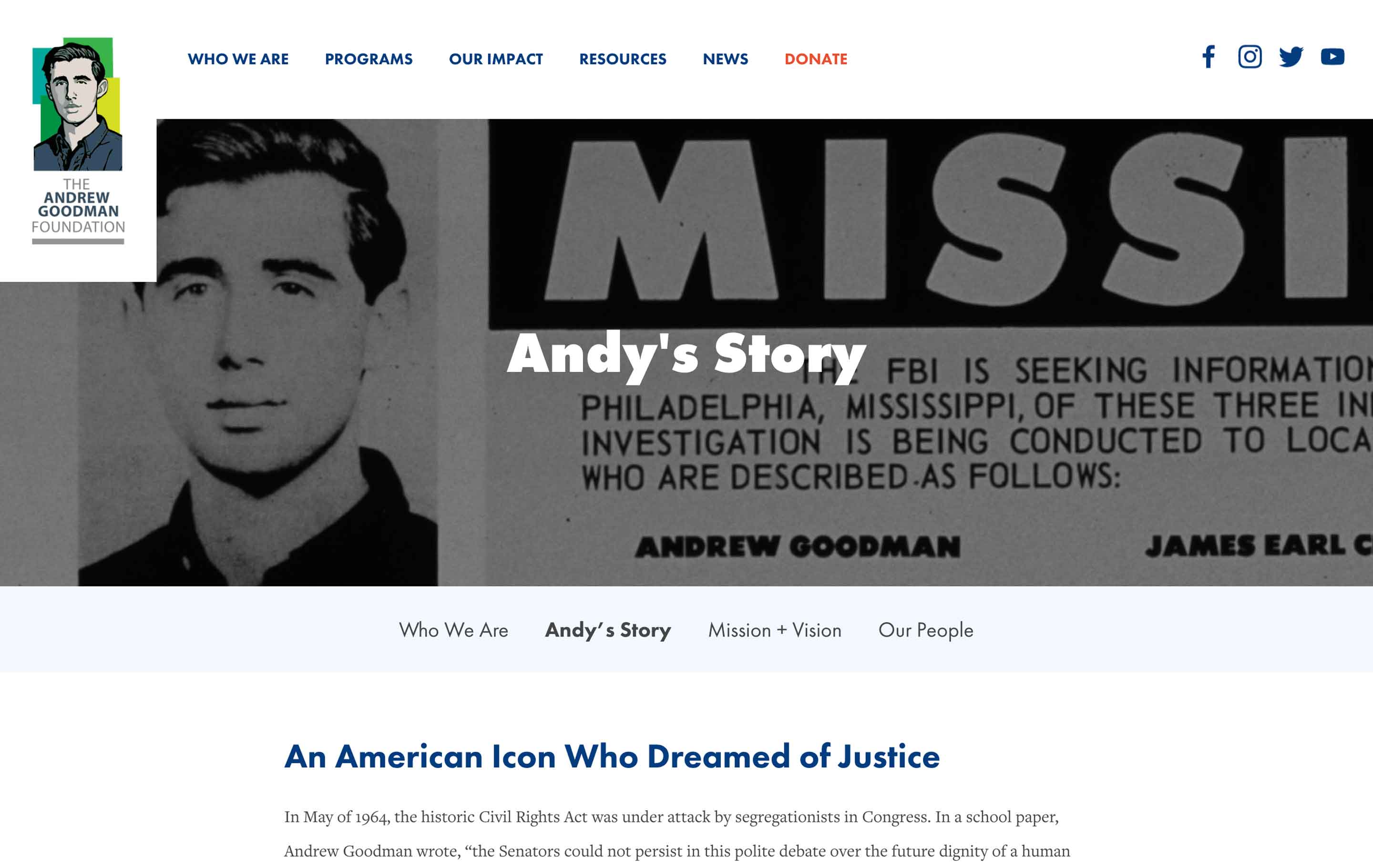
On an interior page, the organization offers a more detailed narrative about Andrew Goodman, the civil rights activist whose work sparked the formation of the nonprofit. This illustrates one way that the “why” can be emphasized throughout a site. By including content about your nonprofit’s founding or history, visitors gain a better understanding of the things that drive your work – your “why.”
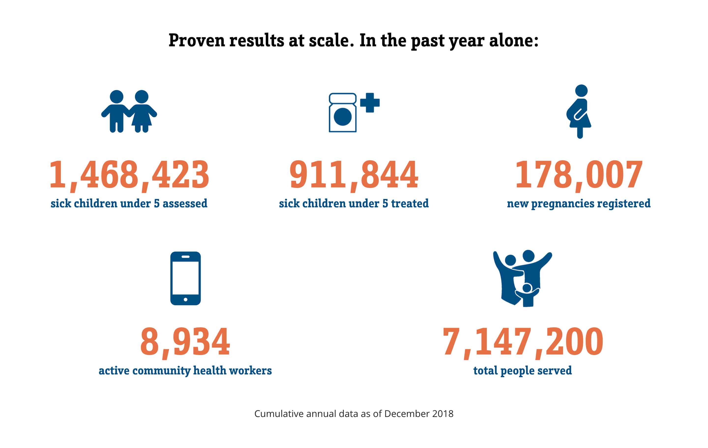
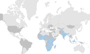
Another way to showcase your “why” is through the inclusion of a stat bar – an often graphic representation of your organization’s key statistics and numerical outcomes. This can be seen on the Living Goods homepage. Living Goods is an organization that supports community health workers in Kenya, Uganda, and Myanmar. In their stat bar, Living Goods lists out things like the number of people they’ve treated and the number of active community health workers who support their mission on the ground. The numbers are something tangible that shows visitors exactly why their work matters – that their mission is proven and ongoing. A stat bar like this one can be similarly useful to other nonprofits by showing evidence of goals accomplished.
Communicating the “why” behind your organization’s work is a necessary part of crafting a strong message that will appeal to casual visitors and ardent supporters alike. Seeing as many nonprofits are built on a passion for change or the desire to make a difference, your “why” can serve your organization by garnering enthusiasm when presented correctly.
Conclusion
Creating a successful nonprofit website comes down to communication and the successful use of the ladder of engagement. By using the “three w’s” as a framework for your site, you’ll be able to offer your visitors a complete snapshot of your organization along with key information about the issue you’re advocating for and the impact that you’ve already made.
To learn more about nonprofit web design, check out our other blog posts on Nonprofit Website Examples and Best Practices, Nonprofit Web Design Trends, and How to Increase Traffic on a Nonprofit Website.


Leave the first comment