Tips for Developing a Custom Design for HubSpot CMS
At NMC, we develop 95% of our projects on our own Content Management System. Our system gives designers total flexibility and is very intuitive for end users, so it ends up being a good fit for just about all of our clients. However, occasionally clients come to us with a strong backend preference for certain reasons. This has happened a few times with the HubSpot CMS, due to the system's helpful business analytics and supporting community.
The HubSpot CMS wasn't originally developed for custom designs and is more geared toward the company's templates. However, with some elbow grease, you can get a custom look on there that follows HubSpot's requirements. We have now designed a couple of custom HubSpot sites (including SLX for Sun Microsystems) and put together this brief tutorial on some shortcuts to freely developing on the system.
Developing on an unfamiliar platform has it challenges, most of which is relinquishing control. For me, not having control of front-end conventions is frustrating. As a web standards enthusiast I’ve established patterns during the build-out of sites designed to minimize browser errors and cut down on development time.
So when it came time to dive in and work with the Hubspot CMS for the Yamaha Music School of Boston and Sun Microsystems' SLX, I went into the projects with the mild hesitation of having no idea what my experience would be like. Thankfully, I was pleasantly surprised with what I was able accomplish through some tricks and ingenuity. Here are a few tips and recommendations I’ve learned from my experience from using the Hubspot’s Business Website Manager:
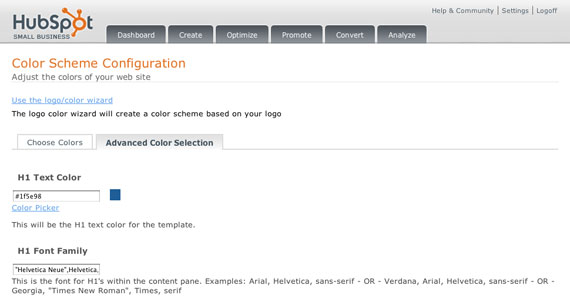
1. Utilize the Color Scheme Configuration settings
Hubspot’s system generates a CSS styles that are placed within the body tags, taking precedence of entire styles sheets I load to the DOM. Since the design specs I had to work with matched one of the systems page templates I thought it would be best to work within the confines of the system. This turned out to save me a lot of headaches later.
2. !important important important
Everything I couldn’t accomplish within the Color Scheme Configuration I wrote into a new CSS file based on some id and class selectors created by Hubspot’s templating system. After uploading a file through the system’s File Manager and linking that file into the header using the Website Setting, I noticed some of file’s declarations weren’t rendering in any browsers. After a few minutes of digging I realized the styles were being overwritten by styles loaded further down in the cascading order. Adding ’!important’ to the end of css declaration value give it precedence over all other ‘author’ and ‘user agent’ styles, or styles created by the developer and browser:
h1{font-weight:bold!important;}
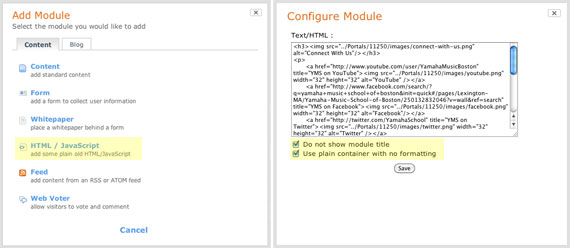
3. Use HTML / JavaScript to add custom code
When you need to add static content or custom images, you need to add a new page Module. Given all Module options, I recommend using plain markup. You can create things with a fresh slate and not be tied down by the templating system’s css conventions and markup. When you’re configuring your new module make sure you select the options to not use the module title and to use plain formatting. With those two items selected, you now have that clean slate to work with.
If any of you are charged with developing a site on HubSpot, hopefully these tips are helpful in tackling the project. While HubSpot's system isn't ideal for totally custom designs, with some extra work, you can still put together an attractive site.


Comments
Ryan Frisch
Instead of using Hubspots built in menu I've created a custom menu and hidden theirs but now I can't hide the navigation on landing pages without extra code on each landing page. Is there a way to identify that a page is a landing page so I can programatically add a class to hide the navigation? Can't seem to find one... Thanks.Chuck Wyatt
Hi Patrick,I really like your write up. I've done several of these Hubspot redesigns and I actually do find them to be far too time consuming because of the inability to start a site without having full control over layout CSS. It kind of makes me feel "dirty" to have to write "important!" all over the place -- I do wish there were a better way.
-Chuck
Richard
I know this is an old post but you gave me some insight.Man you are breaking the iceburg. I was hired to do some custom designing in hubspot and I've been spinning my wheels,...Thanks
Leave a comment