2012 Election Site Roundup
The 2012 election season will be over in just a few hours. Whether or not you approve of the candidates or the results, there’s one thing we can all agree on: there have been some great campaign websites built this year. Here’s a collection of our favorite websites from this season.
Sites We’ve Built
We may be a bit biased, but we couldn’t help adding a select few of the sites we've built to the list.
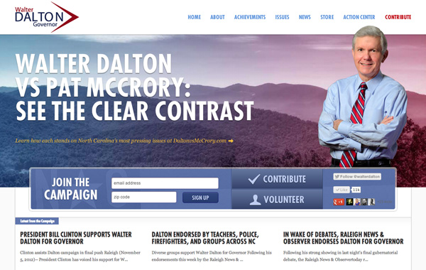
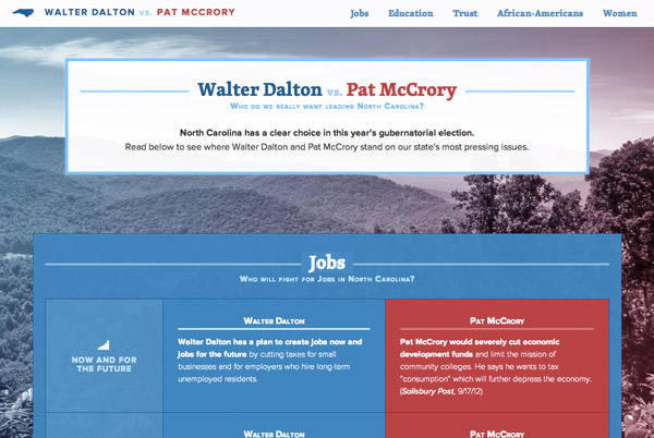
![Walter Dalton for Governor]()
Dalton for NC
Since we are based in North Carolina, this was a special site to be able to work on for Lt. Gov. Walter Dalton. Utilizing a clean easy-to-use design, this is also one of the few campaign sites this cycle that embraced responsive design to make it easier for voters to access information from whatever device they may be accessing the site from.
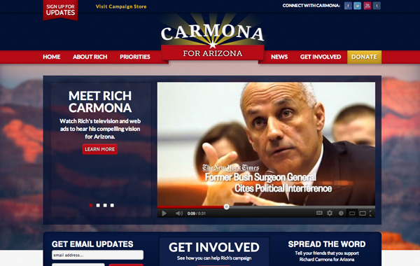
![Carmona for Arizona]()
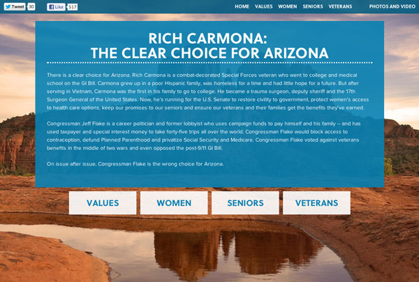
Carmona for Arizona
Rich colors, state flag imagery, and a large-scaled grand canyon sunset photo in the background show U.S. Senate candidate Richard Carmona’s strong ties to Arizona. The site also has several prominent features that encourage supporters to get involved in the campaign – from Carmona’s Twitter, Facebook and Tumblr feeds to a “Support Rich” box that lets users tweet their support directly from the site.
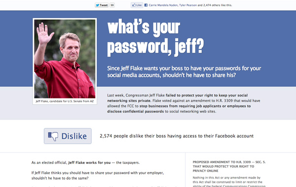
What’s Your Password Jeff
We launched this microsite earlier this year for the Rich Carmona campaign to call attention to a vote by an opponent against prohibiting employers from having access to employees' social media accounts. Due to the subject, this site used a similar style to Facebook and included a prominent "Dislike" button that people could click to express their frustration. Within the first two days of launching, this had over 2,500 shares on social media and led to numerous news articles about Congressman Jeff Flake's vote.
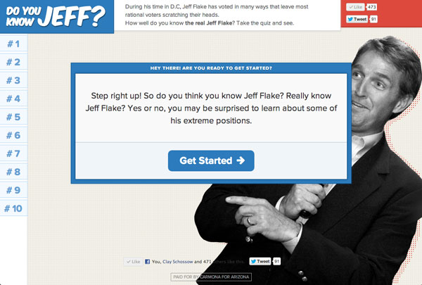
Do You Know Jeff?
This was another fun interactive microsite that NMC launched for the Carmona campaign. Visitors were able to take a quiz that showed off how extreme many of Congressman Jeff Flake's positions are and then share these facts with their social network. The quiz was taken thousands of times site and was spread heavily across social media, helped in part by the site's easy-to-share setup and responsive design.
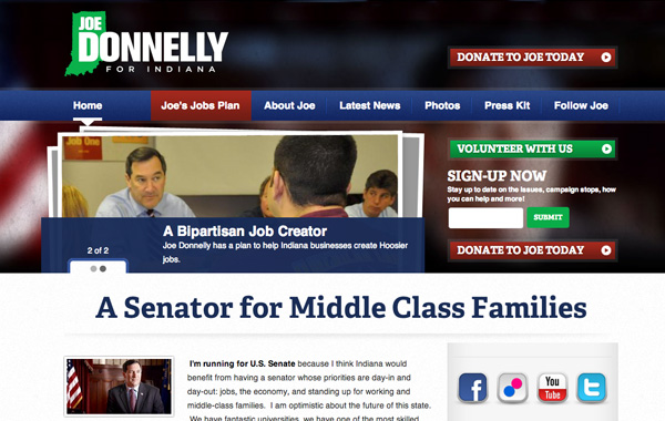
![Joe Donnelly for Indiana]()
Joe Donnelly for Indiana
We were excited to get the chance to work with Joe Donnelly again for his first U.S. Senate bid. Donnelly's new campaign site features eye-catching graphics and design, is easy to navigate, and places calls-to-action right up front for the user.
Clear Choice Arizona and Dalton vs. McCrory
Clear Choice Arizona and Dalton vs. McCrory were two microsites that NMC launched to help voters easily learn the differences between candidates in Arizona and North Carolina. These sites used large landscape images from each state and included a focus on typography to make them both look good and be easy to use.
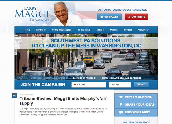
Larry Maggi for Congress
For PA Congressional candidate Larry Maggi, NMC created a clean and easy to navigate site so voters could learn more about Larry Maggi's background and positions. On the homepage, there is an aggregated feed of Facebook posts, tweets, news releases, and blog posts, so potential voters and supporters can easily learn more about and keep track of the campaign.
Presidential Campaigns and Related Microsites
Barack Obama
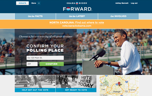
Obama’s 2008 presidential campaign set a precedent in political web design, and 2012 was no different. From innovative fonts, large images, and a simple to read and navigate blog format, this site screams young and fresh. The site is also chock-full of content to engage users, including interactive graphics, anti-Mitt vintage posters to share on your Facebook wall, and a commit to vote tool. To top it all off the site is responsive, meaning it will adapt to any device the user is viewing it on.
Contribute - Barack Obama
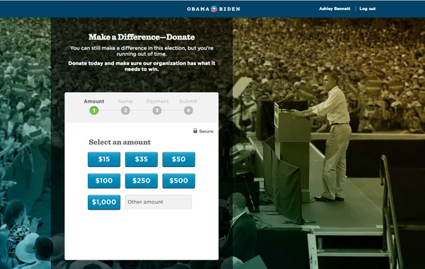
Nothing makes us want to contribute more than a sleek, simple-to-use contribution page. Coupled with the innovative Quick Donate button, the Obama campaign did a great job making donating incredibly painless to do.
Romney Tax Plan
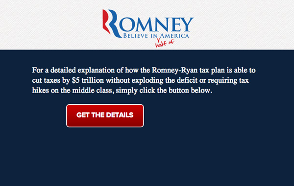
With more than one million Facebook likes and 75,000 twitter shares, who doesn’t love the microsite that “explains” presidential candidate Mitt Romney’s elusive tax plan.
![Obama Isn't Working]()
Obama Isn’t Working
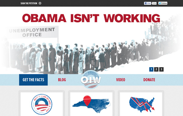
We’re suckers for hand-drawn graphics, and this site is no exception. This retro-inspired site organizes anti-Obama posts in a clear and visual way.
Other Campaigns
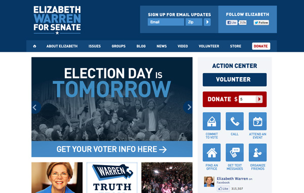
Elizabeth Warren for Senate
U.S. Senate candidate Elizabeth Warren’s site is clean, cohesive and has a prominent call-to-action center for supporters.
![Scott Brown]()
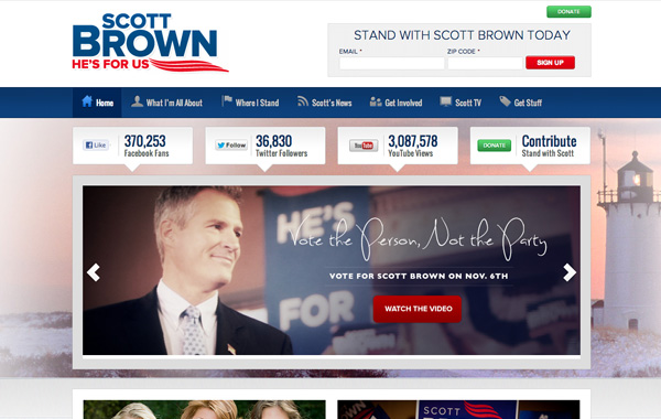
Scott Brown for Senate
Elizabeth Warren’s competitor for U.S. Senate has an equally beautiful website. We love the prominent social share buttons and great photography.
![Heidi for North Dakota]()
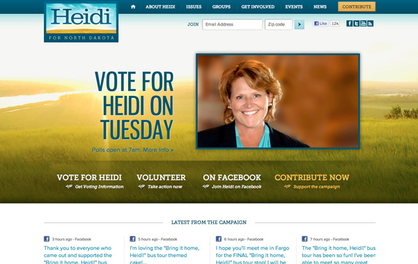
Heidi for North Dakota
This site erases any misconceptions we may have had about North Dakota. It’s modern, bright, and nicely organized.
Others
What are some of your favorite sites that that you have seen this cycle? Let us know in the comments.

Comments
Robert Butler
Great work! Wonderful creative, very intuitive, smart features, well adapted to the daily tactics of political battle. Favorites: Dalton, Obama, Warren...Leave a comment