A Striking Business to Business Web Design
When we first saw our client’s replies to our design survey, we knew this would be a good opportunity to push some design boundaries. In addition to large, beautiful photos from international landmarks (to communicate Align’s truly global reach) to the uncovnentional vertical side navigation, our task was to design and develop a web site that totally set the client’s business apart in a complex market with boring visuals.
Same Company, New Look
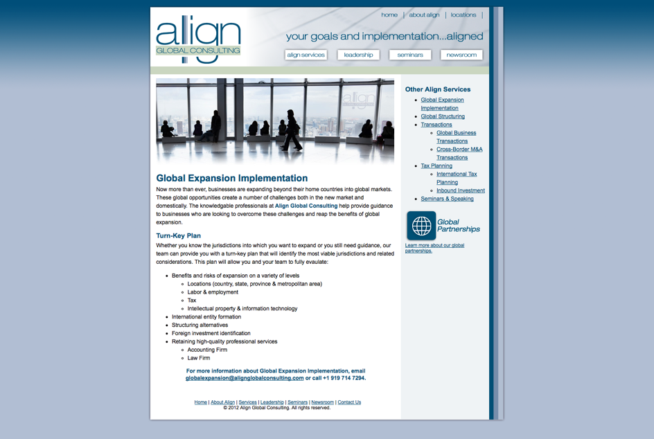
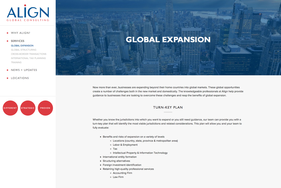
Hover over the above image and slide the bar to see the old and new sites. Align's new site is modern, professional, and responsive.
The previous AGC site lacked polish in the way that most decade-old web sites do: narrow width, overloaded navigation, unnecessary colors and gradients, and outdated typography. Align does business with a lot of technology-focused clients and it was important that the new online presence reflect that expertise. The new site needed to visually connect Align's mission and pitch with what is displayed on the web.
Our Task
Every New Media Campaigns web project begins with the same two fundamental questions:
- What does the client need from the site? (Business Goal)
- What do visitors need from site? (Site Purpose)
In this case, the primary goal of the redesign was not necessarily drive visitors to take action or to collect email addresses, since Align has the problem we’d all like to have: more work and clients than they can handle. Instead, the goal was to communicate a professional, confident, and mature brand that reflects a focus on their international business market and tells the company’s story in a visually appealing and straightforward, way. They didn't want their visual identity to fall behind their business success.
Collaboration is the Key
Serving as the web design and development partner for creative agencies make up almost half of our work and for Align Global, we worked with a consultant who helped streamline the entire process. More than anything, the recurring theme that drove the site’s design approach was “modern”: a modern design for a modern company that consults about modern technology. To us, modern means a few things:
- Generous whitespace (= no unnecessary visual elements)
- Professional typography
- Bold, simple color palette
- High-quality photos consistently treated
- Mobile / responsive design
The client wasn't afraid to take some creative risks to achieve something remarkably different from competitors in the space. In this case, we were afforded the opportunity to draw custom icons to illustrate each of the principal service offerings. The design brief called for an enormous amount of creative freedom to try something new which was followed by a rewarding and collaborative design feedback process while the site was being coded.
Web Design = Visuals + Code That Evolve
As a design moves from its canvas into browser code, sometimes it evolves as we devise new, more practical and refined ideas than we started with. One of NMC’s strengths is how closely our designers work with the development team to make recommendations for improving the design even after the templates have been built out in the CMS.
Because Align Global runs on HiFi CMS, that’s easy to do: it’s so flexible and fast that it becomes easy to stay true to the original design vision even as layout shifted when the full content was introduced. We were particularly thoughful in choosing the (stock) photography assets as the client had a very specific look in mind to reflect the global nature of its work. Align has offices in Raleigh, NC; Mountain View, CA; London, England; and Dublin, Ireland, so its workforce and scope is truly international. One challenge with the redesign was to communicate the idea of ‘international’ without relying on a tired visual cliché of maps and globes. So the pictures we included are high-quality views of London, Palo Alto, Raleigh, and Dublin: just the locations where Align actually has offices.
Playing Google's Game
Effective SEO revolves around several key tactics including: lean, semantic HTML that adheres to Google's published guidelines, consistently creating high quality content, and inbound links from legitimate external sites. The first tactic is the responsibility of the web developer: because our team is well familiar with how Google's organic search results index pages and we code by hand, we can ensure that the sites we deliver are optimized. The second and third are about publishing useful and interesting content. This not only tangibly demonstrates your organization's expertise but increases the frequency with which other sites link to yours.
For Align, we made sure the News + Updates section was both easy to read and easy to update. Instead of a list of headlines, the news items are large targets with the large, attractive photography and subtle animation from faded out to full color. Align has published several dozen articles already and each time new content is available on the site, Google indexes that content helping Align rank for the related keywords. HiFi makes it easy to publish any kind of content so new posts just a few clicks away.
Resulting In a Distinct Advantage
The end result? A fresh, modern site that fits their brand perfectly and is easy to update and maintain, delivered on time and within budget. The new site positions Align as a leader and gives them the tools to further that reputation through publishing though leadership and helpful resources. The client couldn’t be happier. Why don’t you become our next referral?

