Messaging Strategy & Copywriting
Before beginning the design process, we worked closely with the Atlas Point team to strategize around the site’s content. This process included a separate discovery phase, messaging development and revision, and a big picture look at the communication strategy that would support the site and related marketing materials.
During the discovery phase, we studied Atlas Point’s established brand persona and their two distinctive audiences – Financial Advisors and Home Office Leaders. We knew that each audience would respond to messaging differently, so we worked to identify a universal voice that would appeal to both while pulling out messaging and headings that would resonate with each group specifically.
Once we had a solid understanding of the messaging direction and target audiences, we drafted copy for the website based on the goals and objectives that we had identified. Our major focus was writing clear, explanatory prose that underscored the legitimacy of Atlas Point’s work while projecting confidence and professionalism.
We were also mindful of incorporating SEO best practices and content ADA accessibility best practices. For example: planning heading hierarchies and detailed text for buttons and links.
Leading up to the site’s launch, we carried the same themes and approach into a series of email marketing campaigns. The campaigns sought to reestablish a connection with existing contacts and drive traffic to the new site. The email content also served as a jumping off point for the Atlas Point team to develop complementary social media posts and other promotional materials.
User-Friendly Design
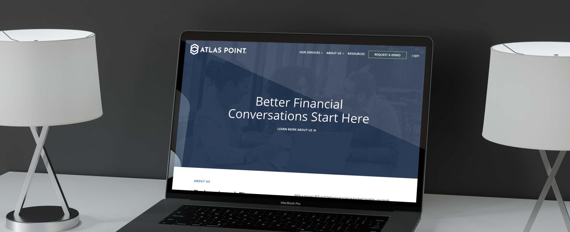
Design-wise, we knew that Atlas Point wanted a minimal and modern website that would allow their offerings to shine. Using this aesthetic as a guide, we developed a suite of layouts that combine plentiful whitespace, geometric shapes, and interactive elements like content sliders, videos, and eye-catching hover effects.
Design highlights include a freeform feature section on the site’s homepage, graphic-driven product pages, a resource library, and a comprehensive About page.
B2B Lead Generation
In addition to a fresh look, Atlas Point wanted a site that would serve as a lead generating tool. We prioritized conversion in a few different ways.
On the homepage, we incorporated large buttons that allow the two primary audiences – home office leaders and financial advisors – to segment themselves immediately. This ensures that site visitors can quickly locate the information and resources that are most relevant to their needs. Once visitors land on the appropriate page, the hope is that they’ll download a PDF, take a sample survey, or fill out a contact form.
We also included testimonials throughout the site. These build interest initially on the homepage, and add helpful personal insights on interior product pages. The clickable carousel format additionally brings in an element of interaction that encourages visitors to spend more time exploring each page.
Finally, we optimized the site’s nav with a prominent “Request a Demo” button that allows visitors to connect with the Atlas Point team. Because this is such a huge conversion point, the entire navigation bar is “sticky” – that is, it stays at the top of the screen as users scroll through each page. Sticky navs are a great way to make sure that visitors can easily peruse site content and take the next step.
Continuing the Relationship
Because Atlas Point intends to grow and scale their business in the future, we built the site on a flexible WordPress base that gracefully accommodates content changes and additions. Admins can use the intuitive CMS to update existing pages, add new resources and tools, and build out fully custom layouts using the pre-designed blocks that we created initially.
Post-launch, the new site has already received positive feedback from Atlas Point’s clients and peers. We’re thrilled with the result, and look forward to offering ongoing support as Atlas Point maximizes their new online presence.


