Goal-Driven Design
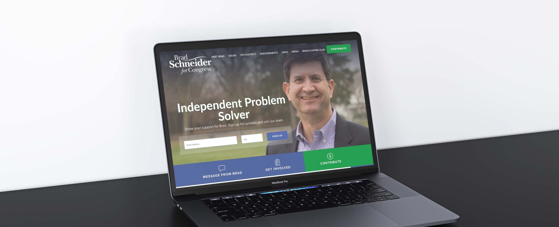
We kept these goals in mind when designing the website. On the homepage, visitors immediately encounter a pop-up box that features Brad’s latest advertisement. This serves to catch visitors’ attention and offer a closer look into what Brad’s campaign is all about. After exiting out of the pop-up, visitors are greeted by a friendly photograph of Brad, his tagline, and a form to sign up for his email listserv. Below, the site utilizes large buttons and engaging icons that encourage visitors to get involved with the campaign. This makes it easy for visitors to explore the various ways that they can show their support.
The design creates a clean and modern feel by making use of a sans-serif font, simple shapes, and bright colors. Varying shades of blue – appropriate for a Democratic candidate – are punctuated by occasional pops of green that add variety and call attention to donation links. Taken together, the design and its features are polished and extremely user-friendly.
In order to enrich the site’s look and feel, we incorporated high quality images throughout the site. The large, colorful photos not only draw visitors’ attention, but also emphasize Brad’s commitment to the voters in his district. He can be seen giving speeches, shaking hands, and generally working hard to represent his constituents.
Technology
Based on our long history of political campaign work, we know that the effective use of technology is a key factor that can make or break a campaign. To make it easier for Brad’s campaign to manage their digital effort, we seamlessly integrated the site with Blue State Digital tools so that all of the email sign-ups go directly into the Schneider campaign database. This allows campaign managers to maintain a single, comprehensive list of supporters, increasing the simplicity and effectiveness of their email campaigns.
We also integrated with the APIs of Twitter and Facebook to pull the campaign's social media content into custom blocks on the website. The live updates encourage visitors to explore the the campaign’s other digital platforms while bringing a dynamic and fresh feel to the site itself.
Why Schneider
We wanted to focus on Brad's depth and determination when it comes to the issues that he feels passionately about. To draw attention to this, we created an image carousel on the homepage that allows site visitors to scroll through Brad’s most important issues. Visitors are invited to learn more about each position by following each image’s link to a detailed interior page.
Along with the carousel, we created a custom layout for key issues that can be accessed from the homepage or through the navigation menu. The grid format helpfully outlines all of the issues, again allowing visitors to access in-depth position statements with another click.
We also wanted to highlight existing supporters to communicate Brad’s proven record of success. To do this, we prominently included a slider of testimonials on the homepage. These statements, coupled with other endorsements on an interior page, offer examples of Brad’s thoughtful leadership and seek to motivate voter turnout.
Expanding the Reach
To increase the campaign’s accessibility, we added a Spanish translation feature that allows each page to toggle between the two languages. By clicking the “En Español” button, visitors can immediately read through the content in Spanish (when available). Because Latino and Hispanic individuals make up 23% of Schneider's district, this feature not only promotes accessibility, but exemplifies the campaign’s commitment to diversity and representation. You can check out the En Español tool in action at http://www.schneiderforcongress.com/issues/budgets
Simply Sustainable
We know political campaigns can be hectic, so we built the site on an easy-to-use CMS that allows the Schneider campaign to manage the site completely in house. As the campaign progresses, staffers can scale the website with new content and easily push out timely messages and endorsements.
An Effective Result
The completion of this project brought an engaging website that successfully integrates user-friendly design and innovative technology. We’ve enjoyed working with Brad and his team for the past three election cycles, and look forward to helping him secure many more victories in the years to come.


