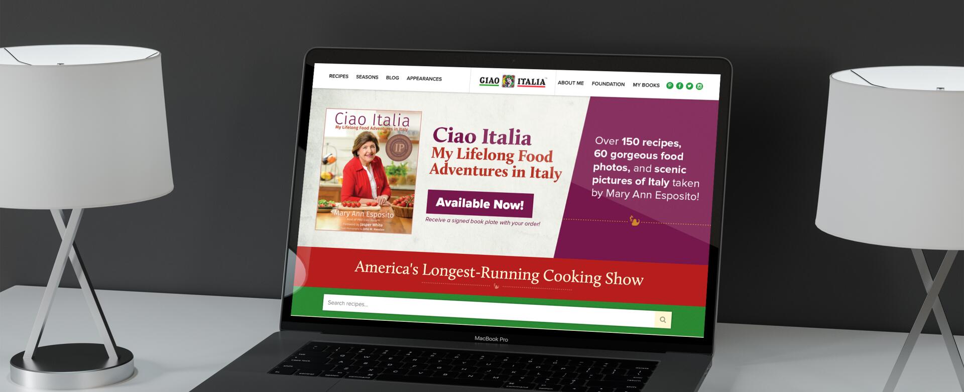
In redesigning and rebuilding the site, our goals were to consolidate all of these tremendous assets (videos, recipes, cookbooks, blogs) into one easy-to-use site. It needed to serve the older, dedicated Ciao Italia fanbase as well as reach a new audience that would find the site through Google searches or social media sites like Facebook and Twitter. Finally, it needed to be completely manageable by Ciao's current staff, who was talented but did not have a Web background.
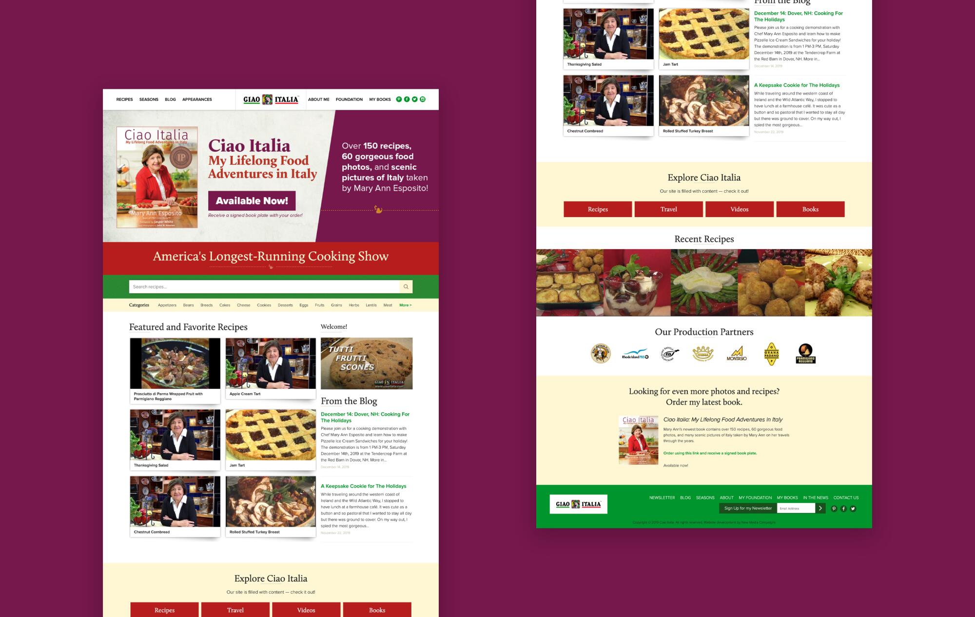
From the outset, we wanted to design a site that would set a tone that was like the show: friendly, homey, and informative. We wanted visitors to feel like guests invited to a dinner where the door is always open. The design needed to be clean and easy to both navigate and read. We wanted the site to feature lots of white space to give it an open feel, but also use traditional, bright Mediterranean colors to set the right tone.
Because we wanted such a clean look and we had such tremendous photographic assets, we built a wireframe that incorporated both colors and imagery. Typically we avoid doing this so that we can focus strictly on the structure of the site elements before moving to the design of a site. In this case, we had some very constructive conversations with the production team at Ciao Italia and felt like we were on the same page. Our wireframes used solid colors and also some photos to convey the desired warm, friendly tone. We started with the homepage because it featured a number of elements that would appear elsewhere in the site.
Once we nailed down that look to a near-final version, we moved to other areas of the site.
The Ciao site was a bit unusual in that it would relaunch with thousands of pages for its recipes. If we did our job correctly, the decades of content that they show had produced would be available through Google searches, meaning that an extremely high percentage of visitors would enter the site through an interior page rather than the homepage. This was therefore an important consideration when we designed the interior pages. They needed to present the necessary content, but also act as an entry point to the rest of the site. For this reason, we kept the navigation design very consistent and clean. We also included some general Ciao content in the sidebar to help draw visitors into the site more deeply.
On recipe pages, usability was paramount. User feedback showed that many fans would either have their laptop in the kitchen while they cooked, or print out recipes to use in the kitchen. We made sure to use a large, high-contrast font for the recipe text and developed an especially usable print-stylesheet. We also highlighted the video at the top of the page. For many fans this would be an incredible surprise: for years they had used their favorite Ciao recipes and had never seen the episode on which they originally appeared!
Finally, there was already a large collection of fans that was using the existing online recipe database, even though it was very slow. They knew exactly how to search for the things they wanted -- many even knew the internal episode numbers of their favorite episodes! It was therefore crucial that the new design be usable and familiar while being improved in speed, efficiency, and design.
The Ciao Italia site development presented some fun, multi-disciplinary challenges:
- Thousands of recipes existed in an old, slow MSSQL database with an unknown schema that needed to be migrated out.
- Once migrated, they needed to be in a more structured format so that we could accomplish our design and SEO goals AND they could be managed by a non-technical user. Recipes needed to be searchable by everything from ingredient to episode number.
- The site needed to be extremely high-performance.
- The front-end code needed to take SEO best-practices into strong consideration.
- All data needed to be available through an API so that Canadian Television could make some recipes available on its site.
- The project had a tight budget.
In order to accomplish this project within a reasonable timeframe, we started on the database problem even before the site had been designed. It was a bit of a logistical issue to get access to the existing database, but eventually we secured a copy after getting remote desktop access to a Windows 2000 server.
Our first step using HiFi CMS was to set up the custom season/recipe/episode database structure along with custom fields.
Next, we created an import format from the previous database and used it to pull in the 20+ seasons with 20+ episodes per season and three recipes per episode in one fell swoop. Additionally, we could turn over the CMS keys to the Ciao staff before the site was finished so that they could upload the latest season that never made it into the previous database.
The results were even more immediate than expected.
Over the first week, before Google could really discover the change, we benchmarked the new site's analytics against the old site's. The change was dramatic. Because of the vastly improved site performance, design and navigation, the number of pages per visit increased 142%, the time on site increased 27% and the bounce rate was down 15%. This number has held even after the initial launch.
Within a month it was clear that the improved SEO and site performance was making a dramatic difference to Google. The first full month after the site launch had nearly a half million page views. Visits originating from search doubled. These results were more than double the highest amount in the site's history. Additionally, the email list began growing again. The list grew by 750 subscribers which was 3% or 35% annualized. This was not just a launch spike, either. Traffic continued to grow for several months, primarily driven by search which increased by 275% in comparison to the old site.
In addition to the new traffic and hard, quantitative improvements, there was incredible qualitative improvement as well. Form submissions and comments poured in by the hundreds complimenting the site. Perhaps most importantly, the Ciao staff was finally able to manage and control their online brand, something they had never been able to do by themselves.


