The Nicholas Institute is focused on helping policymakers solve some of the hardest problems related to the environment. The organization is headquartered at Duke University and serves as a unique resource by assembling a world-class team of economists, scientists, lawyers, and policy experts for the school and community while simultaneously advising decision makers around the world about some of today's most vexing issues. The organization partnered with NMC to upgrade its dated and cumbersome website to a design representative of the Institute's reputation.
Nicholas is a vast research organization with dozens of staff generating research, thought pieces, and resources, representing six distinct programs underneath the umbrella brand. NMC worked closely with Nicholas to bring all of this content into a coherent and clean user experience that let visitors easily navigate to their desired content. The result was to give each site a standalone section of the site that was similar in layout to the others but unique in content, resources, and even color scheme. This solution allowed each program to organize and promote their own content while making it fit in with the rest of the site.
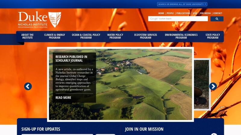
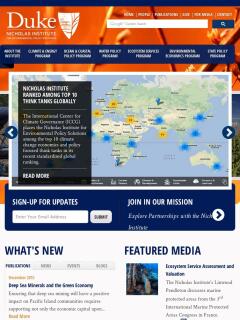
The homepage of the new site uses a unique feature rotation that allows Nicholas to highlight upcoming events, new research, or important news. Additionally, visitors on the homepage can sort through different categories of Nicholas updates by clicking through different tabs in the What's New section; this feature gives visitors an opportunity to consume a wide array of content without overwhelming them by displaying it all at once.
While the main navigation is built around the different programs, visitors curious about the Institute as a whole can use the secondary navigation to learn about contribution opportunities, organization staff, and more. The secondary nag also allows visitors to go directly to a robust Publications search that lets visitors quickly sift through hundreds of resources by filtering based on topics, authors, or content type.
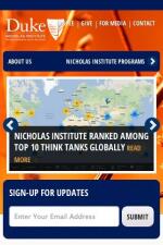
While the site is in line with Duke's brand standards, it was also designed to be Uniquely Duke, helping it stand out some from the typical university site. Large background images, bright colors, and innovative layouts help distinguish Nicholas from other higher education sites. Also, the site was built responsively to ensure that it is optimized for mobile and tablets. The site is powered by Drupal Content Management System, which was an ideal solution for a site with many complex relationships between different pieces of content.NMC has gone on to partner on several other projects at Duke.
The site leverages smart design and technology to create an intuitive and engaging user experience to support a wide-ranging and content rich organization.


