Celebrating 20 Years of Legal Success
NMC partnered with Hutchison PLLC for several years and completed several, iterative revisions to their website. In 2015, ahead of the firm’s 20th anniversary, they decided they wanted to redesign from scratch and set a goal to have their new site not only connect with their clients and drive their business goals, but also to be unique from the typical law firm site and exemplary in what a modern law firm site can be.
Mission accomplished. Not only is the firm thrilled with the new design and NMC proud of the work, but it also is frequently cited as a top legal site and was named by Lawyerist as a Top 10 Best Law Firm Website of 2016.

A Modern Site for a Modern Firm
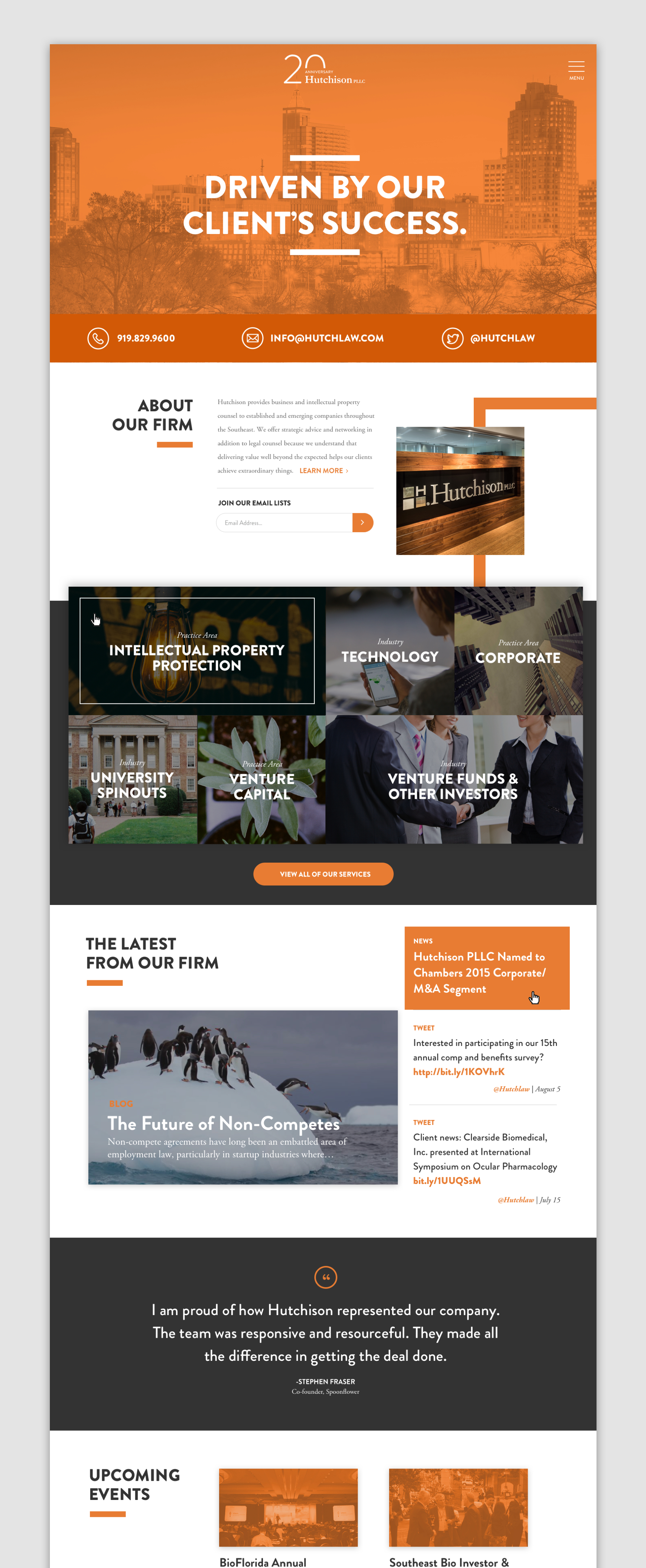
Hutchlaw’s focus is working with emerging companies on business and intellectual property issues. A large portion of their client base are fast growing startups or growth companies looking to cement their place in the market. Hutchlaw wanted the new site to visually connect with this new audience through a vibrant and modern design that also is very easy for clients and prospects to use.
The new site’s layout is a fresh departure from a traditional law firm site and injects elements that would be more often encountered on a startup’s site than a law firm. For example, the site eschews a traditional menu and instead uses a hamburger menu in the top right more often seen on startup sites and in mobile apps; this detail quickly gives the site a more progressive feel and also does not hinder usability since the site’s typical user is a native of the web and used to navigating through this element.
The design is instantly injected with vibrancy through the bright orange color that is a core element of the firm’s brand. The color is not only used as an accent throughout but also as filter on top of the site’s feature image.

A Design that Caters to Client Needs
A grid layout of the practice areas with vibrant images is also an attractive and unique feature while also serving the purpose of catching the attention of visitors and encouraging them to self-select their audience-type and navigate the site. This technique allows Hutchlaw to serve visitors targeted content since the users are identifying what they’re interested in. Additionally, other modern design elements are leveraged throughout the site, such as full width images to break up content areas, content grids to neatly organize content, designed icons to bring text to life, and patterns and accents to add visual interest.

Easy to Manage, Perfect on Any Device
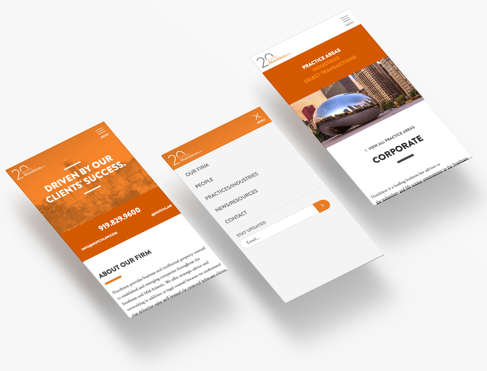
The new site was built on a Content Management System that makes it easy for Hutchlaw to add and edit content, images, and multimedia. The CMS also lets the team categorize content, which smartly feeds it to relevant practice areas, attorney pages, and more, ensuring that there is dynamic and relevant content placed throughout the site. And of course, as with any modern site, it works great on mobile, tablet, and all resolutions in between.

Setting the Tone for Modern Law Firm Websites
Hutch sets a high mark for what a modern law firm website design can be – both aesthetically and functionally. The visual style of the site distinguishes the firm as a leader and the included features make it easy for visitors to quickly get the precise information they need.


