Serving Patients by Serving Web Pages
Located in Smithfield and Clayton, NC, Johnston Health operates two hospitals in Smithfield and Clayton which provide Johnston County residents with effective, high quality care. In order to elevate its web presence to the same level of excellence as its patient care is known for, Johnston Health selected our agency partner, Three Ships Media, and together we redesigned and coded the new site. It involved integrating a number of technologies into one, simple-to-use package and entailed a massive effort to re-think how to organized and present more than 1,000 pages of content.
It didn’t help that on top of the site being so large that its previous technical foundation was from circa 500 BC. Johnston Health knew that in order to continue serving its community in the 21st century, they needed to better organize, display, and interlink all their content.
Show Me the Content
Our first and most important task, therefore, was a content audit followed by information design. This portion of the project we found most interesting: collaborating closely with the client, our team started from scratch, starting from the top-level sections all the way down (sometimes up to 4 nested levels). We kept exactly 0% of the organization from the old site, because it was so clunky and hard to use.
With the content straightened out, we proceeded to the visual design, Wordpress development, and custom Drupal features. Together with our content strategy consulting, our solution makes it as easy to search for a doctor as it is to publish to the “Health Matters” blog (which is read by a surprising number looking for general health information).
The result is a responsive, modern site that’s as easy for patients to use as it is administrators to update.
Designing an Interface for a Diversity of Stakeholders
A large healthcare organization like Johnston Health has to meet the needs of a wide array of stakeholders. Staff, doctors, patients, families, volunteers — it can be very challenging to approach the information design in a way that satisfies all comers. Visitors might be be visiting the site for details on specific cardiology services, parking & shuttle information, or to pay for care, so it was important that NMC simplify and streamline the complexity where possible (and mask it from the visitor where not) to prevent visitors from feeling overwhelmed. Visiting a hospital can be stressful enough without the added frustration of not finding what you’re looking for online.
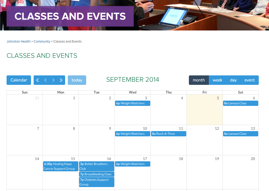
To pull off a successful redesign required very close collaboration with the Johnston Health team. We surveyed other hospital & health care web sites and gathered data from Johnston’s analytics to determine the best ways to organize and structure everything.
Content Types
Virtually all sites NMC develops includes a blog or news section and the design for Johnston Health’s blog feed includes big, bright, high-resolution images which can be sorted by topic. But beyond the amount of standard content was the the number of different types the new site had to support: not just text and photos but infographics, videos, and some really complex forms.
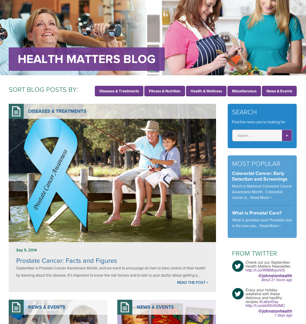
Many of these were introduced for the first time with our redesign so we had to think through the best way to implement them from a development perspective. We created custom Wordpress fields to handle each of the content categories so it’s easy for admins to keep up with.
Putting It All Together
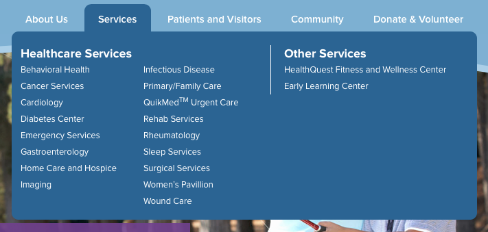
Our solution was to combine the content into five principal sections: About, Services, Patients & Visitors, Community, and Donate & Volunteer. We determined this organization best reflected the content and we began consolidating content from the old site’s haphazard areas. Even a glance at the Services section reveals the depth of content on display: of the 17 major Services, each has many sub-services (and some still more sub-services under those!).
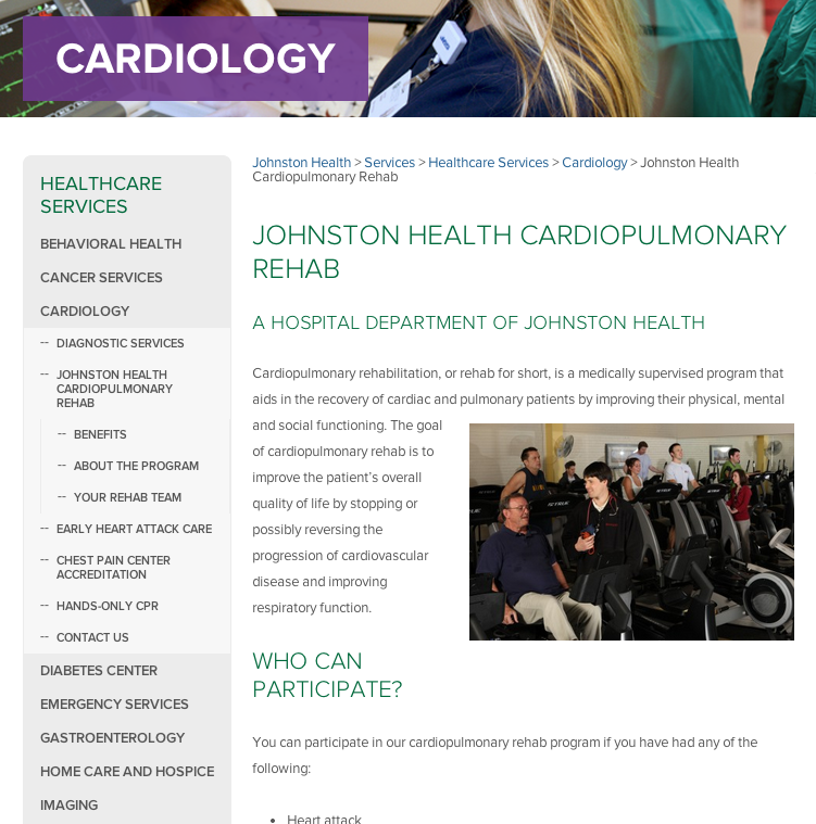
After a lot of blood, sweat and tears went in to making sure every single page rendered just right (hello there, IE8!), was nested in the correct menu, used the correct H3 styles, and loaded in milliseconds, the Johnston Health team couldn’t be happier. Both the new, post-lauch analytics and personal anecdotes confirm that the new design serves the needs of their many site visitors far better than before.
Special Features
A few bits we’re especially proud of:
Find a Doctor
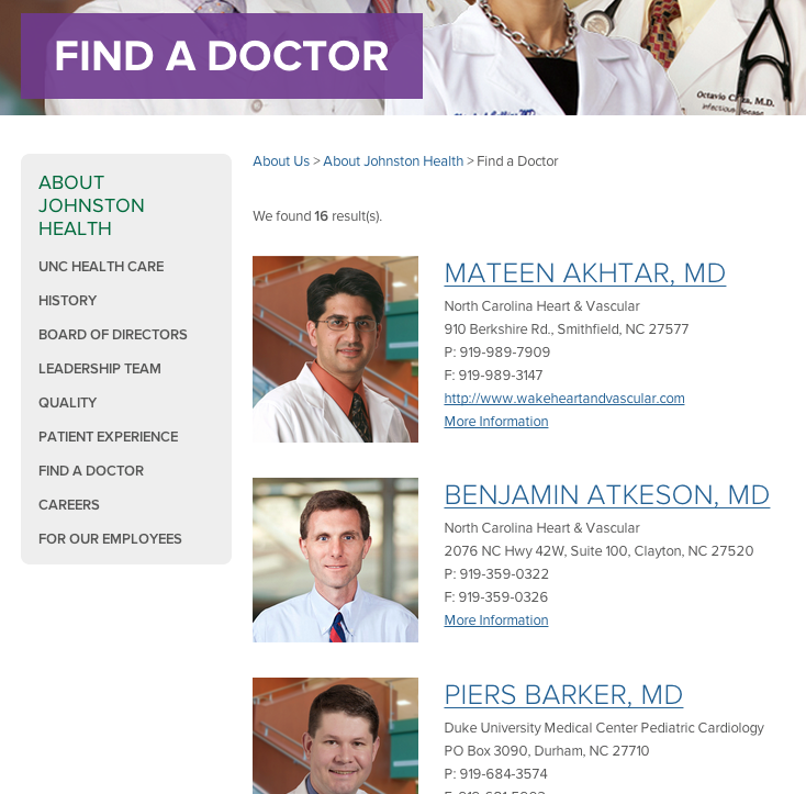
A “Quick Find” tool allows visitors to find the exact doctor that fits a visitor’s individual needs. One selects a specialty — and optionally include keywords and a last name — to find the results instantly. We made it easy for the Johnston Health team to maintain by means of a database that updates by uploading a simple CSV. The web site synchs without site admins having to change their existing workflow.
Send a Greeting
How do you encourage people to send get well cards? Make it really easy. We developed a tool in which visitors can email a greeting card to someone or, even better, send it directly to the nurses’ stand where they can be printed and hand-delivered.

Our senior developer, Josh, wrote more about it on our company blog.
Patient Stories
We have a custom testimonial content type called Patient Stories which can be added to any page and are pulled in at random under the main content. Site visitors can click through to see all Patient Stories tagged in that service line as well as all patient stories regardless of service. Deceptively simple-looking, it’s a powerful feature: it's just a few clicks to add one to any health care service page.
Homepage Rotation
Home page carousels are pretty common but not ones with custom shapes. The arch element is a key element in the Johnston brand and to include it dynamically required some clever thinking. Our front-end developer on the project, Todd, explains the challenges on our company blog.
Bill Pay
Finally, Johnston Health’s goal was to centralize the online experience as much as possible. Staff login links are easily accessible as well as patient and customer payment forms. We also created a secure payment processing form for them (using authorize.net) for credit card processing.
Effective Design, Useful Technology, Friendly People
About halfway through the project, Johnston Health was acquired by UNC Healthcare. It’s a great opportunity to expand the reach of their services but it also means our team had to make quite a few on-the-fly changes to the design! Matching the new brand standards on short notice was a challenge but we’re pleased with the result. Nothing our team of friendly project managers and skilled developers can’t handle, so you can be confident your project will be in good hands, too.


