We're always excited to help a member of the vibrant Triangle startup community. Working with Medlio was an especially exciting opportunity since they are not only a local startup, but they're also boldly trying reinvent the healthcare system to make it smoother for patients, doctors, and insurance companies.
Medlio created a mobile app that acts as a virtual health insurance card, allowing doctors to provide patients with estimates ahead of time and for patients to seamlessly pay with their Health Savings Account (HSA) while they're still at the doctor's office. The app simplifies the process, allowing patients to have an idea of what something will cost and makes it easy for doctors to quickly get paid. That currently isn't the case because most HSA plans require the doctors to mail a bill after the visit.
It's such an exciting company that they were invited to be a featured speaker at the prestigious Health 2.0 Conference in San Francisco. This speaking opportunity meant they needed their new site built and launched very quickly. We worked with their team to get the site from design to live within a week. Wanting to ensure the company put its best foot forward at the conference, we worked hard to not only get the site launched in time but also really make it shine.
To provide the best experience for visitors, while making sure the site really shined, we put a lot of care into the HTML/CSS setup of the site. We used LESS and a nice grid system to flexibly layout each page. Using LESS allowed the styling to be very clean and minimal. It also made it easy to compartmentalize each element of the site into something that we could style responsively at a number of resolutions.
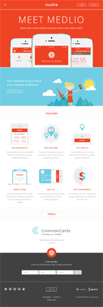
Knowing the company is representing the future of healthcare we wanted to make sure the site had some polished, modern interactions to engage visitors. The site designer had done a wonderful job of producing assets and describing animations. We took advantage and built in a number of nice CSS animations. When you initially land on the homepage, the phones are CSS animated into place using a 3d transform so phones and tablets can smoothly display it at 60 frames per second. We used a similar transition effect for when visitors click on the menu icon and the site menu slides in.
On interior pages, we use a fade-in for the main page titles. All of these effects were carefully built to make sure they don't affect site load time in anyway, and they're geared at helping excite visitors about the future of the app.
Since the initial rollout of the site happened during the conference and it's promoting a mobile app, it was really important for us to build the site responsively. The responsive setup ensures that the site looks great at any resolution and on any device.
The Medlio team was super excited everything came together quickly and looked so great, but not as excited as we were to have played a role in this great site and company.


