PROTECTing Children from Harm
The National Association to Protect Children (formerly Promise to Protect) is a national pro-child, anti-crime membership association established in 2004. A 501(c)(3) non-profit, the NAPC works to protect children across the country from physical, sexual, & emotional abuse. NAPC deals with a challenging subject and approached NMC to deliver a modern website with two especially challenging requirements.
The first requirement was to make clear that protect.org is really two organizations: the non-profit, NAPC, as well as a bipartisan pro-child, anti-crime political lobby called PROTECT. The sole focus of the lobbying arm PROTECT is to make the protection of children a top political and policy priority at the national, state, & local levels. They accomplish this by educating the public about policy and coordinating volunteer campaigns to contact legislators about specific topis. NMC had to find a way to make the distinction between both organizations crystal clear on the website.

The second challening requirement was to balance the visual design in a way that satisfies the needs of a very specific audience. Visitors to protect.org include not only governmental and political agents “to whom we must always project an image of strength, respectability, and responsibility,” but “grassroots volunteers who will maintain their excitement as A VITAL PART of our movement,” to use the client’s words. Further: “We are looking for web designers who understand the need for meeting and maintaining both goals and keeping them in balance” and a design firm “who can communicate to us a strong, clear vision for a new website. This is a ‘blank sheet of paper’ project, NOT a simple ‘re-design.’”.
NMC rose to the challenge to design and build a new, custom website on the Drupal content management system that exceeded even their stringent expectations. The result is a modern and responsive non-profit website that loads quickly, provides more resources, and is easier to manage. The new site manages the tricky visual balancing act of catering to distinctly different audiences coming to learn about two distinct organizations.
The Creative Brief: Our Task
Like many of our clients, the previous website was in bad shape. But successful sites don’t start with Photoshop, they start with a careful, thorough, and intentional assessment of the message we’re using the website to communicate. That means reviewing all the words, pictures, and videos to determine how best to arrange it so that it’s easy for visitors to find.
Before & After Design


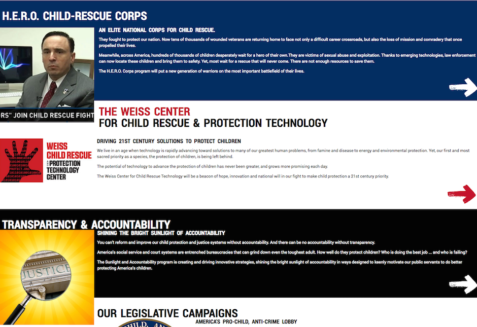
The old site was in bad shape: poorly organized, hard to read, and difficult to update
Again, in the client’s words: “We are currently very frustrated at our site’s disorganized, dense, and difficulty-of-access look. … We need an idiot-proof platform that keeps things from getting visually disorganized over time because we add material constantly.” We worked closely with PROTECT to sort, categorize, and import more than a decade’s worth of content to permanent and easily accessible locations. We also introduced new sections, such as Essential Reading, Legislative Victories, and daily social media content.
We gave special attention to the new Take Action and Give pages, since participating and donating are the currency of every non-profit and built an internal search engine that actually works. On the home page, watch as the "Our Impact" numbers grow to reveal the results of PROTECT's hard work winning campaigns and raising money. Finally, we gathered the extensive video content together so it can be browsed easily on the Video Wall.
Visual Design

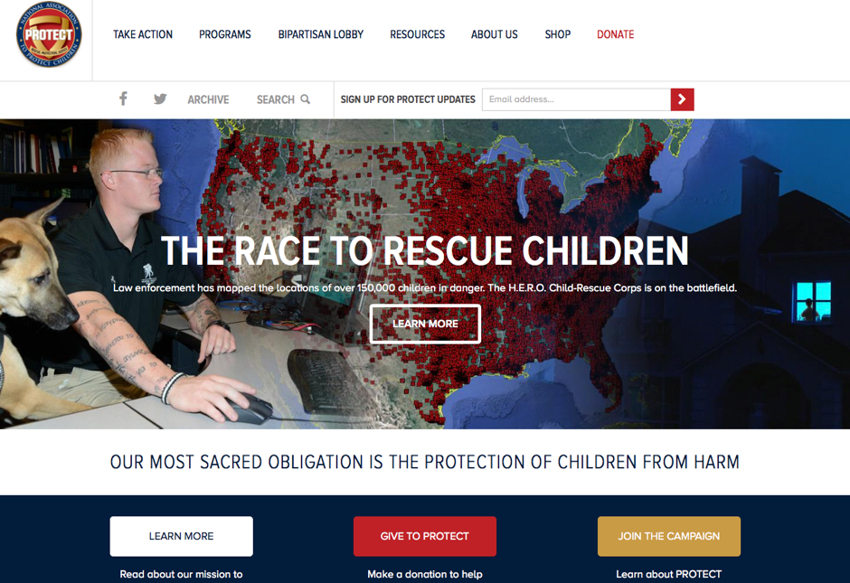
For the visual design, we drew on the existing PROTECT logo, which is modeled on a governmental seal. The brief included the phrase “sophisticated and formidable” and needed to reflect its origin as a political lobby, rejecting any overt emotional ploys intended to tug on heartstings. The simple shapes, saturated colors, and lack of extraneous visual flourishes such as shadows or texture conveys the boldness and gravity of the organization’s work.
We used subtle design changes to communicate which side of the non-profit / lobby organization the visitor lands on. On most pages of the site (such as Mission), the page title has a dark blue background. But on pages that are related to the lobbying side of the organization (such as Federal Campaigns), the background is red and the website logo changes to the advocacy logo.
Coding the Back End
PROTECT came to use with years of great published content. Part of the reason we chose Drupal to power the back-end content management of the site is because Drupal is well-suited to pushing and pulling data and so we wrote a custom script to parse their original Joomla content. Another reason is Drupal made it easy to develop a sophisticate custom category and type-based resource search tool; the majority of the site’s content consisted of kinds of resources that we needed visitors to be able to quickly and easily parse and explore. On the resource library, visitors can search by type, category or keyword.

This project included a few unusual code integrations. Due to the sensitive nature of their work, the client wanted additional security so we set them up on their own dedicated server using CloudFlare, which in addition to increasing performance offers extra protection from a variety of online threats & nuisances such as spammers, bots, and malicious attacks. And since the principal task of any non-profit is to motivate and encourage supporters, we integrated the email signup form with their Salsa CRM database and donations via their existing PayPal account.
A Better Website to Help Protect Children
PROTECT was terrific to work with: the more clarity a client can bring to their own mission and purpose of the website, the more easily we can deliver a solution they’ll be happy with. In this case, close collaboration throughout the project was important so that their public outreach team could be involved in weighing the pros and cons of certain design & development decisions. The NMC staff has a lot of experience working closely like this and was able to articulate our thought process and to push back when we felt strongly about a better solution. The result is a true collaboration and a much better product for an organization doing vital, urgent, and challenging work.


