UNC Nursing

An Eye-Catching New Look for a Top-Ranked Nursing School

As one of the country’s top ranked public nursing schools, Carolina Nursing offers a series of competitive degree programs that consistently produce exceptional graduates. The school’s national reputation has earned recognition by U.S. News and World Report, the American Health Council, Shanghai Ranking’s Global Ranking of Academic Subjects, and others. 

Knowing that our understanding of the UNC brand runs deep, Carolina Nursing approached us for a higher education website design that would showcase the school’s distinctive offerings within a modern, intuitive, and scalable online platform. By leveraging our work on similar projects for UNC Kenan Flagler, UNC School of Information & Library Science, and UNC Campus Rec, we were able to efficiently evaluate Carolina Nursing’s core objectives and transform their vision into a website that will support their needs for years to come. 
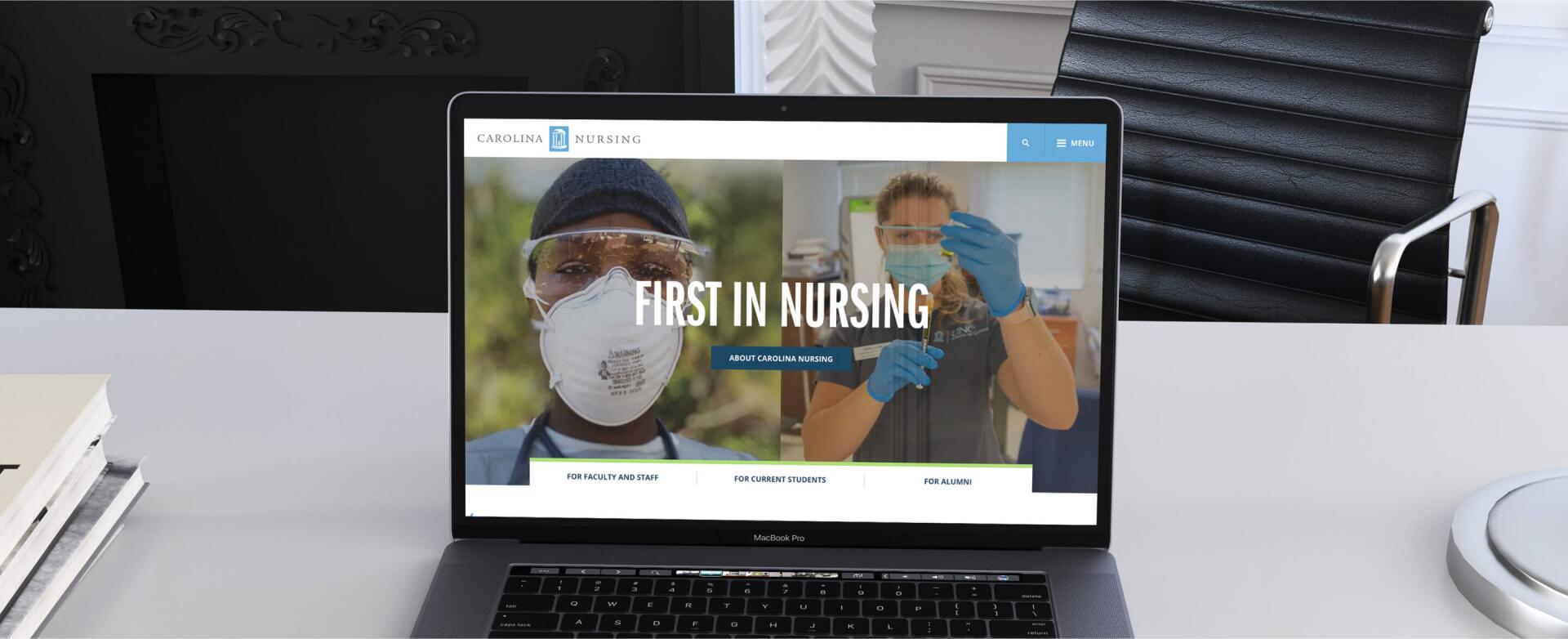
Designed to Stand Out Online

First impressions are important, and we wanted to make sure that Carolina Nursing’s new website would reflect their position as a leader in the higher ed space. To accomplish this goal, we came up with a modern concept that utilizes clean layouts, dynamic movement effects, playful colors, and custom graphic elements designed by UNC Creative

Beginning on the homepage, the site captures attention with streamlined wayfinding options, high quality images, and efficient interactions that guide users towards interior content. The overall look is defined by eye-catching circle and wave shapes and bright accent colors. 

Interior pages carry through the same themes while introducing important content and resources. Design highlights include practical sliders, content grids, filterable feed pages, and other elements meant to conserve space and maintain visual variety. All of this is made possible by a blocks-based Wordpress setup that allows site admins to continually iterate on and generate new layouts. 

Although the site has an intentionally distinctive look and feel, all fonts, colors, and graphics are ADA accessible and consistent with the overarching UNC brand guidelines. Read more about striking the right balance in our blog post on higher education website design best practices.


Thoughtful Navigation Features 

In addition to a great look, Carolina Nursing needed a site that would engage a wide range of stakeholders – everyone from prospective students to established donors – with helpful features and an intuitive navigation flow. 

They loved the active feel of a pop-out menu, so we centered the site’s navigation on a sidebar design that features a keyword search bar, easy-access dropdowns, and a series of quick links to audience landing pages and the school’s social media platforms. The collapsable nature of the menu eliminates on-page clutter and maintains the site’s clean and modern aesthetic. 

When exploring interior pages, users can jump between topics by using the helpful section subnav menus. These appear on program pages and others with a high volume of related content. They’re an ideal option for adding wayfinding pathways without overloading the site’s main menu or dropdowns.

Navs aside, the custom blocks setup also fosters a smooth browsing experience by offering numerous ways to connect content across the site. For example, many of the expertise areas highlight relevant projects, news, publications and faculty members. Not only does this make it easy for users to dig deeper into topics of interest, but it also boosts the site’s SEO by showing the depth and breadth of the content.

Built for Future Growth

As the school continues to grow their website, in-house admins can take advantage of the user-friendly content management system to add additional resources, events, publications, and entirely new pages – all made easy with a library of pre-styled blocks that fit seamlessly with the rest of the site.