
ADA Best Practices for Accessible University and Higher Education Websites
For many colleges and universities, a diverse student body is what makes a higher education experience unique. Students with different cultural traditions, social classes, disabilities, and racial backgrounds can express diverging perspectives and uncover unexpected similarities. More importantly, students surrounded by an assorted group of peers are likely to develop a broader understanding of the wide-ranging and ever-changing world around them.
This is all no secret. Higher ed institutions are well aware of the benefits of a diverse cohort. It all comes down to whether or not the school can attract and enroll a group that fits the bill. And when it comes to attracting prospective students with disabilities, web accessibility is an essential first step.
In this post, we’ll explore what web accessibility means for higher education institutions and offer ADA-backed tips and best practices for making your higher ed website accessible for everyone.
Why Web Accessibility Matters for Universities
First impressions are everything. Considering that a university’s website is a common starting point for research and exploration, it’s important to make sure that site visitors of all abilities can take advantage of online content and resources. If visitors are finding that your website largely excludes those with disabilities, the natural conclusion is that the school may not be a good fit in person either.
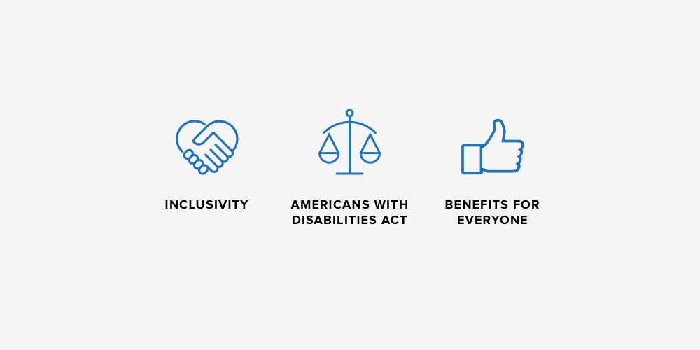
Beyond courtesy and inclusivity, web accessibility matters because it’s the law. The Americans with Disabilities Act (1990) contains anti-discrimination provisions that call on businesses to offer modifications and other adjustments for disabled populations. While the ADA was written before specific web guidelines could be put into place, two truths have since become common knowledge:
- Websites are included under the ADA
- Noncompliance has consequences – big ones. (Don’t believe it? Both Harvard and MIT have been involved in accessibility lawsuits in recent years.)
The bottom line: web accessibility is a want and a need. Next, we’ll explain what it looks like and how to make it happen.
Web Accessibility Basics
In practice, web accessibility means taking additional steps throughout the design, build, and maintenance processes to create a consistent experience for all site visitors, regardless of ability. This includes design choices and technical setups that accommodate assistive technologies like screen readers, dictation programs, and keyboard-only navigation.
While there isn’t one set of official guidelines available, the most widely recognized standards come from the Web Content Accessibility Guidelines (WCAG) provided by the World Wide Web Consortium (W3C). W3C is a leader in the web accessibility space, and their work serves as a reference for many accessibility consultants and digital agencies like NMC. Thus, our tips are based on core principles and points from the WCAG along with experience we’ve gained through accessibility work with clients like UNC Kenan Flagler.
Now, on to our higher ed accessibility best practices! Skip ahead with the following links:
- Content Recommendations for ADA Best Practices
- Higher Education Web Design ADA Tips & Best Practices
- Technical Tips
Web Accessibility for University Website Admins
The university and higher education website designs we typiccaly work on have often been designed and built long before our contacts reach out to us with questions about accessibility. If this is the case for you, don’t be discouraged – there are many steps that can be taken to improve accessibility even after a site has been established for years. The following tips focus on creating and structuring content in a way that prioritizes accessibility.
Add Structure With Headings & Lists
With few exceptions, most websites are built with standard content structuring features that mimic the tools offered by traditional word processors. Adapted for the web, these features include hierarchical headings (H1 through H6, to be used in descending order), bulleted lists, numbered lists, blockquotes, and page dividers like horizontal lines.
Use these tools as much as you can! Solid blocks of content limit opportunities to consume information quickly – both for sight-based readers and visitors who are using assistive devices. Structural elements like informative headings, quick-reading lists, clear quotes, and section dividers help everyone to quickly identify the sections and topics that they’re looking for.
Improve Browsability With Anchor Links
Anchor links are links or buttons that, when clicked, automatically carry the reader to a specific section lower on the same page. They’re helpful for accessibility because they allow users to easily skip over irrelevant content and instead navigate to the information that interests them the most. To see how this works, try clicking the following anchor link to skip ahead to our next topic, Design Best Practices.
If it’s possible in your CMS (content management system), use anchor links to break down long posts and offer shortcuts to key page sections. On a long page about admission requirements, for example, this could mean providing quick links to details about standardized testing scores, grade expectations, and other key criteria.
Use Descriptive Links & Buttons
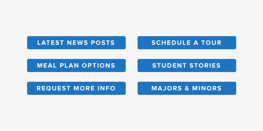
As a general rule, buttons and links should be able to be understood without additional context. Yes, it can be tempting to use typical labels like Learn More or Read More, but these phrases fail to explain the associated action and often leave non-sighted readers confused about the step that they’re taking.
Instead, be specific about what will happen when a user clicks a button or link. Acceptable button examples would be Learn More About (School Name), Read Our Latest News Articles, Explore Meal Plans, and so on.
The same rule applies to links. Rather than labeling a link with a vague phrase like Click Here, describe the page or resource that you’re referring to. Two in-text examples would be: “Our students can choose from dozens of majors and minors based on their unique interests. Read a letter from our provost for more details about our academic programs.”
Link text is particularly important when it comes to file downloads. Nobody likes a surprise download to begin with, so make sure to clarify when a link will save a PDF or other doc to a user’s device. One easy way to do this is by adding parentheses that state the file type and size. A great download link would look like: “And when you’re ready to learn more, make sure to check out our Meal Plan Comparison Chart (PDF Download, 5MB).”
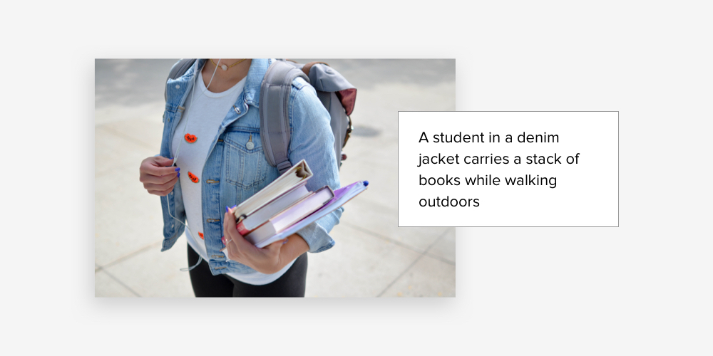
Write Alt Text for Images
If you’re not familiar already, alternative text – alt text, for short – is a brief description that makes it possible for visually impaired users to understand what’s happening in an image or graphic. The descriptions are often entered into the CMS when images are uploaded, so this is an easy step that content editors can take to make their site pages more accessible.
The best alt text descriptions are concise and purely informative. Since screen readers and other assistive devices notify users when they encounter a visual asset, there’s no need to start the description with a phrase like “an image of” or “a photo of.” You’ll just want to focus on explaining the content of the image.
Alt text examples could be:
- A group of students smiles and laughs around a table in a cafeteria
- Two girls work on laptop computers at a library table
- A first-year student waves to his parents from the steps of a dorm building
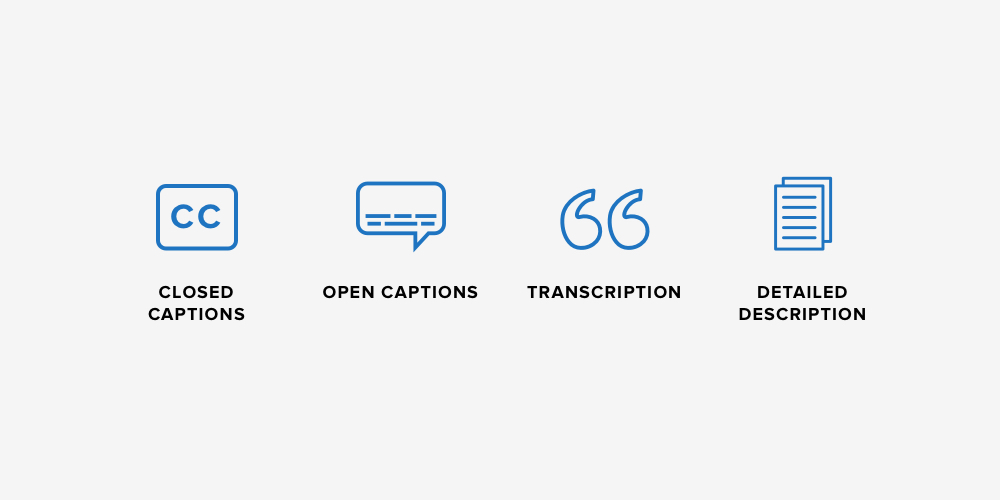
Supplement Videos With Captions & Descriptions
Like images, videos should be accompanied by additional descriptors for users who have visual challenges. You can approach this in a couple of different ways.
The gold standard is captioning. Closed captions can be turned on and off based on a user’s preference, while open captions are always visible. Given that many people choose to activate captions when watching without headphones or in public settings, open captions are a great option that can be implemented during the production and editing process of the video itself. Closed captions are a little more tricky to manage, but luckily, videos added directly from YouTube already have a CC button in place.
While captioning is ideal, it’s often dependent on your site’s video setup or the platform that you’re embedding from. If you can’t add captions to your videos, another way to improve accessibility is to pair each video with a detailed description and a text transcription (if available). This way site visitors can still understand key takeaways even if they’re not able to watch the video as intended.
For more guidance on creating accessible web content, check out our dedicated blog post: Web Accessibility ADA Tips, Examples, & Best Practices for Content Editors.
Best Practices and Examples of University Website Design
If you’re just starting a new website project – or even if you’re still in the website RFP stage – you’re in luck. You can shape your online presence to be accessible from the very beginning. This section will walk through a few design considerations that you’ll want to keep in mind as your project progresses.
Choose High Contrast Colors
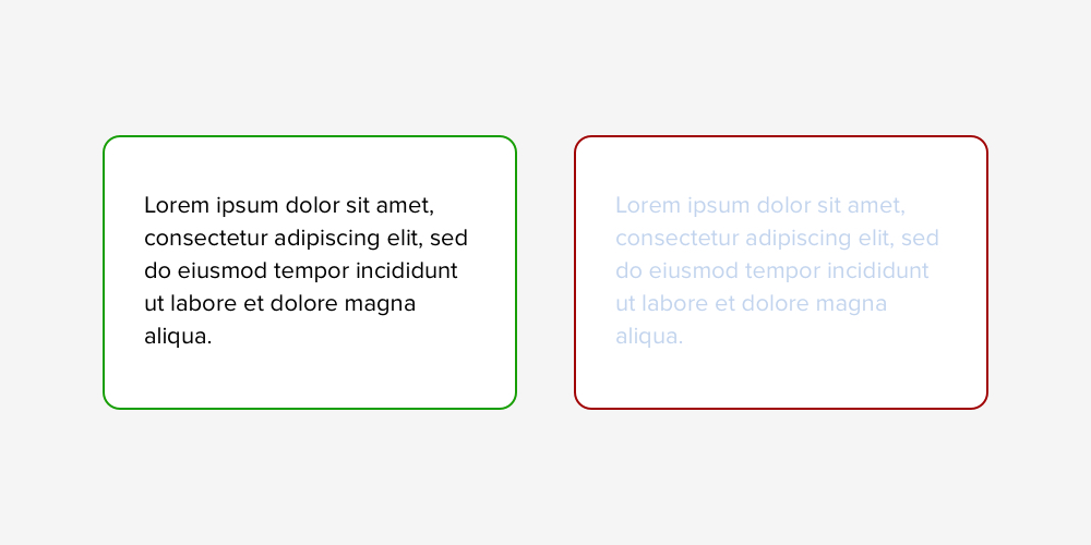
We’ve said this before, but it’s advice worth repeating: check and double check that the text is legible over the background color. The WCAG offers the minimum contrast ratio of 4.5:1. Designers can test this by entering two colors into an online tool like Web AIM’s contrast checker or Stark’s free contrast plugin.
While the ratio might not mean a lot to non-designers, it really just ensures that highly readable combinations like black text on a white background are prioritized over low contrast alternatives that might not be as visible for some users (think: yellow text on a white background, or white text over a pastel background).
But this isn’t to say that colored backgrounds or bright headings should be avoided. You can still incorporate school colors by selecting appropriate pairings of dark, mid, and light tones. Some schools have even addressed accessibility in their brand guidelines by providing acceptable combinations. If this is the case, let your designer know which colors are “safe” up front.
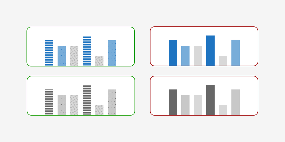
Strategize Around Charts & Graphics
Beyond text, you’ll also need to think about contrast when designing (or reviewing) any charts and graphics that will appear on the site. Color is a great tool for showing the difference between data points or categories, but it shouldn’t be the only distinguishing factor given that some site visitors might have limited perceptions of color. Adding patterns, textures, or varying line styles can help to make charts more accessible for everyone.
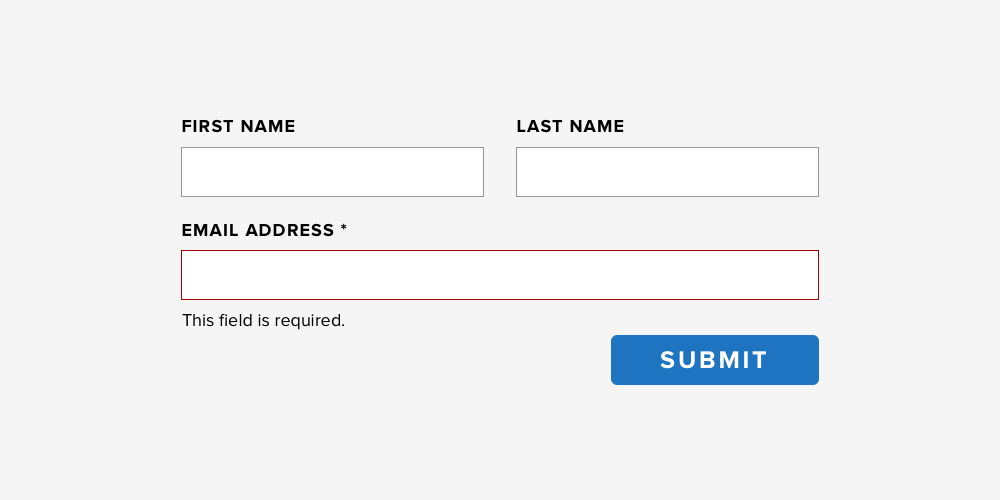
Design Forms With Visible Labels
On most higher ed websites, visitors can fill out forms to do things like request more information about the school, register for a tour, or connect with a member of the admissions team. Forms are an essential part of data collection, so they’re a necessary factor in the accessibility conversation.
As your designer creates form layouts, here are a few key elements to pay attention to:
- Identifiable Fields. Make it easy for site visitors to identify the form’s fields by using outlines and/or color. There should never be any doubt about where users should type their responses.
- Field Labels. Similarly, form labels should be clearly visible near the corresponding field. In-field form labels (the kind that disappear once you start typing) should be avoided.
- Intuitive Submit Button. Ensure that all responses are collected by creating an obvious submit button and positioning it at the end of your form.
- Clear Error Message. If the form contains required fields, make sure that the error message identifies missing information with complete clarity. The best error messages incorporate a visual indicator like a highlight or arrow along with a text reminder like “Last Name is a required field.”
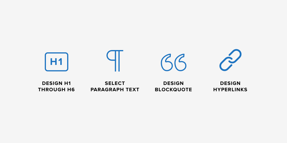
Create Elements for Content Editors
During the design process, your designer should also create the elements that content editors will eventually use to structure their copy. This includes selecting and sizing headings H1 through H6, styling paragraph text, blockquotes, dividers, and the appearance of hyperlinks and buttons. These are standard elements that almost all designers will incorporate by default, but it never hurts to reinforce their importance.
Read more about design considerations in our blog post, Best Practices, examples, and tips for ADA Accessible Web Designs.
Technical Considerations for University Website ADA Accessibility
While the most visible parts of web accessibility are design and content-related, equally important technical elements support the site behind the scenes. In this section, we’ll go over a few technical best practices for higher education website accessibility.
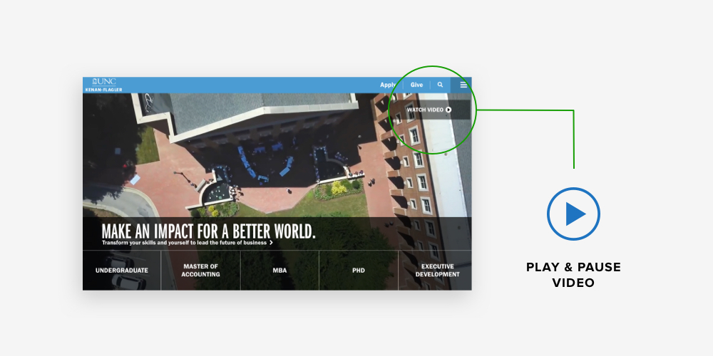
Add Controls for Dynamic Features
Slideshows, videos, and other moving features are a popular way to capture visitors’ attention and break up the monotony of text. However, these dynamic elements have the potential to frustrate site visitors who consume information differently or require extra time to take in what’s happening on the page. Developers can address this by adding user-friendly controls for playing, pausing, and moving between slides.
Confirm Keyboard Accessibility
Not all site visitors use a mouse or trackpad to click through content. Instead, many use keyboard controls to tab through pages and interact online.
As your site is being built, you’ll want to make sure that your developer is applying the features and navigation tools that will make your content keyboard accessible. This involves adding visual cues that show which element is currently selected (called focus indicators), planning a logical order for keyboard users to follow on each page, and testing everything to make sure that it all functions properly.
For more on keyboard accessibility, check out this in-depth guide from WebAIM.
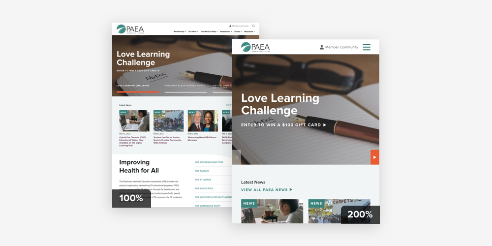
Test Browser Zoom
Per WCAG standard 1.4.4, users should be able to zoom in on any page up to 200% without having to compromise on content or site performance. This is easy to test – just visit your website, zoom in, and look for issues like overlapping text, unusable menus, and features that get cut off.
Ideally, the site should adapt as users zoom in. Image cards, multi-column content, and form fields usually stack up in a single column and menus often switch to their mobile version. Your developer can guide you through these decisions and build an experience that functions as smoothly at 200% as it does at a standard zoom level.
Accessible University Websites Always Win
These days, most colleges and universities have adjusted their environments to include thoughtful details like wheelchair ramps, elevators, braille tags, door openers, and accessible dorm rooms. These features recognize the unique and varied needs of a diverse student body, and they make room for all students to use facilities in a way that works for them. At the end of the day, creating an accessible online experience is doing the same thing, but digitally. Web accessibility is yet another way to highlight your school’s ongoing commitment to inclusivity.
And there are no downsides. Accessible websites can incorporate all of the high impact features that you’re looking for – from school colors to videos to polished layouts. They just do so in a way that’s mindful of the different ways that people access the web. Better yet, many accessibility best practices actually benefit everyone, not just people with disabilities. (I mean, who doesn’t like to breeze through long pages with anchor links!?)
While web accessibility can seem like a lot to take on, you can always opt to start small. Making minor changes like adding alt text to images or rethinking color-based charts can make a big difference to many site visitors. And then over time, you can reevaluate and expand your accessibility measures as your resources and budget allow.
Further Reading
This post is far from exhaustive, so we encourage you to read more about web accessibility by consulting the resources listed below:


Leave the first comment