McAdams

Crafting a Distinctive Website for an Established Engineering Firm

Founded in 1979, McAdams is a full-service design and engineering firm with 450+ team members and offices in North Carolina and Texas.

Known for their thoughtful approach to complex projects, McAdams has gained recognition for their large portfolio of work that includes substantial parks, commercial destinations, residential developments and more. Each project is shaped by McAdams’ strategic insights and deep knowledge across multiple engineering disciplines.

As the firm evolved over the years, the scale and sophistication of their projects outpaced the look and function of their website. It was clear that they needed to rethink their digital presence, and we were excited to step in as a B2B website design partner to guide the team towards a new and improved McAdamsCo.com.  Additionally, we're proud that this site was recognized by the Zweig AEC Marketing Awards as the 1st Place award winner for Best AEC Architecture Engineering Construction Website.  

Identifying Key Goals

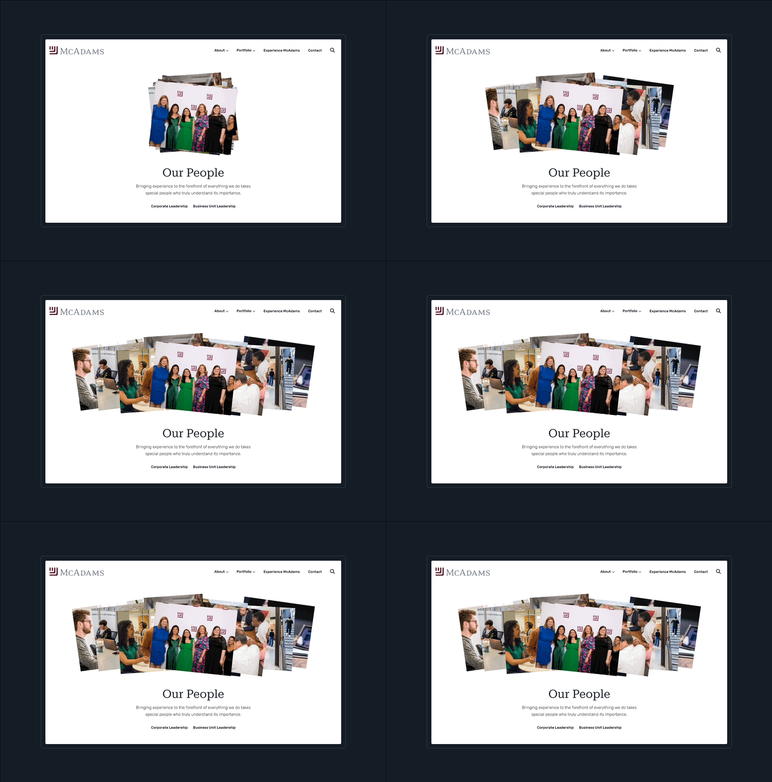
We kicked off the project by interviewing key stakeholder groups, analyzing performance data, and reviewing brand standards and desired design outcomes. In addition to being difficult to navigate and visually outdated, our main takeaway was that the site was missing a huge piece of McAdams’ metaphorical “special sauce” – the people.

We learned that the firm’s vibrant and empowering culture plays a big role in attracting new talent and enabling the innovative, high-quality work that McAdams produces. Showcasing professional development and related topics became a defining goal that would be woven throughout the site and laid out on a new page dedicated to the McAdams Experience.


Creating a Welcoming Homepage

Fresh. Clean. Bright. Exciting. These adjectives were key themes drawn from the discovery process that drove our approach for the site’s homepage. We focused on balancing minimalism and fun by highlighting featured work, services, and values with colorful hover states, video elements, and subtle animations.

Designed With Users In Mind

Like the homepage, the site’s interiors are thoughtfully designed to feature content and images in an attractive and user-friendly way. Standout features include filterable news and projects, interactive photo details, and deep case studies with dozens of custom options for displaying information.

For the firm’s Careers section, Experience McAdams, we developed a distinctive style to set the page apart from the rest of the site. In addition to a striking dark background, the page includes various interactive effects and a playful burst of confetti on page load.

Built on WordPress CMS, the site is primed for growth. Admins can use the intuitive content management system to add new portfolio pieces, publish news items, update team bios, and put together new pages that match the established styles of the site.  The "blocks" setup in WordPress allows the firm to leverage different designed elements across the site to help easily carry through the specifcially crafted details to different areas of the site as it grows.   

The site has been a success for the firm in its initial launch, being applauded internally and already making a difference for the firm's digital marketing efforts.  The site's performance metrics graded by Google vastly improved and immediately after launch there was a tracked uptick in Google impressions by 20+%.  In addition to the reimagined and polished design, the site took a big step forward in marketing performance.  

Related Architecture, Design, Engineering, and Construction Website Designs

NMC has worked with several other firms in and around the AEC industry and you can see related work and case studies for the KPF Architecture website design and Altitude Design website.