At NMC, we’re lucky to work across industries in a number of diverse verticals. We love the variety for a lot of reasons, but primarily because it pushes us to stay up-to-date on the trends, best practices, features, and tools that are unique to each industry.
In this post, we’re taking a closer look at the features that position CPA and accounting firm websites for success. Feel free to jump ahead with the shortcuts below:
- Elegant & Sophisticated Design
- Prominent & Intuitive Navigation Items
- Clear Verticals & Services
- Relevant News & Blog Posts
- Quick Contact Process
Elegant & Sophisticated Design
For CPA and accounting firms, it’s important to use design to quickly establish credibility and professionalism. This can be tricky online, since you can’t rely on typical factors like a polished office space or an in-person first impression to set the tone.
Instead, you’ll want to evoke the same feelings by translating your firm’s unique character into the fonts, colors, textures, and images that make up your website. For a more traditional firm, this could mean a combination of refined serif fonts, trustworthy shades of blue, and straightforward visuals. If your firm prefers to push the boundaries, however, you may lean into modern shapes, brighter accent colors, and other elements that communicate your particular approach.
The bottom line – be consistent. Your website experience should reflect the values and attitude that you project in person.
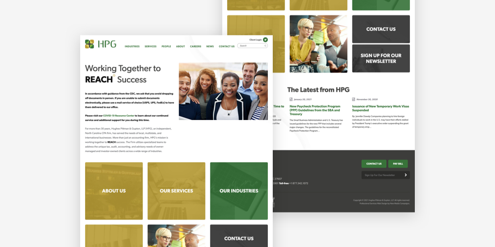
Take, for example, this CPA website that we created for Hughes, Pittman & Gupton. The site brings together subtle background watermarks, sleek sans serif typefaces, and engaging images – all while staying true to HPG’s signature green, gray, and gold color scheme. All elements considered, the design communicates that HPG approaches their work with a fresh and modern perspective that, while unique, still respects tradition and convention.
For more professional service website design inspiration, take a look at Twelve Common Features of a Modern Law Firm Website. Many of these features are equally beneficial for CPA and accounting firm websites.
Prominent & Intuitive Navigation Items
After forming an initial impression based on your site’s overall appearance, visitors are likely to look next to your content. This begins with the menus and buttons that guide navigation.
Make it easy to locate information with a prominent navigation system that visitors can’t miss. The easiest way to do this is by incorporating a top navigation bar with clear labels and user-friendly dropdown menus. Most accounting firms include menu options for Industries, Services, Our Team, About Us, News, and Contact.
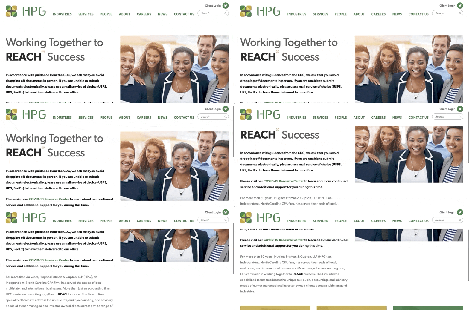
Hughes, Pittman & Gupton takes this a step further by utilizing a “sticky” nav bar. The bar is “sticky” because it stays at the top of the screen as users scroll down each page. Since sticky navs ensure that menu items are always visible, they’re a great option for firms looking to boost browsing efficiency.
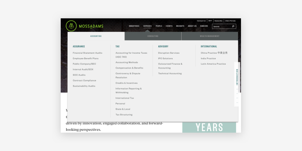
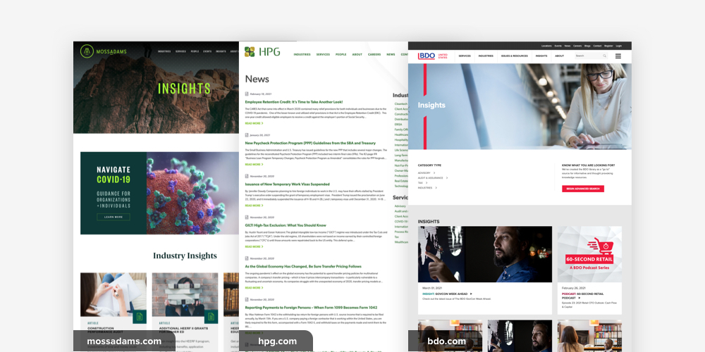
While we didn’t create it, we also love the tabbed Services megamenu used by Moss Adams. The menu’s neat organization offers direct paths to each of the firm’s many practice areas without overwhelming site visitors.
Clear Verticals & Services
Site visitors are likely coming to your website to determine whether or not your firm is a match for their needs. Thus, you’ll need to clearly outline the verticals that you work in and the services that your firm is equipped to provide to clients.
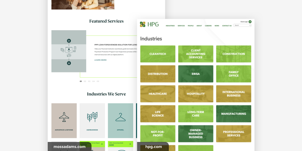
Many CPA and accounting firm websites introduce industries and services on the homepage. Depending on the look and feel of your site, these items can be displayed as a list, slides, image tiles, or icon blocks – there are plenty of options to fit every aesthetic. In addition, each industry and service should have a dedicated interior page (like this industry page from HPG) that offers more information about the topic.
We like how Moss Adams highlights services and industries on their homepage with an interactive slider and user-friendly icon tiles.
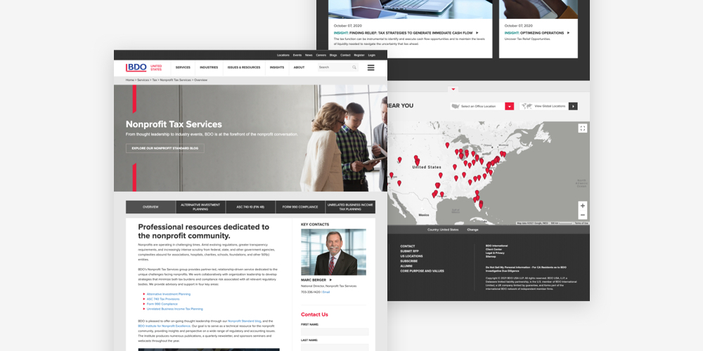
Industries and Services pages are also a great place to highlight related team members, relevant news articles, and client testimonials or case studies. Building in-depth content about your offerings emphasizes your expertise and makes it easy for visitors to understand your firm’s capabilities. Global accounting giant BDO utilizes this approach by including key contacts and featured insights on each Service page.
Relevant News & Blog Posts
Many CPA and accounting firms choose to deepen their websites with a News or Blog section. This is a good idea for several reasons:
- Proving Expertise. Sharing knowledge about your industry proves that you have it in the first place. Show off a little! News or Blog posts are a great place to break down complex topics, offer opinions on controversial issues, and outline the strategies that set your firm apart from the competition. Regular posts about industry developments also underscore your team’s commitment to keeping up with the most current standards and best practices.
- Providing Helpful Resources. Free insights are always appreciated, especially when they offer clarity about topics that can be confusing to non-experts – like taxes and accounting. High quality content is genuinely helpful not only to existing clients, but also to other visitors who stumble across your website online.
- Search Engine Optimization. And speaking of attracting new site visitors, a wealth of News or Blog content can help your site to build organic traffic over time. How? Google ranks websites by evaluating their authority, quality, and overall strength – much of which is determined by assessing the site’s content. So, if your News and Blog posts consistently demonstrate that your firm is a reliable source of information, Google is likely to take notice and boost your ranking for the relevant topics.
To learn more about SEO and professional services websites, check out our SEO case study for law firms.
Quick Contact Process
Even if your website has a top-notch design, the most intuitive interface, and an abundant library of high quality resources, it won’t do much for business if site visitors can’t connect with your team. Strong CPA and accounting firm websites – and all websites, for that matter – sprinkle contact information and interest forms throughout their content to ensure that visitors are never left searching for a way to take the next step.
The most common ways to direct visitors to contact information are:
- Placing a Contact button in the main navigation bar (you’ll see that all of our examples include this)
- Listing your physical address, phone number, and email address in your site’s footer
- Placing contact forms on the pages where visitors are most likely to convert, like service or industry pages
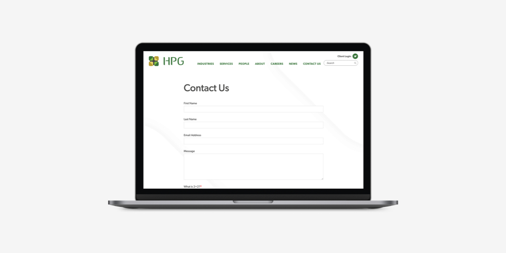
As for the contact forms themselves, we recommend keeping it simple – gather the information that you need without adding unnecessary questions and additional fields. You can always ask for more details later on. Brief forms are unintimidating, efficient, and approachable.
Conclusion
By spending some time thinking through your site’s design, content, and features, you’ve already begun cultivating a digital experience that will differentiate your firm online.
Looking for a partner to bring your plan to life? Reach out to us and we’ll work together to build the website that will take your business to the next level.



Leave the first comment