At NMC we’re always on the lookout for new programs and tools to aid our design process. We all made the switch to Sketch a while back and we dabble in new prototyping tools every now and then. When Adobe released a preview download of Experience Design (XD), their new all-in-one UX design tool, we knew we had to try it out too.
What We Love
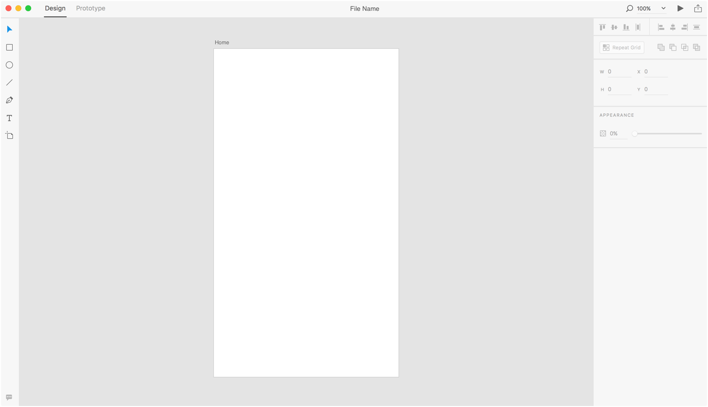
- The Interface. In XD you get the great UI design that you expect from Adobe. The interface is very minimal with simple icons and a light gray tone throughout. Within the first few minutes of using XD we all felt completely comfortable with the tools and interface because most features work similarly to Sketch and other Adobe programs.

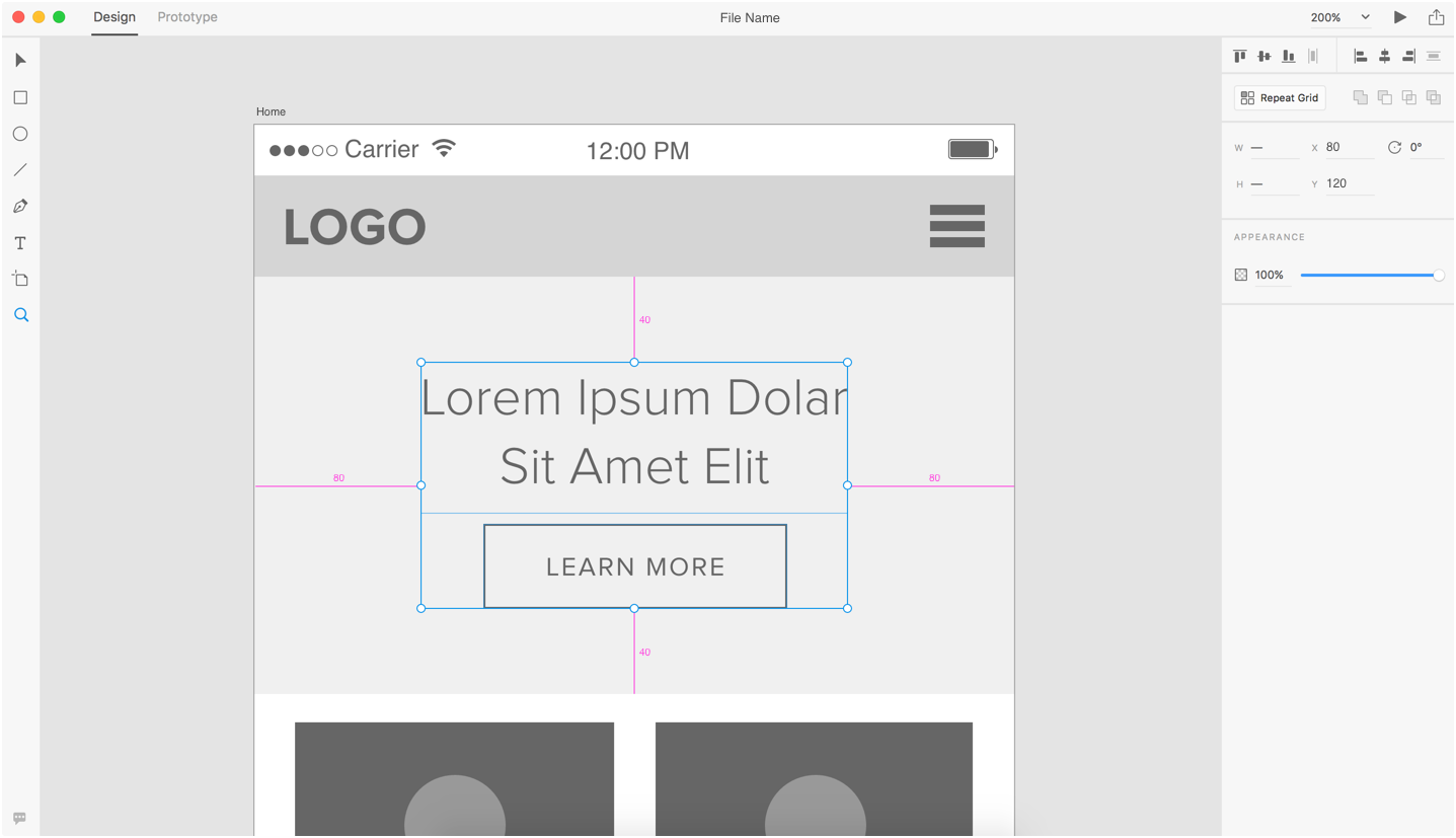
- Spacing and Distribution Tools. Us web designers love Adobe's smart guides tool because we need our designs to be pixel perfect. Adobe XD includes smart guides as well as even more features that make it easy-peasy to precisely align objects. Along with the smart guides, the object can snap to the artboard center, snap to the side of another object, or evenly distribute itself between already defined spaces on the artboard. This will be helpful in ensuring similar items have the same distance between them, making measurements like padding and margin uniform. Another new spacing feature is pixel-perfect measuring. When an object is selected you can hold down the alt/option key to see that objects pixel distance in relation to it’s artboard as well as other objects around it. Another great feature for designer-developers!

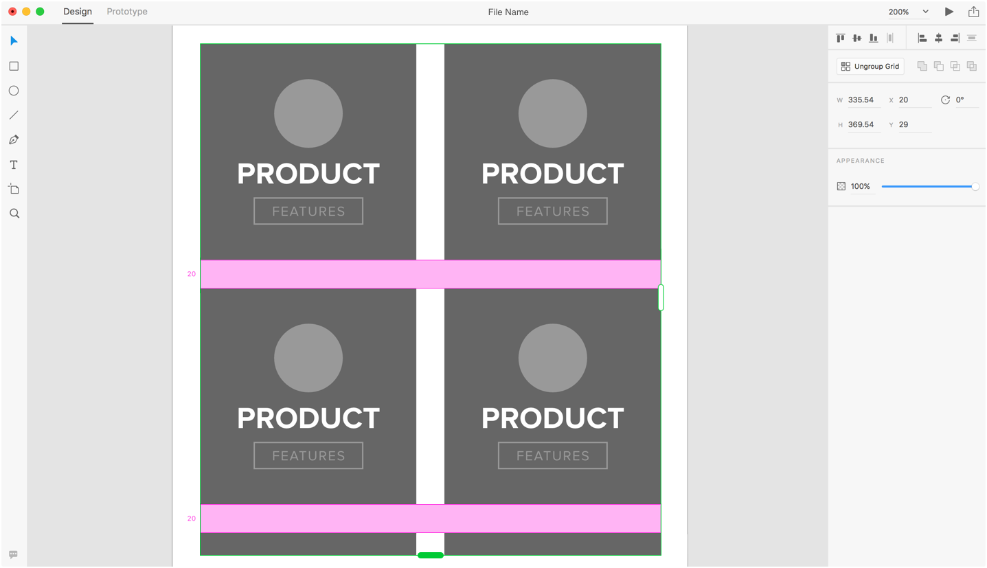
- Repeat Grid. We all shared a big “woahhh…” when using this feature for the first time. The repeat grid feature allows you to select any item or group of items and replicate them horizontally and/or vertically with a quick click and drag. You can then edit the items individually if they need to have minor differences like color or text changes. This will save loads of time when mocking up elements like blog listing pages, photo galleries, and action centers.

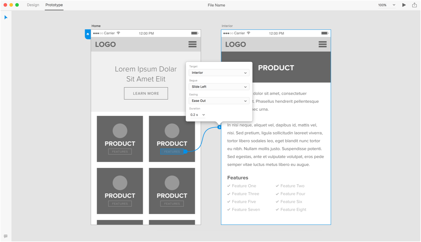
- Prototyping. Prototyping your designs is a way to ensure that your client and your team understand the flow of a website or app. There are many great resources for prototyping, but working in yet another program is another step that can add time and be out of reach for many projects. The addition of prototyping into XD is a quick way to show flow and interactions on designs and wireframes without even leaving the app. Currently, XD prototyping only has a few page transitions, but we hope they add more features along the way.

Looking Ahead
It’s too early in the game to list out any cons since the program is still in beta. There are definitely many features that were missing like blend modes, layers, hover interactions in prototypes… the list goes on, but every update brings new features. You can check out their feature request forum to see what’s in the works and even add your own request.
With the simple interface, the support and team of Adobe, and the addition of prototyping within the app, Experience Design could make serious waves in the web and UI design community. We’re looking forward to seeing how the app continues to progress and are excited with the direction it's heading in!


Comments
Jose
Nice review :) I heard some time ago about Adobe XD but never had the opportunity to try it, I'm looking forward to try it!Leave a comment