Several years ago, our team switched away from Photoshop to start using Sketch as our primary web design tool. It has been a great transition for us. We love the lightweight nature of the platform ability it has given us to work better, faster.
One of the many cool features in Sketch is the ability to create libraries. A library is essentially a master sheet of symbols that can be used across all of your Sketch files. The most common use of a library is creating design systems for single projects that a team will be collaborating on. This is a lifesaver for maintaining consistency with small changes like color or text size, because when one library element is changed it updates everywhere it's used.
We’ve also found that Sketch libraries can provide quick access to frequently used UI elements across all of our designs, project-to-project. In our base elements library we have all of our commonly most used icons, elements, blocks etc. at our fingertips.

As you can imagine, Sketch Libraries are a huge timesaver overall and also allow us to have different designers work on the same project without sacrificing consistency and polish. Here are 5 ways that we use Sketch libraries to optimize our workflow:
1. Frequently Used Icons
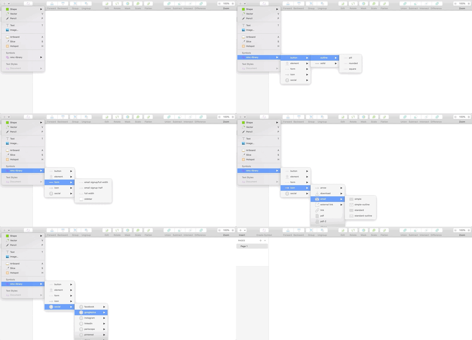
In almost every design we use a search icon, an email icon, and often things like an external link icon, a PDF download icon, etc. Though every one of these icons are customizable to match a certain aesthetic, the underlying fundamentals of them are generally very similar. Because of this, we've added these standard icons in solid and outline styles to our library. If we end up wanting to tweak an icon a bit, we can just “detach from symbol” so that it’s editable and no longer connected to the library.
2. Social Icons
Depending on the project we like to display social icons differently, so the library includes all common social icons with either no background, a square background, or a circle background.
3. Buttons
Most buttons on the web have the same basic design: a rectangular block with text centered on top of it. Our button library has a variety of styles such as square corner, rounded edges, and outline to choose from. After dropping these into a layout we detach it from the symbol so that we can apply color and change the font to match the design.
4. Small Blocks
Our frequently used elements aren't always small items like icons and buttons, sometime they’re larger, designed blocks on the site. Examples of small blocks would be the standard call-to-action block that includes an icon, heading, sentence of text, and button or a stats block that includes a large number/percentage and sentence of text. We use blocks like this often, so it's nice to have them already made and ready to drop into a design for customization. Having these at our fingertips allow us to spend our time, thought, and effort around the design details to make these blocks standout rather than on the basics.
5. Forms
Forms can be time consuming to create from scratch and when used for blocks like email sign ups, they often look very similar. Because of this we use libraries to drop in these forms with one click.
Learn how to create Sketch libraries to optimize your workflow and maintain consistency across designs, and let us know how you put them to work in your process!


Leave the first comment