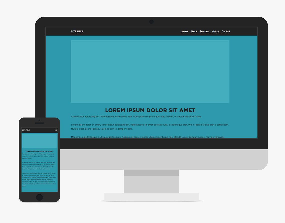
A header bar with the logo in the top left and navigation items on the right is a common pattern in website design. Over the years it is one that I've seen it often enough that I have settled on an approach for implementing it. The result is some simple html/css/js that works for a variety of designs that fit this pattern. It works great on devices of all sizes. (Check out the final result here on CodePen)

A goal in putting this together is for the HTML to be very simple and descriptive. This is the skeleton of what you need:
<header id="header">
  <div class="container">
    <h1>Site Title</h1>
    <nav id="nav">
      <ul>
        <li><a href="#">Home</a></li>
        <li><a href="#">About</a></li>
        <li><a href="#">Services</a></li>
        <li><a href="#">History</a></li>
        <li><a href="#">Contact</a></li>
      </ul>
    </nav>
  </div>
</header>
The CSS for the header comes in two parts and is slightly more complicated. It is possible to implement this as either a fixed, sticky header, or one that stays at the top of the page as you scroll. For the purposes of this post, I've implemented it as fixed. I've also eliminated non-interesting css like text colors so that the important parts stand out. A link to the full project is at the bottom of this post.
The first part of the css is for the menu at desktop resolutions. If I had a graphic logo instead of text, I prefer using an <img> tag instead of a background image. This makes it easier for people to right-click and download it if they want to use it somewhere. Additionally, it's easy to support retina resolutions by scaling the image (since background-size isn't supported in still-used versions of IE).
#header {
  z-index: 2;
  position: fixed;
  width: 100%;
  height: 60px;
  line-height: 60px;

  h1 {
    position: absolute;
    top: 0;
    left: 0;
  }
}
#nav {
  position: absolute;
  right: 0;
  ul {
    li {
      float: left;
      a {
        display: block;
        padding: 0 10px;
      }
    }
  }
}
I then set up a media query to handle the header and navigation at mobile resolutions. When setting up your mobile navigation, it's important to be thoughtful about which devices you include. I don't believe in serving mobile navigation (or mobile sites) to iPad users. Since the release of the device, users have expected the ability to navigate "full" websites. Directly clicking menu items is preferable to opening a menu and then clicking an item when space allows it. The next important cutoff are 7" Android tablets which generally fall at 600px. I try to serve these desktop sites whenever possible as well.
To set up the mobile navigation, I first code it as if it had already been opened. I then worry about toggling its state later. To illustrate this, I put the "transition" code separately at the bottom.:
#nav {
    width: 100%;
    top: 60px;
    &:before {
      content: '\2630';
      display: block;
      position: absolute;
      right: 3%;
      top: -50px;
      line-height: 40px;
      cursor: pointer;
    }
    ul {
      background: #222;
      width: 100%;
      li {
        float: none;
        a {
          padding: 10px 3%;
          line-height: 20px;
          border-top: 1px solid #333;
        }
      }
    }
  }
  // Transition
  #nav ul {
    transition: 350ms;
    transform: perspective(600) rotate3d(0,0,0,0);
    transform-origin: 50% 0;
  }
  #nav.open ul {
    transform:  perspective(600) rotate3d(0,0,0,0);
  }
Here is what this CSS does:
- It hangs the navigation below the header bar, exactly.
- It uses a css pseudo-element for the menu button. This is pushed back up on the header bar.
- The floating is killed and each menu item is made a block element. (For touch targets, it's best to have at least 40px to work with)
- The menu is then 'hidden'. When the "#nav" block gets the "open" class, it is shown.
The nice thing about this setup is that the two states (open/closed) are fully set in CSS as is the animation between the two. Here I am using a 3d perspective effect. This is perhaps flashier than some sites call for, but it performs well since it is hardware-accelerated and because it places the nav in the z-axis, the CSS doesn't need to know how many menu items are in the html. That is a handy feature for client-controlled CMS-driven sites. (There are other solutions to that problem like animating max-height, but having hardware acceleration is nice)
So the last step is the javascript that toggles the class. If you've got jQuery on your site this is a breeze (if you don't, that's fine too, we're just toggling a class):
$(function(){
  $('#nav').click(function() {
    $(this).toggleClass('open');
  });
});
A nice feature of having the click event on the entire #nav block instead of just the button is that when you click a link, the nav will close while the next page loads, making it seem more fluid.
This simple structure can serve as a basis for a variety of designs. You can check out this project here on CodePen or if you've got any questions or comments leave them below!


Comments
Jan
Hi Joel,Thanks for this nice example. I would like to use it on my website. I understand that this a relatively old post. Did you or someone else update this menu, is it still useable? If so, can you tell me how to make it work without the complete jquery library, but with just a small piece of javascript?
Jordan
To anyone wondering how to prevent the menu from opening when clicking or tapping below the header bar:You have to stop event propagation to prevent bubbling in the DOM, like so..
$('#nav').on('click', function(event) {
$(this).toggleClass('open');
event.stopPropagation();
});
In addition to that, you want to be using the .on() method and pass it the event handler you are detecting as it's first parameter instead of using .click(). This way you can set the element to .off() when it doesn't need to be used (eg: when you're using the website in desktop mode). Read all about .on(), .off() and other event handlers on the official jQuery documentation: http://api.jquery.com/category/events/event-handler-attachment/
apripuppey
i have the problem at the #customnav, when i click somewhere below my menubar (i.e i put an image with a link inside it below my mobile menubar and want to click the image ) it triggers the menubar to open instead of hitting my image link, how to solve it? i tried to use the z-index to the #customnaw but nothing happened. Sorry for bad english before , cheersTom
nevermind! I fixed it by adding z-index: 2 to the header in the media query sectionTom
Hi there, I know this is an older post but I'm hoping someone might be able to help. I'm using this header for a school assignment, everything is working except the page links don't work once the responsive dropdown menu is activated. They work fine on desktop, and I see nothing in the "a" tags change in developer tools when changing browser widths. Any ideas?Web Design
I got overflow part x-axis. I want to disable it and avoid scrolling on x-axis;Mike
Note that the some CSS is missing for the mobile menu:#nav ul - add a display: none;
#nav.open ul - add a display: block;
Without these additions the menu always shows and the toggle button does nothing. This same issue affects the Codepen demo.
b3nk3
Hi, it is a neat solution, the only problem I have is, if I have a long menu, which is bigger than the viewport, i cant scroll the menu, even if i set height 100% and the overflow y:auto overflow x: none.have you got any solution for that?
sergey
nice and compact but I did not get where do uave the indication that ul is inline why is it display:inline;block;I am using a macbook safari on a mac 10.5.8
Dnyanesh Pawar
Nice introductory blog.. Really helpfulWim Rijnders
Thanks for sharing. I really like your solution with the menu button for the small dimensions, simple yet lovely.I would like to be able to use submenu's, could you share your thoughts about how to implement these?
Leave a comment