I recently upgraded to a MacBook with Touch Bar and was instantly curious about how the touch bar would (or would not) change my designing experience and workflow.
The touch bar is a row of controls that change functions depending on which app you have open, which allows for more customized options than the standard functions bar. Design programs like Sketch, Adobe CC programs, and even Text Edit have all customized the controls that are available in the tool bar when that program is in use.
For the past several years at NMC, our agency has used Sketch as our primary web design tool, and we really enjoy it. So, this post is going to focus on how the new touch bar impacts my workflow with Sketch.
The Touch Bar in Sketch

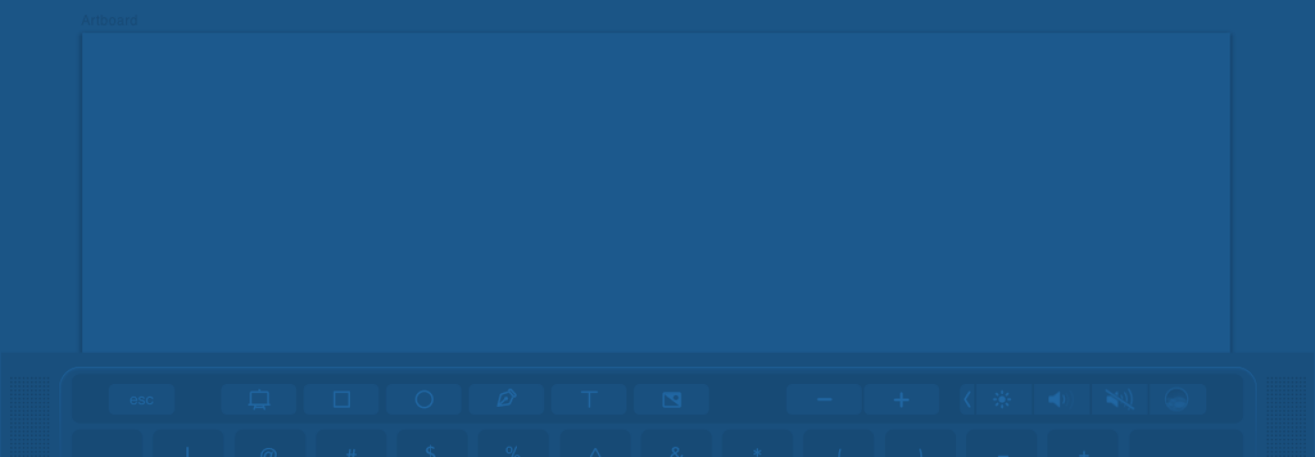
Above is what the touch bar looks like when you open Sketch. It has buttons for creating shapes and text, adding images, and zooming. (The four buttons to the right are stationary system-wide controls.) If one element is selected, the touch bar changes to show tools like color, rotate, and flip. When multiple elements are selected, it changes to show tools like boolean operations, group, and align. So, as you're working, the touch bar is always changing to show tools that are most relevant to what you are doing at that very moment.
Now, I'll touch on a few of the Sketch touchbar functions that I've integrated into my daily workflow. Note that there are quite a few functions that also have a keyboard shortcut, which is easier for me to do than moving my hand up to the touch bar:
Align
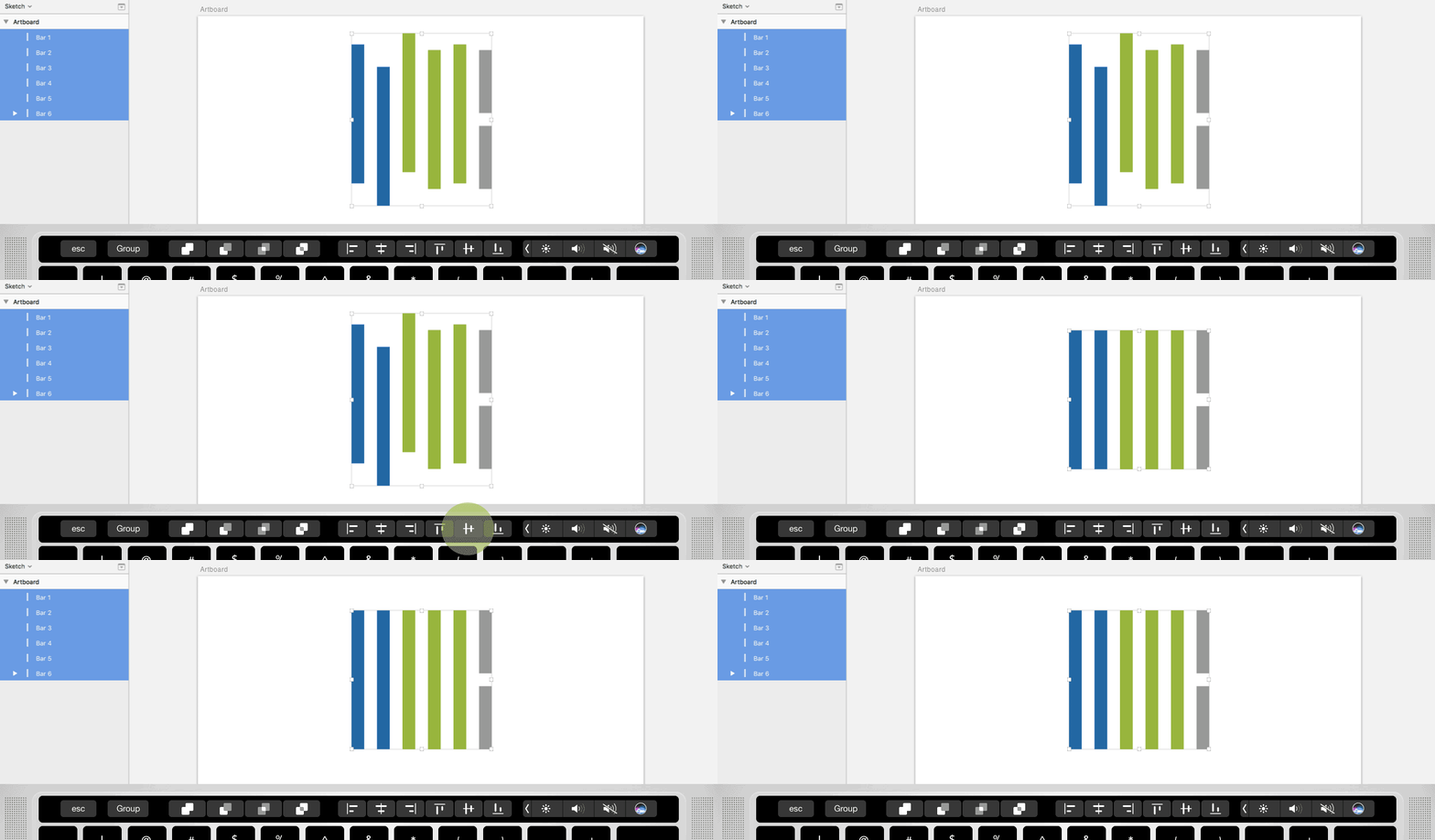
The align tools in Sketch are also located at the top of the right toolbar, so they are always accessible. I have found that using the touchbar for aligning items can be a bit quicker since it's just a simple tap rather than moving the pointer to the toolbar and then selecting the correct align tool.
Boolean
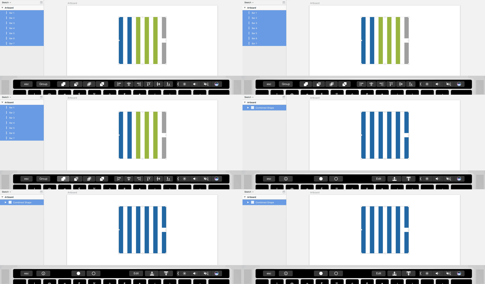
Also known as the ‘pathfinder’ tool in Illustrator, I use this tool a lot to create vector shapes. Similar to Align, these tools are also located in Sketch's top toolbar, but I've found that just tapping the touch bar with my left hand is quicker than moving my mouse up to the top toolbar.
Group/Ungroup
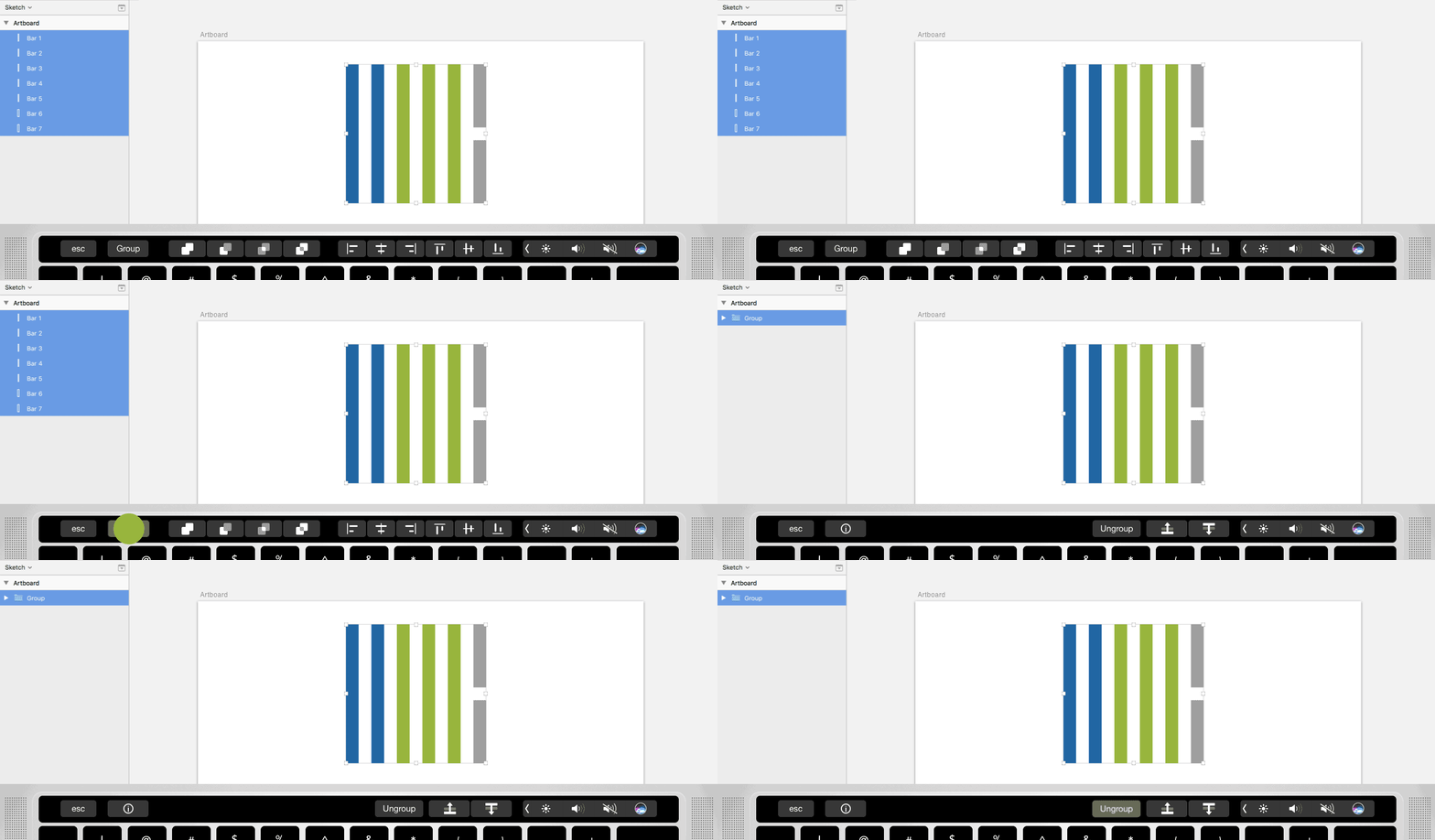
This is as simple as an on/off toggle button. Super quick and easy to access.
Flip
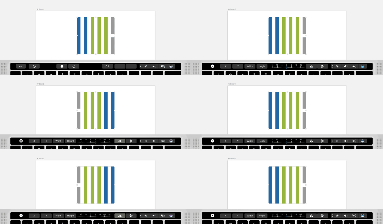
Previously, my go-to way of reflecting an item was to right-click on the item, scroll down to ‘Transform’, and then choose the flip selection. For me, all of those steps are tedious and clunky when I'm working fast. There have been many, many times when I’ve scrolled too little or too far and clicked the wrong option, throwing off my flow.
However, with the touch bar, reflecting items takes only two quick taps. Less clicks and no scrolling through toolbars; I’m all for it!
Rotate
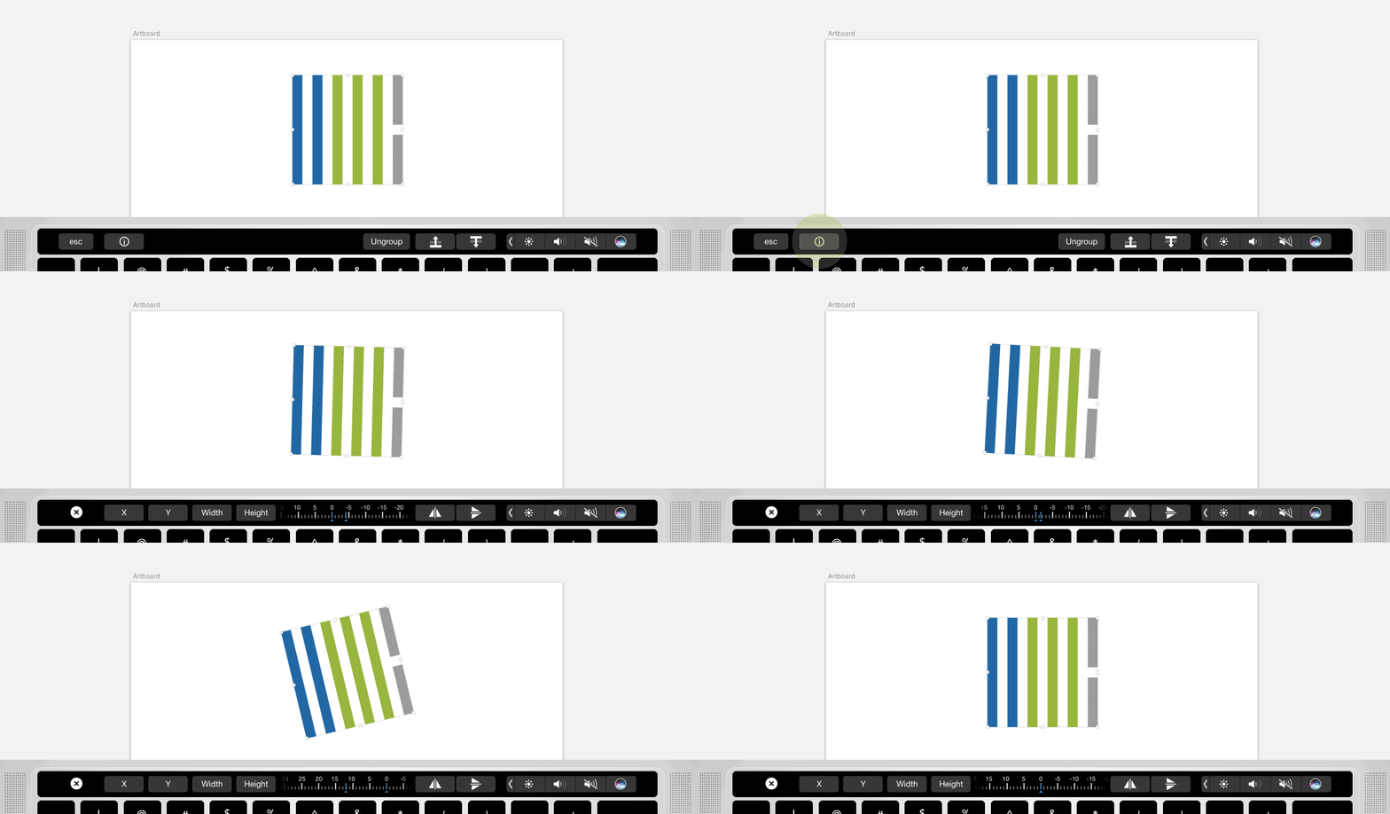
To be honest, I don't use this function very often because I find the keyboard rotate controls easier, but the slider in the touch bar is pretty fun to use!
Conclusion
After working with the touch bar for a few months I can say that it does provide easy access to a few of my most-used tools that were previously buried in dropdowns or right-click toolbars. It makes my design process a bit more efficient by trimming seconds off of quick tasks like grouping, aligning, reflecting, or rotating design elements. However, I don’t see it revolutionizing my workflow and cutting my design time in half, since there are also keyboard shortcuts that do many of the things that the touch bar can do. Either way, the touch bar is a cool tool added to my design process, and I encourage you to give it a try and see how it works for you!



Leave the first comment