At NMC, we wireframe 99% of our projects. While we have arrived at some great results by going straight to the creative design, we've refined our process over the years to now start with wireframing as the first step. We've found that starting with wireframes has consistently resulted in better websites with a smoother overall process.
Why Wireframe?
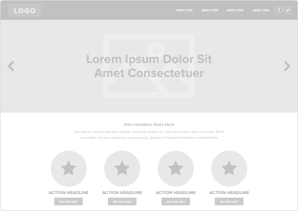
For those who are unfamiliar with the concept, wireframes are grayed out layouts that show our recommendations for the elements to be included on the design and their relative prominence within the site. The wireframes don’t convey any actual design details as they generally just consist of gray boxes, but they are aimed at just presenting the layout of different features. There are a few reasons we find this step to be helpful:
- The grayed out appearance of a wireframe makes it easy for the client to focus on layout and structure without being distracted by colors or copy.
- It gives us a chance to provide the client with several very different layouts to choose from. If they scrap a wireframed layout idea, the loss is significantly less than if it were a fully designed layout.
- Designers are free to fully focus on user experience and flow before choosing typefaces, colors, images, and other design elements. If a design looks great, but doesn’t work well, it isn’t a success after all.
- They can be iterated on quickly. If the client has any significant changes or wants to combine elements from different versions, we can implement them on the wireframe much more quickly than revising a design since there aren't any creative details to fit in.
Why Make a Wireframe Kit?
Even with all of those benefits, creating new wireframes from scratch for every project can quite literally be dull (gray) after a while. Making elements in new documents over and over again can get monotonous and use up time that we could be using to get creative on fleshed out designs. To speed things up, we often found ourselves opening up old wireframe files to pull from, which works but can be also be inefficient and counterproductive. We knew we needed a resource to make the wireframing process more efficient and since our site designs often include similar elements like news feeds, call out sections, etc, we decided to make our own wireframe kit.
Yes, there are hundreds of wireframe resources on the web, but we haven’t come across one singular kit that includes every element we need, plus we wanted our wireframes to have a consistent look and feel to them. So, instead of downloading various kits, we built our own cohesive kit that includes common features used often across our designs.
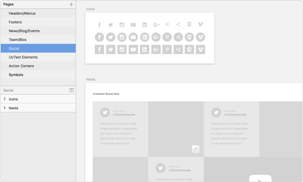
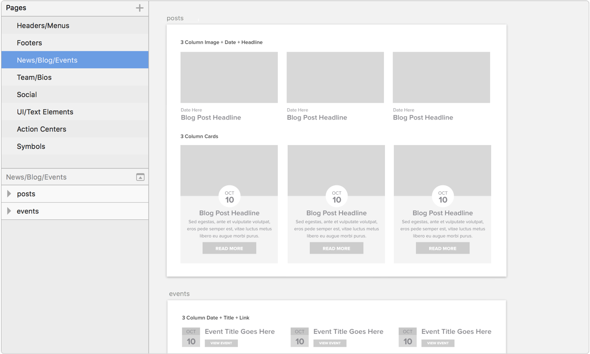
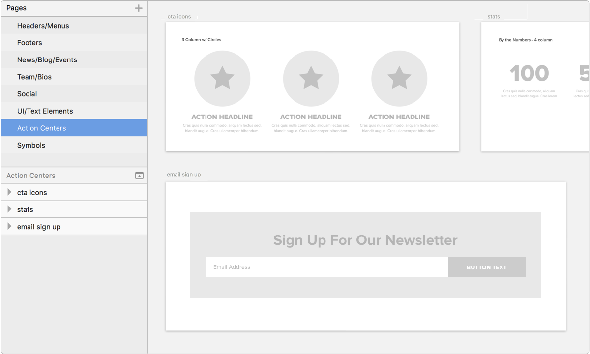
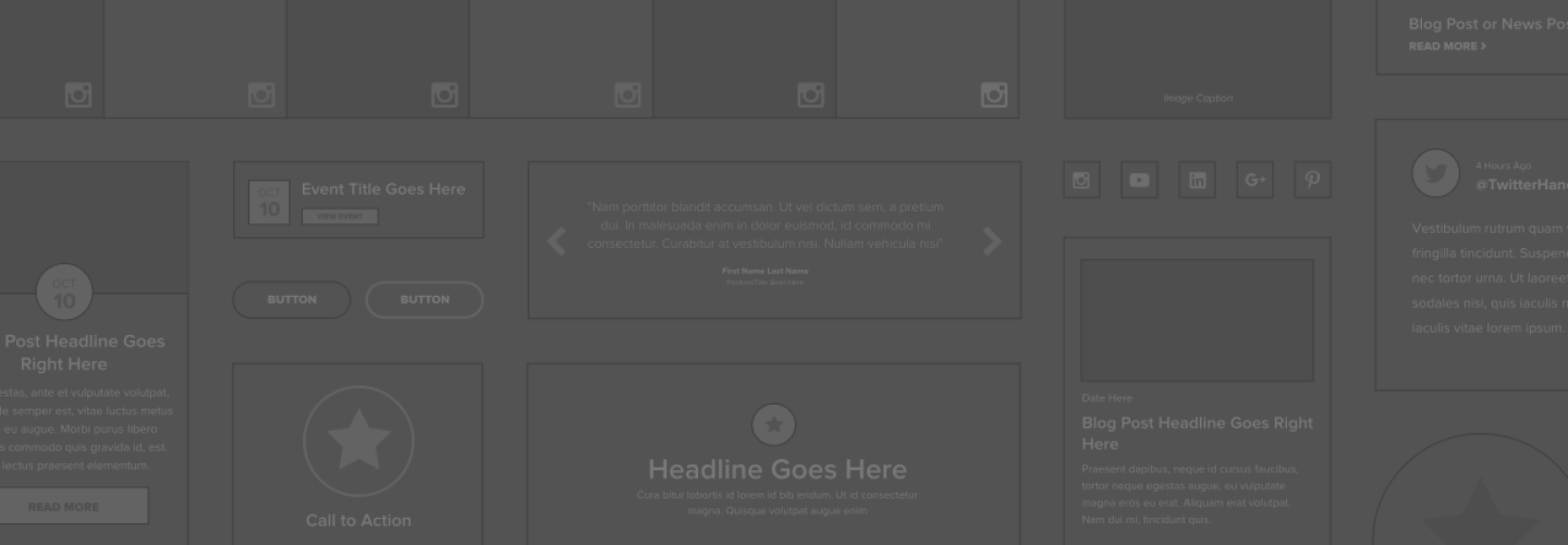
Since we design exclusively in Sketch, we’ve created a Sketch document with several pages of wireframe elements from social icons, to headers, to news feed layouts. This document is always open alongside new projects for easy access to the layout elements we need. Obviously, for many sites we’ll change up the elements a bit, but we've found this is a really helpful and valuable starting point. Using our kit, we can reuse elements over and over on different sites, customize them for that specific site (e.g., add a thumbnail image spot), and turn around consistently polished wireframes. It has improved our process and our work.
Take a peek at our wireframe kit Sketch doc:
Results
As a result of using this resource in the wireframe stage we now have more time to create innovative layouts and our wireframe elements have a consistent look across projects. Additionally, this process has freed up time to be dedicated to the design stage, giving us more time to really push it and create polished designs and layouts that have great usability. Our first leap was incorporating wireframing as a core part of our creative process, which we highly encourage you to try out if you're not already. Next, was building tools around that process to make it more efficient and effective. If you have your own process or favorite wireframe kits, please feel free to share in the comments!


Comments
John
I think making a wireframe kit is very good to those who wants to have a simple and sleek design while the contents are shown in a formal fashion. The impression I got from a wireframe kit is that we can focus primarily on designing the appropriate layout for our sites.Leave a comment