Highlights from the Latest Update
Everybody’s favorite UI design app just got a big update! It’s only one tenth of a version but 3.1 packs in a ton of useful new features (you can also check out our list of the best Sketch plugins to enhance your design process even more). The release notes feature a ton of substantial changes but I want to cover a few of the highlights that make a huge difference in daily workflow.
Images
Two new commands: ‘Replace’ & ‘Original Size’
Images exist as layers, like any object in a Sketch document, though as layers you drag or place in the canvas. And like all layers you can apply all the same treatments like strokes, drop shadows, blurs, and more. Now with Sketch 3.1, you can now replace the contents of an image layer with a new image so that you don’t have to recreate those layer effects.
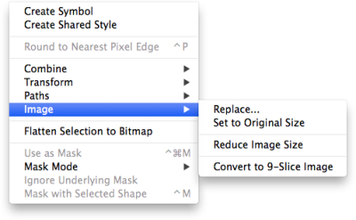
This is really handy because in practice if I have, say, a hero image with effects on it and the client changes her mind, I don’t have to delete it and then try to remember what opacity level, blend mode, and color adjust I had on the image. I can just go to Layer › Image › Replace, pick the new one from the file inspector, and boom: new image with identical effects.
It’s true you could create a new layer style to save the lot of them, name it, then apply it to the new photo that you dropped in. But not only is it an extra step but I found it a little awkward since layer styles are really about saving a collection of layer effects in order to re-use them on multiple objects. Makes less sense when it’s a single use case.
But! That’s not all that’s new about images in 3.1. Sketch now remembers the original size of an image that you’ve placed so that no matter how many times you re-size it, you can always revert back to the original size. Simple menu command at Layer › Image › Original Size.
Pages Panel
Now a permanent UI panel
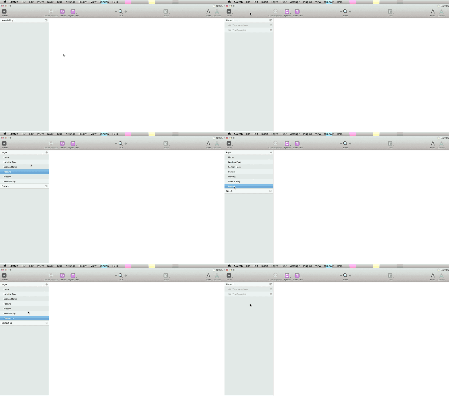
This is a small one but the Pages panel — previously a popover — has now been redesigned with a permanent UI. Hidden by default, you can click the little down arrow to see each page and now it’s easy to drag & drop layers from the current canvas to move objects quickly between pages (which used to be a pain).
Rulers
Previews and performance
Rulers in Sketch have always baffled me a little bit so I’m glad to see them get some love in the 3.1 update. Each artboard has its own “zero-point” origin, relative within itself, which of course makes sense (especially for laying out rulers and grids). But I keep surprising myself whenever I click off an artboard into the “infinite canvas” and see that there exists an absolute origin which arranges not only individual objects but the art boards themselves. I guess the confusion stems from looking at the “Position” fields in the inspector and mentally mapping them to numbers in the ruler.
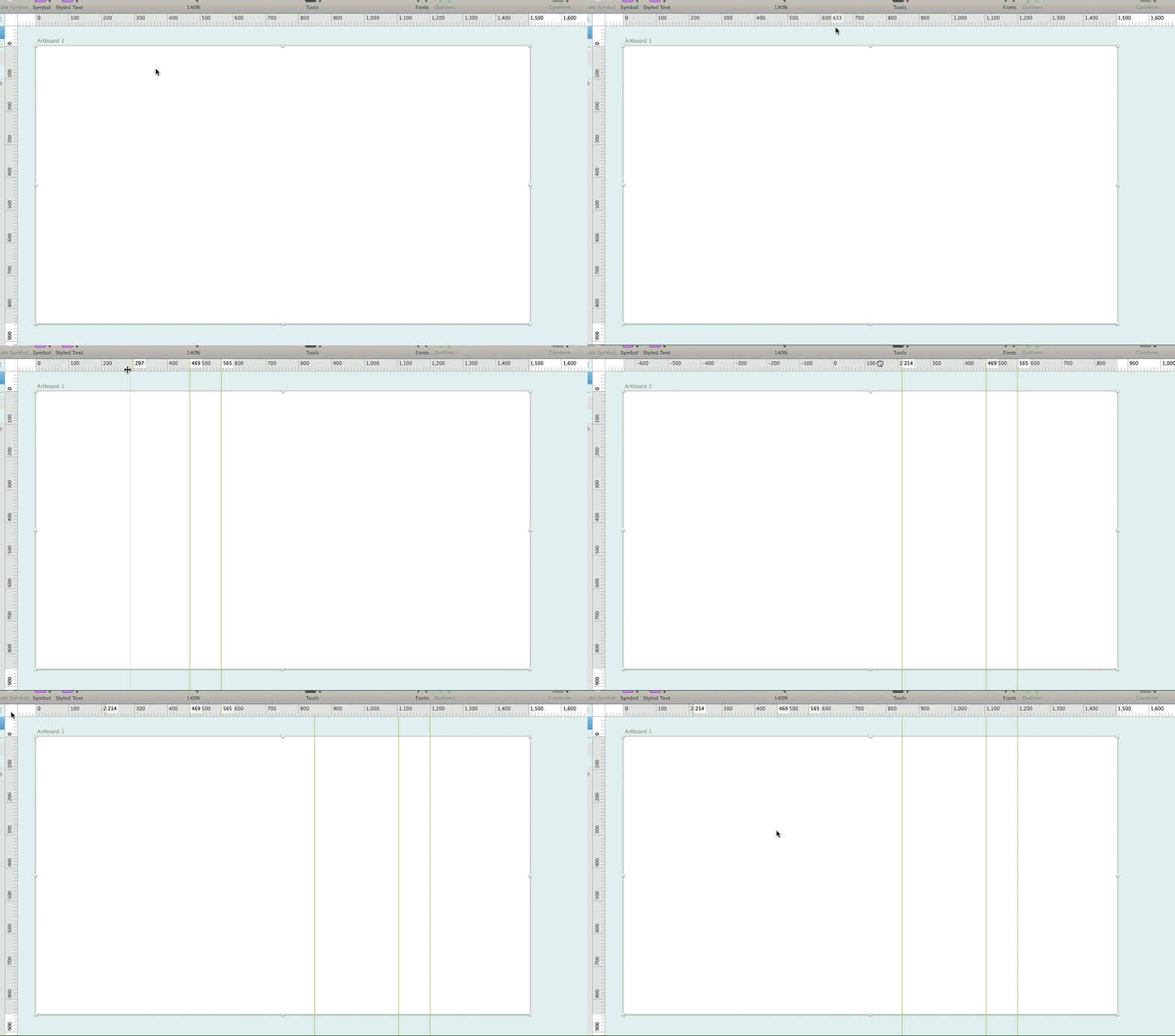
The new rulers and layer (or “smart”) guides are much easier to use. Not only can you add guides with a single-click, but simply by hovering over them you get a quick preview of where your next guide will go. Really great for quickly checking if layers align. Best of all — yay old Fireworks habits! — double-clicking the “ruler intersection area” (where the horizontal and vertical rulers meet at top left) resets the origin. Handy if you accidentally grab and drag the ruler.
Also? Rulers are much snappier performance-wise.
Text Editing
Better snapping and easy re-sizing
There’s no graphic design without words so it’s crucial that any drawing & UI software handle text well. Originally, Sketch’s handling of text was a bit, shall we say, sketchy (… sorry) and unreliable to the point of being unusable for full-time design work. I spend more time with text than any other visual element (including images) so if I can’t get in the right flow on that level, I can’t design.
From the very beginning, though, Sketch always rendered text closely to how it’ll look in a browser, which is one of its best features. And it was good enough to look past a lot of its early flaws. But at times some of its buggiest behavior has been related to refresh errors, re-sizing artifacts, and poor layer snapping and I suspect that held back a number of people who wanted to use it more but couldn’t.
Which is why I’m happy to report that in the new update, the overall text editing experience has been much improved. 3.1 not only fixes a refresh issue when changing text layers from Fixed width to Auto (this would drive me crazy), but now text layers snap reliably in a couple different ways.
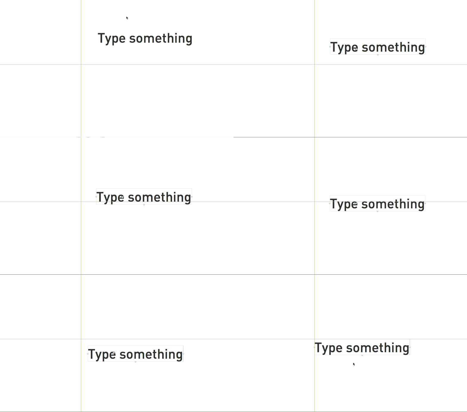
For example, if you’re dragging a text box down toward a guide, here’s the order in which it will snap:
- The bottom edge of the text box
- The baseline edge of the text itself (descenders below)
- The middle of the text (centered)
- The top edge of the text box
Of course, it will snap to the left and right edges of the text box when dragging sideways, as well. Another improvement (again for folks with Adobe keyboard shortcuts burned into memory): cmd + enter can now be used to exit text editing mode, in addition to Sketch’s traditional ESC key.
Super Bonus Text Feature #1:
This was new with 3.0 but if you didn’t know, you can re-size text by dragging from the bottom text handle. One of my favorite text editing features of Illustrator (that Fireworks sadly lacked) is the ability to click and drag to re-size text dynamically. It works with other shapes, why not text? Previously, to make text larger or smaller required manually typing in new font size values: dragging the selection handles simply made the text box bigger without changing the text size.
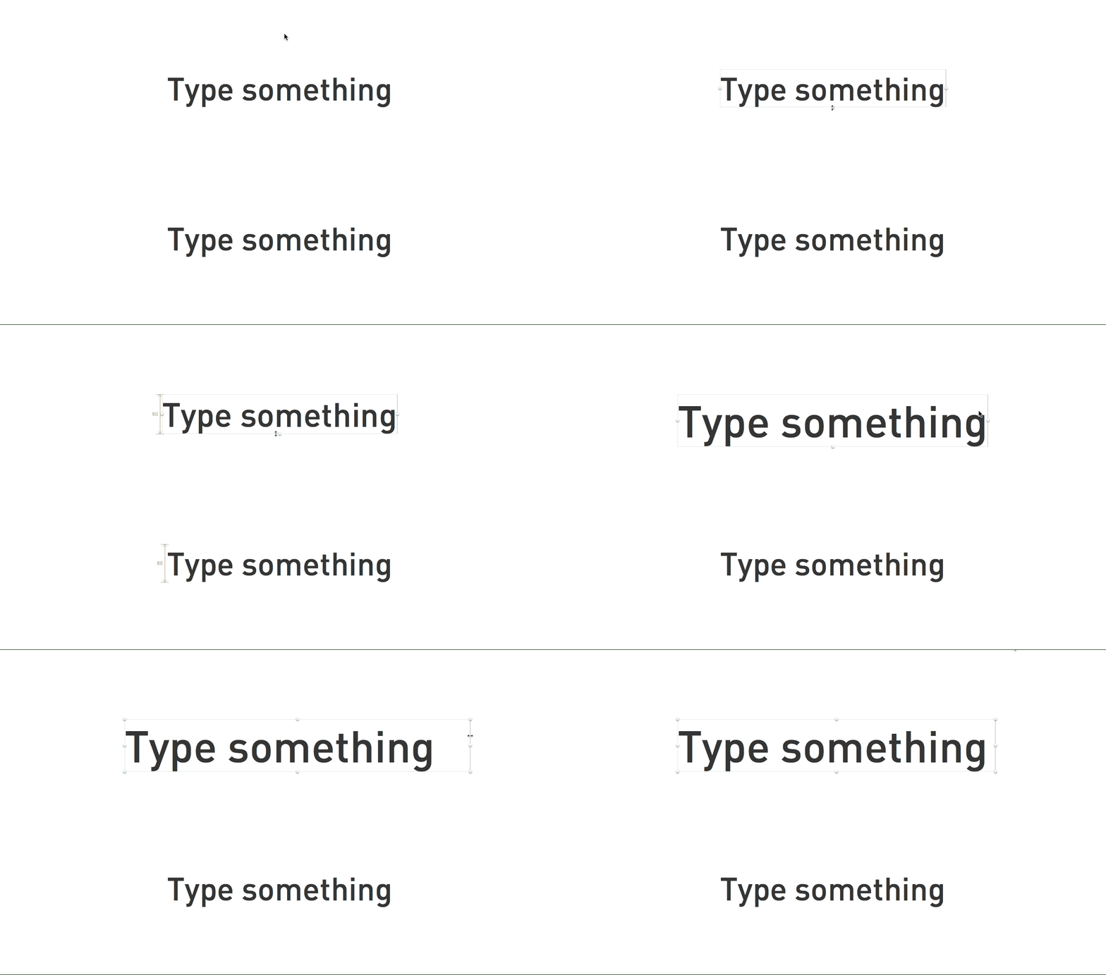
You can still see this in action now if you grab the right or diagonally bottom right handle: clicking and dragging just re-sizes the text box (and switches its width mode from ‘Auto’ to ‘Fixed’). But as of 3.0, clicking and dragging the bottom handle changes the text size. Presto! I can’t believe how much I missed this until Sketch added it.
Super Bonus Text Feature #2:
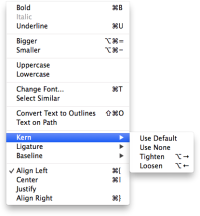
Speaking of hard-wired Adobe shortcuts, you may have instinctively tried to kern letter pairs using option+right/left arrow. In Photoshop or Illustrator, that will increment or decrement the letter spacing by one unit. In Sketch, it behaves as the Mac system default: option + right arrow jumps to end of a word, option + left arrow to the beginning. I’ve had to leam to kem all over again.
But! Recently I discovered that Sketch does have these options tucked away under Type > Kern > Tighten / Loosen. So they are there but sadly tucked away with some pretty wonky default key commands. Naturally I opened up Keyboard Shortcut in System Preferences and re-mapped those to a more sensible choice. This totally made my week.
General Layer Improvements
- Previously, layers wouldn’t snap while re-sizing them. This behavior now works as expected.
- While inserting a layer, you can now drag outside the canvas to make the view scroll. The current view used to just stay put but now the view moves with the new object.
- The “Mask with Selected Shape” menu command used to be really squirrelly for me: seems I frequently got an error message for not having the right combination of bitmap & vector layers in the right order. Release notes for 3.1 say that it “now accepts any combination of layers” and I’m not exactly sure what they changed but in heavy use in the last few days so far it’s worked much more reliably.
- Shapes that you’ve combined via Boolean operation work better: instead of showing the total bounds of all subpaths (in the layers view as thumbnails), you see only the visible area only. This makes it easier to ID them at a glance.
Minor Bits
Overall Improvements
A few highlights from the release notes:
- Better integration with the system color picker for gradients
- Improves the zoom tool on dark backgrounds
- Improves undo for renaming layers
- Significant speed increases with pattern fills (also file size reduction), rulers, zoom, and rendering
- Color and Gradient presets now display a checkered background when they're transparent
- Symbols and Text Styles menu can now be arbitrarily deeply nested by using / in their names (instead of only one level deep)
- Much improved support for integration with FramerJS (fixes all known bugs). I don’t have much experience with this but am excited to try it out (Framer looks awesome)
Tons of Bug Fixes
There are a whole bunch of these listed in detail in the release notes and I don’t have direct experience with most of them. But 3.1 addresses a handful in particular that caused me an awful lot of grief:
Bitmap cropping
3.0 introduced some basic bitmap editing tools that are super useful. Simple things like cropping, filling, and selections. But it also introduced a bug: when making a selection to crop, if you left any extra space on either side of the selection, the crop would re-size the bitmap to fill it. So unless you made the selection exactly along the edges of the image, you’d get distortions. For example, if you wanted only to crop the bottom 20% of an image and so only cared about getting the bottom edge of the selection in the right spot and made an arbitrarily large selection, the crop would not only remove that portion but stretch the image to fill. Totally useless! But now happily fixed.
Invisible Text
Sometimes when you pasted text into the canvas, the text would be invisible. Not always, and sometimes it would reappear, but I would end up with like a dozen identical layers of text because I couldn’t see it and thought it didn’t paste right.
Shifty Artboards
As the content of your web view grows (the client wants a carousel… at the bottom!), you have to re-size the artboard. And if you only did it from the bottom or right, you wouldn’t have an issue because the content would stay put. But if you tried re-sizing an artboard from the top or the left, the content used to shift up or left with it. Like in Photoshop when you’re editing a canvas size and want to add space all around: you don’t want the content to migrate.
Shift-Clicky Anchor Points
If you shift-clicked on an already selected anchor point in a vector, you used to select it again. Now, shift-clicking actually deselects it as you’d expect. Magic!
My Favorite
“Fixes a bug where some documents could consume extraordinary amounts of CPU” LOL
What's New for You?
At New Media Campaigns, we rely on Sketch to deliver professional quality web and app UI designs every day. New updates are great because when you spend so many hours every day using a tool, even small improvements make life easier! Has 3.1 made your life easier? Did I miss anything cool? Let us know in the comments.



Leave the first comment