In 1989, a young Jim Ziolkowski encountered extreme poverty for the first time as he traveled through the Himalayas. But amidst the hardship he also encountered hope – hope driven by the opening of a new school in Nepal, hope that education could transform a community.
Motivated by this powerful experience, Ziolkowski returned to the United States, abandoned his corporate finance career, and began putting together the programs and initiatives that would eventually become the buildOn movement. In the years since, buildOn has become a global nonprofit that seeks to break the cycle of poverty by promoting education and meaningful community service both here in the U.S. and abroad.
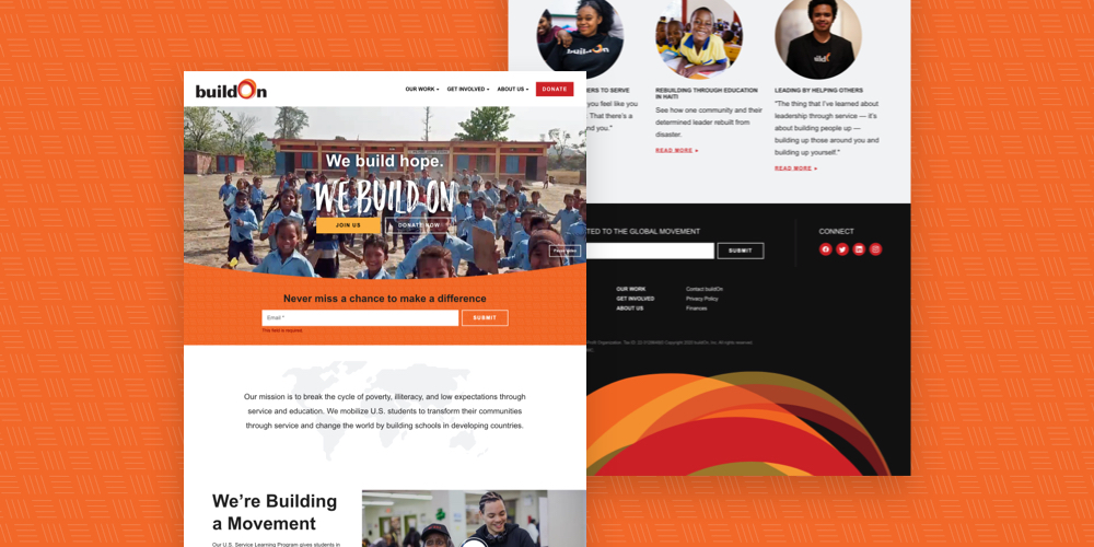
After years of significant growth and expansion, buildOn’s original website had become dated and inefficient. Thus, the buildOn team approached NMC for a new nonprofit website design that would better communicate the organization’s impact, work, and program offerings.
In this post, we’ll take a closer look at the buildOn project and the in-depth process that led to a successful launch.
Clear and Achievable Goals
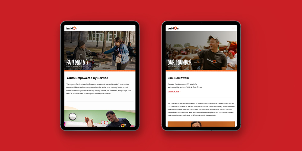
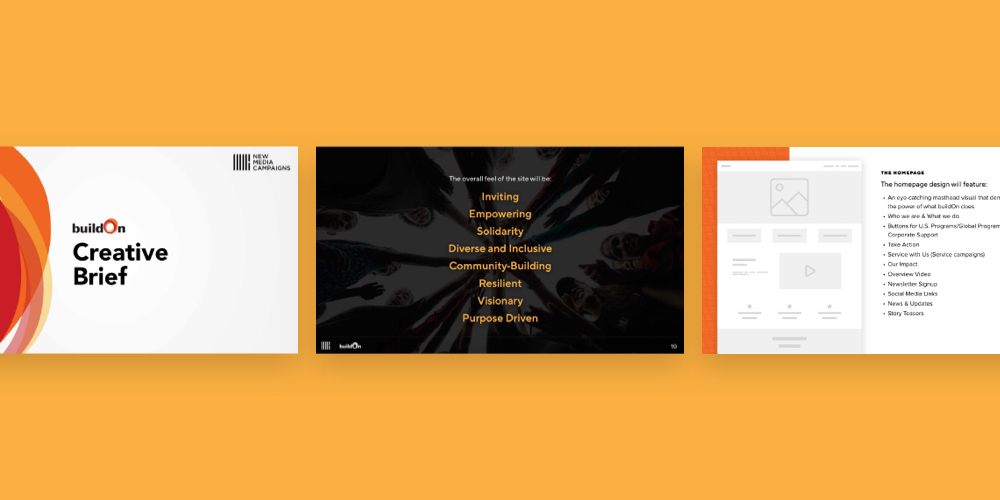
As with any project, we began the initial exploration phase by working with the buildOn team to define clear objectives for the new website. The biggest takeaway: they wanted the new site to move away from the vision of buildOn as a charity for people to instead emphasize the fact that buildOn partners with people to bring about global change. With that, we moved forward with a series of ideas centered on creating an inviting, empowering, inclusive, and purpose-driven digital space.
Other key objectives included the following specific targets and requests meant to strengthen the nonprofit’s web presence:
- Highlight buildOn’s work with high quality images, videos, and other compelling visuals
- Demonstrate buildOn’s proven impact with program statistics, stories, and testimonials
- Encourage visitor engagement with integrated forms, calls-to-action, and sign-ups
- Educate the community with deep, easily accessible content about buildOn’s work and mission
With these goals in mind, we moved next to the design phase.
Powerful Visual Language
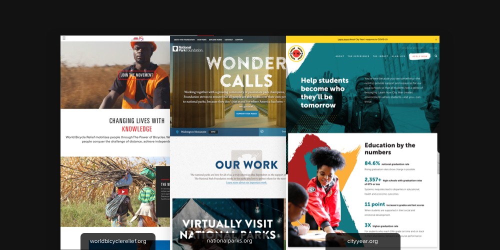
When gathering inspiration for their new online identity, buildOn looked to other established nonprofits like World Bicycle Relief, the National Park Foundation, and City Year. They loved each site’s strong visuals, powerful slogans, and prominent calls-to-action, and knew early on that they wanted to cultivate a similarly compelling feel for the new buildOn site.
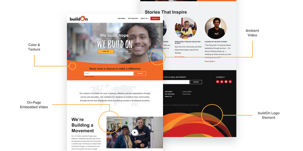
To accomplish this, we agreed that the best approach would be to highlight buildOn’s existing brand, colors, and awesome photography with dynamic new layouts and distinctive design features.
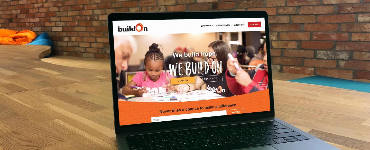
The resulting designs incorporate punchy shades of red and orange, intensity-boosting gray-blacks, subtle background textures, and plenty of high impact visuals (both photo and video). Additionally, gentle curves and circles allude to the abstract rings of the buildOn logo, which appears most prominently in the site’s footer.
Engaging Content
Content-wise, we worked hard to design a library of blocks that engage site visitors while emphasizing key ideas, statistics, and core buildOn programs. We did this by adding visual interest to text sections with things like half-and-half content, multi-column layouts, icon headings, and image-backed statistics.
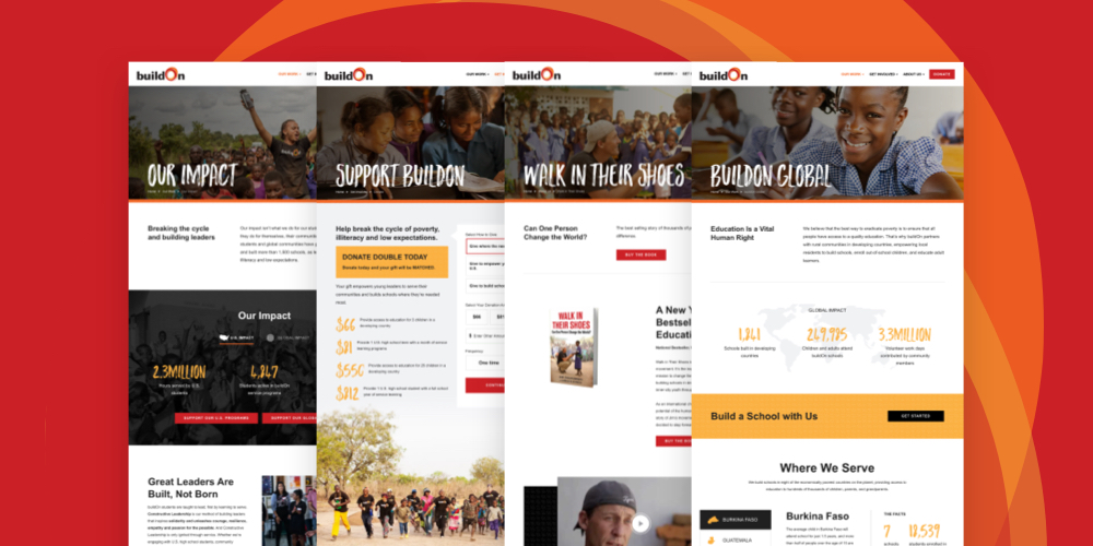
Homepage highlights include a watermarked mission statement, embedded video, image calls-to-action, featured stories, and of course, the can’t-miss ambient video hero. All in all, we love how the homepage grabs visitors’ attention and offers numerous opportunities to explore the many facets of buildOn’s work.
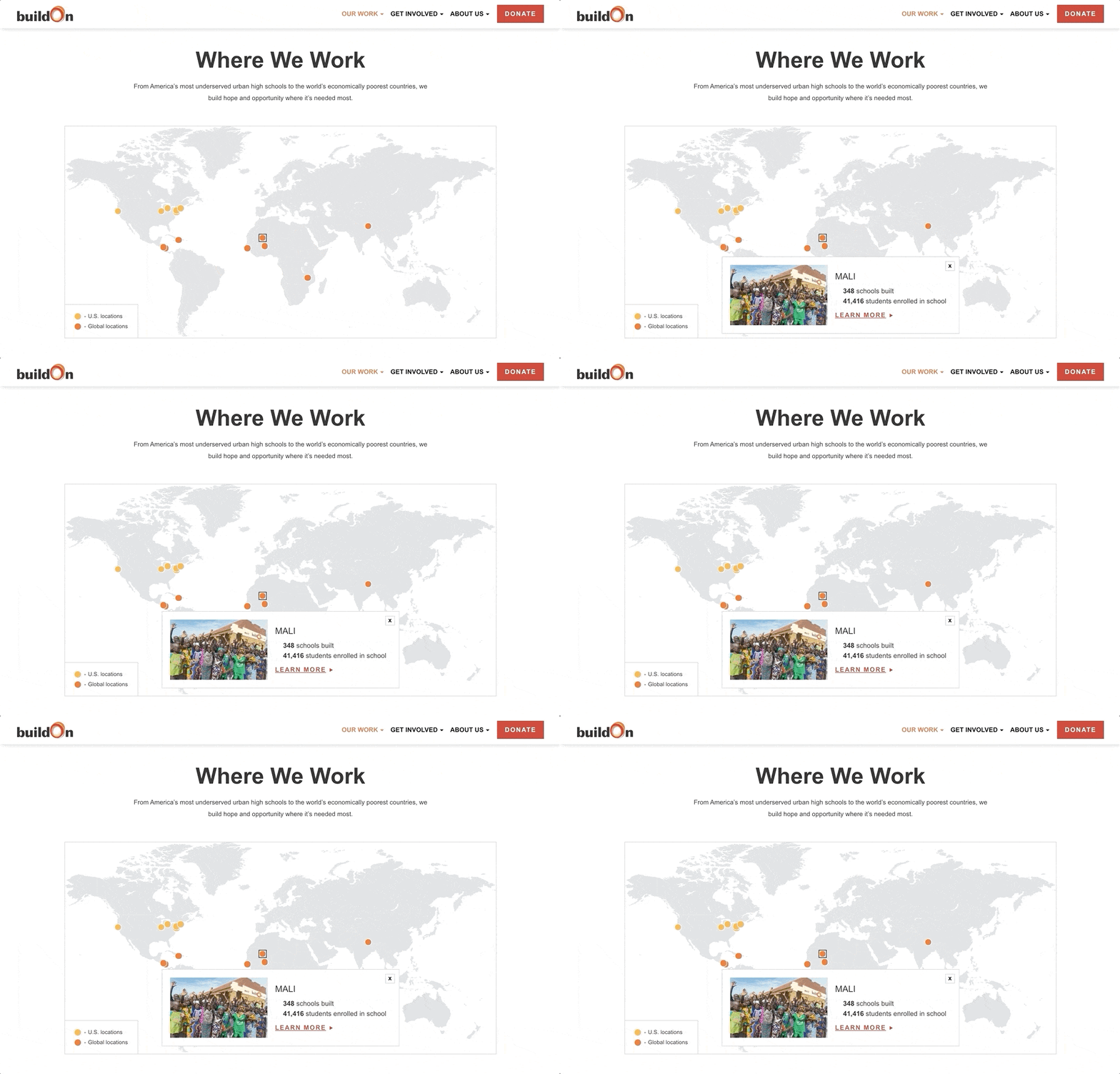
Interior pages like buildOn Global and Our Work similarly engage by prioritizing variety and eye-catching visuals. Elements like clickable tabs, action buttons, expandable accordions, and image slideshows encourage interaction while making the most of the available space. In addition, several interior pages include a custom interactive map that helpfully displays buildOn’s program and trek locations.
Conversion-Focused Features
Like many nonprofits, buildOn relies on their website to drum up public support and ultimately, to encourage conversion actions like signing up for a newsletter, registering for a program, and making a financial donation.
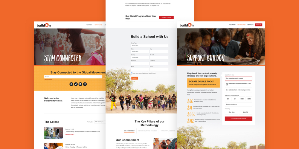
To address this need while staying true to the site’s look and feel, we built a series of custom forms that integrate smoothly with the rest of the design. The forms are powered by FormAssembly, a program that buildOn had already been using to collect data and information from supporters.
The forms appear throughout the site at natural points where visitors might be inclined to take action. This includes email signups on the homepage and news center along with program-specific forms on interiors like Serve Locally and buildOn Global. And thanks to the site’s abundant flexibility (we’ll talk about this next!), the forms can easily be added to new pages should the need arise.
Flexible Management
From the beginning, buildOn made it clear that they wanted the site to be flexible. Needs change, programs expand, and events come and go, so it was essential for the site to support quick content changes and additional updates.
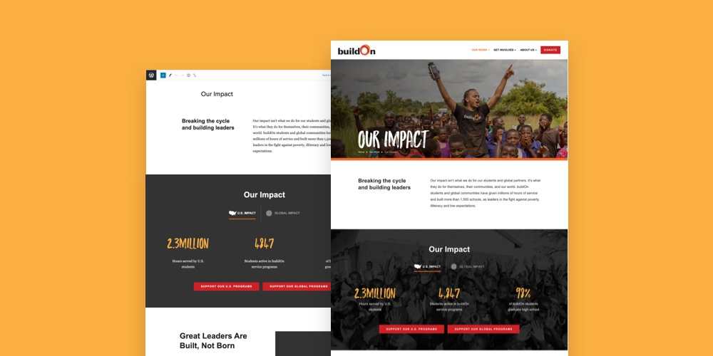
In order to make the site as flexible as possible, we built it on an adaptable WordPress base that allows site admins to edit existing pages and build new layouts using the content blocks that appear throughout the site. The blocks are as intuitive as they sound – they can be dragged into place, reordered with a single click, and customized with headings, colors, icons, and images.
Not only is the site’s flexibility great for admins, but it also ensures that the digital presence will scale smoothly with buildOn as they continue to grow as an organization.
A Positive Outcome
Post-launch, the site has earned praise from the buildOn team for its polished look and clear messaging. We’re just as happy with the result, and look forward to supporting buildOn as they adjust to the new site and continue to make it their own.


Leave the first comment