What makes a good nonprofit website design?
Here at New Media Campaigns, we've done several nonprofit websites. One of my favorite designs however is The Lucy Daniels Center for Early Childhood because it incorporates so many good nonprofit design practices.
Here are 7 rules of thumb for nonprofit web design:
1) A good nonprofit website design should prominently show the organization's purpose and goal.
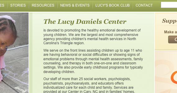
Oftentimes, the first thing people want to know when they go to a nonprofit's website is what exactly that organization does, what services it offers and who it is designed to help. A short but informative description of the organization should be featured in the center of the homepage so visitors don't have to look around to figure out what exactly goes on at the nonprofit, the information is right in front of them.
2) A good design for a nonprofit website should have a feel that matches its service.
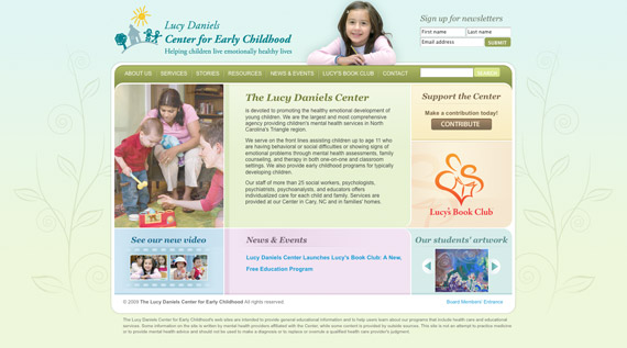
As an organization that helps children with behavioral or social difficulties, it is important that the overall feel of the website exude a comfortable and inviting feel. For Lucy Daniels, the pastel colors and subtle vines give the site and service a friendly and vibrant aura.
3) A good nonprofit website design should make it easy to contribute to the organization.
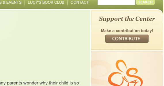
Donations are almost always a crucial need for nonprofit organizations. For that reason, it's important that a nonprofit's website highlight the ability to donate the organization's cause. On Lucy Daniels, the link to donate is prominently displayed at the very top of the sidebar menu. Users tend to us an 'F-shaped' reading pattern when looking at web content. This means that the further down a webpage you go, the less likely users are to look at the right side of the page. So it's important the donation feature show up at the top of the right side of the webpage so that users see the option of contributing as early and often as possible.
4) A good nonprofit web design should show the organization's expertise on its subject.
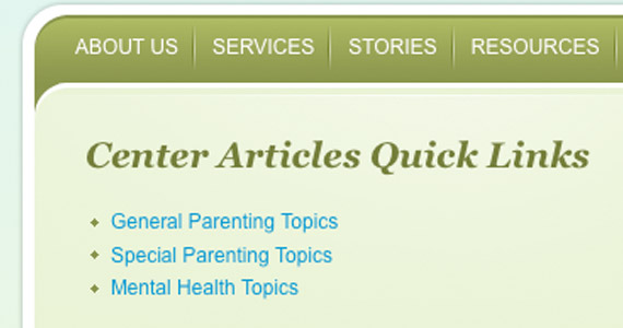
Lucy Daniels has a Resources section that houses hundred of articles written by their staff. Each article is categorized by topic and offers users the ability to print off a PDF of the article to keep for their own. Not only does their website display their knowledge of children's childhood issues, but they became a resource for quality information on that subject.
5) A good nonprofit website design should show in addition to tell what the organization does.
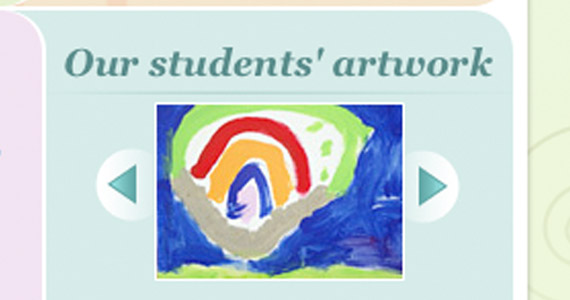
In addition to videos explaining all the services that Lucy Daniels offers as well as a slideshow of images showing the children who are involved learning and having a great time, the Lucy Daniels site provides the ability to scroll through the children in the program's artwork to add that special touch and personality and really get to the core of what their service is about.
6) A good nonprofit web design makes it easy to get involved and get more information about the organization.
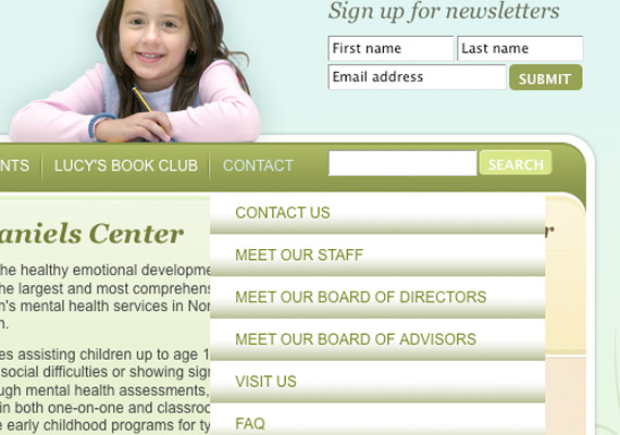
The Lucy Daniels site provides an obvious area to sign up for newsletters and contacting/asking questions is easily accessible in a 'Contact' dropdown menu. Because it's likely that a nonprofit needs volunteers, it's important to highlight the contact section so that someone who wants to contribute her time and energy can.
7) A good nonprofit web design will include a News and Events section or a Blog.

Like any website, it's important to give users an incentive to return to a nonprofit's website. The easiest way to do that is to constantly be adding new content. Usually this occurs in a News section or in a blog. Nonprofits should highlight these consistently updated sections so that returning users can check out what is going on right now in their organization.
The Lucy Daniels Center's website isn't the only nonprofit to incorporate all of these design strategies though, what other nonprofit designs do you all find functional, easy-to-use and asthetically pleasing? What other features do you think go into the design of a good nonprofit website?


Comments
Margaret
I recently came across your blog and have been reading along. I thought I would leave my first comment. I don't know what to say except that I have enjoyed reading. Nice blog. I will keep visiting this blog very often.
Margaret
http://grantfoundation.net
Leave a comment