At the end of each year, we look forward to writing our annual blog post that predicts and explains the design trends that we expect to see in the months to come. Sometimes we’re right and sometimes we’re wrong, but it’s safe to say that we never expected the year that we’ve had and the trends that have come with it. That’s why, for the very first time, we’re taking a moment to reflect on the trends that we saw and how they might come into play in the future.
eCommerce
Pre-COVID, online shopping was already becoming more popular by the day. This makes sense – it’s convenient for busy shoppers, the selection is infinite, and price comparison is as easy as opening a new window or tab.
But once the pandemic set in, eCommerce became an essential for those who wanted or needed to keep their distance from stores and businesses. Thus, we saw an increase in clients wanting to revamp or implement online shopping platforms.
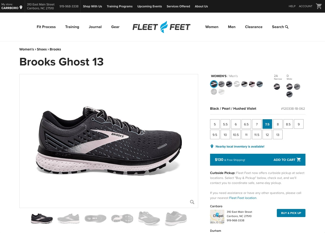
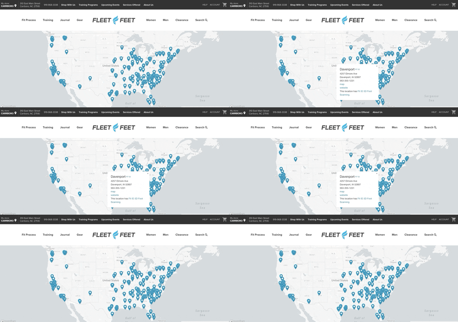
Longtime client Fleet Feet, a national run-specialty retailer, is a great example of a business that prioritized eCommerce in response to COVID restrictions and changes. As soon as Fleet Feet realized that their in-person customer service model would not fit into the new landscape, they approached us to rework their existing eCommerce setup to include curbside pickup. Other retailers have done the same, and we expect to see even more eCommerce advancements in the year to come.
COVID Content
With everything from medical appointments to fitness classes going virtual, many – if not most – businesses have adjusted their website to highlight additional COVID-related content and resources. For some this has meant adding downloadable PDFs, whitepapers, and guides, while others have adapted by turning to videos, webinars, and other online modes of engagement.
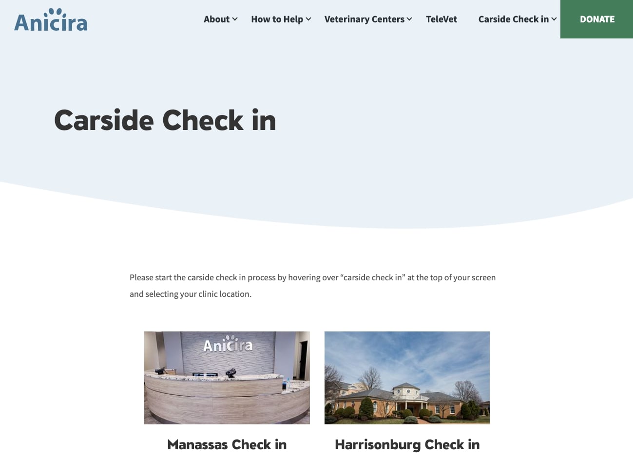
Our client Anicira, a veterinary care center, adjusted their website in a unique way by adding a carside check-in/out feature that integrates with a live chat manned by the center’s employees.
Looking ahead, we’re confident that COVID website content is here to stay. It’s clear that businesses and shops will need to continue providing updates on day-to-day operations and expectations, and websites are the perfect place to do that.
Alert Bars
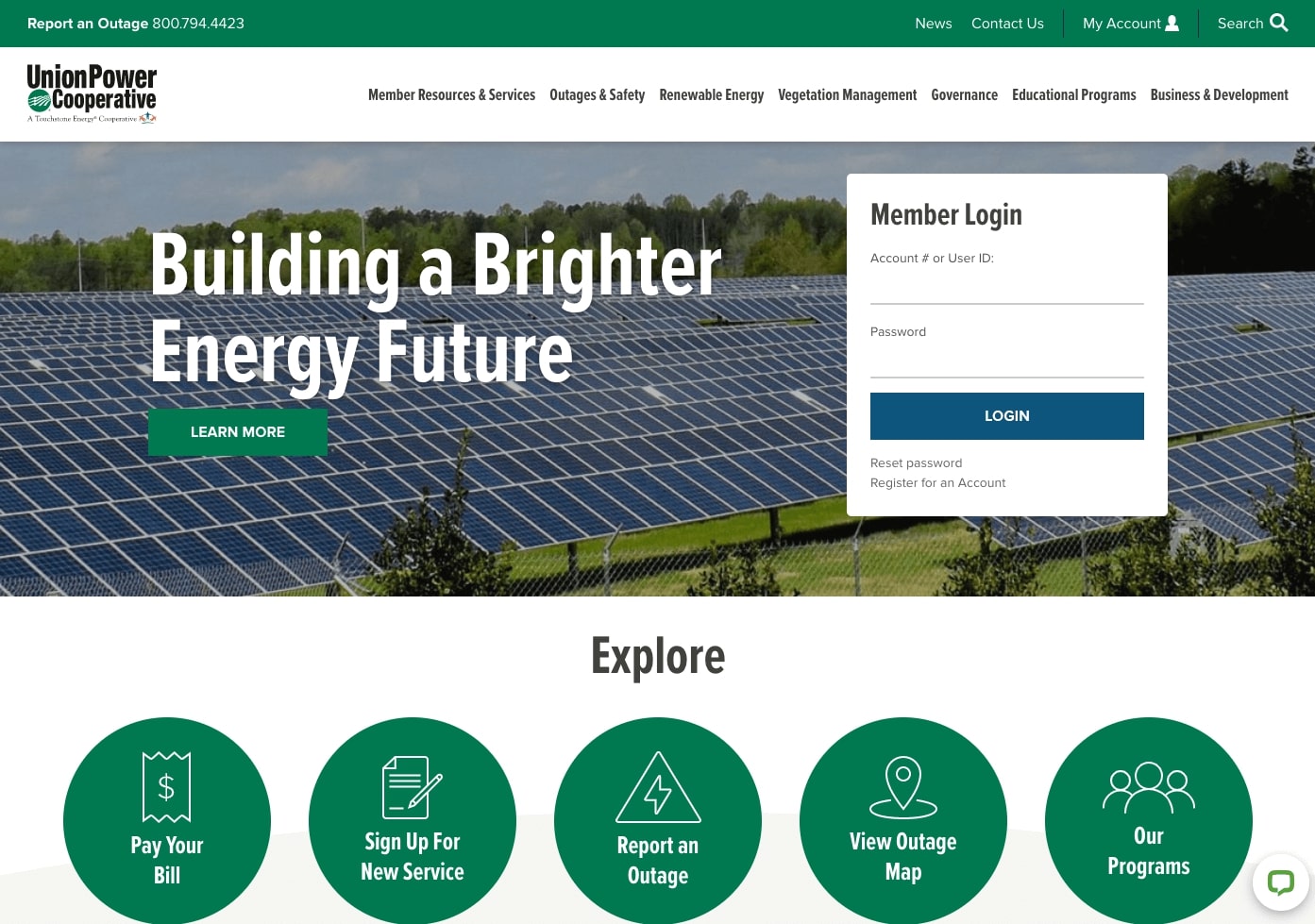
For more urgent updates, we noticed a significant increase in the use of can’t-miss alert bars and popups. Alert bars typically appear at the top of a user’s screen, either above or below the site’s main navigation bar. Because they’re so prominent, they’ve historically been used to highlight temporary changes like holiday closures, pressing donation needs, or upcoming events.
In COVID times, alert bars have become the place to notify site visitors of new safety measures, shipping delays, and requirements for in-person visits. And as the pandemic has stretched on, they’ve also taken on the important role of directing traffic to in-depth COVID content and resources like the ones we mentioned above. Alert bars, like COVID content and eCommerce, are sure to stick around for the duration.
Ambient Video
While the pandemic has defined several of the year’s web design trends, we would be remiss not to touch on the dozens of other features that have taken hold during the past twelve months.
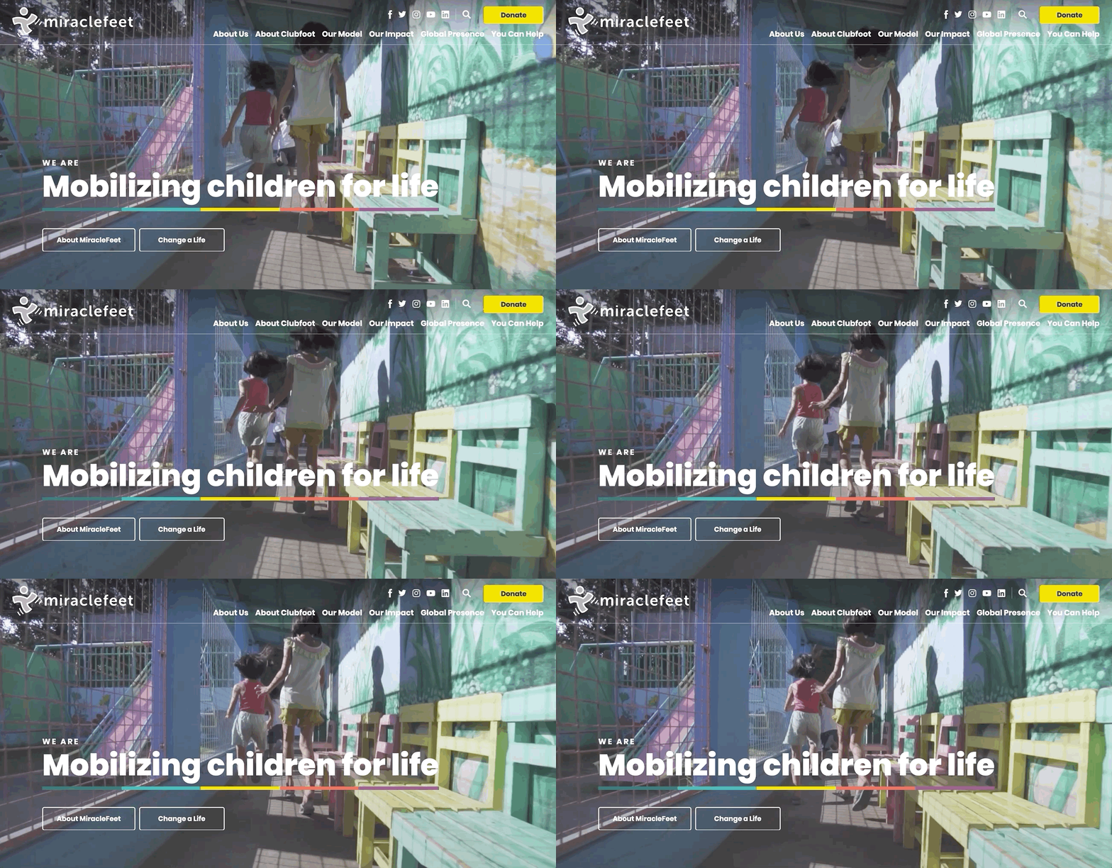
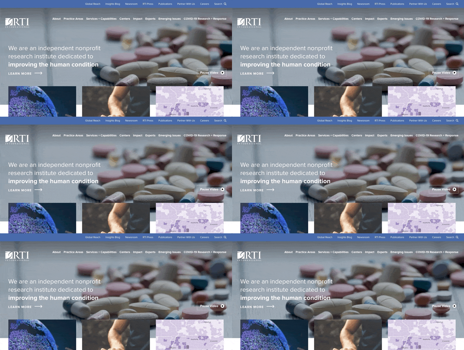
We’ll start with ambient video. This trend has been on the rise for awhile now. Why? Video brings energy and adds a distinctive dynamic edge to any website. And let’s face it, it’s cool!
In our own work and across the web, we’ve definitely seen more ambient video this past year. It’s a sign that the trend has fully taken off – even in categories as diverse as law firms, nonprofits, B2C, and B2B. Considering the way that the trend has grown in 2020, we predict that we’ll see a lot more of it in 2021 and beyond.
Thinking about adding ambient video to your website? Take a look at our blog post, Examples of Ambient Video on Websites, for inspiration!
Icons
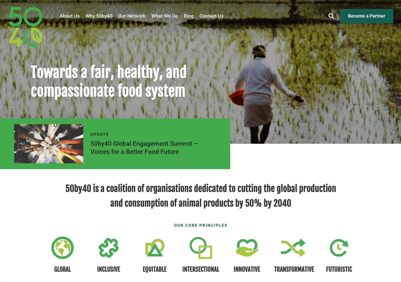
Being a visual medium, websites have almost always featured a variety of graphics and images. That said, icons aren’t necessarily a brand new trend, but we think that they’re still important enough to mention in this post.
Our clients love icons because they’re a quick and fun way to communicate a concept. And with today’s vast icon libraries (like FlatIcon and The Noun Project), the choices are nearly endless.
From a utility standpoint, icons are helpful because they make it easy for users to scan a page and immediately identify what they’re looking for. We’re trained to associate things like a magnifying glass and a search tool, so icons improve user experience while speeding up the browsing process. A number of our clients have requested icon-driven websites this year, and we don’t anticipate that they’ll fall out of favor any time soon.
Layouts That Break the Mold
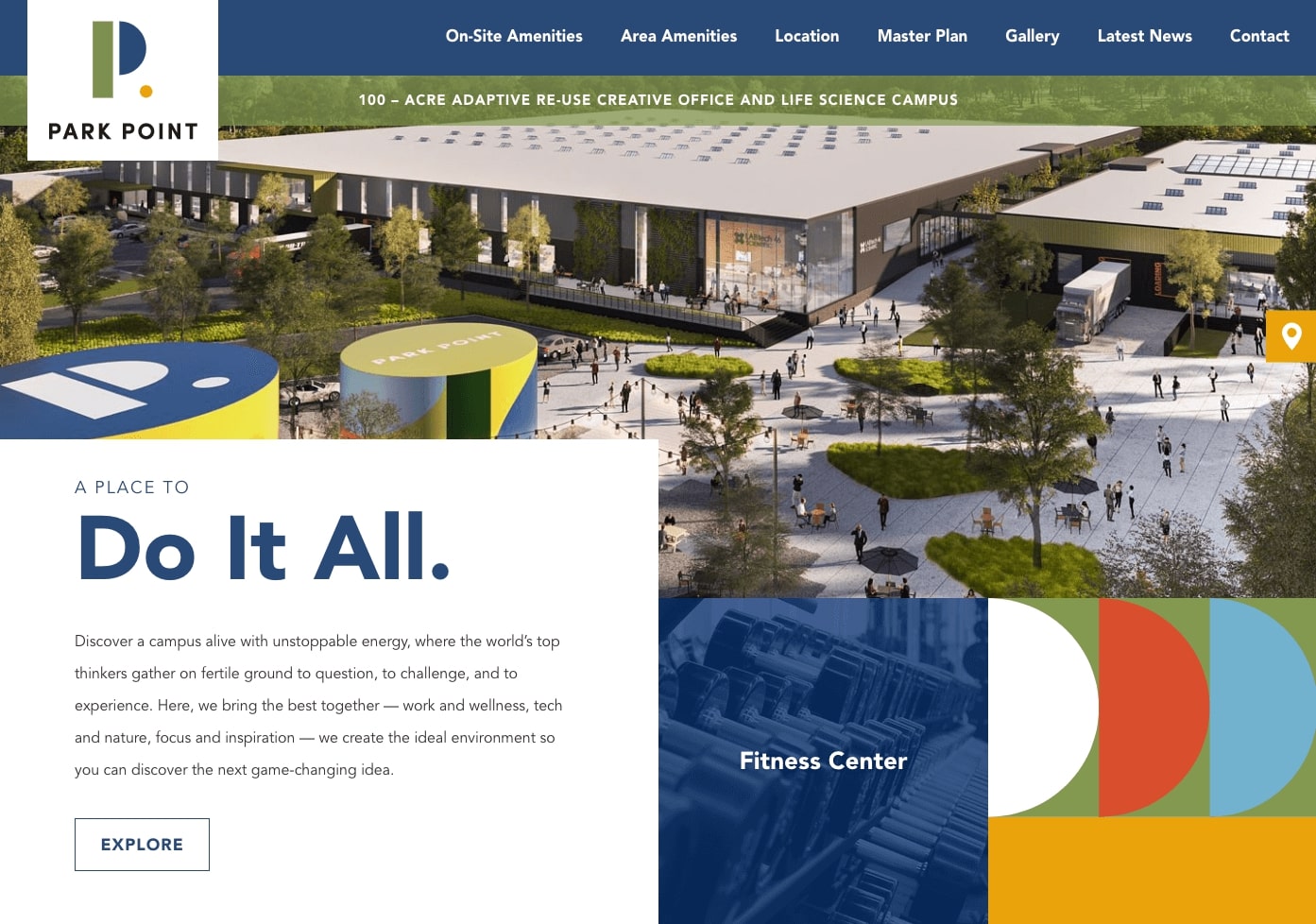
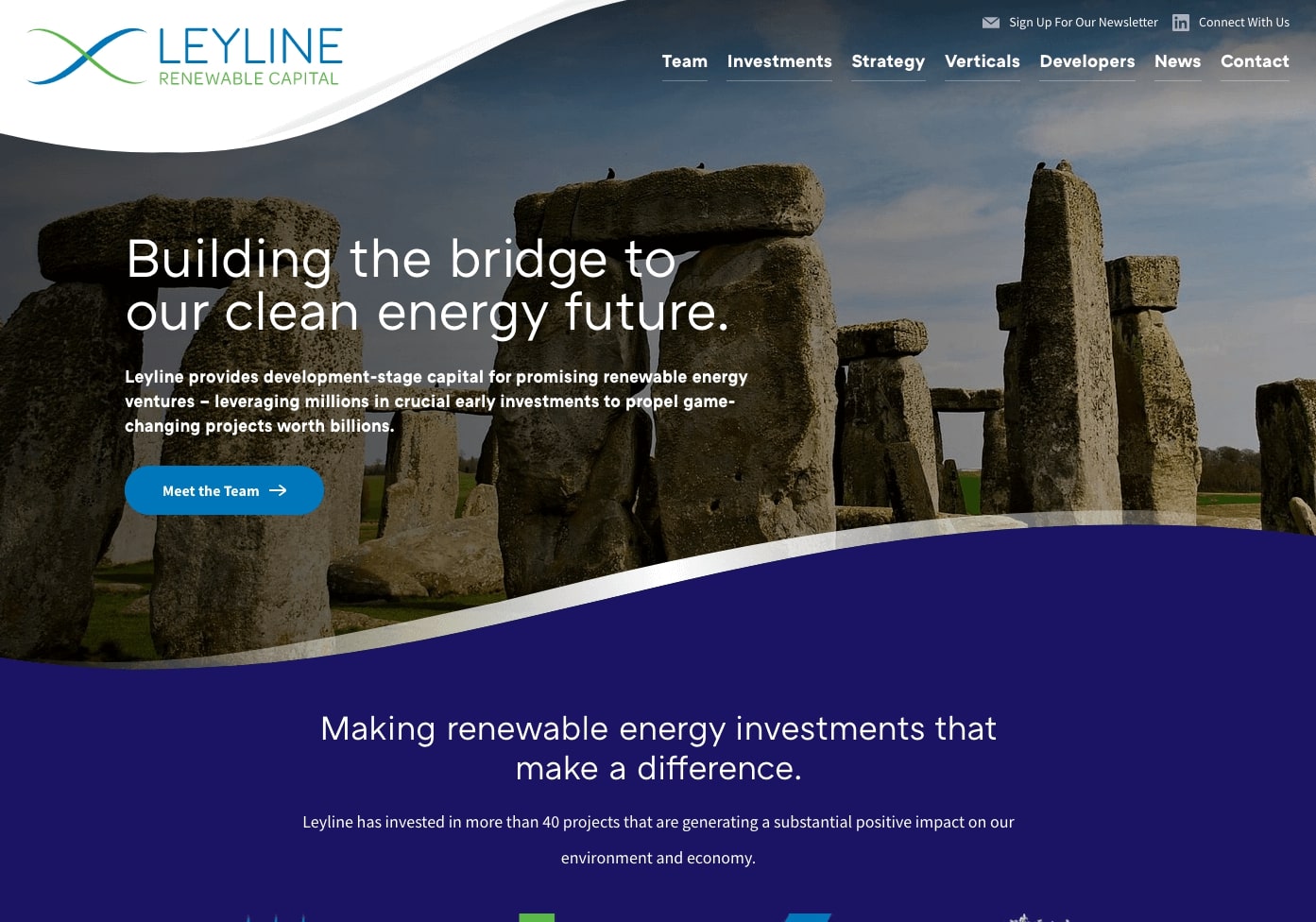
In our 2018 Trends post, we noted that design was becoming less structured and more fluid than what we had seen in the past. Well, it’s safe to say that the creative juices are still flowing! 2020’s layouts were noticeably more flexible and open than ever before.
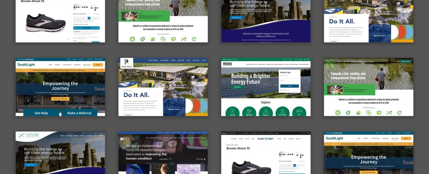
Some websites embraced this trend by mixing it up with a nontraditional homepage hero. Others brought in more whitespace, softer divisions between page sections (or none at all), and unique shapes, curves, and grid-defying forms.
With giants like Apple and Google adopting increasingly freeform layouts, we think that the trend will absolutely come into play even more in 2021.
Interactive Maps
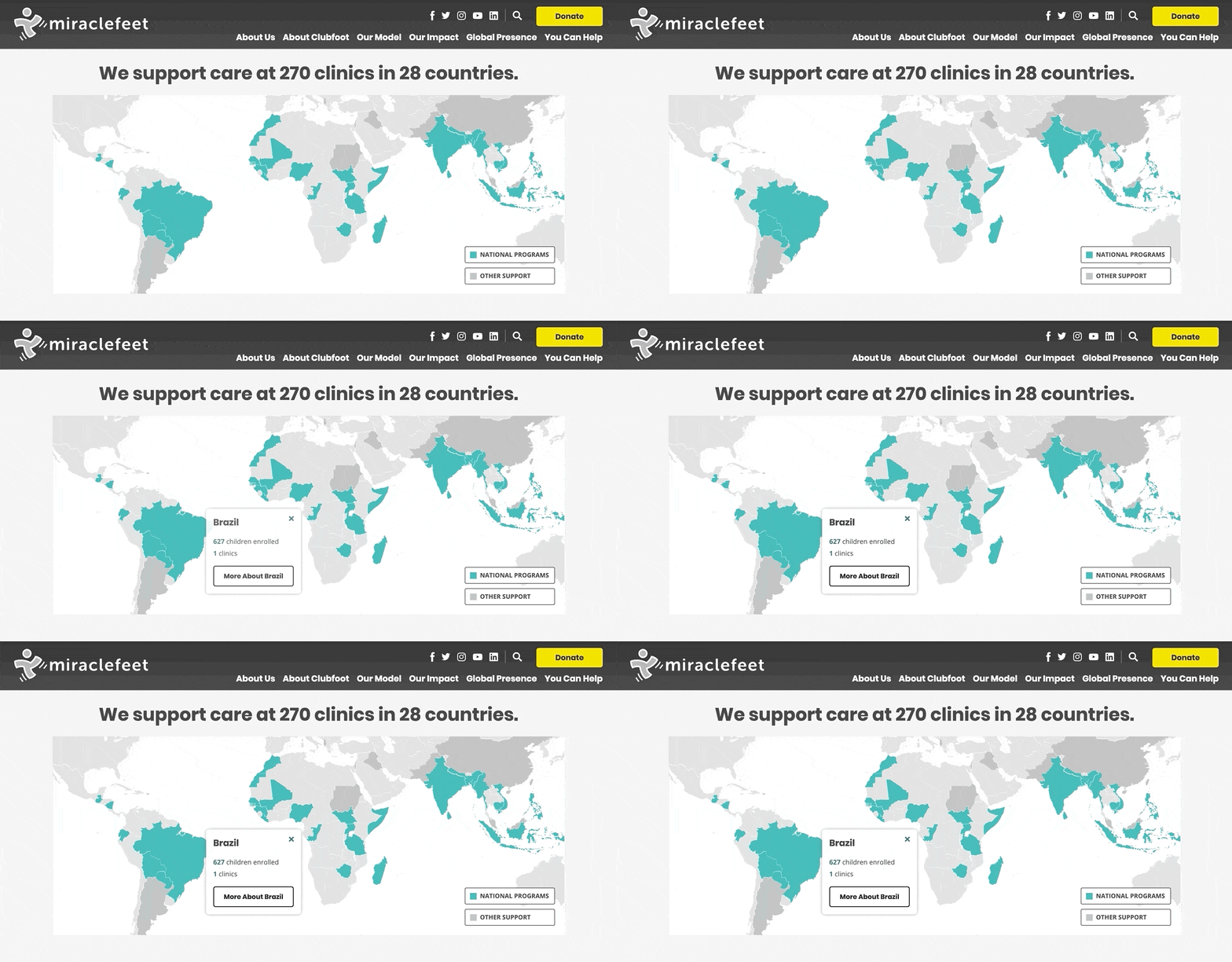
If you’ve been following our blog, you’ll know that we’ve been talking about interactive maps all year long. We gave examples of interactive maps, explained how to build one using a Google Sheet, and showcased them in a variety of case studies and other posts. And all for good reason! They’re hugely popular thanks to their versatility and helpful nature.
Without a doubt, interactive maps are a trend that will be with us for the long run. Even as styles change and layouts evolve, we’re confident that the base concept will remain popular and desirable.
Conclusion
This year placed a huge amount of emphasis on the web. The quick shift to a digital-heavy lifestyle brought challenges and frustrations for many, but most importantly it caused businesses of all types to rethink their online strategies, to learn and adopt new tools, and to push ahead into an uncertain new landscape defined by cultivating engagement online and limiting in-person interaction.
While we’re hoping to return to some version of normal eventually, we’re also encouraged by the enthusiasm with which our clients have embraced these website updates and adjustments. In 2021, we’re looking forward to continuing to offer support and guidance as new trends develop and additional digital needs emerge.
––
Stay tuned – the 2021 edition of our trends forecast is still to come! Until then, check out past versions from 2020 web design predictions and 2018 web design trends.





Leave the first comment