Happy New Year! While the pandemic years were a bit of a blur, we’re proud to look back at how we continued to grow and adapt during 2022. We tackled projects of all sizes across industries like nonprofit, law, real estate development and insurance, and had the privilege of working with clients located throughout the United States and abroad.
Some of the most memorable projects of the year included designing websites for two new podcasts, developing a print document and microsite for a major nonprofit fundraising campaign, and launching a feature-packed online presence for a leading climate research organization. But there were so many highlights! You can read about a large selection of our projects below.
As always, we also enjoyed keeping up with the latest trends. Over the past 12 months, we saw a lot of gradient color treatments, engaging interactive maps, micro animations, and non-traditional masthead layouts. We had a lot of fun incorporating these features into our work and showing clients how to translate their brands into dynamic, user-friendly websites.
We hope you’ll enjoy exploring the work we've highlighted here. If you’re interested in seeing even more of our projects, make sure to check out our full portfolio!
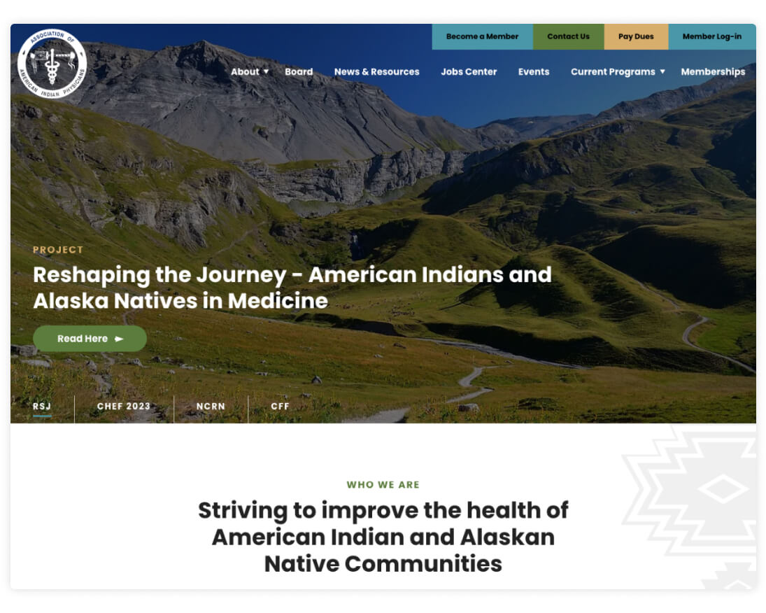
Association of American Indian Physicians (AAIP)
AAIP is a nonprofit membership organization that provides networking and professional development opportunities to American Indian physicians. Complete with a Jobs Center and a filterable collection of News & Resources, the site serves as a helpful hub for members to connect and learn.
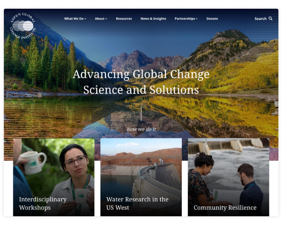
Aspen Global Change Institute (AGCI)
The Aspen Global Change Institute is a nonprofit research organization that offers programs and resources centering on climate change topics. The robust new site includes more than a dozen custom layouts and an integration with SalesForce that surfaces AGCI’s entire work output archive in feeds for Resources, Workshops, and more.
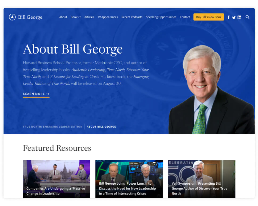
Bill George
Bill George is a recognized thought leader and author who has taught leadership at Harvard Business School since 2004. His site combines information about his books, articles, and podcasts with practical details about availability for speaking engagements.
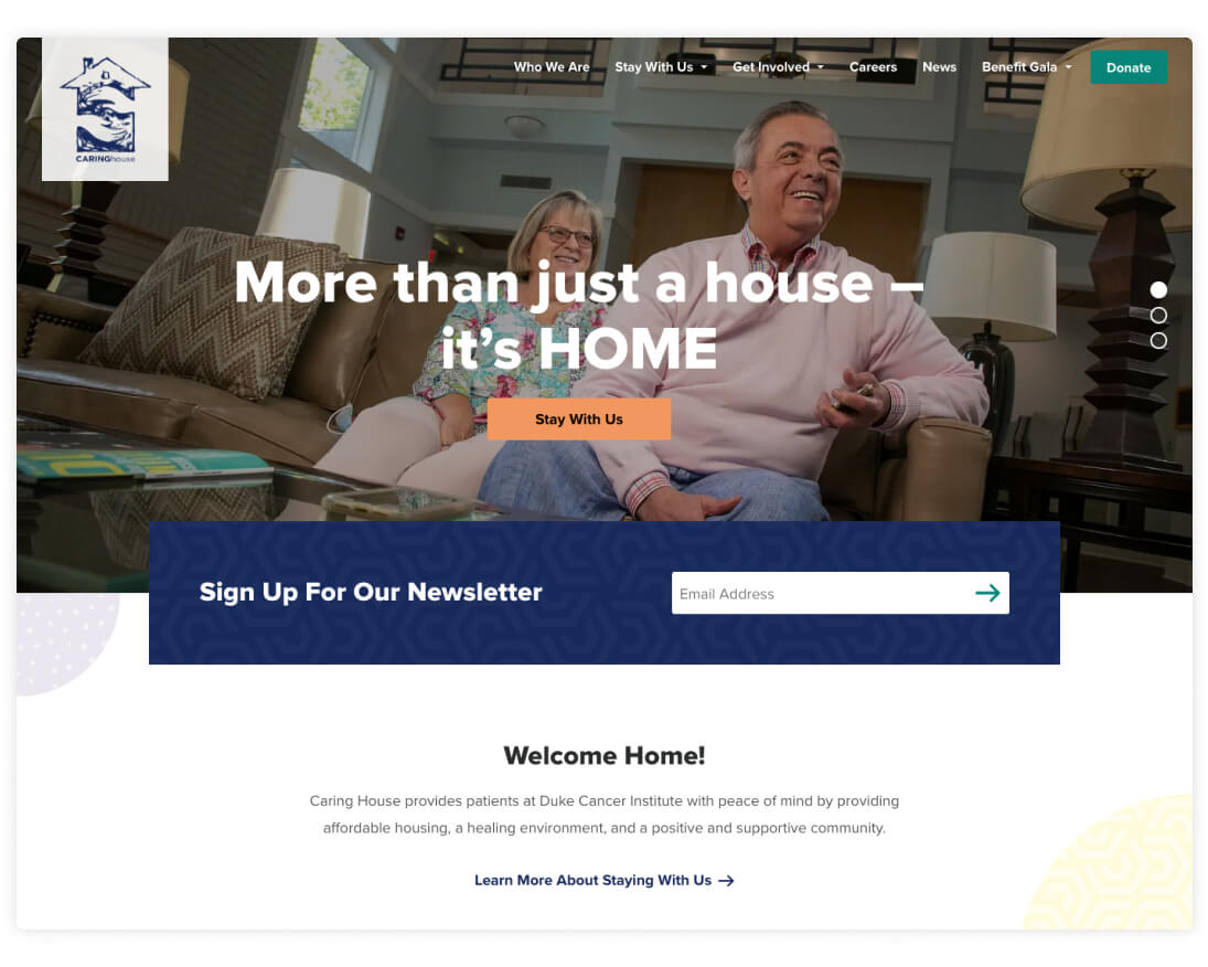
Caring House
Located in Durham, NC, Caring House is a home-away-from-home for patients at Duke Cancer Institute. The site matches the organization’s calm and welcoming approach with soft colors, friendly images, and a playful combination of accent patterns. Clear navigation options allow site visitors to quickly find information about the facility and opportunities to offer support.
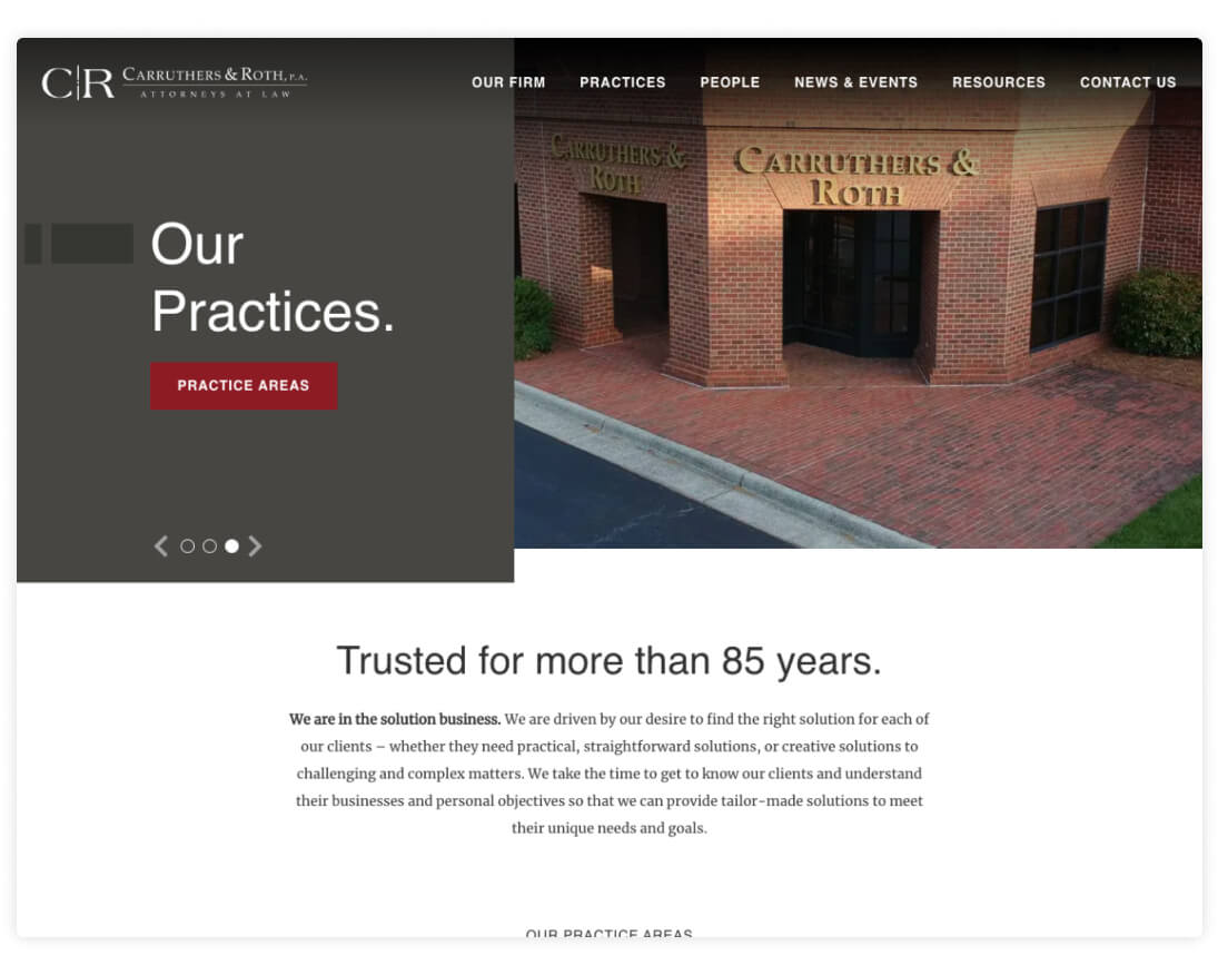
Carruthers & Roth
Carruthers & Roth is a Greensboro-based law firm that specializes in a results-driven approach to a wide variety of practice areas. Site highlights include an ambient video call-to-action, sleek practice area layouts, and a filterable News & Events center.
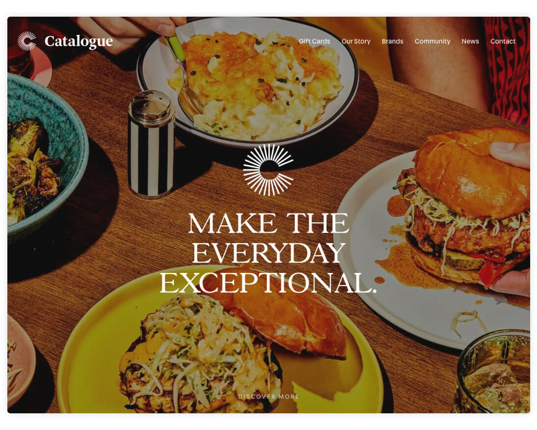
Catalogue
Designed by our friends at Franklyn, Catalogue is a collection of premium restaurant brands that share several core themes. Once the designs were handed off to us, we built the site to include numerous animations, dynamic scroll effects, and other features that contribute to a smooth user experience.
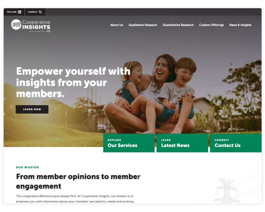
Cooperative Insights
As a business unit within the North Carolina Association of Electric Cooperatives, Cooperative Insights conducts qualitative and quantitative research about cooperative issues and member satisfaction. The site largely follows the visual style established by the main NC Electric Cooperatives site while incorporating additional layouts and content blocks.
CRG
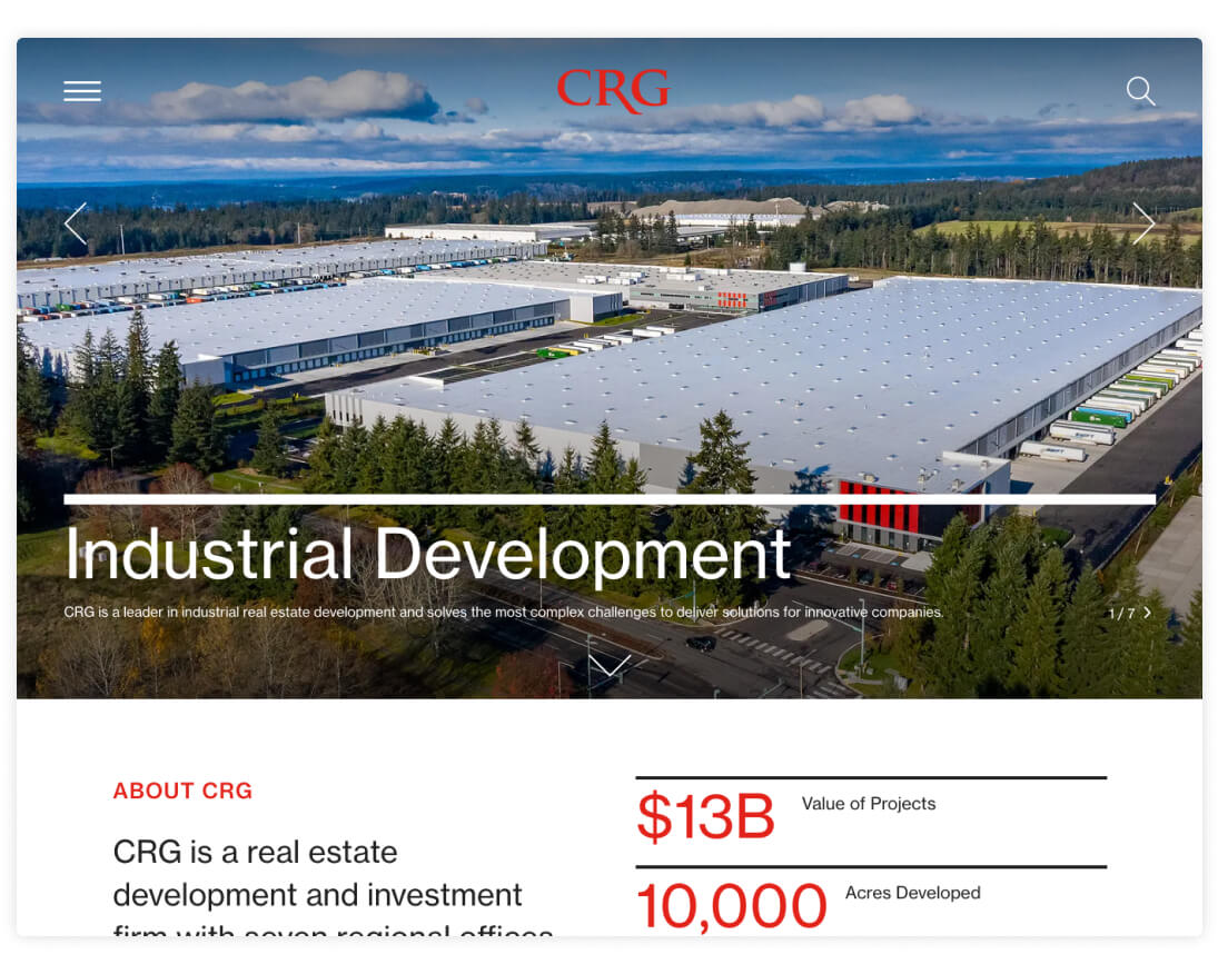
Also in partnership with Franklyn, CRG is a real estate development site that builds on last year’s work for Clayco and the Lamar Johnson Collaborative. For CRG, we refreshed some of the core elements to match CRG’s brand and content needs. We also built out several additional layouts and a flexible block system that CRG can use to grow the site in the future.
Crossing the Line Podcast
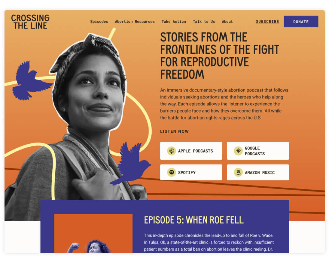
Created by the storytellers at Population Media Center, Crossing the Line is a documentary-style podcast about the challenges encountered by individuals seeking abortions. The site draws inspiration from the show’s colorful key art and offers easy access to episodes, abortion resources, and more.
Durham Chamber of Commerce
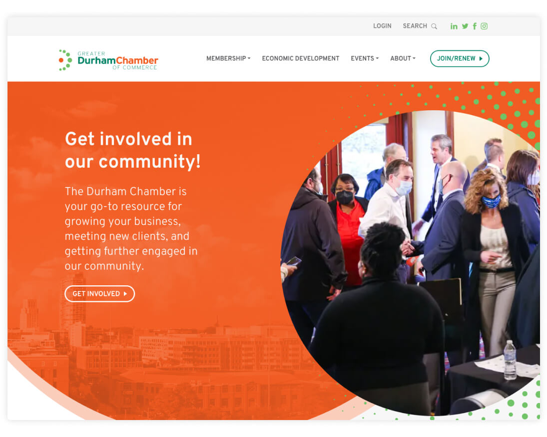
Designed by Liaison Design Group, the Durham Chamber of Commerce website is a resource for organizations and individuals interested in exploring the area’s business environment. Complete with helpful features like a statistic-driven community profile, we built the site to be equally user-friendly and responsive.
EngenderHealth
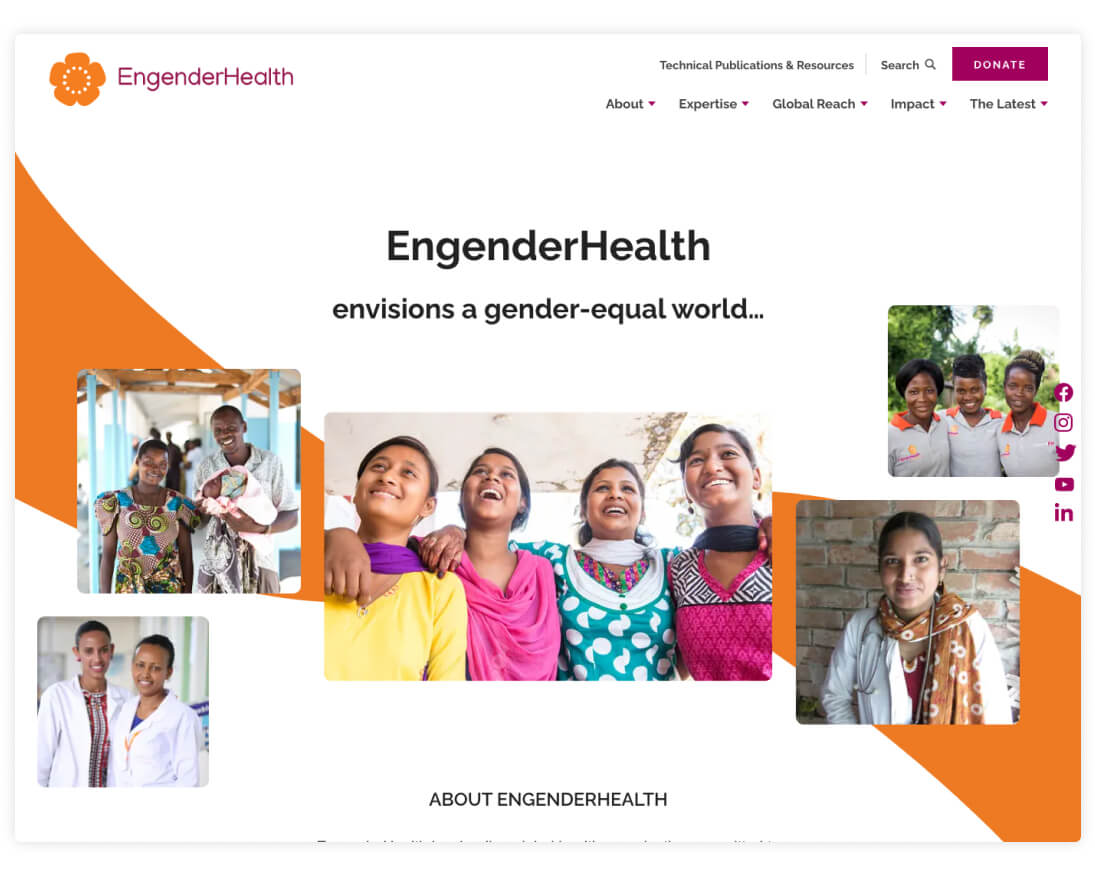
EngenderHealth is a global health organization that focuses on gender equality and reproductive rights. As detailed in our case study, the project included a comprehensive discovery process, detailed wireframes, and a suite of custom layouts designed to showcase EngenderHealth’s reach and impact.
Girl Security
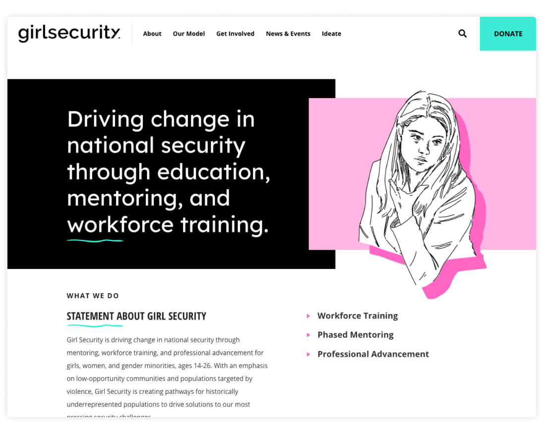
Girl Security is a nonprofit that encourages girls and gender minorities to explore careers in national security. The site features custom illustrations from the organization’s Creative Director, El Nicklin, and colorful layouts that showcase resources, industry partners, and information about the nonprofit’s approach.
GoACH
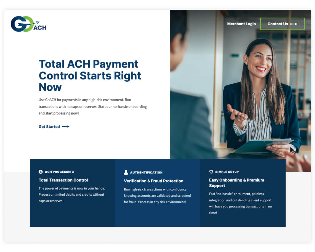
GoACH offers ACH payment processing that can be automated and managed through a user-friendly software program. With a streamlined single-page design, the site strategically guides users towards a contact form where they can share key details about their needs and connect with GoACH staff.
ICFJ It Takes a Journalist
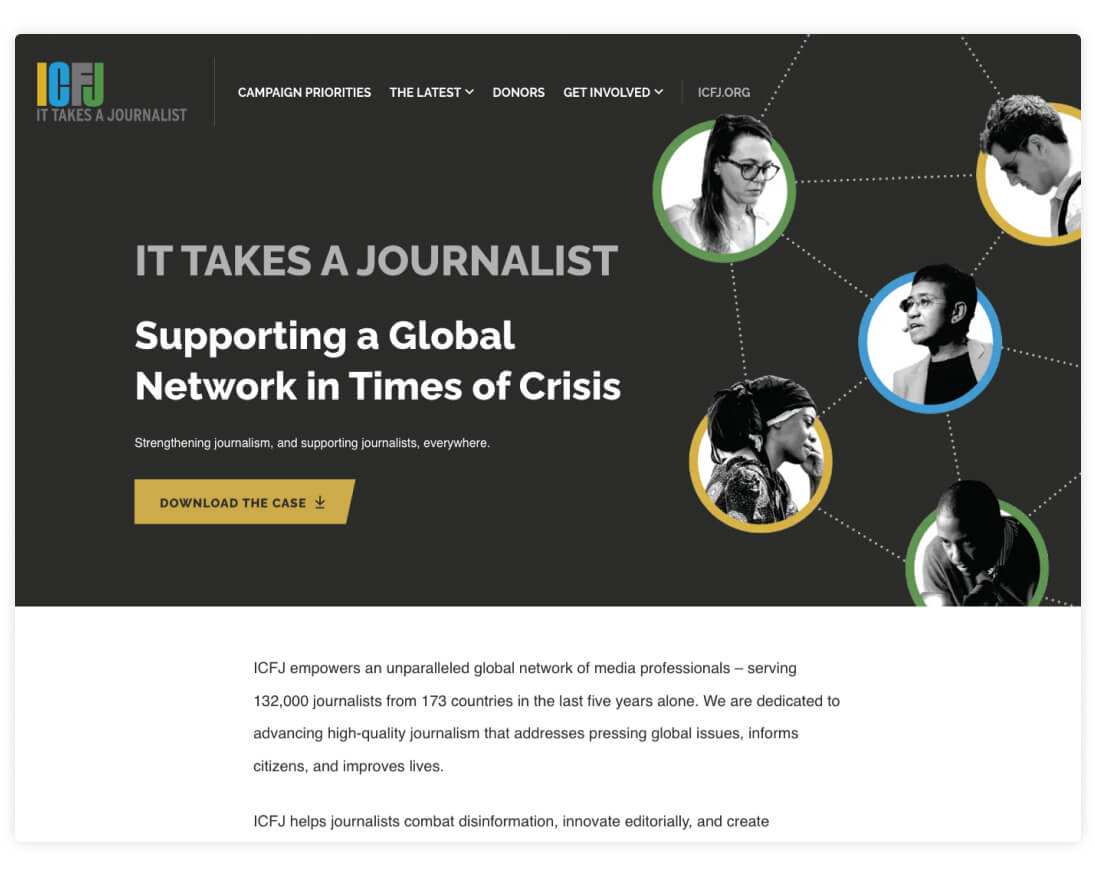
The International Center for Journalists provides professional development programs and resources for a global network of journalism professionals. For their fundraising campaign, It Takes a Journalist, we designed a detailed print statement along with a companion website where site visitors can view progress and major gifts.
In a Perfect World Foundation
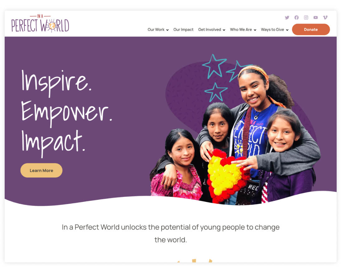
In a Perfect World Foundation empowers young people by offering resources and educational programs that are designed to help kids reach their full potential. Their new site captures this mission with playful graphics, lively photography, and layouts that highlight the nonprofit’s impact in communities around the world.
MCA Track
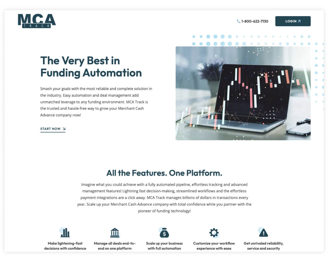
In partnership with GoACH, funding software provider MCA Track helps businesses manage merchant cash advances through a secure and streamlined online platform. The new website repositions the company with a minimal visual style that highlights key features and information about the product while guiding users towards a prominent contact form.
MiracleFeet Brace
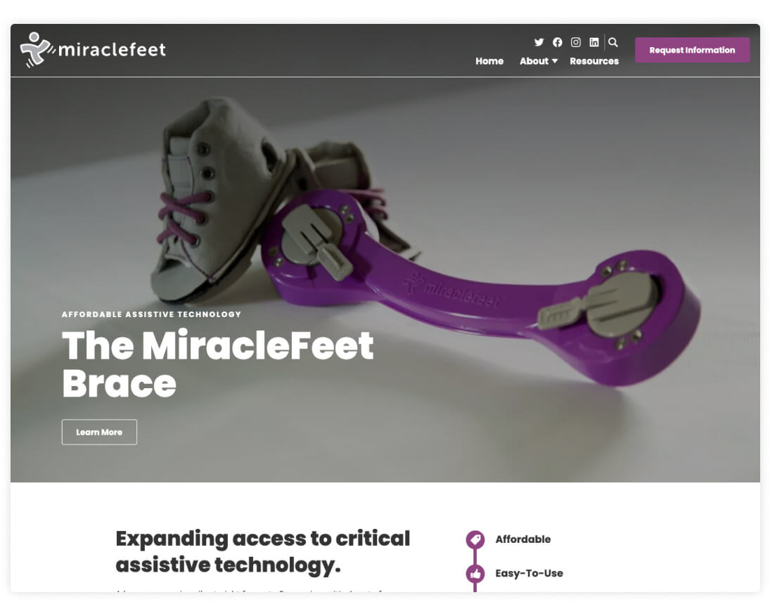
After launching a new website for MiracleFeet in 2020, the nonprofit came back to us to create a microsite for their unique clubfoot brace. The microsite features content about the brace including user resources, the development process, and a form for requesting information.
Muter Construction
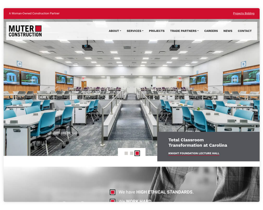
Based in Zebulon, NC, Muter Construction is a woman-owned firm that offers a variety of commercial construction services. Their new site centers on a clean design with bright images that highlight the diversity and quality of their work. Custom layouts for individual projects, services, and other content make the site easy to explore and pleasant for users to browse.
NAACP Diamond Anniversary Gala
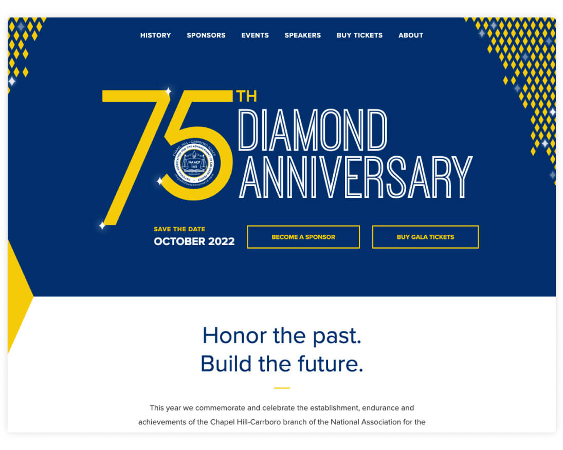
To celebrate the Chapel Hill-Carrboro NAACP’s 75th anniversary, we designed a diamond-themed microsite to promote their annual fundraising gala. The site includes custom typography, a subtly animated diamond pattern, and blocks for the organizers to feature sponsors, events, and special guests.
North Carolina Museum of History
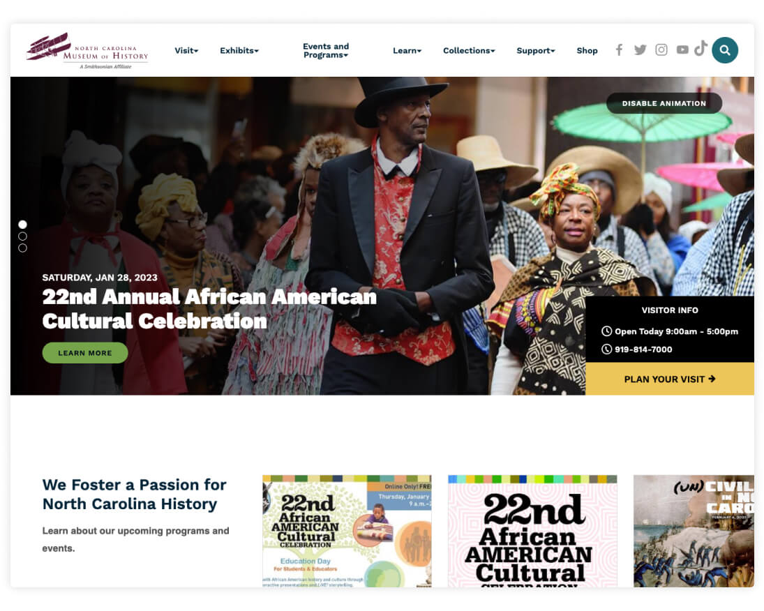
Centrally located in Raleigh, the North Carolina Museum of History is home to numerous exhibits and a collection of more than 150,000 historical artifacts. Working closely with the NC MoH team, we designed and built a new website that efficiently shares information and guides users towards information about visiting or getting involved.
Oakbridge Insurance
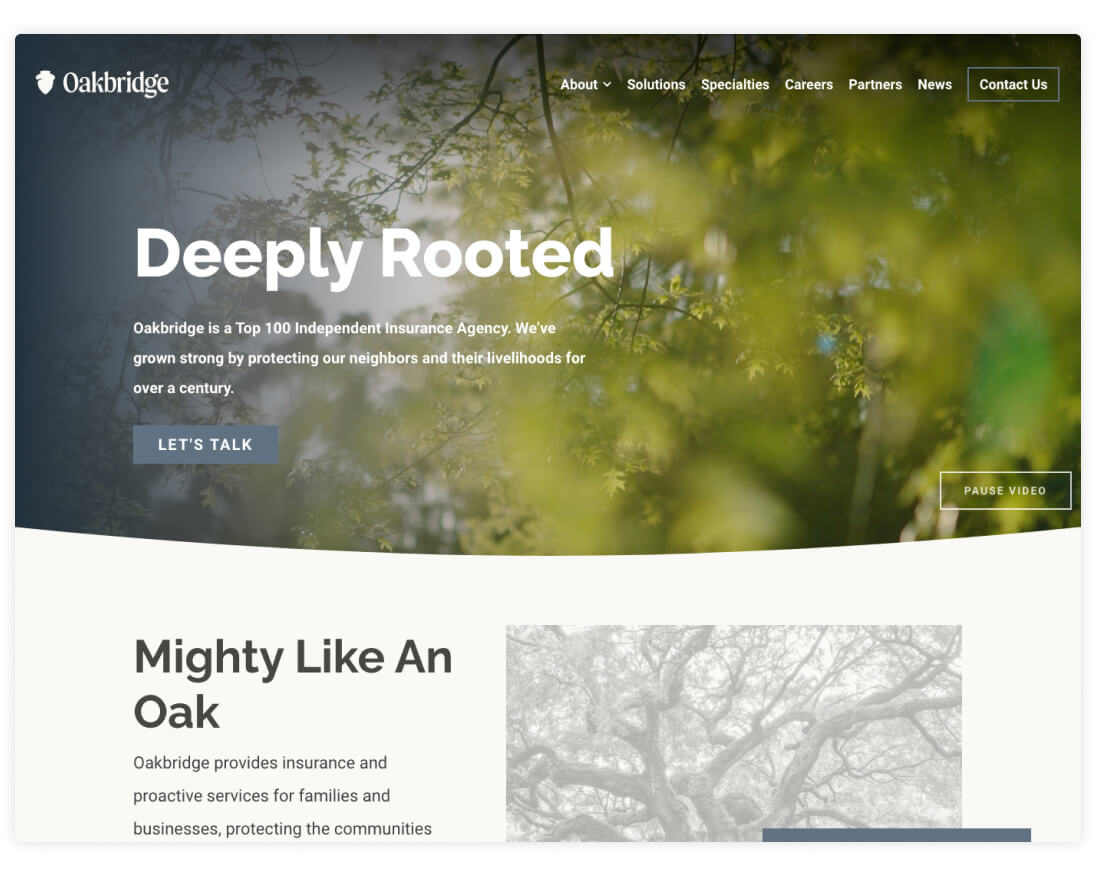
Founded in late 2020, Oakbridge is an insurance agency that balances the resources of a large firm with the personalized approach of an independent agency. The site speaks to prospective partner firms by highlighting business specialties, solution services, and general information about the benefits of the Oakbridge approach.
Population Media Center
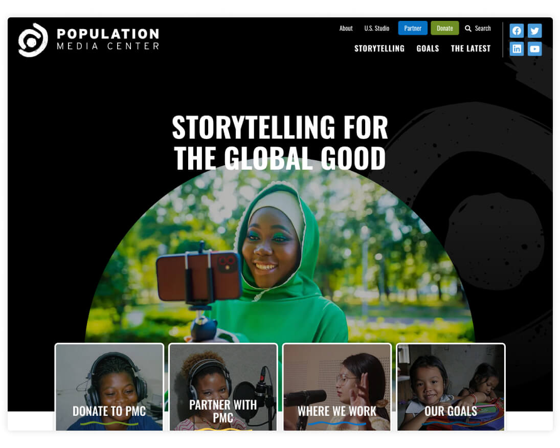
Population Media Center is a global nonprofit that uses storytelling to raise awareness about social and environmental issues. Through television shows, podcasts, radio programs, and video games, PMC promotes their messages to audiences around the world. Their new site is robust but easy to navigate, and includes helpful features like an interactive programs map, a filterable news center, and engaging designs that draw inspiration from PMC’s brand and logo. Read more in our case study and explore the related podcast sites: Crossing the Line and The State of: Women.
QHP Capital
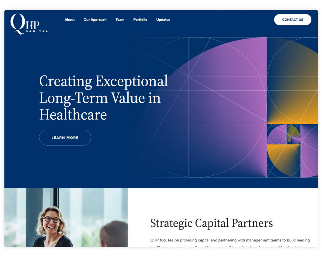
Founded as a management company for NovaQuest Private Equity (another NMC client), QHP Capital invests in healthcare companies at strategic points designed to drive growth. For their new website, we created a unique visual style that centers on bright colors and sophisticated golden ratio graphics. Highlights include a filterable portfolio page, a streamlined team layout, and an interactive card stack for exploring company values.
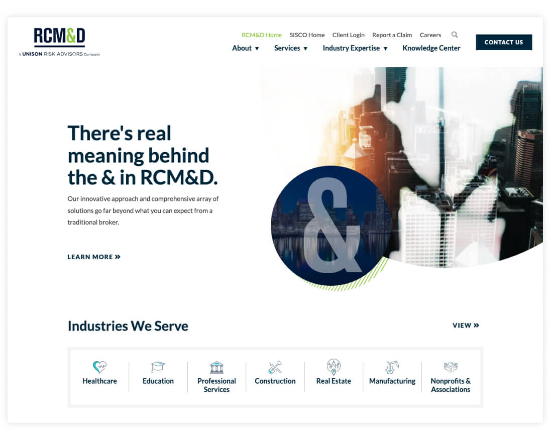
RCM&D
RCM&D is an independent insurance advisory firm that leverages responsive and thoughtful service to help clients meet their business objectives. The site’s clean and minimal design helps users focus on important information, and neatly structured content makes it easy to quickly navigate to areas of interest.
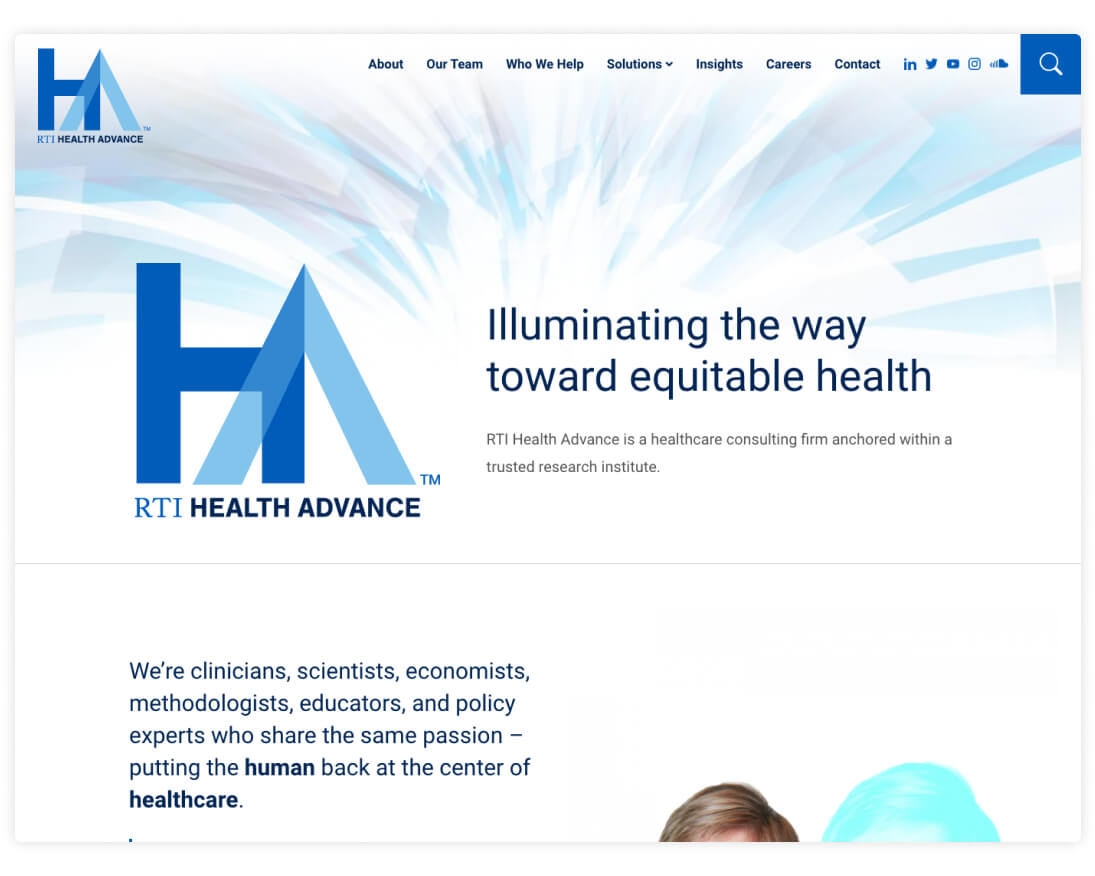
RTI Health Advance
RTI Health Advance – an offshoot of longtime client RTI – is a healthcare consulting firm that helps clients find solutions to industry-specific challenges and goals. Their new website utilizes distinctive branding and defined sections about the team, prospective clients, research insights, and service offerings.
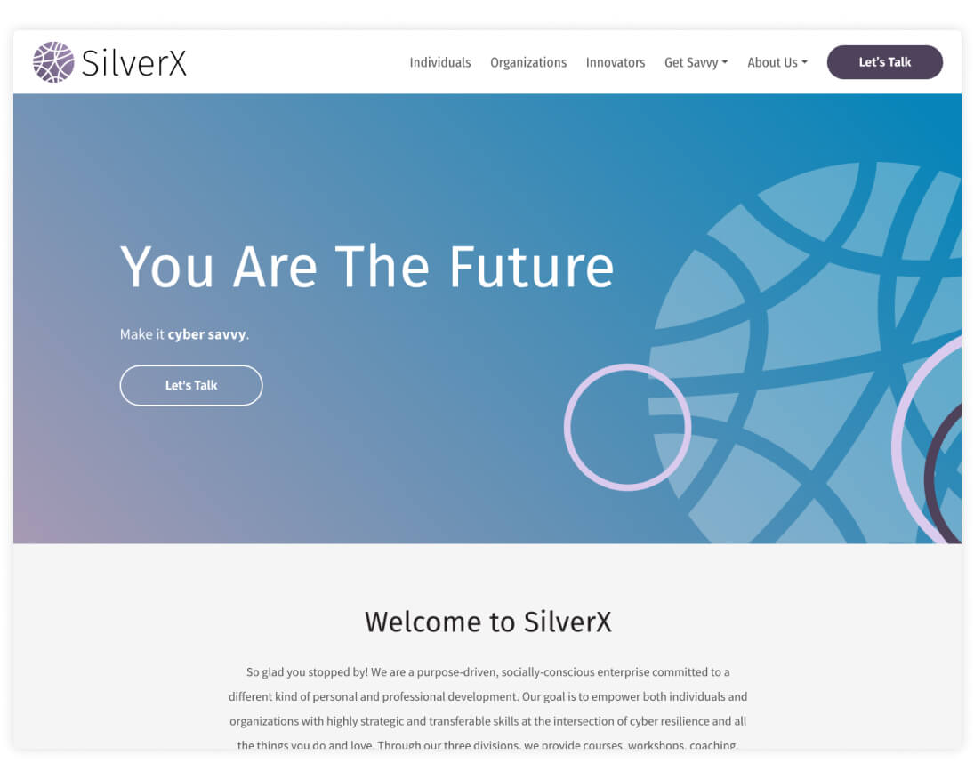
SilverX
SilverX helps clients become “cyber savvy” through a series of engaging programs about cyber security and related concerns. In addition to a user-friendly website, we designed an abstract logo that has allowed SilverX to grow their brand and build consistency across marketing materials. Both the site and logo feature abstract details and gradient colors that lend a polished, tech-inspired design.
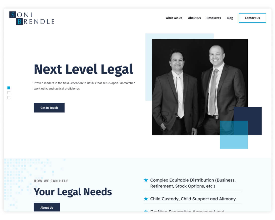
Soni Brendle
For NC-based law firm Soni Brendle, we designed a modern site that features animated illustrations, geometric textures, and an organized structure that helps users quickly find the content that they’re looking for. With layouts for practice areas, blog posts, and downloadable resources, the site serves as a helpful hub for current and prospective clients.
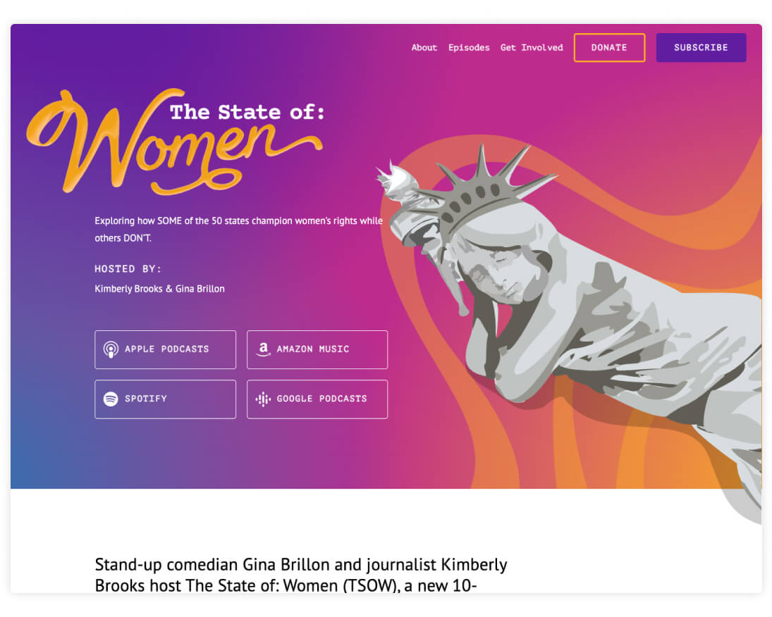
The State of: Women
Similar to Crossing the Line, The State of: Women is a podcast from Population Media Center that explores how women’s rights vary from state to state. Building on an initial brand concept, we finalized the logo design and created a website around an eye-catching visual style. Key features of the site include an integration with Simplecast for on-page playback, a distinctive color theme for each episode page, and a resource center that links out to external sites and tools.
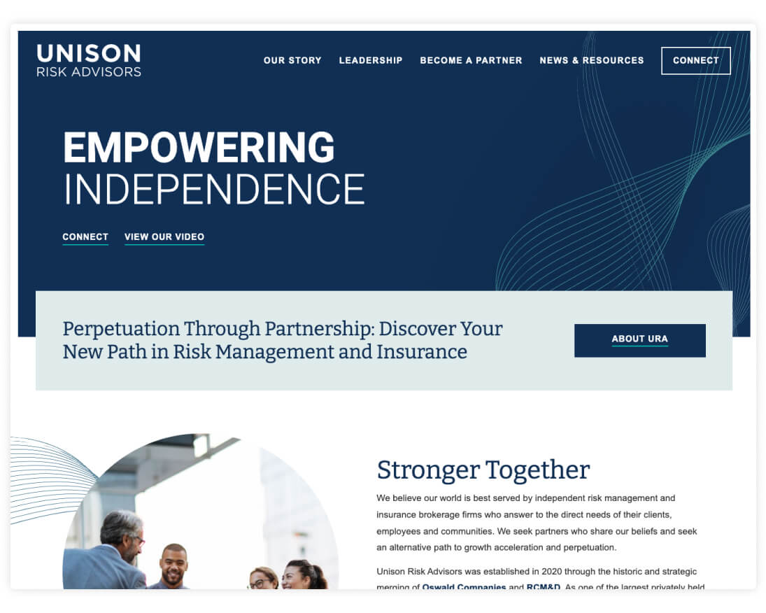
Unison Risk Advisors
Following the merge of Oswald Companies and RCM&D, Unison Risk Advisors was founded as an insurance brokerage and risk management firm in 2020. Having launched a handful of related sites over the years – Oswald, RCM&D, Taylor Oswald, Oswald Financial, and OsWell – our familiarity with the parent companies allowed us to move quickly when designing a new look for Unison Risk Advisors. With abstract graphics and a polished color palette, the site feels non-traditional and easily stands out from industry competitor sites.
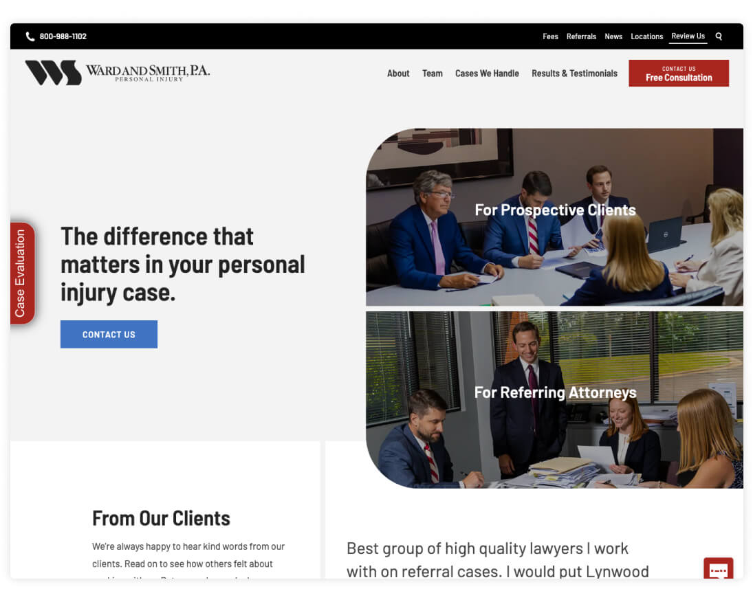
Ward and Smith Personal Injury
Ward and Smith is a North Carolina law firm that consists of specialized practice groups that focus on areas ranging from Agribusiness to Family Law. For the Personal Injury practice group, we created a standalone website to house relevant news, team bios, and information about the types of cases the group typically handles.
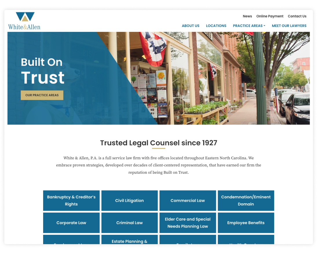
White & Allen
With five offices across Eastern North Carolina, White & Allen is a regional authority on a wide range of practice areas. Inspired by the geometric shapes in their logo, the new website’s modern layouts neatly organize information and create a smooth browsing experience for users.


Comments
Orismar H.
A great website design agency in Phoenix should deliver visually stunning and functional websites. Any agencies known for creative design?Leave a comment