A Beautiful Proposal Makes a Great First Impression

A lot of people, including us, are putting more emphasis on mobile website design because of the increasing frequency of readers viewing content on mobile devices. People are doing much more than just looking at websites on their mobile devices however, they're reading books, watching movies, playing games and checking email.
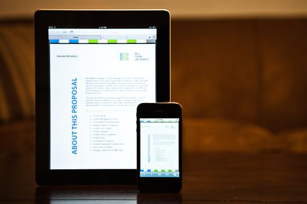
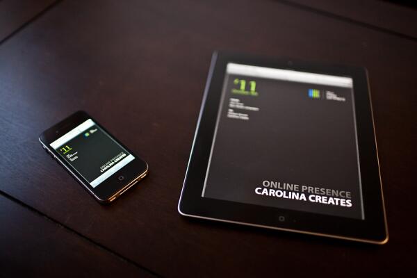
NMC's first impression on many of our clients is our proposal. And more often than not, this first impression comes into their inbox. In the last two years, checking email on mobile devices has increased 20%, whereas viewing email on a desktop has decreased by 11%. That's why we put great care into making sure our proposal looks beautiful on cell phones and tablets, in addition to when printed out or viewed on a desktop.

The attention to detail and effort in a proposal's design can go a long way toward showing a potential client the quality of your work and the care with which you approach projects. Apple is notorious for paying close attention to the design of the packaging of its products. They ensure that when it comes to their products, if people are going to judge a book by its cover, they're going to judge that cover favorably.
The same is true for a proposal. When a potential client's first impression of your firm's work is often your proposal, that first impression needs to show the attention to detail that you put into your work. And that attentional to detail should come across no matter where they're viewing your proposal. Make sure to think through every possible way a potential client will interact with your firm and the materials you provide them.


Leave the first comment