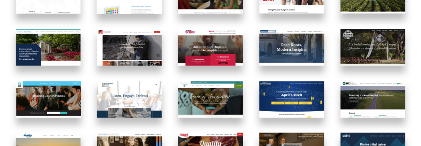
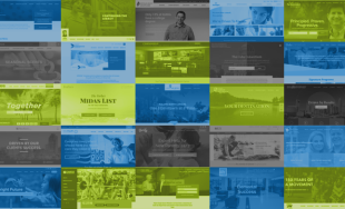
Happy New Year! While we're busy getting started on our work and goals for 2019, we wanted to take some time to reflect on our work from 2018. This past year brought us many exciting opportunities, from full branding work to custom building digital tools to complete overhauls of large sites. We couldn't be prouder of the work we accomplished last year and can't wait to see what the new year brings! Below is a sampling of some of our work from the year, showing a variety of different sizes, features, and audiences. It doesn't represent all of our work from 2018, but are 25 of those we were most excited to put out there!
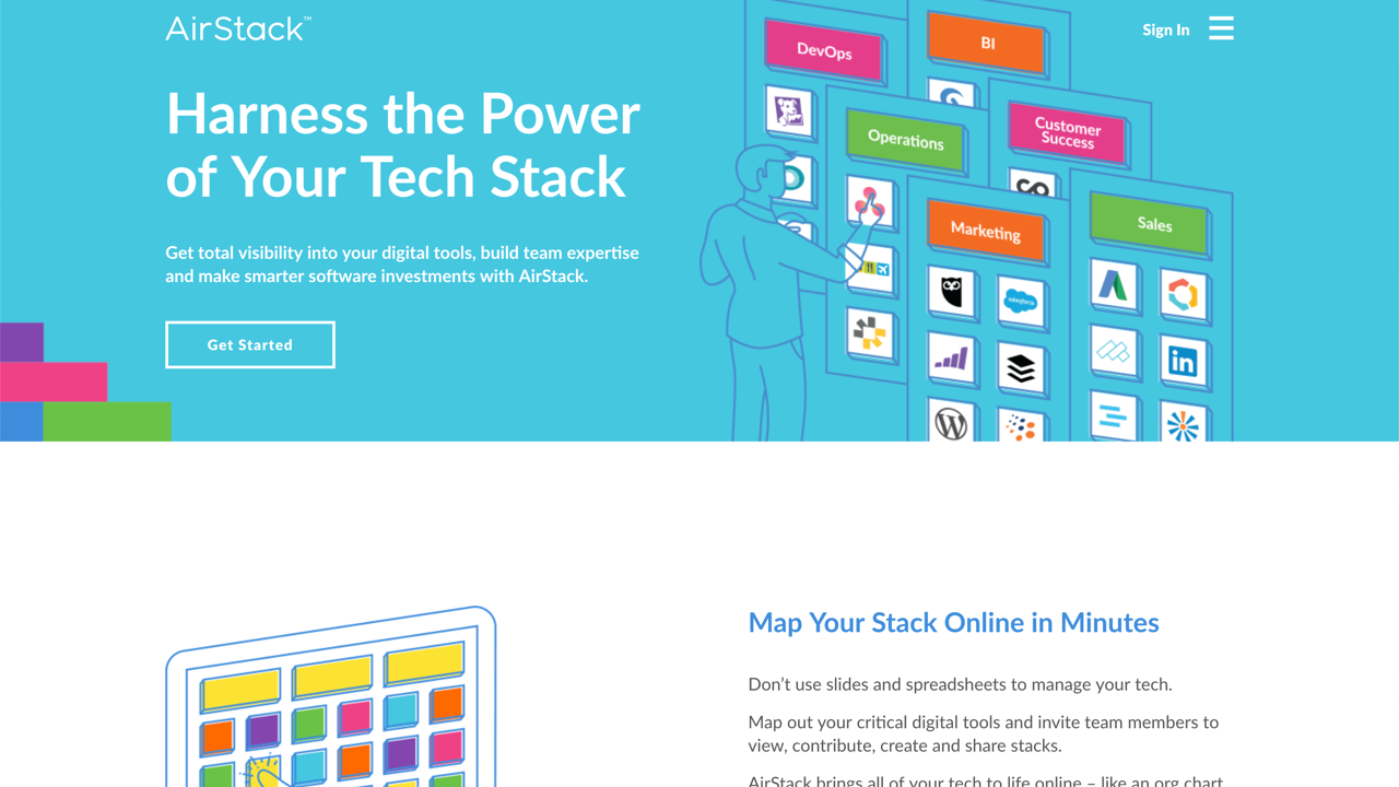
AirStack
We worked with our good friends at Liaison Design Group to design and build a web presence for the new tool AirStack. The tool lets teams quickly map out their digital tools and collaborate with teammembers in real-time. AirStack brings all of a team's tech to life online. It was a great opportunity to help introduce this new product and we continue working with the team to scale their digital marketing efforts.
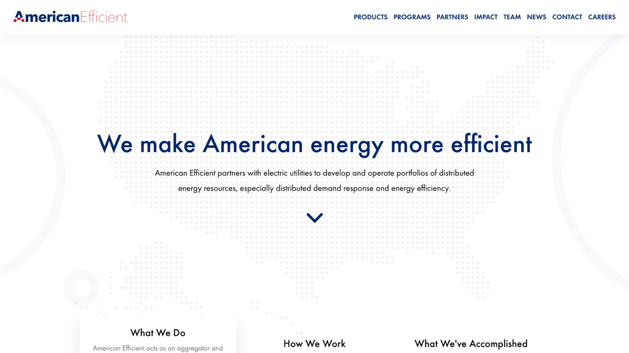
American Efficient
American Efficient partners with manufacturers, retailers, electric utilities and grid operators to develop and manage portfolios of energy efficient resources. They wanted a website that established their business credibility and highlighted the impact of their programs. To make them stand out, we used a long single-page layout with eye-catching effects as the user scrolls down the page.
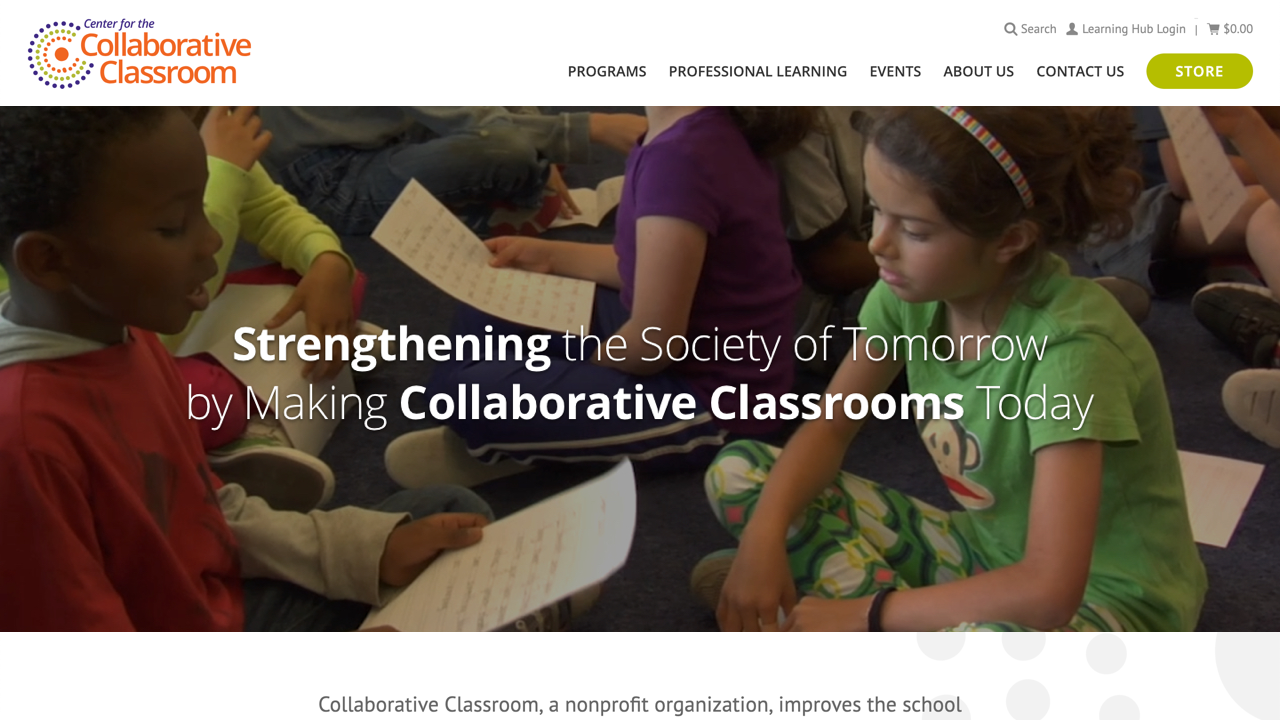
Center for the Collaborative Classroom
Center for the Collaborative Classroom, a nonprofit organization, improves the school experience of children across the globe by providing teachers with engaging curricula and ongoing professional learning that support the academic as well as the social and emotional development of the students we all serve. We created an engaging site with video and cold colors that features an extensive e-commerce store for their products and pages. The site deepened our already strong experience doing nonprofit website design and development, helping organizations reach their critical stakeholders and fundraise.
First Nations
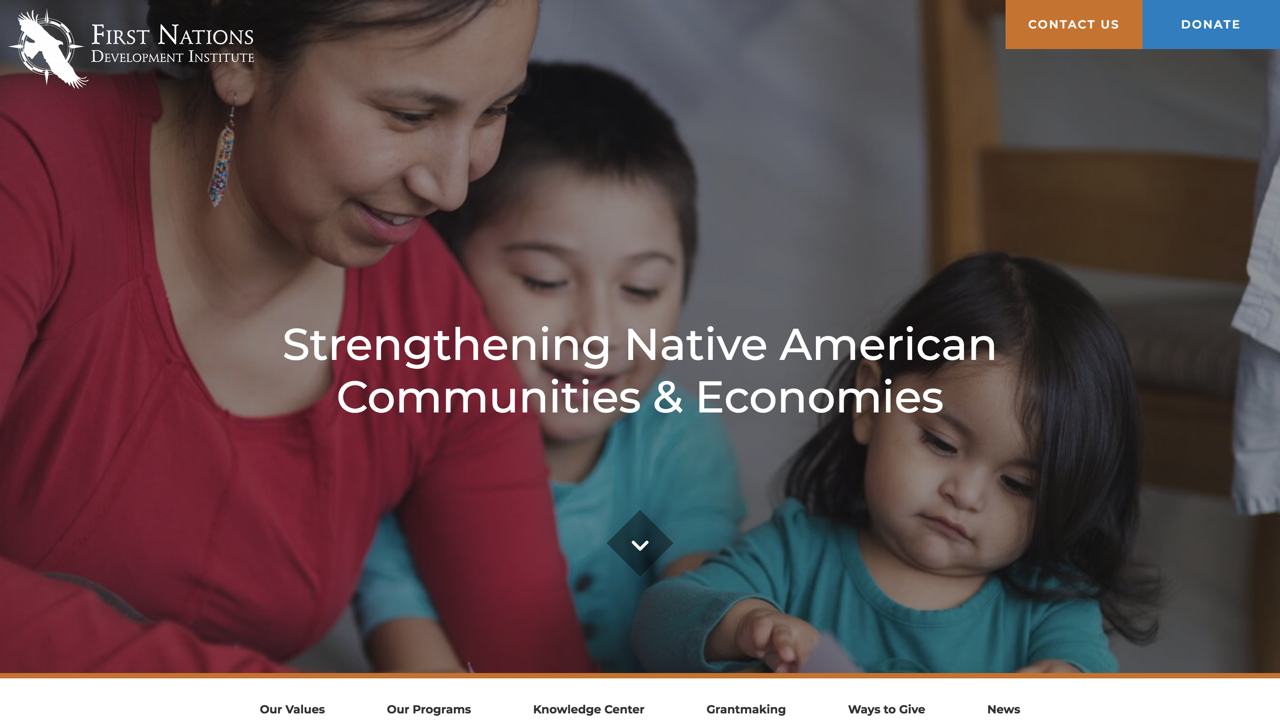
First Nations is a nonprofit that supports economic development in Native American communities. They approached NMC to redesign their site this year after it was feeling a bit outdated and not reaching all of their target audiences in the most effective way. We helped created a site that focuses on their large impact in communities around the country. The site features revamped program pages that clearly list out current projects, related resources, and personal stories. The organization has thousands of helpful resources – from webinars to recipes – so we reorganized them into a knowledge center that users can easily browse by topic, keyword, or type. Finally, we made it easy for users to quickly search the grants awarded by First Nations and see the areas they’ve impacted.
Fleet Feet
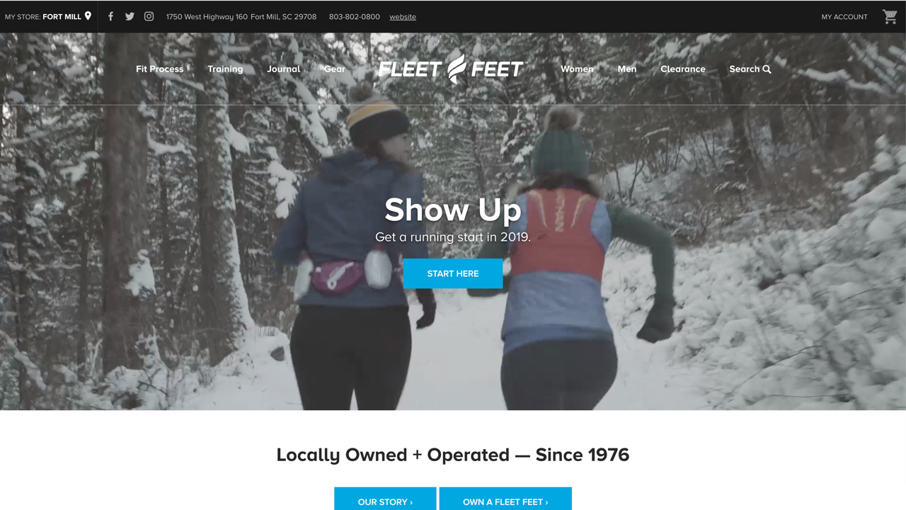
Fleet Feet enlisted us to give their site a 2018 refresh to pair with their new branding (we designed and built their initial ecommerce site back in 2014). The redesign includes a more optimized and condensed header, cleaner product listing pages, and revamped interiors that make content more accessible to users.
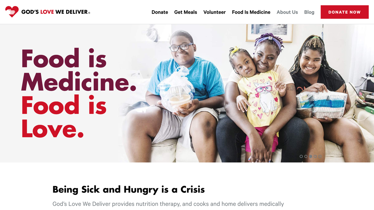
God’s Love We Deliver
God's Love We Deliver is a nonprofit in New York City that makes a big impact for the city by delivering medically tailored meals for people living with severe illness in the area. Our friends at Franklyn worked with the group to refresh their branding, visual language, and design a beautiful and clean site. We then picked up the work and built the designs on WordPress with a block system that makes it very easy for the organization to manage and scale this large and important site for years to come.
Golden Leaf
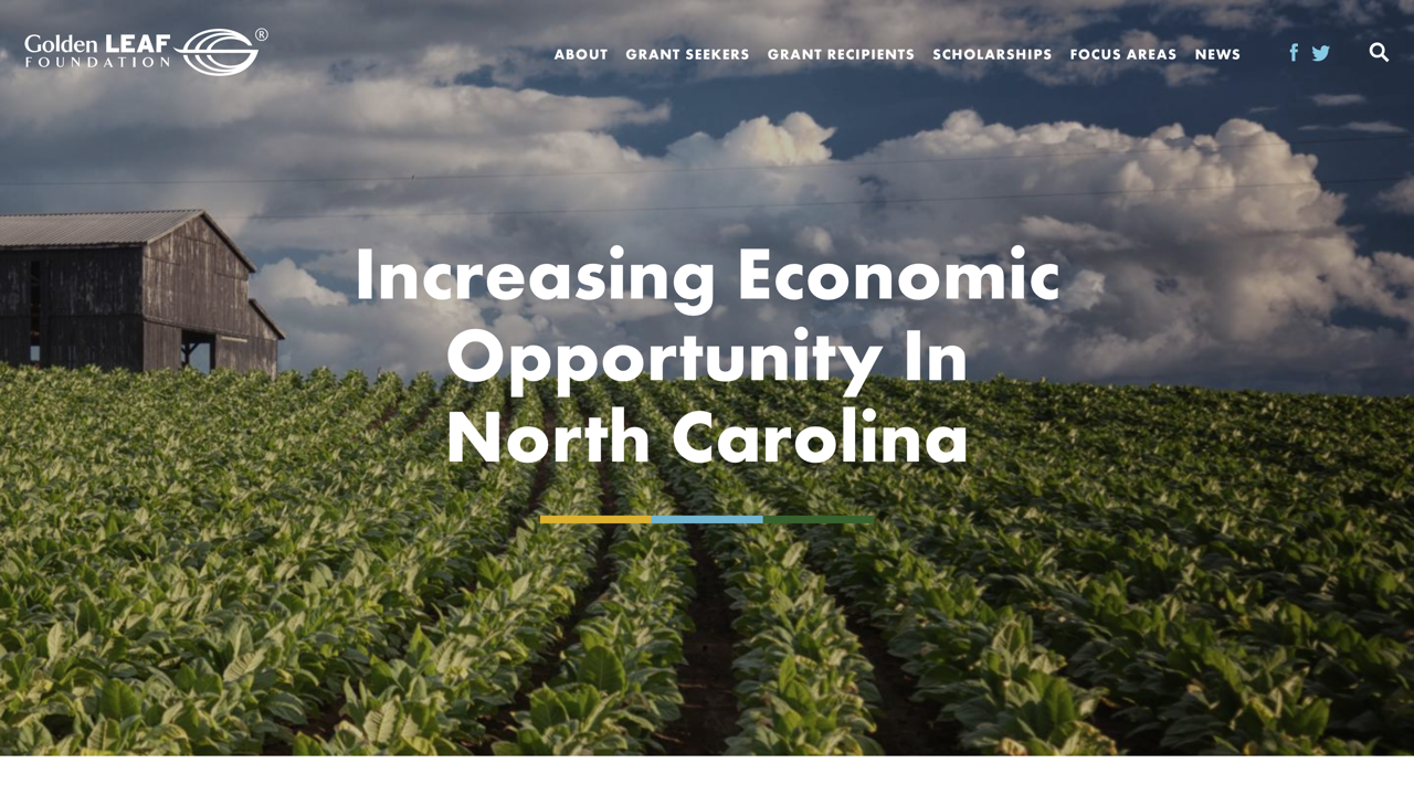
Golden Leaf is a prominent North Carolina nonprofit that helps create new economic opportunities in areas of North Carolina that preivously relied heavily on the tobacco industry, When they approaced us to redesign their site this year, we knew we wanted to focus on their work and impact around the state. The new site includes an interactive map highlighting their successes, new focus area pages that easily break down their work in that industry, and streamlined interiors that make it easy to search and apply for grants.
International Women’s Media Foundation
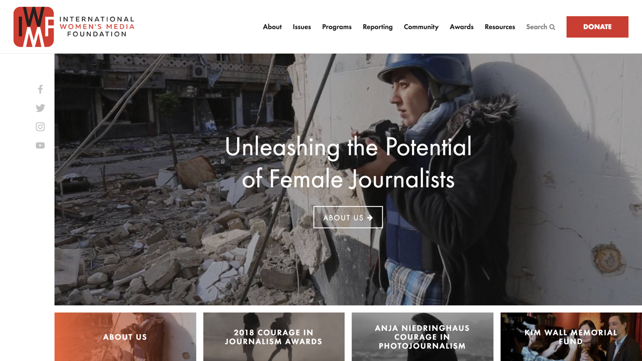
IWMF is a large DC-based nonprofit organization that helps aid female journalists around the world in safety training and international reporting trips. They approached us this year to redesign their site in a way that better showcased the work they were doing and the wealth of stories they have helped spawn. The new site features in-depth program pages with links to apply, testimonials from former fellows, and news produced through the program. The stories produced by IWMF fellows previously only lived on the news sites they were published for such as NPR or the New York Times, but users can now browse these stories on the IWMF site and filter by topic, program, location, or publication.
Manning Fulton Attorneys
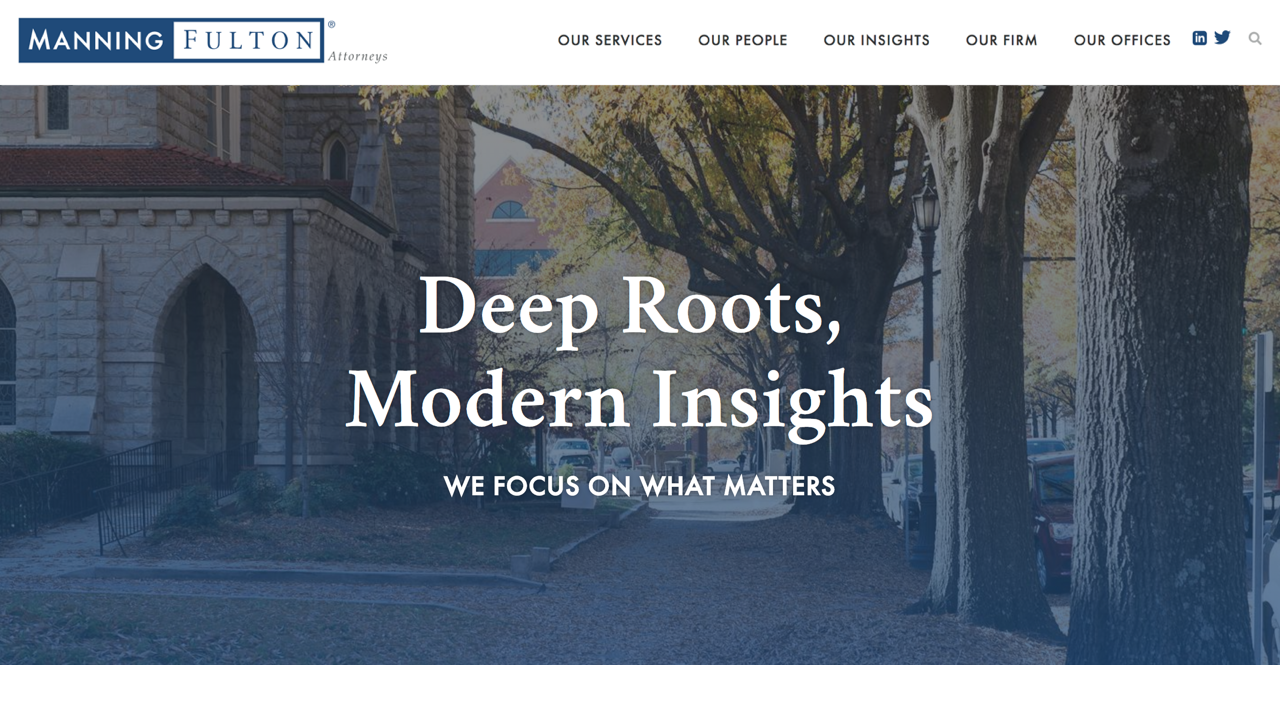
Manning Fulton is a law firm with locations in Durham and Raleigh, NC. We created a site for them that establishes their reputation as one of North Carolina’s preeminent middle-market law firms and acts a hub for communications and insights. The service landing page's act as a hub for everything related to the service and provides all information that potential clients need to learn about the services and contact the firm directly. Projects like this one continue to add to our experience in law firm website design and development, helping firms around the country harness the web's ability to successfully market themselves and impress potential clients.
Mccormick Farms
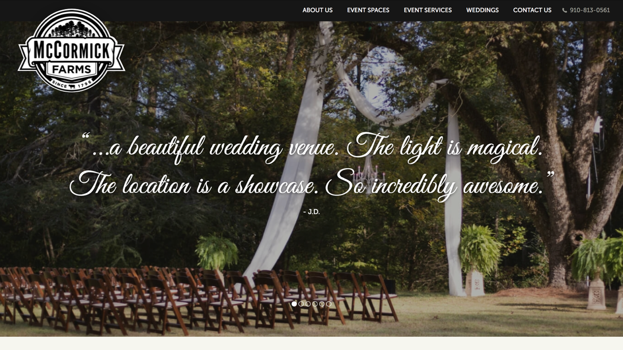
McCormick Farms is a beautiful, family-owned farm and event space in Southeastern North Carolina. They needed a website that would highlight the beauty of the space and its flexibility to host weddings, corporate events, athletic races, concerts, and more. To do so, we included not one, but two large image sliders on the homepage of the site. Image carousels were also an important feature on interior pages to show more in depth images of different spaces throughout the property. The script font and rough textures add to the custom touch of the site and the farms offerings.
Michigan Works! Macomb/St. Clair
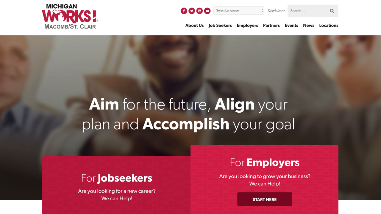
We built a site for them that connects job seekers and employers to information on how to find, post, and secure a career in the Macomb and St.Clair counties of Michigan. The site features in-depth landing page's that organized into various sections with different types of content for easy browsing. The job postings page is easy to use and connect job seekers directly to applications.
Moishe House
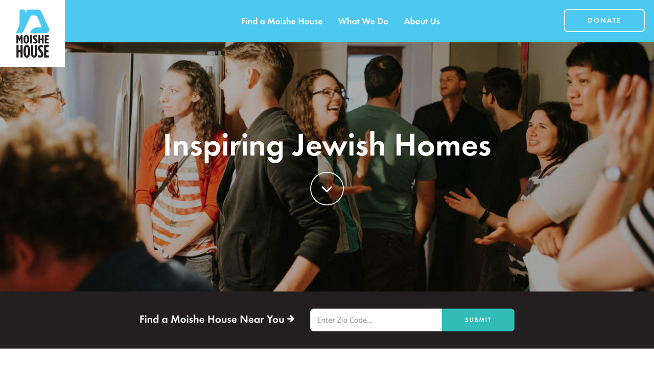
Moishe House is an organization that helps bridge the community gap for young jewish adults between graduating college and starting a family. We built and launched their site this year to help better reflect their mission and target audience. Their new site now allows users to easily find and connect with house in their area, explore international programming, and see the large impact of this organization.
Montgomery Rennie Jonson
Montgomery Rennie Jonson is a law firm based in Ohio, but works in states across the country. To show their national and local influence, we built a map on the homepage with stats about where they have worked and litigated in. For their specializations, we used a simple grid of image blocks that drives visitors directly to the content they came for.

NC Counts Coalition
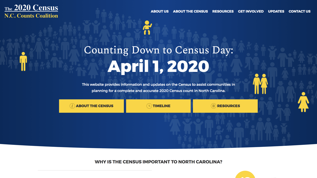
The NC Counts Coalition needed a site to provide information and a collaborative space for 2020 Census planning. The coalition has a large body of information regarding the 2020 census so we designed content heavy interiors that feature jump-to subnavigation, charts, a timeline, and FAQs. The website also acts as an information hub for all-things-census so the resources and news and updates are organized into cards that are easy to browse.
NC Electric Cooperatives
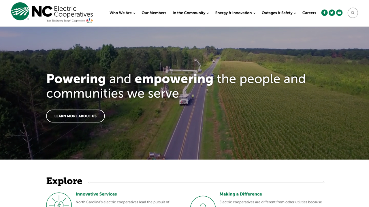
The NC Electric Cooperatives is a group of cooperatives that provide electricity, invest in their communities, and deliver energy solutions to communities in 93 of North Carolina’s 100 counties. They came to us for a site that provides information to consumers, features energy innovations, and highlights important information like power outages. Custom icons, ambient video, and interactive elements give users an enriching experience while visiting the site. The Our Members page features a custom interactive map that shows the different Cooperatives through the state.
North Carolina Community Foundation
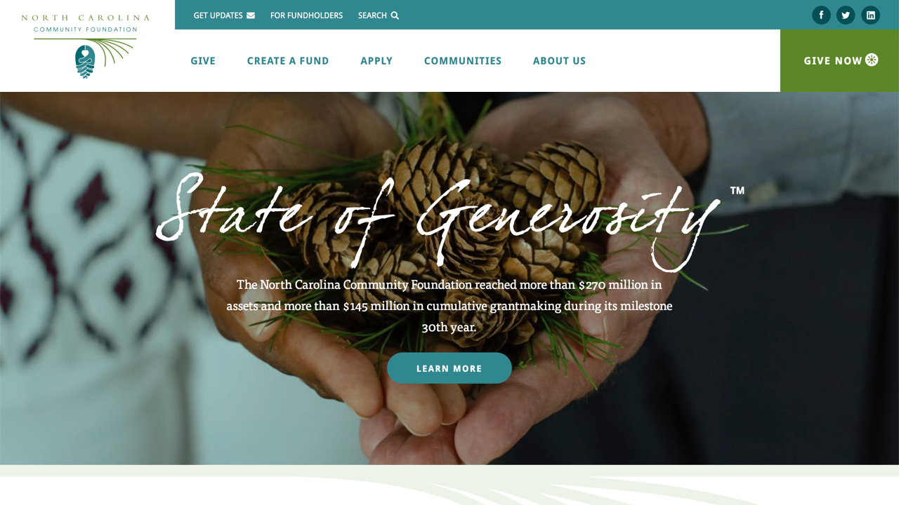
The North Carolina Community Foundation has been a longtime client of ours - we designed their first site back in 2010! When they approached us to redesign their site this year, we could not have been more excited to help give them an update.The new site gives their brand a modern feel, without alienating their users. The homepage now includes a big, bold feature area where they can tout their "State of Generosity" tagline, or customize it to promote their disaster relief fund. The site utilizes interactive maps to showcase the communities they work in, better highlights their extensive news and blog posts, and allows users to quickly browse and learn more about their funds.
Nuventra
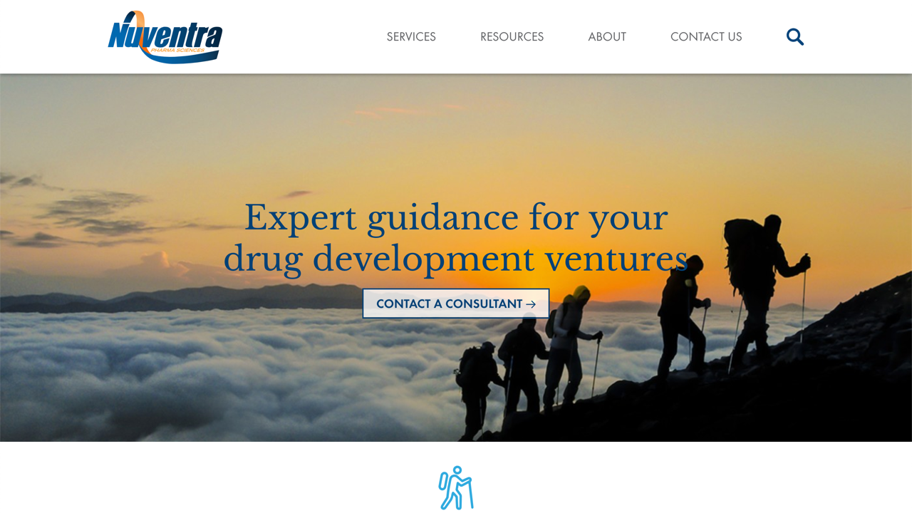
Nuventra is a fast-growing company with a focus on PK/PD sciences leading to informed drug development. The company needed a new site to reflect their expanded scope, exponential growth, and leadership in the marketplace. Our friends at Liaison Design Group designed the new site and had NMC build it out with a flexible WordPress setup that allows the company to easily manage the site internally.
Pete Buttigieg
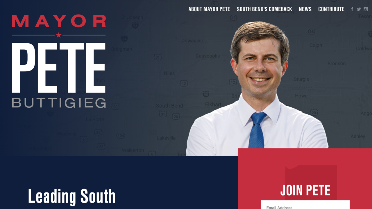
We've worked with Mayor Pete Buttigieg ever since he first successfully ran for Mayor of his hometown, South Bend. As the Mayor's profile has risen, including a highly publicized run for DNC chair, and his policies have helped make significant progress in South Bend, he needed an updated site to detail his story, work, and vision. We were excited to help bring that to life and continue our ongoing relationship with him.
Reclaiming Native Truth
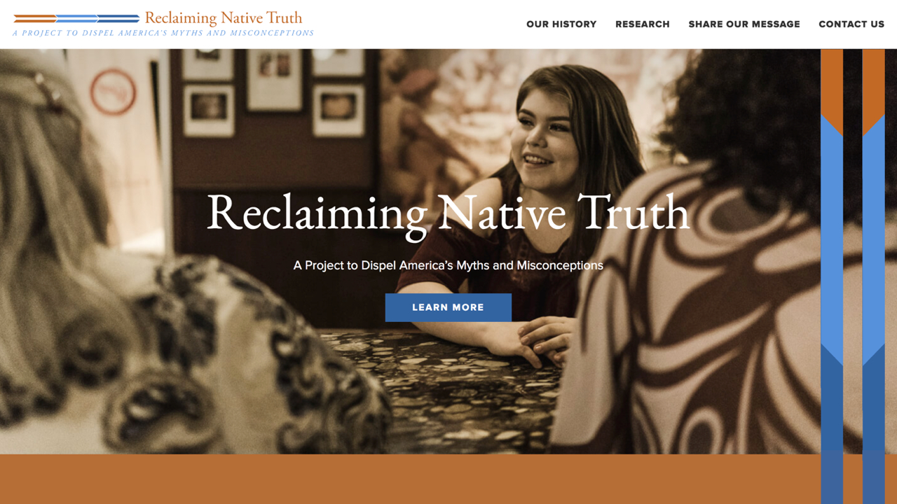
Reclaiming Native Truth is a national effort to empower Native Americans to counter discrimination, invisibility and the dominant narratives that limit Native opportunity, access to justice, health and self-determination. We built a simple, one-page site for them that highlights their cause, projects, and accomplishments. Keeping in line with the brand, we used bright colors, warm images, and geometric shapes through the site.
Remedy Review
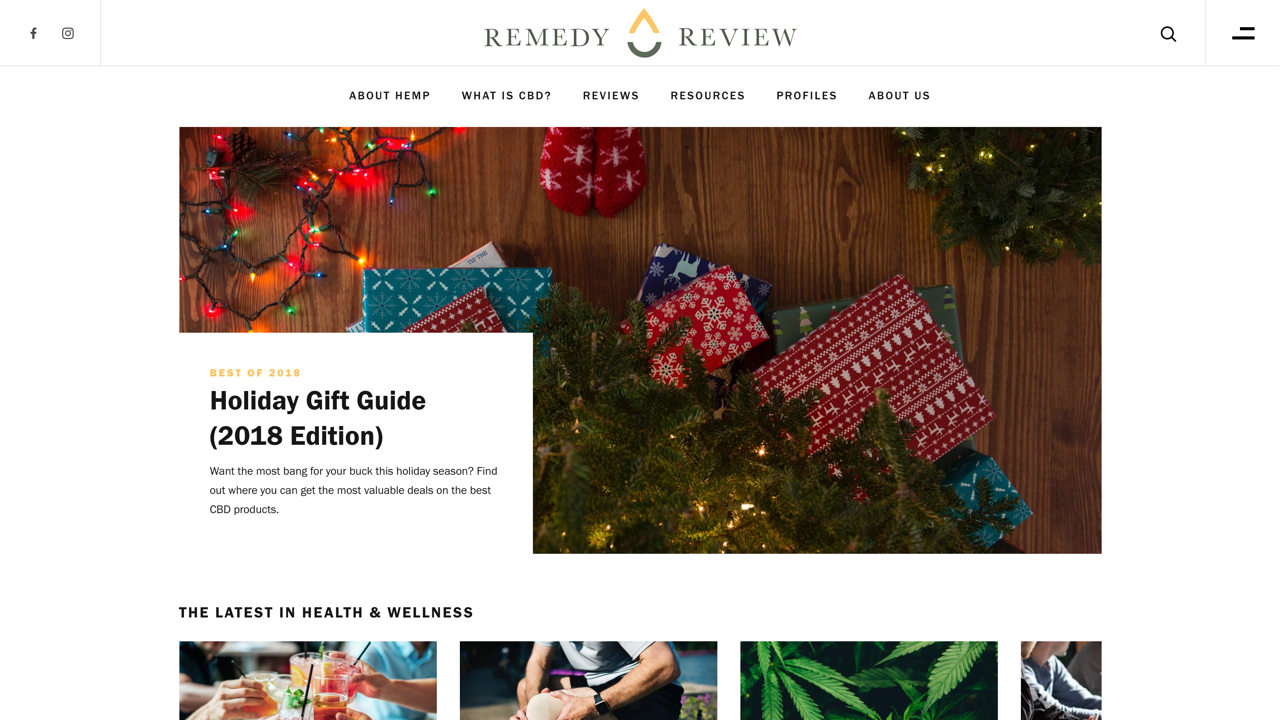
Remedy Review is a hemp and CBD news and review site brought to you by the same company behind House Method (which we helped brand and launch in 2017). For their site launch, Remedy Review wanted similar functionality to House Method, but for the brand to feel its own. We reskinned the House Method site and updated elements like the header, fonts, and colors to better match this new brand.
UNC Injury Prevention Research Center
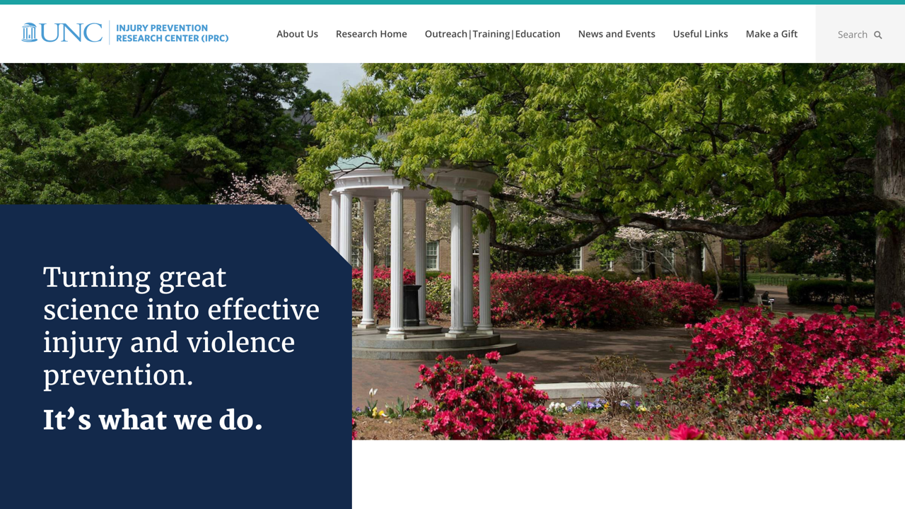
UNC IPRC is one of the leading injury and violence prevention research hubs in the nation. After creating a custom interactive experience with them last year, we partnered with them again to redesign their primary site to publicize their work, impact, and reach stakeholders. The redesigned site provides a new brand aesthetic, highlights their research and impact, and allows visitors to contribute to the organizations
UNC School of Informatin and Library Science
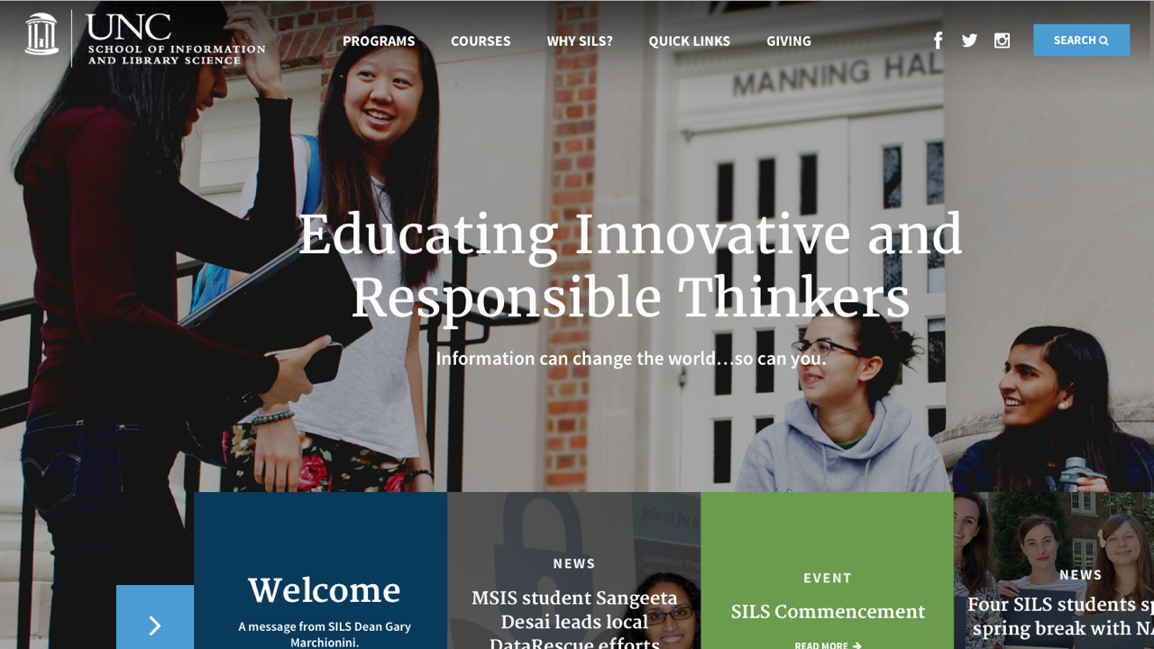
The School of Information and Library Science at UNC approached us to redesign their site in a way that would help make their program stand out from the competition and be distinct at UNC. We met with many different stakeholder groups at the School and established a strategy that would showcase the strong ratings and unique work this program produces. The new site features clean, but visually powerful program pages that feature program alumni, testimonials, related news, and easy access to applications and program information. We also redesigned the course listing to be easier for students to skim, and created a compelling giving page that features program statistics and stories in addition to their donation campaign information. This was a unique partnership where we created the design and the UNC SILS team developed the site - and we couldn’t be more thrilled with how it turned out!
Villari Foods
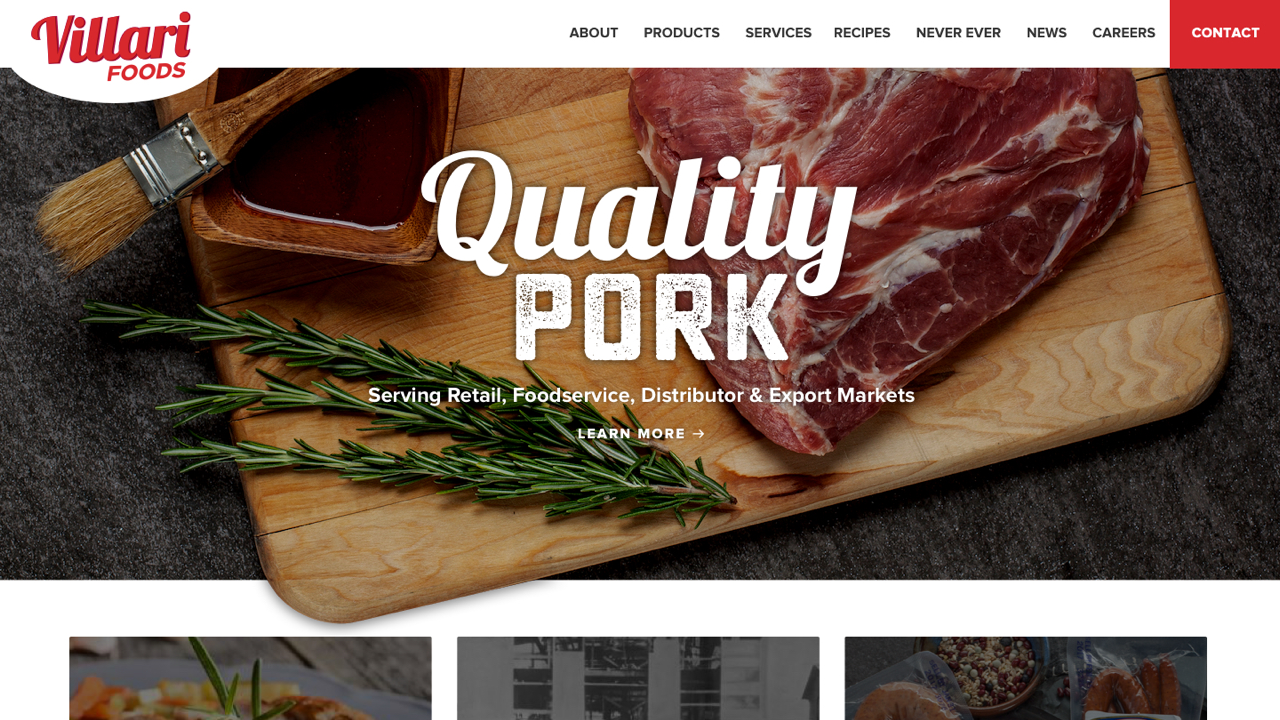
Villari Foods is a family-owned business that offers a wide variety of quality pork and other meat products for retail, food service and export markets. A company with such a rich history needed a rich design, so we used bold photography, creative fonts, and realistic textures to bring the site to life. The product pages feature cooking instructions, nutrition facts, and recipes that include that product.
West Arete
West Arete is based on in Pennsylvania and crafts custom software for higher education clients. They were looking for a new site design that would engage audiences in the higher education space and generate leads. Our friends at Newfangled led the firm's new online strategy and provided consultation on design approach to make sure the new site was following best practices to excel at marketing West Arete on the web. We used colorful graphics with trendy gradient shapes, custom icons, and a bold font to create a clean site that presented their capabilities and successes in a clean, tech-forward design.
Wyatt Early Harris Wheeler
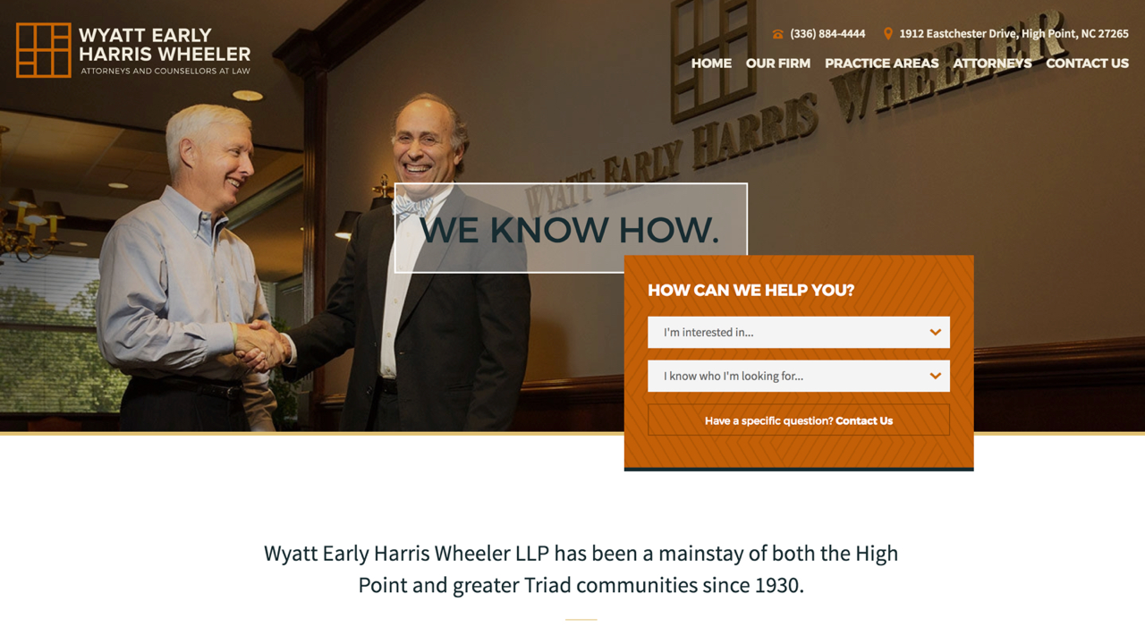
Wyatt Early Harris Wheeler is a law firm based in the Triad of North Carolina. We build them a site that uses bold colors, custom icons, and a fun pattern for a personal touch. The homepage features a search block that allows easy access to what information the user is looking for. The clean attorney listing presents each attorneys contact info below their thumbnail, so that information is easily accessible without even having to click further into the attorneys individual page.




Leave the first comment