This year was a big one for NMC. We moved into a new, larger office, gained three new team members, hosted meetups and classes, and several of our team members spoke around the country and the globe (you can read more in our 2016 Year in Review). The biggest accomplishment for us this year though has been our work. We created bigger, better projects, and we couldn't be happier with the work our team has done. Here is just a sample of some of the projects launched this year that we are proud to show off:
1. Academic Advisory Council
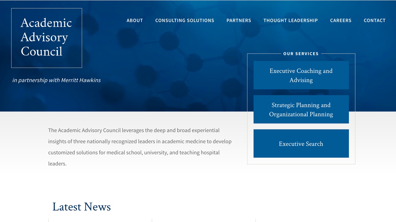
We love working with B2B companies, and Academic Advisory Council's clean, modern design has become one of our favorites. Despite being a small site, it's packed with unique layouts that highlight their services, leadership, and news and resources.
2. Andrew Goodman Foundation
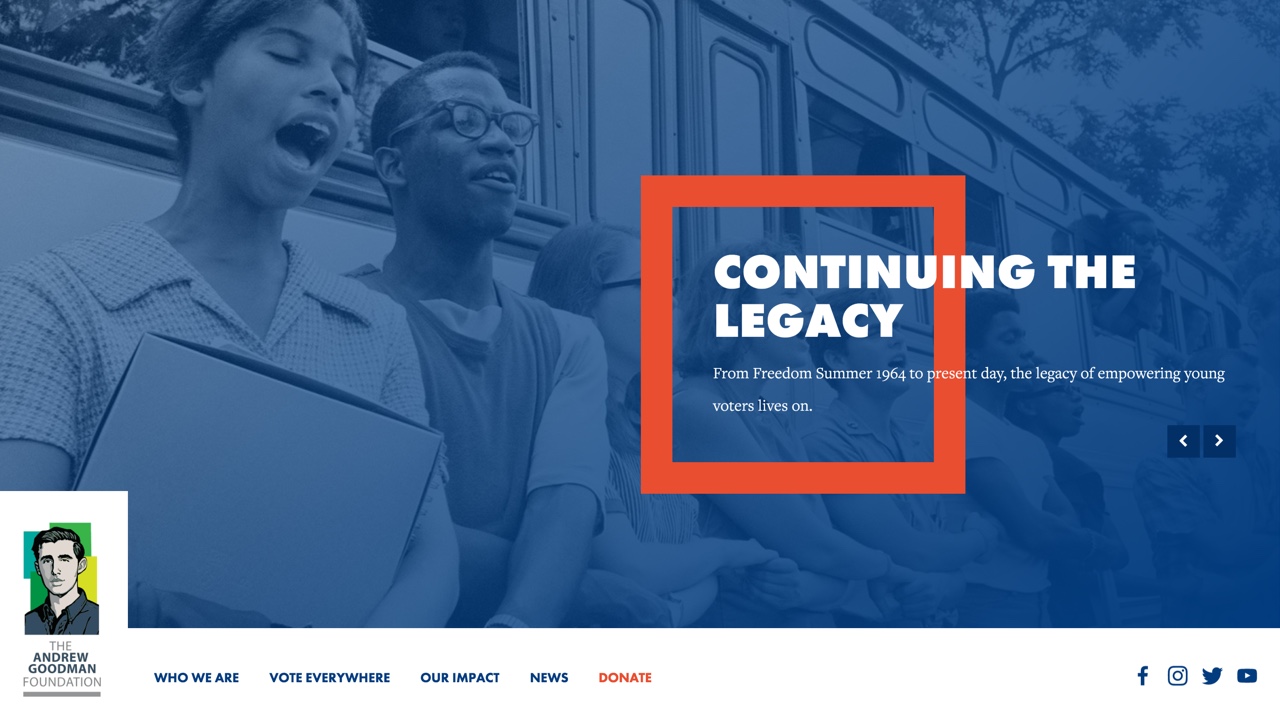
AGF is an amazing organization that encourages civic action in young adults, and has a powerful backstory from the civil rights movement to boot. We loved creating a modern and fun design geared toward getting students involved. The site includes large visual tile grids, customizeable by-the-numbers stats, and an interactive timeline.
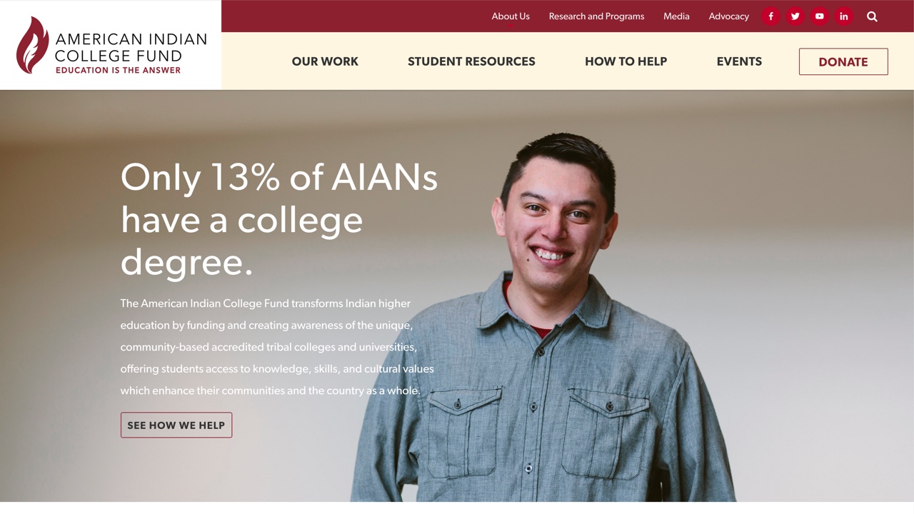
3. American Indian College Fund
The American Indian College fund is a vibrant organization that connects students to tribal colleges and universities. We wanted to design a unique site that appealed to students and donors alike and loved using bright and bold colors, large images, and tiled grids throughout the design.
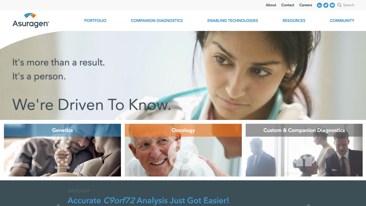
4. Asuragen
Asuragen needed a site that could present their multitude of products, resources, and research in an organized way that wouldn’t overwhelm the user. To accomplish that we used a clean design, mega menus, breadcrumbs, and interactive call to action visuals throughout making for a slick content heavy site.
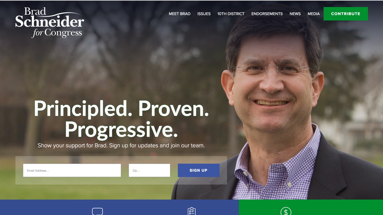
5. Brad Schneider for Congress
We launched more than 17 campaign websites this election cycle. Schnieder's modern campaign website was a fun one to work on, with lots of great, large images, highlights to the issues he supports and his social media feeds, and a unique color palette.
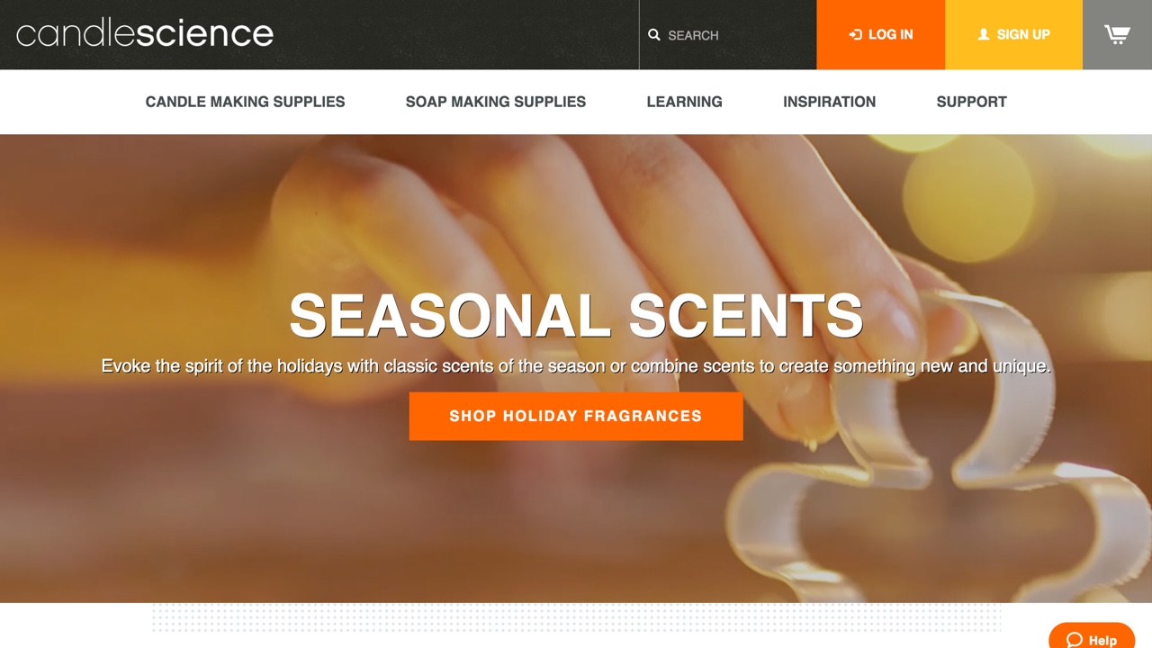
6. CandleScience
Craft candle supply company CandleScience came to us to create a more modern and mobile-friendly design for their development team. We loved creating a clean new homepage, tutorial layouts, and new category and product layouts that make purchasing a breeze.
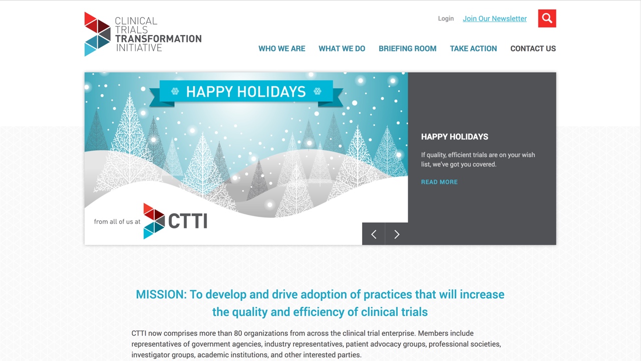
7. Clinical Trials Transformation Initiative
CTTI is a unique organization working to to develop practices for higher quality and more efficient clinical trials. We designed their site to be fresh and straightforward, with some fun info-graphic like touches and a mega-menu to aid in ease of navigation. The site was developed on Drupal.
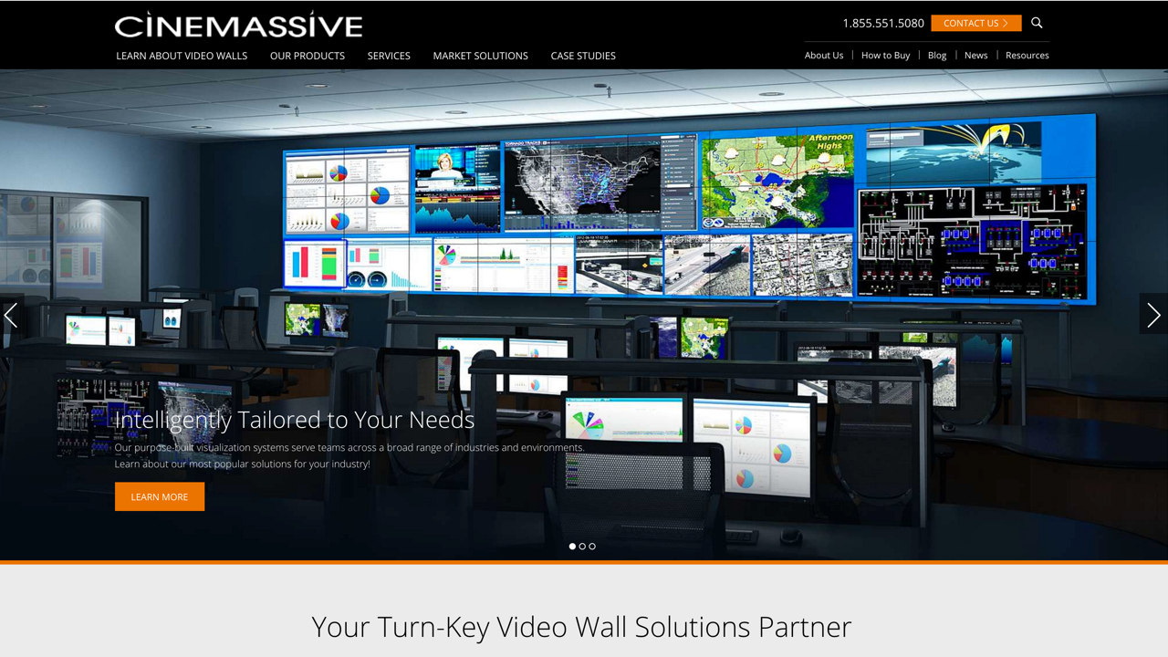
8. Cinemassive
Cinemassive approached us to develop their new website design on Wordpress. We pride ourselves on creating an extremely flexible Wordpress setup. Their designs were brought to life with 10 unique layouts, and an incredibly flexible 'Modules' layout that gave CineMassive more than 20 different Modules that could be added in any order and as many times as desired on any given page
9. The Cuba Consortium
The Cuba Consortium approached us to design an informational site for their organization, which aims to promote conversation on U.S.-Cuba relations. We wanted the design to show both facets of the organization, while also appearing unified - so the homepage prominently features a split design of both the U.S. Congress Building, and Cuba's National Capital Building. An email signup form is prominently placed in the banner area, while the site also features each of the advisory board members and calls-to-action to contact or view news on The Cuba Consortium.
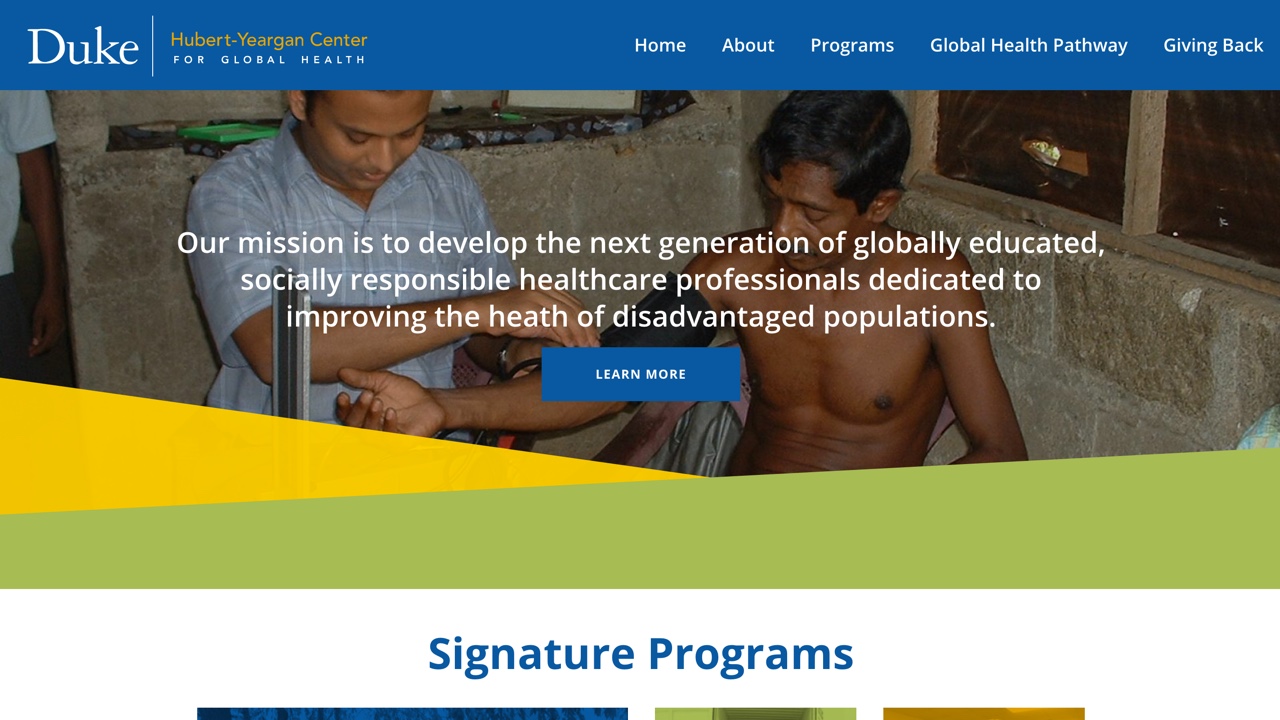
10. Duke Hubert Yeargen Center for Global Health
After seeing the website we designed and developed for the Duke Global Health Institute, Duke's Hubert Yeargen Center approached us to redesign their new site. The design has a major focus on the center's research and education programs, and features large customizeable tile grids, an interactive map, and 9 unique layouts.
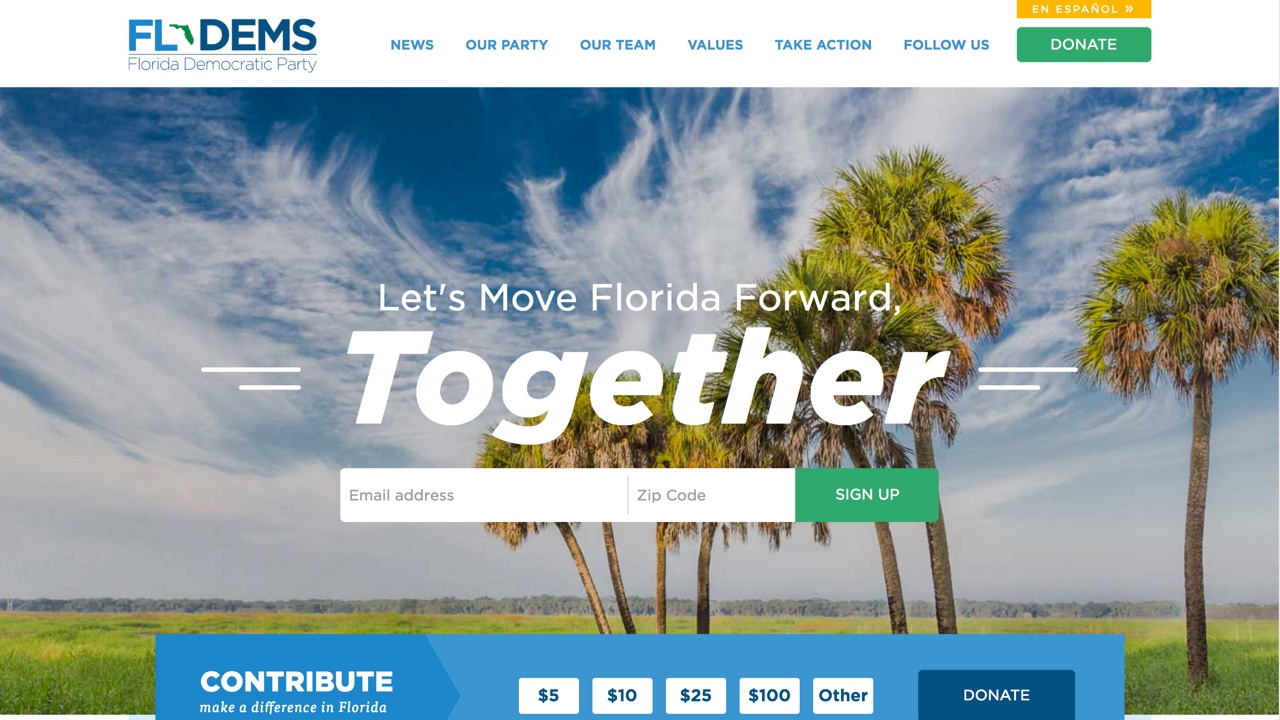
11. Florida Democratic Party
We launched the site for the Florida Democratic Party back in 2014, and it has always been one of our favorites. They returned to us this year to redesign their homepage based on changes in their content needs. The new homepage is cleaner, more florida-centric with a large banner image, and puts more visual emphasis on their news items with a tile grid.
12. Forbes Midas List
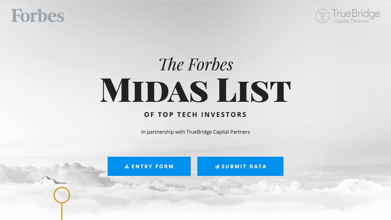
The Forbes Midas List is the definitive ranking of investors each year. We had the honor of creating a splash page for this year's submissions, where users could submit deal data securely and learn about the history and methodology of the list.
13. Here We Grow NC
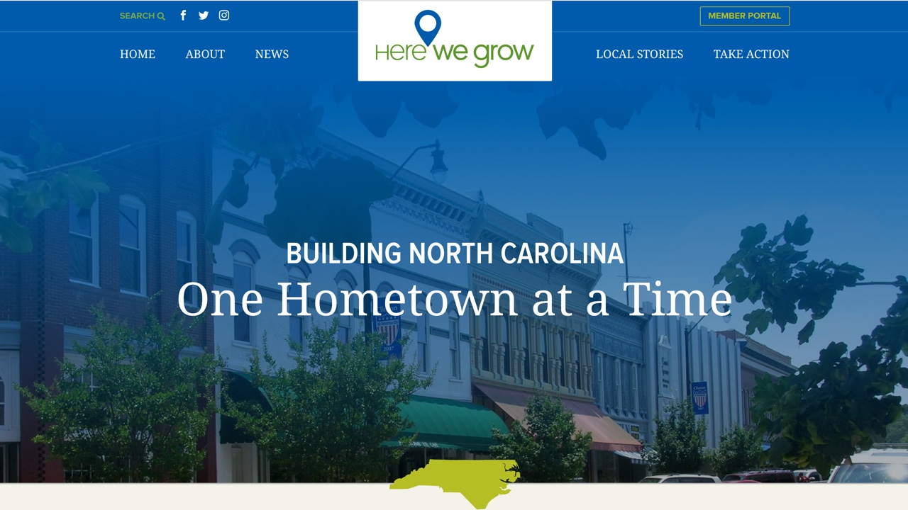
Economic development web design projects hold a special place in our hearts, so when the North Carolina League of Municipalities approached us to develop a new site that would serve as a source for stories on how local governments are creating new job opportunities for NC, we jumped at the chance. We created a fresh design for Here We Grow NC, which prominently features local stories in an interactive map. The entire site is customizeable (map included) and built on WordPress.
14. Home of Golf
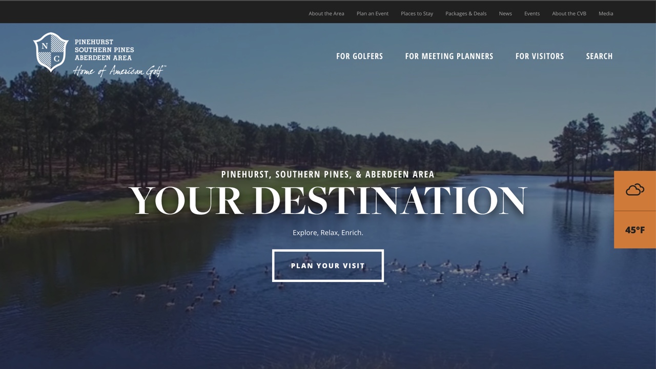
The Convention & Vistors Bureau of Pinehurst, Southern Pines, Aberdeen Area approached us to redesign the Home of Golf, a site geared at enticing vistors to travel to the area. The area is beautiful and steeped in golf history, so designing for them came easy and it's become one of our favorites to work on. We used color and type to portray the sense of tradition that the area holds, but created a modern layout to make it easier to navigate and give it an approacheable feel. The site features large photos of the landscape and attractions on each of it's pages, an ambient video to draw in users on the homepage, and unique landing pages for various visitor interests. The site went on to win the Platinum award from the Destination Marketing Association of NC.
15. Hull & Chandler, P.A.
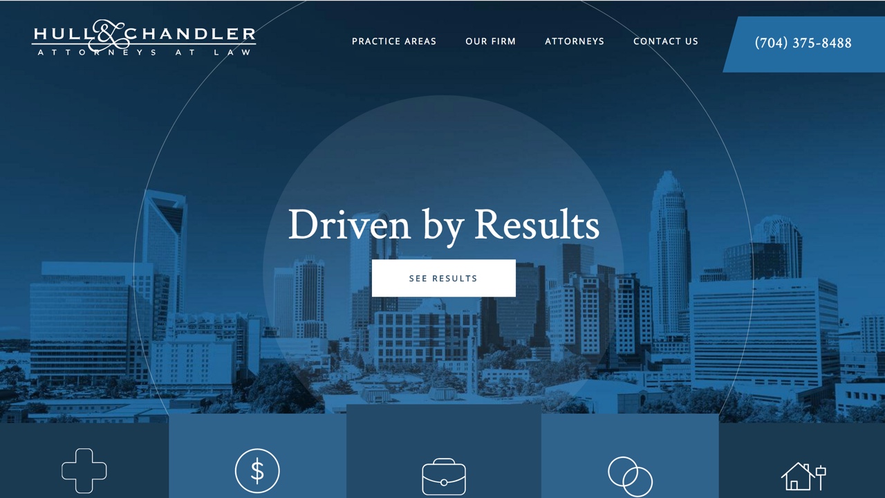
We love partnering with law firms, and launched 6 new sites for firms just this year. Hull & Chandler approached us to redesign their site upon deciding to rebrand away from a personal injury firm, to a broader practice focus. The new design features a clean, modern look, calls-to-action to all of their practice areas, a Charlotte focus, and prominent introductions to their attorneys and their specialties.
16. Hutchison Law
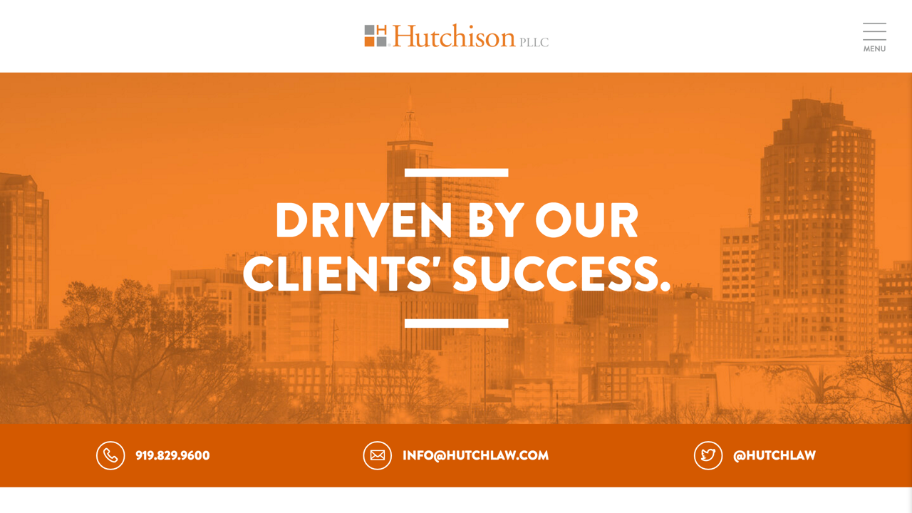
We partnered with Hutchison PLLC several years ago to launch their previous website. Ahead of their firm's 20th anniversary this year, Hutchison approached us to completely redesign the site. Their modern new design heavily focuses on their services geared toward emerging companies and technology. The site is frequently cited as a top legal site and was named by Lawyerist as a Top 10 Best Law Firm Website of 2016.
17. Intrahealth
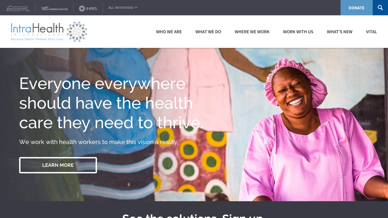
Local nonprofit, Intrahealth, works in over 100 countries to help strengthen their healthcare systems. They approached us last year to redesign their website to help better convey their message and get users to interact with their content. Intrahealth has a vast amount of resources on their site, so this was no easy task, but we created a design that remains cohesive, clean, and spans 19 unique layouts. The website features an interactive map of countries they work in, large photographs and pull-out facts to show their impact, and calls-to-action and links to resources on every page. Everything on the site is customizeable and built on Drupal.
18. Pacify
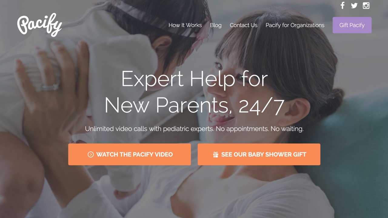
We created a landing page and logo for parenting startup, Pacify, a few years ago. It's been fun to watch the company's app evolve, and this year we were approached to launch a full website for them. The new design is visually heavy, featuring large photos, testimonials, and interactive elements. There's also a special focus on gifting the product, which features a unique landing page.
19. RTI
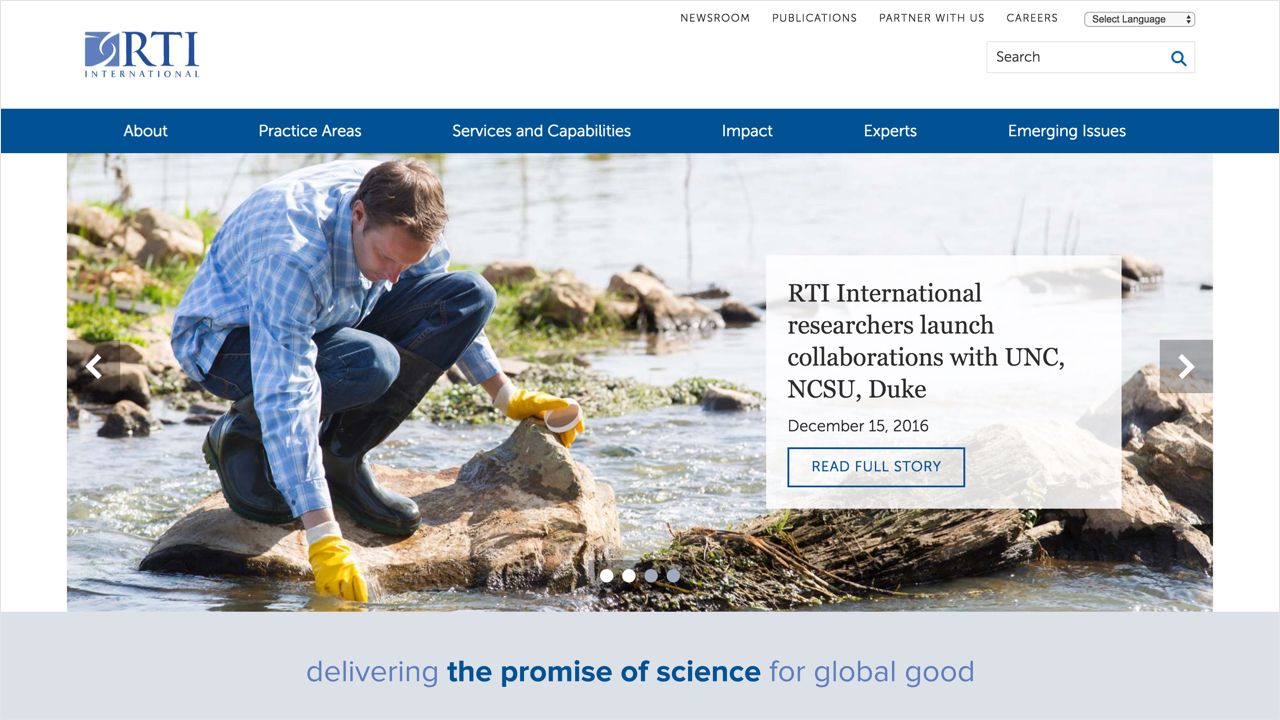
RTI International is a powerhouse nonprofit research institute who does work in more than 75 countries. The organization has a team of more than 4,000 and tackles hundreds of projects each year. They came to us to work with them to launch a new site that was meant to be more focused on telling the stories of their work, built to modern standards like having a responsive design, easy to manage from an administrator point of view, and integrated with a number of external systems that they manage.RTI provided the initial design layouts and we worked with them to refine those and build them on Drupal CMS, giving the institute a flexible and impressive new web presence.
20. SECU Family House Winston Salem
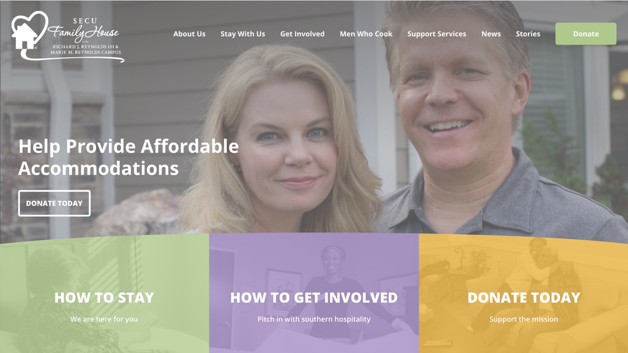
We designed a new logo and website for SECU Family House at UNC Hospitals a few years back, so we were thrilled when the SECU Family House in Winston Salem contacted us to redesign their website. The new site is clean and more organized, and has a special focus on their impact - with by-the-number features on the homepage and large photos throughout the site.
21. The Children's Partnership
We were lucky to work with many nonprofits this year. The Children's Partnership is an advocacy group that works on improving the lives of underserved children through healthcare and technology. We loved creating a professional, clean design that still had lots of fun child-like elements worked in – like bold colors and scrolling animation effects. 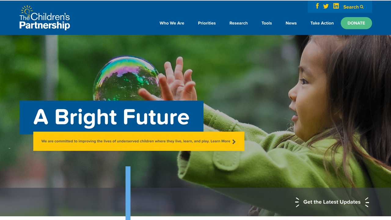
22. UNC Campus Recreation
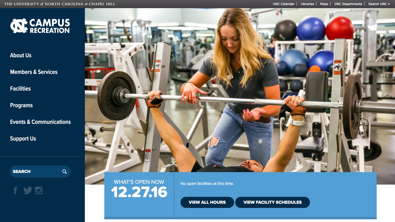
We have several UNC Chapel Hill Alumni on our team, so we always enjoy working on a site from out alma mater. After seeing the UNC Dining site we launched in 2014, UNC Campus Recreation contacted us to redesign and develop their new site. The new site completely caters to the students - it's mobile friendly, easy to navigate and places programs and facility hours at the forefront of the design.
23. Wyatt Early Harris Wheeler
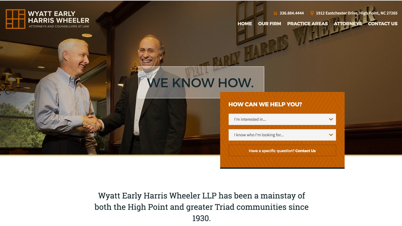
Wyatt Early Harris Wheeler, a law firm out of High Point, gave us free reign when they came to us for a new website design. One main goal of their site was to push users to contact them so we included an interactive contact feature directly in the homepage hero as well as a contact form in the footer of every page. Cool fact: we even provided the photography services for the new site!
24. Wyrick Robbins
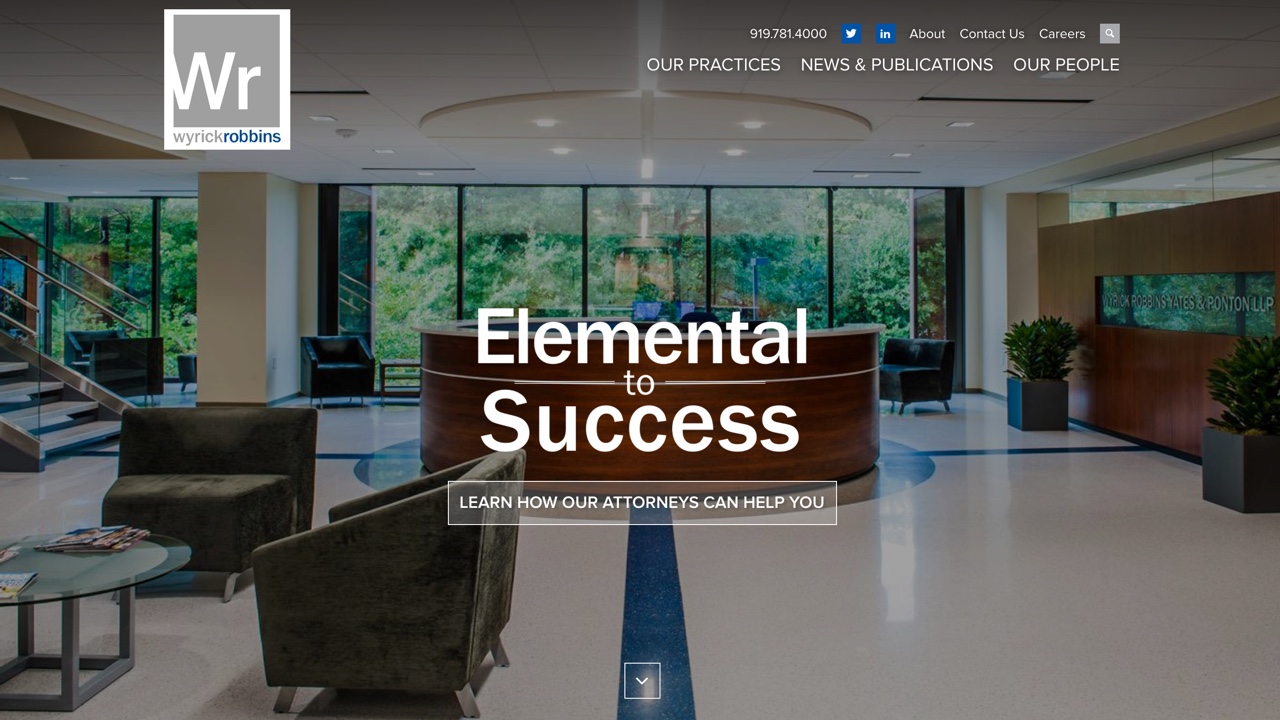
We were excited when Wyrick Robbins asked us to redesign their site as they are a large local firm and are viewed as a leader in the area in entrepreneurial law. The new site better portrays their capabilities to potential clients. The design features large banner images, call outs to their practice areas, and prominent areas for representative transactions and clients.
25. YWCA Boston
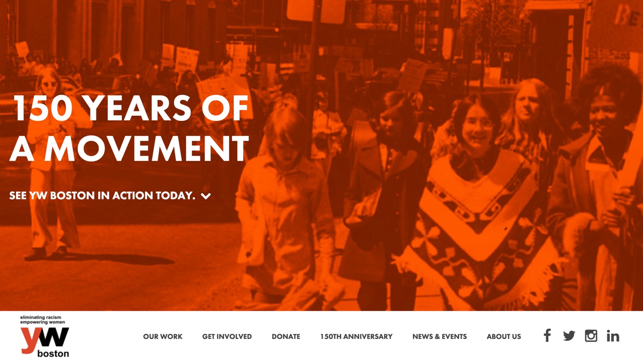
We were honoroed when YWCA Boston, the first YWCA in America, approached us to redesign their website ahead of their 150th anniversary this year. The organization is proud of their history and programming, so we made that the center of the design. The site features large banner images from both the past and present, customizeable tile grids to highlight their programs, interactive features to learn more about the organization, and large by-the-numbers features to show their impact.


Leave the first comment