These days, there are dozens of web design tools available on the market. Each one offers distinctive features and extras that are meant to set it apart, but it can be difficult to select a tool and commit to learning the ins and outs — especially if it will change your team’s overall workflow.
Having been in the business for almost two decades, our team has tried a few different tools for our web design process. We used Photoshop very early on – spoiler: this wasn’t a good fit – and then switched over to Sketch when it was fairly new to the scene. Sketch and Sketch Cloud dramatically improved our workflow and allowed our team to grow and collaborate, but over time we found ourselves searching for something that would be even more of an “all-in-one” tool.
Enter: Figma. Like Sketch, Figma is a vector-based editor that is primarily used for digital design – particularly projects like apps and websites. Since its release in 2016, Figma has experienced a rapid jump in popularity and continues to generate industry buzz. While we were aware of Figma as a general trend, it only seriously entered our radar when some of our design agency partners began sharing assets and designs as Figma files.
After demoing the program for a handful of select projects, we decided to make the switch and we haven’t looked back. Here are a few reasons behind our switch and why we’re loving Figma:

All-in-One Workflow
Our previous website project workflow, from design to client presentation to dev, used several different services. We used one program for design, another for uploading and presenting layouts to clients, and a third for handing off files to developers. While each of these services worked well for the intended purpose, moving between them added friction that slowed down our overall workflow.
In Figma we have all of these capabilities in one place, which is a huge timesaver for everyone involved. Here’s a look at how we break down our design workflow in Figma:
Design
The project organization in Figma allows us to create a folder for a client that can house an unlimited number of files. This is especially helpful over time, since our clients often come back to us for website updates or additional work. Whenever this happens, we can easily open the client's project folder and consult the original design or add new files for things like extra layouts, social posts, annual design audits, and so on.
Client Presentation
To give clients a realistic view of what the designs will look like on a live site, we like to share a link (rather than a jpg) that they can view in their browser. We use Figma's prototype sharing feature for this. Unlike other design programs, the client can only see what we’ve shared with them, which is a bonus!
Developer Handoff
Before making the switch to Figma, we were using Zeplin to pass designs off to our development team. Now, we can do everything in Figma using the Inspect mode. Inspect mode allows developers to view the designs and download specific assets.

Team Collaboration
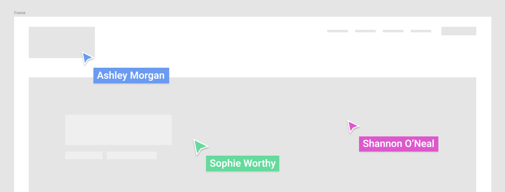
When multiple users are simultaneously working in a Figma project, they can see all collaborators in real time. In addition to showing live edits, Figma even shows each user's cursor with a color and name label. It’s pretty cool!
This advanced collaboration feature gives our team the ability to directly interact within a design file. We’re able to have a phone/video call about a project and point at specific elements to show quick ideas right there on the spot.
Another great aspect of this feature is that it limits the possibility of overwriting someone else's work. Because users are able to make design updates at the same time – and Figma auto-saves! – it's almost impossible to completely erase previous changes or versions.

Prototyping
With Figma we use the Prototype mode to 1) present our designs to clients and to 2) add animations to our designs.
Client Presentation
When we're ready to send a design to a client, we start by grabbing a prototype link for the specific frame or flow that we want to present. This displays the designs like a slideshow right in the browser, which gives the client a realistic view of what the website will look like once it's live. Clients are only able to see the page that was shared with them, so we can easily control what they can and can't see.
Animations and Interactions
In addition to presenting our designs with the prototyping tool, we use it add animations and interactions like hover effects, sticky headers, etc. Being able to show these cool features this early in the creative process – rather than during development – gets the client more excited about the designs!

Improved UX
A few features in Figma stand out as great improvements to our designer workflow:
Wicked Fast Cloud Saving
Since Figma is built in the browser, changes to files are instantaneous. No more waiting around for files to save!
Great Vector Capabilities
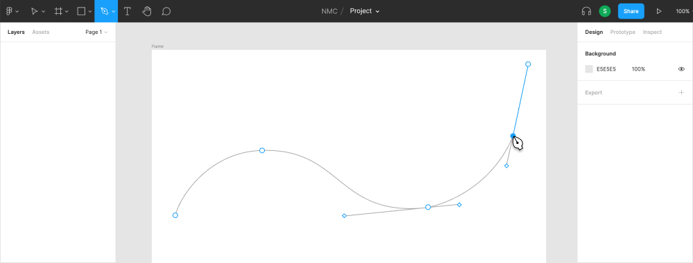
The pen tool in Figma is akin to the pen tool in Adobe Illustrator. It’s precise and requires a lot less switching between Illustrator for vector assets.
Photo Editing
The photo editing features in Figma like contrast, saturation, and blend modes are often all that we need when it comes to using photos in web designs.
A Few Things We'd Change
As with any program, there are a few things about Figma that we would change if we could. However, we're optimistic that these cons will be worked out or added as new features in the future!
- Figma doesn’t necessarily work offline. It will work offline if you go ahead an open your file before you disconnect, so you can prepare ahead of time if needed, but would not be ideal for long tasks with limited internet access.
- Figma doesn’t support .EPS files. We often receive logos and other assets as .EPS files. In order to drop these into our Figma projects we have to re-save them as .SVG first, which is an extra step that we'd like to avoid.
Have you tried using Figma yet? Leave us a comment below and let us know how it has improved or changed your design workflow!


Leave the first comment