What to include on a custom 404 page
When someone lands on your 404 page, it means something somewhere went wrong. The challenge then becomes salvaging some good from that error and preventing the visitor from immediately navigating away from your website as punishment for your mistake.
People have tried being artistic, funny, and just plain weird on their custom 404 page. We believe however that keeping visitors on your site when they arrrive at a 404 page comes down to four things: being helpful, informative and creative, all the while relating to your business.
Create a helpful 404 page
The most important factor when building a custom 404 page is keeping the visitor in mind and why he arrived on that page. Someone was looking for something and arrived at your site hoping to find it. So far, your site has proved worthless. So first thing's first, you should provide some way for the visitor to easily take another stab at finding what they're looking for.
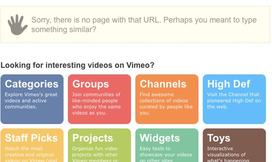
Vimeo's 404 page immediately gives visitors eight different but clear possible next steps in hopes that the user will continue searching around their site, even though they arrived their through a broken link.
A 404 page should be informative about your business
If a user arrives at a 404 page, it's likely he either typed in the wrong URL, clicked on a broken link, or was sent to a page that had been moved or deleted. Either way, it's likely he may not know exactly what kind of organization the website belongs to, making it important to have a quick, basic summary of who you are and what you do clearly layed out on your 404 page.
Creative 404 pages can keep visitors on your website
When a visitor's first impression of an organization's website is that the page he's searching for doesn't exist, showing a little creativity can go a long way towards winning back that visitor's interest and encouraging him to keep looking around your website. Whether that creativity is shown through copywriting or imagery, it needs to be immediately evident in order to keep users from quickly clicking the 'back' button and going somewhere else.
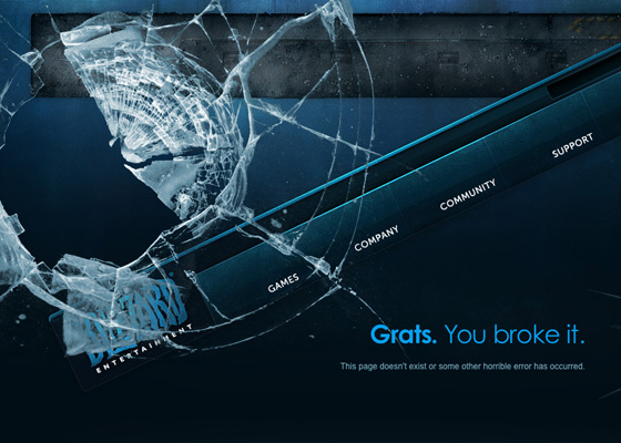
The Blizzard Entertainment website's 404 page cleverly depicts what their site would look like as if their site was captured in a broken picture frame. The main navigation links still work and the diagonal structure of the broken header navigation might be enough to get an unsuspecting visitor to keep clicking around.
404 pages should relate to your business
The best 404 pages accomplish the strategies above all the while keeping them connected to what the organization does.


Leave the first comment