Nonprofit websites, not unlike other industries, have a broad array of audiences they need to communicate with. There are donors interested in how their dollars are being used, community members curious about the work being done in their neighborhood, internal staff and prospective employees who want to learn about the organization, the recipients of the organization's services, and many other stakeholder groups. Different content on the site is naturally suited for different audiences, but one type of content that typically has broad appeal are the Grants, both those given in the past and upcoming application opportunities.
Grants are relevant to everyone interested in the organization, as they demonstrate how the nonprofit's resources are disbursed, the type of initiatives being funded, the top priorities, and how to potentially receive funds from the group. While Grants are something that are universally relevant and deserve to shine on the site, they're often an afterthought in terms of design, feeling stale compared to the rest of the site. This disconnect is typically due to groups feeling wed to third-party Grant Management Software tools that manage the data but provide limited options in how that data is presented and styled on the site.
After spending time and money working to launch a new website that positions the nonprofit as an expert in its area, it's a lost opportunity to then have the Grants presented as clunky and dated. There's a better way. Grants can be given the same beautiful treatment as the rest of the site, allowing the target audiences to have a delightful experience while interacting with this priority content, and it doesn't require expensive and cumbersome third-party software.
NMC develops and designs nonprofit websites for clients around the country, and we've worked with a number of these to break free from the restraints of unattractive third-party embeds or poorly functioning one-off solutions.
Designing a Grants Search
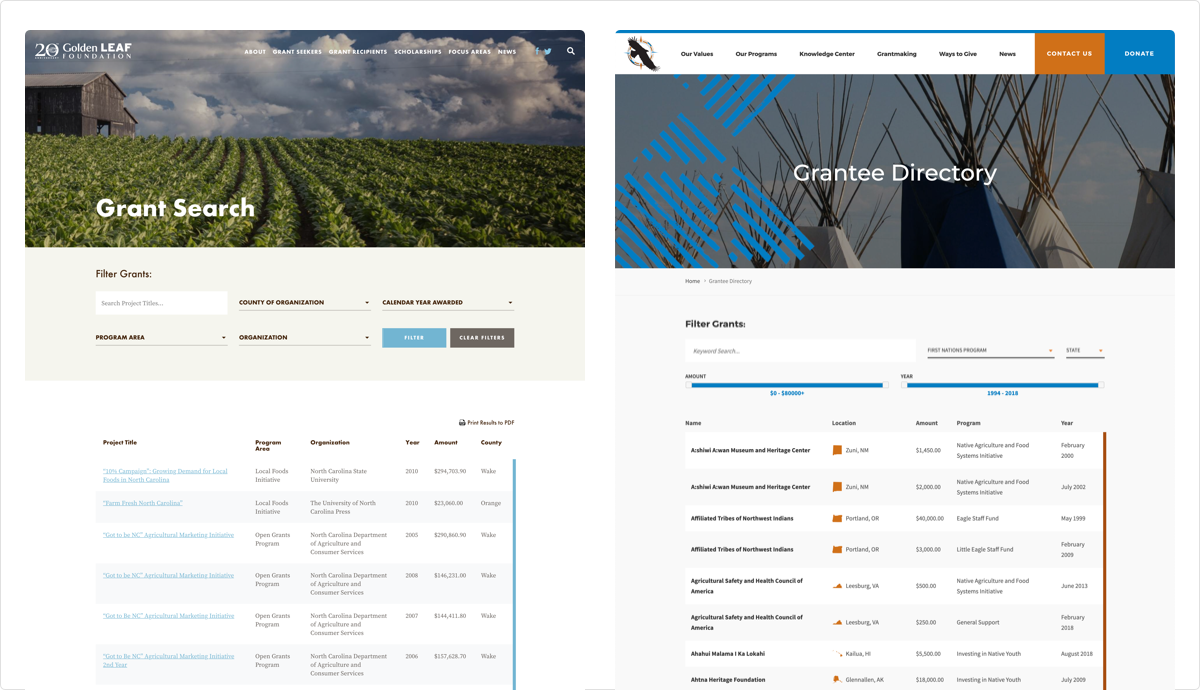
The design of the Grants Search will determine how comfortable visitors are using it and how much value they get from it. There are a few key principles to consider when designing one.
First, the filtering and search options for the site should be immediately visible and not hidden on the page. Each field should be clearly labeled to let visitors at a glance get an understanding for what the different criteria are they can search by. When done well, these filters not only unearth the actual search possibilities, but they also connote important information about the organization.
For example, in the First Nations Development Institute Grants example below, someone looking at the site can immediately get an idea for: typical range in size of grant, how long the organization has been providing grants, its geographic scale being nationwide, and that there are multiple programs that can be applied to. For someone landing directly on this page, even without conducting a search, they'll now have important information about FNDI just due to the design.

Second, the tool should feel consistent in design with the rest of the site. When a third-party tool is just dropped into the site without being cleanly integrated into the design, it can be jarring for visitors and introduce a cumbersome new functionality paradigm. Users shouldn't have to work to figure out how to use a new, separate tool; they should be presented a consistent aesthetic and user experience that makes it easy for them to quickly dive into the data.
Third, there should be custom designed ways for visitors to interact with the data and feel the site instantly respond to them. Novel design techniques help encourage visitors to actually use the tool and can also present the data in a clear way. Going back to the FNDI example above, visitors are able to drag along bars to define their search criteria. This is a fun and interactive way that encourages visitors to use the tool, but also serves a functional purpose by making it quick and easy to conduct searches. Similarly, a custom designed map lets visitors click on a desired state and automatically sort the results. As these different design features are leveraged, the data instantly filters, feeling live and responsive to visitors and encouraging them to tinker with the filters to expand or refine their search.
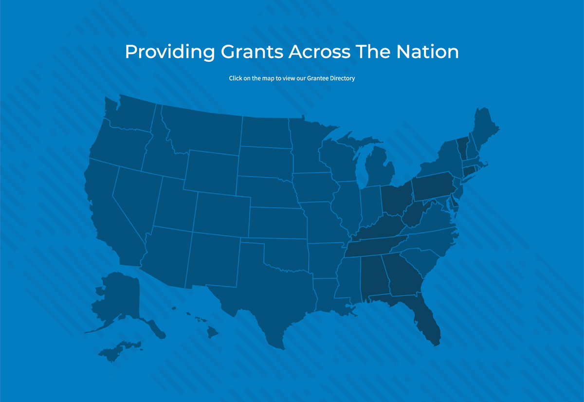
A custom design provides the polished and engaging look and feel that the organization is likely going for while also yielding real functional benefits that will lead to more use of the tool.
Powering a Grants Database Search By Spreadsheet
As mentioned above, the alternative to a custom designed solution is often third-party tool embedded on the site. In addition to the design ramifications detailed above, there are also often functional and practical limits to this approach.
These tools are often added to a site via iFrame, which can lag when loading on the page and also aren't known for performing particularly well on mobile devices and different screen resolutions. If the search is hosted on a third-party site that is just linked to, rather than via an embedded iFrame, then the feature's Search Engine Optimization value is essentially voided. Links pointing to the tool will accrue search engine value to the third-party rather than the nonprofit's website, and since it's on a third-party domain without relevant content, the chances of that page showing up for branded searches with your name and "grants" become much more limited. For these reasons, the best approach is often to build it directly onto the main site.
Since alternatives are full-fledged platforms, there's often a misperception that building a custom grants search requires huge development overhead or a custom application. In fact, the approach can be pretty lightweight; NMC has had a lot of success leveraging the functionality of Google Sheets to power the interactive database.
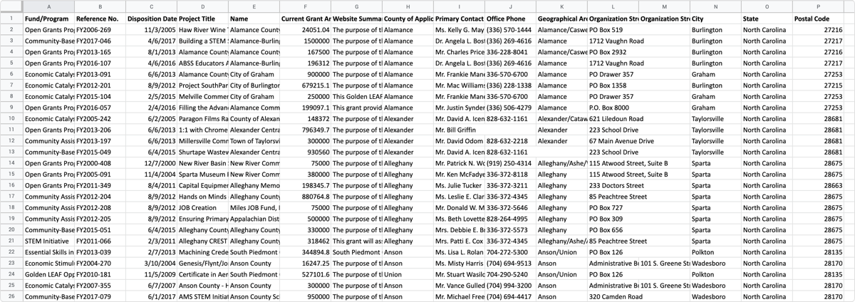
With this approach, the nonprofit sets up a Google Sheet with all of their publicly available Grant data in it. The sheet can contain as many columns as desired, and each column will represent information that should either be searchable/filterable on the site or viewable as part of a Grant. For example, there would be columns for things like Title, Organization, Summary, Location, Date, Overview, etc. The entire experience can be powered from this Spreadsheet, so set it up so anything you want people to see is filled out in an applicable column.
Most Grant Management platforms lets you export data to a CSV and Google Sheets can be built from a CSV import. So, the initial population of data can be done with pretty minimal work or overhead from the organization.
Google Sheets have a very flexible API that can then be used to sync the data to the website. The web development team should be able to feed all of the information into the new design without any restrictions relevant to design. Also, depending on criteria setup by the development team, the connection will be done in a relatively real-time manner, meaning all you need to do is add, delete, or modify information in the Google Sheet and it will sync with the live site.
Using Google Sheets allows you to leverage a free platform that can be easily populated from the tools that most nonprofits are already using Grant Management System exports, Excel, or some combination of both). The platform gives you access to powerful query and filtering through its API. It also strips away any design requirements since the database is maintained distinctly from the actual design, allowing the initial design and functionality to be totally custom to meet your vision and goals. Finally, it ensures a truly real-time feed of data from the spreadsheet to the website.
It is worth a friendly reminder that the data will all be public, which is the goal with it being connected to the main website, so don't store anything you don't want out there in this spreadsheet.
Another benefit of this approach is the cost structure. Most Grant Management Software tools carry a monthly cost, whereas this setup is typically structured with an upfront cost and no ongoing fees. This can be done because there's the upfront cost of the initial design and development, but once that's setup, the ongoing overhead and maintenance is related to Google's free Sheets tool and API. So, you may end up paying a bit more upfront (you also may not!), but you will save in the long run by eliminating a recurring cost, while also getting a solution that better fits your needs to begin with. A true win-win!
This approach lets you decouple your website's Grants Search from the Grant Management Software, providing more flexibility and customization.
Conclusion
Making Grants easily discovered, searched, and linked to should be a high priority for any nonprofit website, and this approach ensures that the user experience feels polished and bespoke, which is actually what you want stakeholders to take away from your grants process. Let us know if you have any other novel approaches to enabling this important element or get in touch if you're curious how we can help you with yours!



Leave the first comment