Happy New Year! After another extraordinary twelve months, we’re excited to look back on what we accomplished during 2021. It certainly wasn’t the year we imagined, but we were able to continually adapt and build momentum — even as we worked from home and collaborated virtually with each other and our widespread network of clients.
This year marked our fifteenth year in business. And if you’re familiar with our history, you’ll know that we got our start in political campaign website design. It’s a niche that we still love, but we’re also proud to have expanded our expertise over the years to include a number of meaningful and diverse verticals. We’re thrilled to share a selection of these web projects with you below. You can skip ahead to a specific category using the following links:
- Nonprofit – We continue to work with nonprofits — large and small, local and international — on branding, web strategy, and everything in between. Many of our clients have even responded to the ongoing pandemic by launching online resource hubs and virtual events.
- Legal – Law firm websites also make up a significant portion of our work. This year saw an increase in solo practitioners revamping their digital presences or striking out on their own for the very first time. We loved being able to support these talented firms by working through SEO challenges, designing logos, and launching dynamic sites of various sizes.
- Political – Our original niche. This year we created political campaign websites for several promising candidates and worked with a super PAC and a state’s Democratic caucus on refreshing existing online presences.
- B2B – In the B2B space, we worked with a wide range of clients on a number of exciting projects. Highlights included leading a messaging and copy overhaul for a financial services firm, creating an engaging fintech site using a vibrant new visual identity, and partnering with our friends at Franklyn — a New York-based creative studio — on several projects for major players in the construction and architectural design industry.
- Higher Education – Considering that our office is situated between some of the country’s top universities, it makes sense that we also sustain ongoing relationships in the higher education arena. In 2021, we were thrilled to launch substantial websites (in both shades of blue..!) for groups like Carolina Nursing and Duke Global.
- Health – Health was obviously a huge focus of the year, which we saw reflected in our clients’ growing interest in digital health solutions. For us, that meant designing websites for health-focused organizations and service providers complete with helpful extras like downloadable resources, interactive calendars, and more.
Nonprofit Website Design
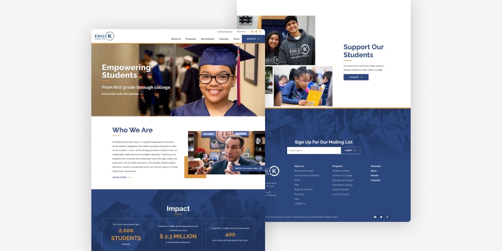
Emily K Center
Founded by legendary Duke basketball coach Mike Krzyzewski, the Emily K Center works to guide underprivileged students towards higher education opportunities and meaningful careers. Their new website furthers this mission by clearly outlining the nonprofit’s four signature programs and ways for volunteers and supporters to get involved. Read more about the project in our case study.
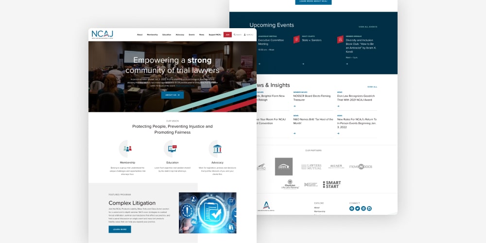
North Carolina Advocates for Justice (NCAJ)
NCAJ is a nonpartisan, nonprofit membership association that supports the state’s trial lawyers by offering continuing education courses, networking opportunities, and advocacy resources. Knowing our experience in both the nonprofit and legal spaces, NCAJ came to us to guide a comprehensive repositioning project that resulted in a new visual identity and corresponding website. The brand and site are defined by clean lines, an energetic color palette, and flexible elements that can be used across digital, print, and other promotional assets. Read more in our case study.
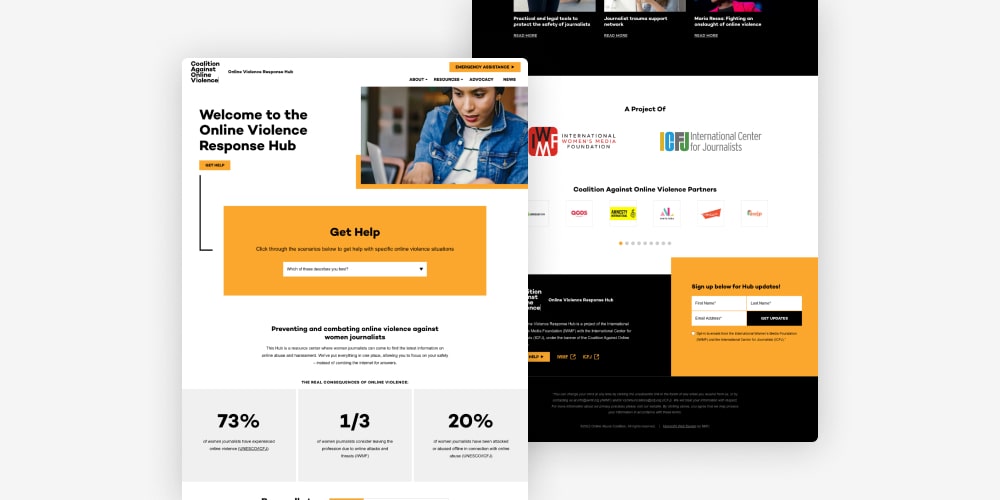
Coalition Against Online Violence (CAOV)
Founded as a joint initiative of the International Women’s Media Foundation and the International Center for Journalists, CAOV is a collection of media organizations that provide support and resources to female journalists who are facing harassment and abuse online. Both parent organizations are clients of ours, so we were a natural fit when it came time to brand the nascent coalition. We created a logo — complete with a series of custom animations — and website that establish a recognizable look for the group while providing clear steps for accessing resources and getting help. Read more in our case study.
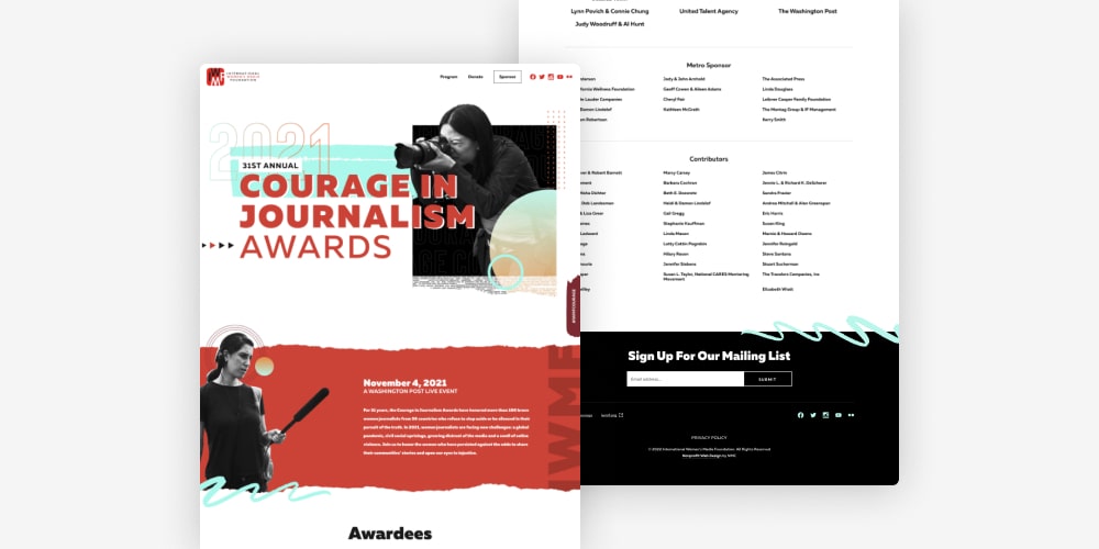
IWMF Courage in Journalism Awards 2021
In 2020, we designed and built an event microsite for the International Women’s Media Foundation’s virtual Courage in Journalism Awards celebration. Since the event was held virtually again in 2021, we gave the site a facelift to incorporate an entirely new look and several additional layout blocks. Read more about the project in our case study.
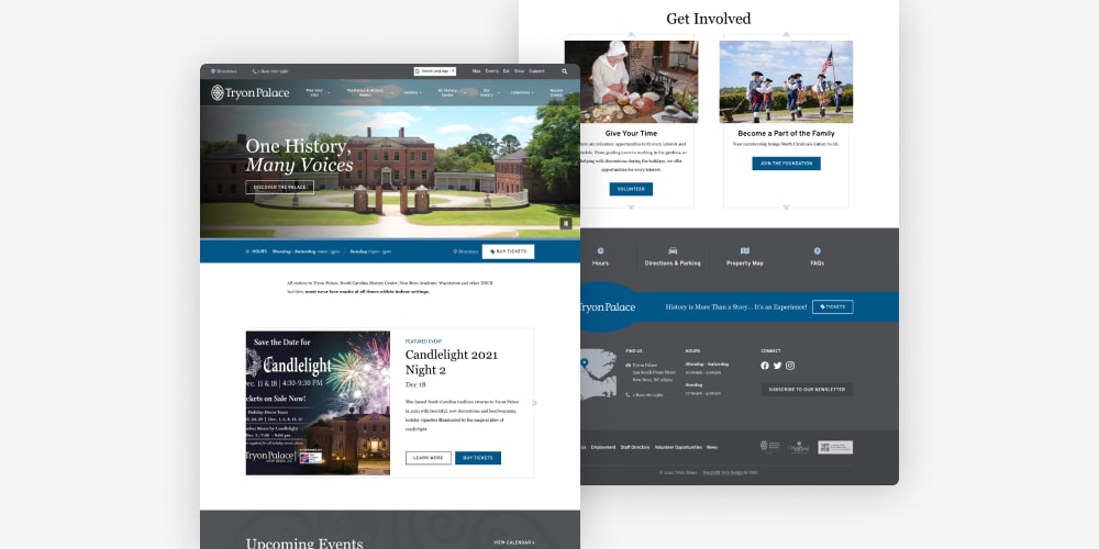
Tryon Palace
Tryon Palace is a significant North Carolina historical site that served as the home of the state’s British governors into the 1700s. We had previously worked with the organization on an earlier version of their web presence, and we were excited to partner with them again on a full redesign and relaunch of the site. Notable elements of the refresh include an ambient video homepage, numerous custom interior layouts, and a user-friendly megamenu system that guides browsing and exploration.
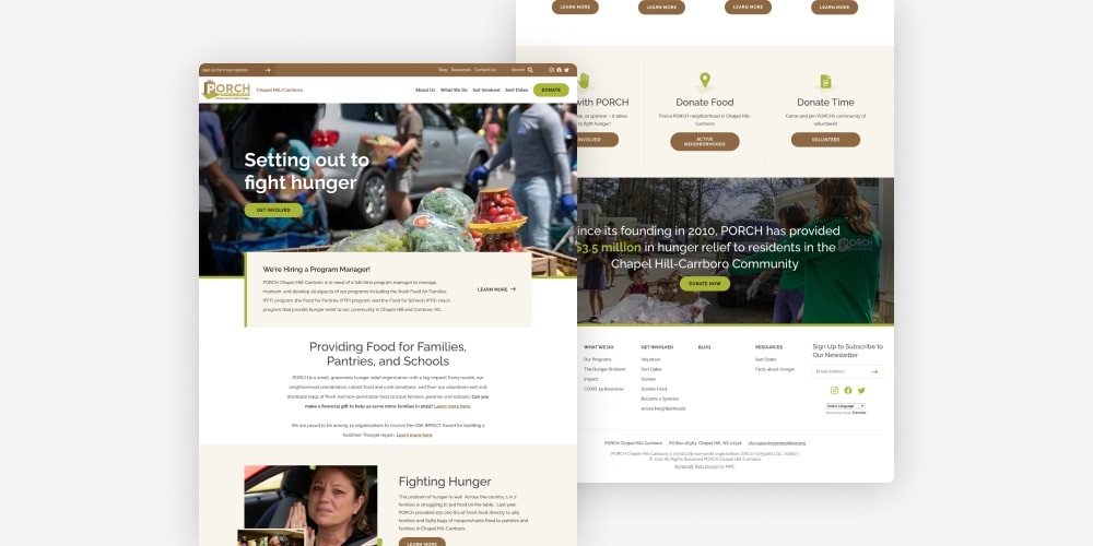
PORCH and PORCH Communities
Based right here in the Chapel Hill-Carrboro area, PORCH is a grassroots hunger relief organization that collects and distributes food to families in need. In response to an enormous amount of growth — that saw PORCH expand to neighborhoods across six states! — PORCH connected with us to create a cohesive web presence that could scale to accommodate all of their community chapters.
The finished sites are powered by a unique WordPress setup that allows each PORCH chapter to customize their own microsite. Read more about it in our case study.
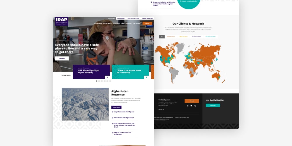
International Refugee Assistance Project (IRAP)
IRAP is a New York-based nonprofit that collaborates with lawyers and law students to provide legal solutions to refugees around the world. Complete with in-depth issue area pages, filterable News & Resources, and prominent calls-to-action, the site mobilizes supporters and explains available services for those in need of help.
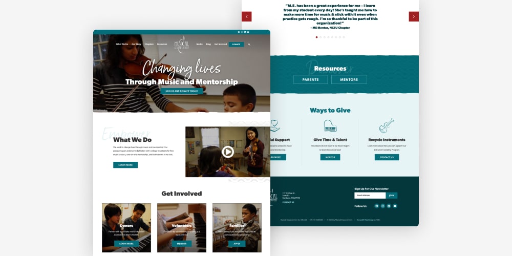
Musical Empowerment
Since 2002, Musical Empowerment has provided music mentorship to underserved youth by facilitating free lessons and instrument loans with the help of college volunteers. We worked with the nonprofit to create a robust online hub where stakeholders and families can learn about the work and explore ways to get involved or apply for mentorship. Notable site features include styled video blocks, a filterable blog, and adaptable layouts with room for testimonials and image galleries.
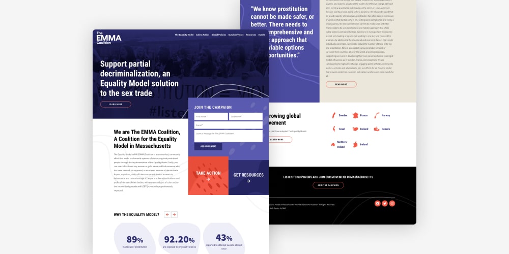
The EMMA Coalition
The EMMA Coalition — short for Equality Model in Massachusetts — is a community-led effort that works to eliminate prostitution by promoting adoption of The Equality Model. We helped the nonprofit launch a website that explains the proposed legislation, calls the public to action, and offers resources for learning more about core issues. Defining features include playful abstract shapes, eye-catching colors, and filterable feeds for news and events.
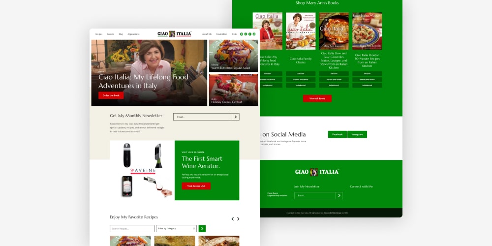
Ciao Italia
Created and hosted by Mary Ann Esposito, Ciao Italia is a nationally televised PBS cooking show. We had worked with the organization a number of years ago on one of their early web presences, and we were excited to get involved this time around when it was clear that the site needed a full refresh. The updated site features a clean and modern design, custom recipe layouts, and embedded videos to showcase clips from the show.
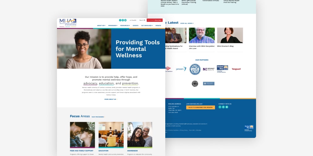
Mental Health America of Central Carolinas
Headquartered in Charlotte, NC, MHA of Central Carolinas provides mental health services and advocacy for individuals and families in need of support. We worked closely with their team to create an approachable website that houses information about programs and available resources. Design-wise, the site utilizes bright colors, friendly images, and bespoke layout blocks that break up text-heavy content.
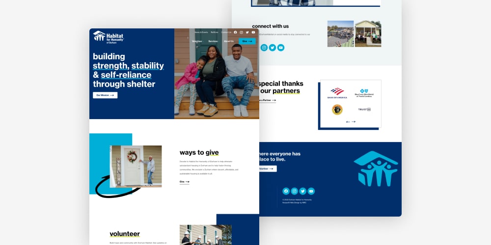
Durham Habitat for Humanity
One of our last site launches of 2021 was for Habitat for Humanity of Durham, a longtime client who operates a local chapter of the larger Habitat network. The updated site features an entirely new design that includes playful hand drawn elements, punchy accent colors, and clear paths that direct users towards information about volunteering, donating, or applying for services.
Law Firm Website Design
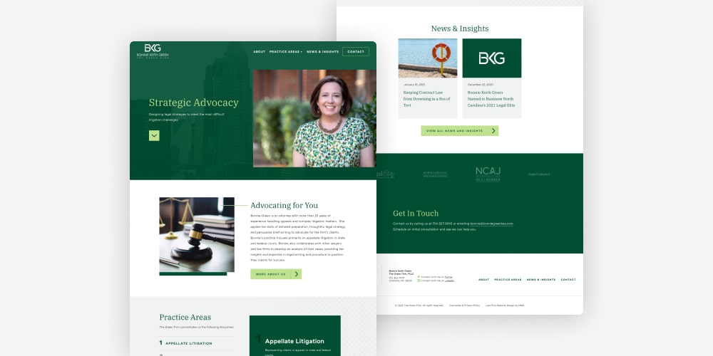
Bonnie Green Law
Bonnie Green is an experienced solo attorney based in Charlotte, NC. For her new website, we focused on creating a modern look that delivers information in an attractive, user-friendly format. The site includes helpful features like cross-linked related content, news posts, and dynamic hover effects for buttons and links.
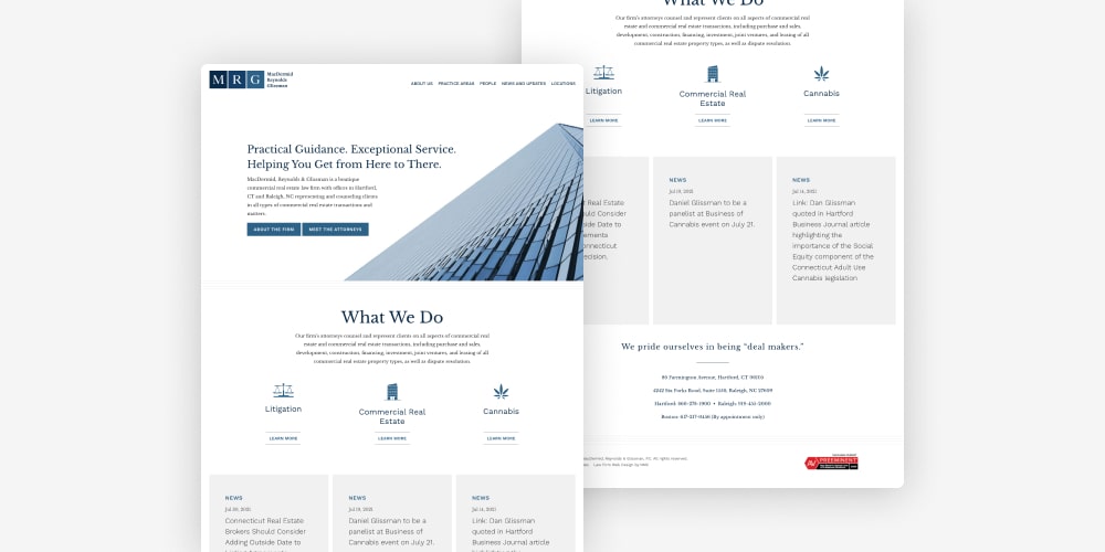
MRG Law
MacDermid, Reynolds & Glissman is a commercial real estate law firm with offices in Connecticut and North Carolina. We worked with the firm on a full rebrand that included creating a logo, website, and supporting print assets. As a whole, the visual identity is defined by intentional whitespace, clean lines, and subtle shades of blue. Website highlights include custom practice area layouts, in-depth attorney bios, and a scalable block system that allows the firm to easily grow the web presence over time.
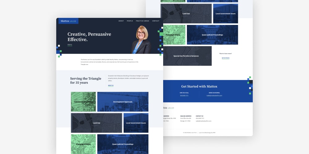
Mattox Law Firm
Established in 2003 by Isabel Worthy Mattox, Mattox Law specializes in commercial real estate, land use, and corporate law. In order to enhance the firm’s online presence, we built a polished new website that features a bright color scheme, an intuitive navigation structure, and plenty of calls-to-action that encourage site visitors to get in touch.
Political Website Design
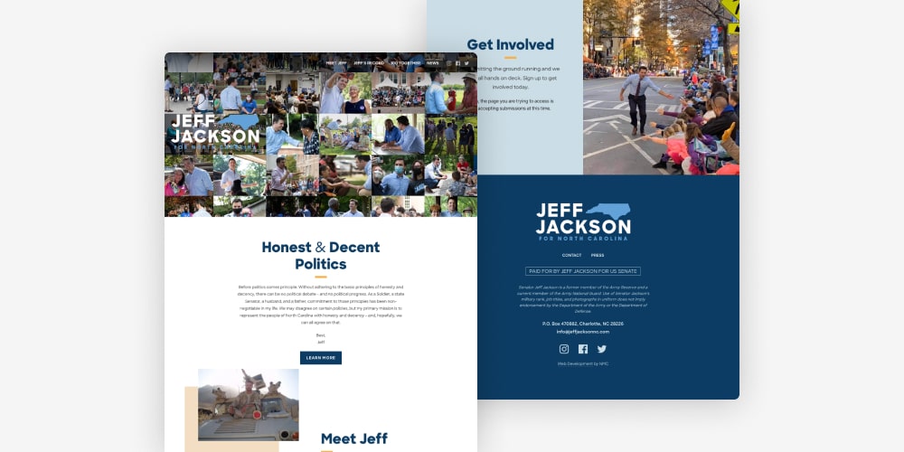
Jeff Jackson for U.S. Senate
When Jeff Jackson decided to launch his U.S. Senate campaign, he approached us to lead the digital effort by creating a new website. The site tells Jeff’s story with images, videos, and constituent statements, all while maintaining an approachable and friendly feel. While Jeff left the race in late 2021 to endorce Cheri Beasley (a former NMC client), we were immensely proud to have been part of his journey. Read more in our case study.
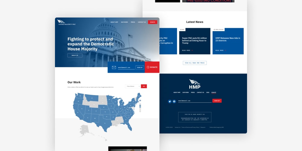
House Majority PAC
House Majority PAC is a super PAC that focuses on electing Democratic candidates to the U.S. House of Representatives. Having worked with the group on an earlier version of their website, we were thrilled when they came back to us for a full redesign and refresh.
The site takes an interactive approach when it comes to showcasing past and current work. Elements like an interactive map, embedded videos, and a filterable news feed engage site visitors and make it easy to explore HMP’s impact. Read more in our case study.
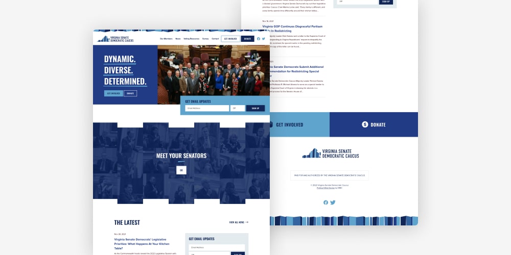
Virginia Senate Democratic Caucus
For the VA Senate Democrats, we created a distinctive new website that centralizes information about senators while providing voting resources and the latest party news. Playing off of the organization’s vibrant logo, the site incorporates bright shades of blue, playful textures and patterns, and clear calls-to-action for users to donate or subscribe to emails.
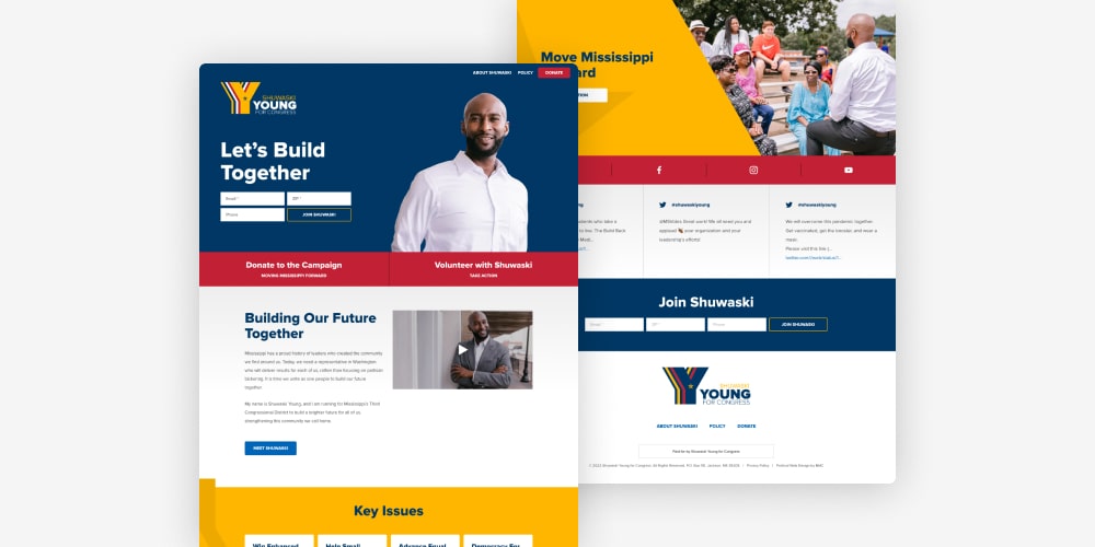
Shuwaski Young for Congress
Shuwaski Young is a Mississippi native who is running for Congress in order to bring change to the state’s third congressional district. As we crafted his new website, we made sure to bring in engaging design elements along with the rich colors and bold graphics of the existing logo and brand. The site tells Shuwaski’s story with high quality images, videos, and detailed information about policy positions and campaign strategy.
B2B Website Design
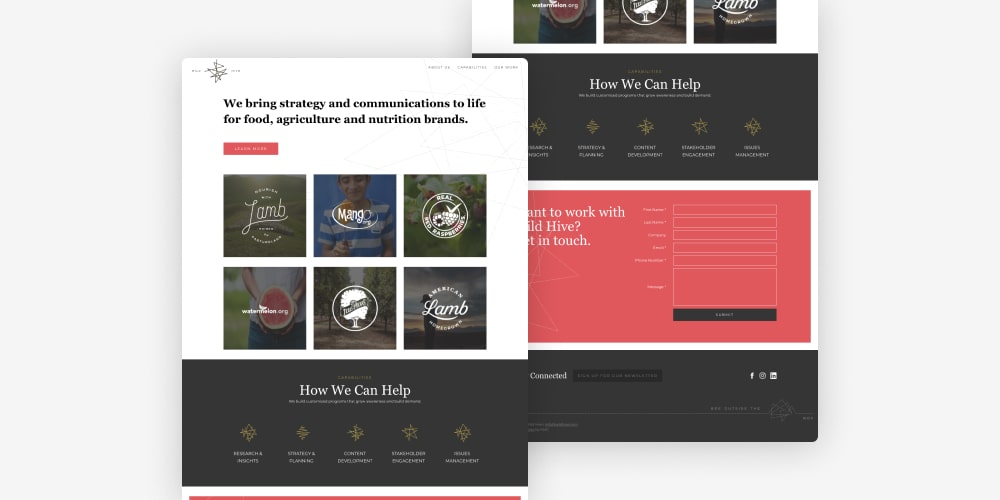
Wild Hive
Wild Hive is a boutique brand strategy firm that specializes in the food and agriculture industry. Because their work is highly visual, they knew that a sophisticated website would be an essential part of highlighting recent projects and showcasing their design aesthetic. The resulting site combines playful animations, detailed case studies, and seamless integrated forms for a digital experience that is sure to attract new clients for years to come.
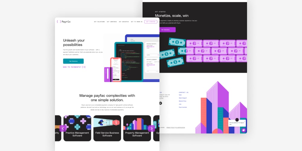
Payrix
As a rising star in the embedded payments sector, Payrix set out to reinvent their look with a fresh visual identity and a corresponding website built from scratch. Our friends at Brooklyn-based design agency Franklyn tackled the branding process, and we took the reigns when it was time to shape the new online presence.
The site is chock-full of custom elements. From unique animations to on-brand illustrations to thoughtful charts and visuals, each page has been carefully designed to reflect the new look while providing a top-notch user experience. Read more in our case study.
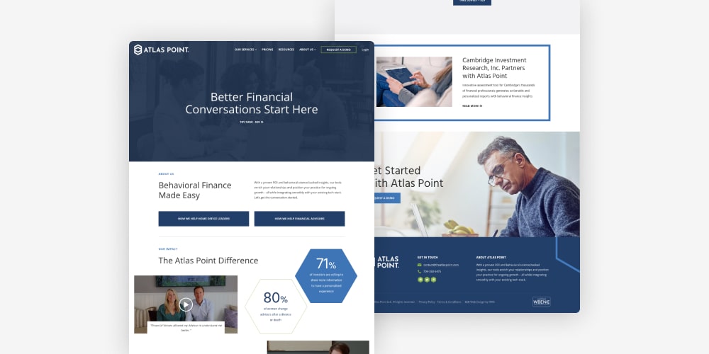
Atlas Point
Atlas Point is a financial services firm that builds tools to help professional advisors understand each client’s behavioral biases. We worked with Atlas Point to create a scalable new website that would appeal to the firm’s core audiences while providing relevant background information and resources. The design is modern, minimal, and polished.
In addition to building the site, we led a comprehensive content strategy process to develop messaging for key pages and supporting marketing materials. Read more about both portions of the project in our case study.
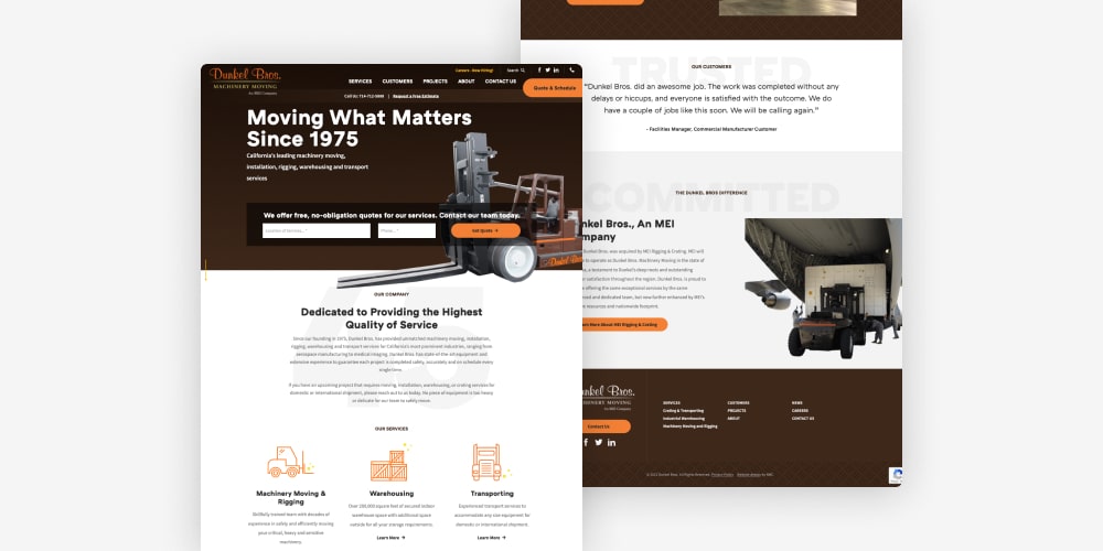
Dunkel Bros. Machinery Moving
Back in 2020, we worked with MEI Rigging & Crating on a new website that would outline the company’s services and recent projects. When they acquired Dunkel Bros, a California-based machinery moving and rigging company, we adapted the original template to spin up a site for the new branch of the business. The Dunkel Bros site is customized with colors, images, and logos that distinguish it from the main MEI presence.
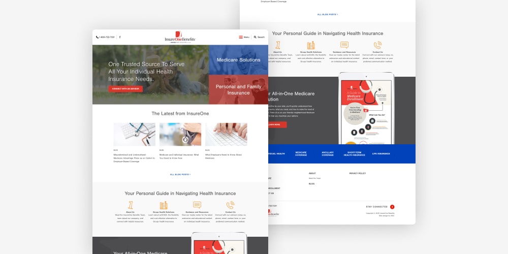
InsureOne Benefits
InsureOne Benfits is an insurance and Medicare brokerage firm located in Ohio. We’ve done a significant amount of work for their parent company, Oswald, so we were excited to get involved again when InsureOne was due for a new website. Like the Oswald sites, InsureOne’s web presence is neat and user-friendly. A concise hamburger menu guides users towards key topic areas, and a filterable resource center makes it easy to access guides, resources, and more.
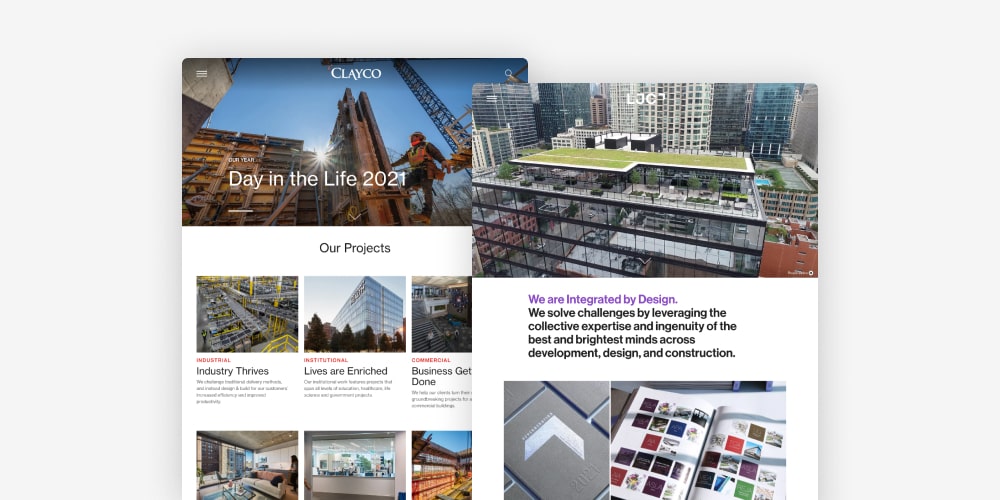
Clayco & Lamar Johnson Collaborative (LJC)
Clayco and LJC came to us through our design partners at Franklyn. Clayco, the parent company, provides a wide range of building solutions, and LJC, the design arm, offers integrated design and architecture services.
The sites share some core layout blocks and features but have been customized for each entity’s brand and content needs. We handled development, which meant bringing the designs to life with ambient video, interactive sliders, hover effects, and more. Both sites are built on WordPress to ensure easy management and smooth scalability.
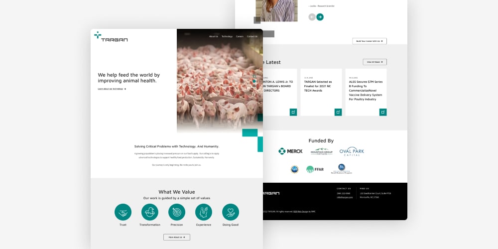
TARGAN
TARGAN is a Morrisville, NC based biotech company that develops advanced technologies for livestock vaccination programs. The company connected with us as they were undergoing a rebrand — they were founded as Applied LifeSciences and Systems in 2015 — and we worked together to design and build a website using the new logo and brand aesthetic. The resulting site is clean, modern, and easy-to-navigate.
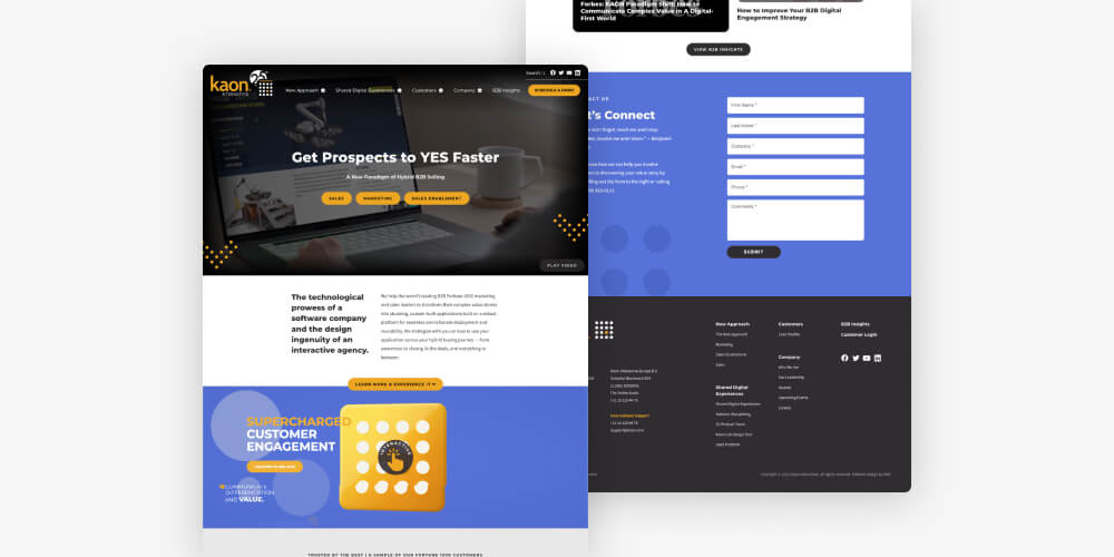
Kaon Interactive
Kaon is an innovative B2B marketing firm that develops interactive digital experiences for a range of clients across multiple verticals. Since their work is unmistakably dynamic, we approached the website design and build process with an eye towards movement elements like custom animations, embedded videos, load-in effects, and more.
Higher Education Website Design
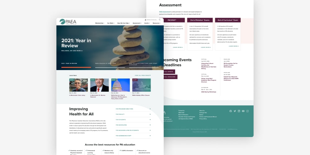
Physician Assistant Education Association (PAEA)
PAEA is a nonprofit membership association for physician assistant education programs in the United States. We worked with the organization first on a new brand and logo, and then expanded the identity to a full website redesign.
Both the brand and website center on a polished, modern aesthetic. Intentional whitespace adds room for each element to breathe, and bright accents of orange, teal, and purple draw users’ attention to important details and action items. In terms of site features, highlights include specialized layouts for testing programs, an interactive map, and an intuitive megamenu system. Read more in our case study.
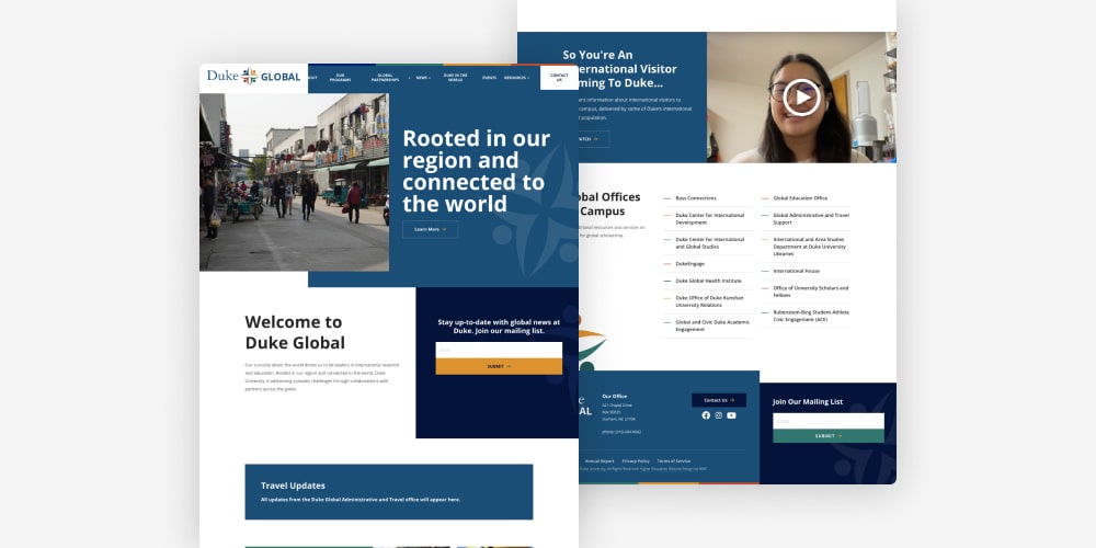
Duke Global
Duke’s Office of Global Affairs supports and coordinates the university’s global research and scholarship opportunities. Having worked with several other Duke offices in the past, we were excited to partner with Duke Global on a new visual identity and website.
The logo and website utilize an abstract person motif to convey Duke Global’s focus on connecting people and communities worldwide. The site takes this a step further with elements like student and faculty profiles, an interactive map, and statistics about Duke’s impact.
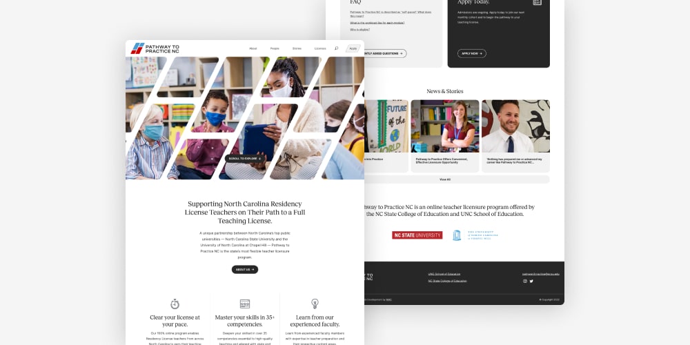
Pathway to Practice NC
Pathway to Practice NC is an initiative of two of the Triangle’s top universities — UNC and NC State — that allows educators to pursue licensure online. The site was designed by UNC Creative and handed over to us for development. Some of our favorite features include the subtle logo animation, a number of custom hover effects, and a unique news feed that incorporates filters and a keyword search bar.
Digital Health Website Design
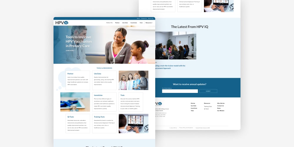
HPV IQ
Operated by the UNC Gillings School of Global Public Health, HPV IQ is a resource hub where healthcare providers can find data and training tools to promote HPV vaccination. The new site features a refined design with easy-access downloads and engaging content layouts.
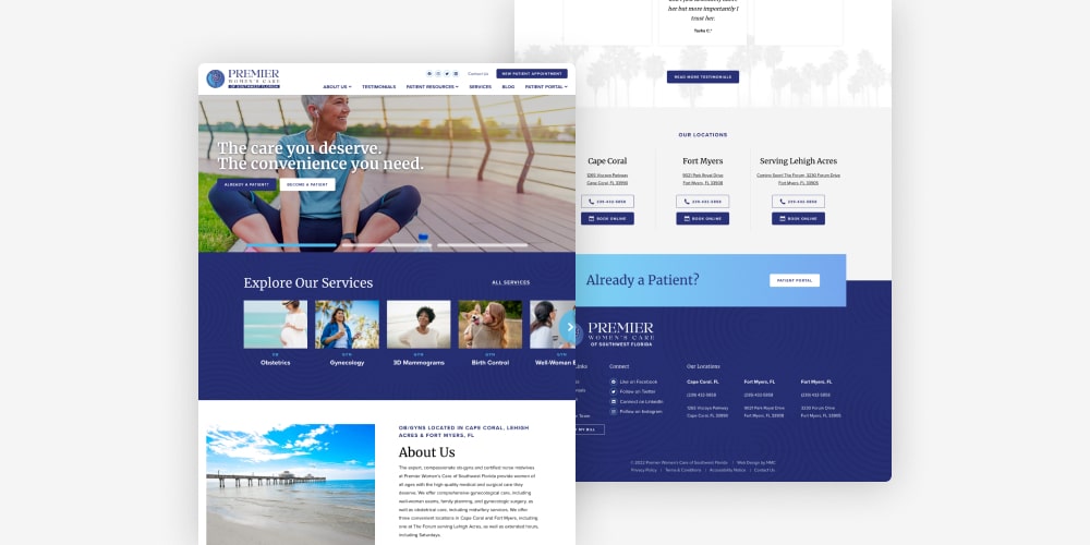
Premier Women’s Care of Southwest Florida
Premier Women’s Care offers a wide range of healthcare services for women and girls in southwest Florida. With a fresh website design that includes testimonials, comprehensive service listings, and informative resources, the practice is now positioned to engage new and prospective patients online.
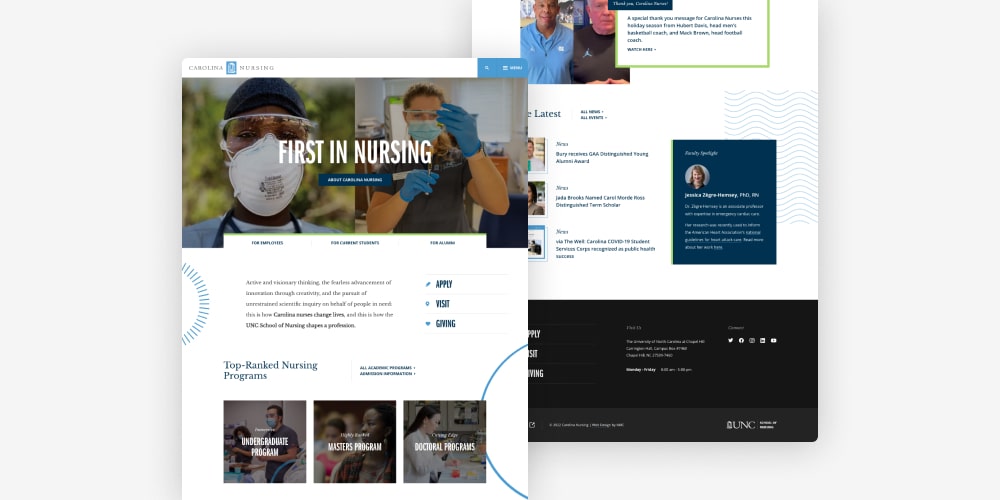
UNC School of Nursing
With an office location just minutes from UNC campus, we always look forward to the opportunity to partner with our friends at Carolina. For UNC Nursing, we worked closely with the team to craft a substantial new website that showcases the school’s academic programs, research efforts, alumni services, and more. The fresh and modern design incorporates dynamic movement effects, eye-catching colors, and custom graphic elements designed by UNC Creative. Read more in the case study.
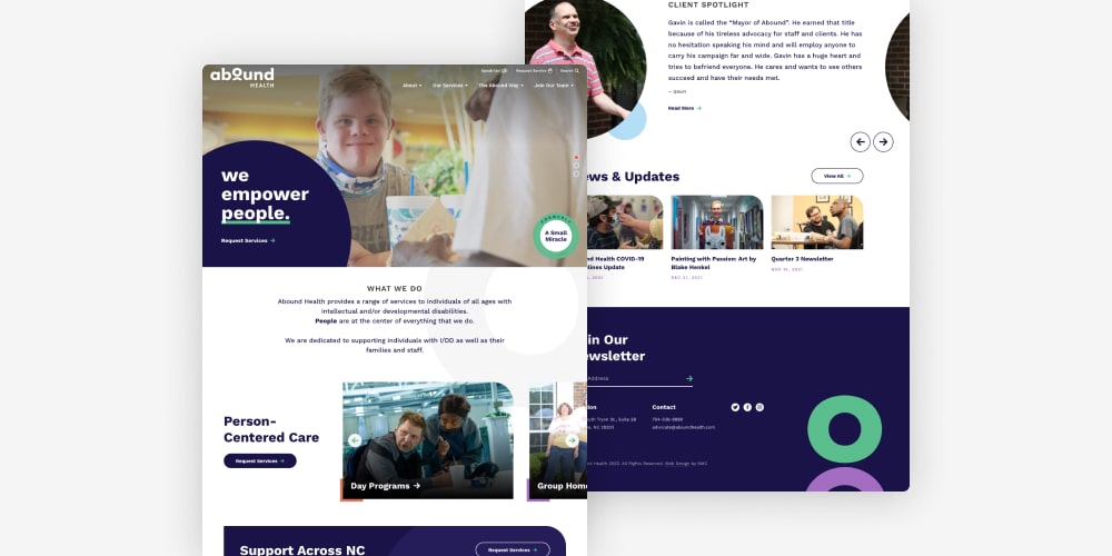
Abound Health
For more than 20 years, Abound Health (formerly A Small Miracle) has been providing care for individuals with intellectual and developmental disabilities. Their services include facilitating day programs, group homes, job placements, and other specialty assistance options.
We worked with Abound on a full rebrand that resulted in a sleek new logo and website along with coordinating print materials and physical signage. As a whole, the visual identity captures the organization’s friendly and approachable nature while communicating their commitment to staying current and up-to-date. Read more about the project in our case study.

Leave the first comment