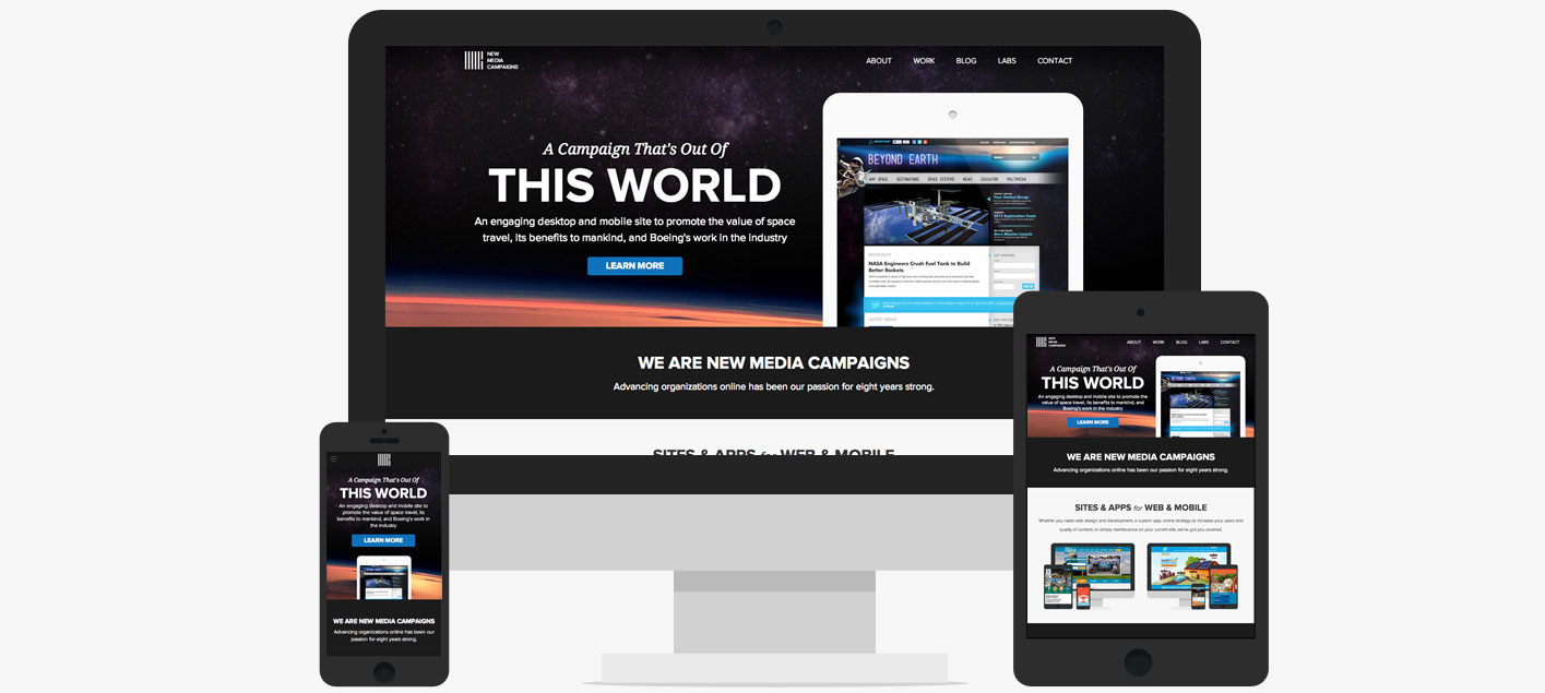
Welcome to the new online home of New Media Campaigns! It’s been three years since we launched the last NMC site, and our company has seen quite a few changes since then. We’ve moved into a new office space, nearly doubled our team size, and gained hundreds of new clients. We’ve also broadened our focus, and grown from a company that not only has expertise in political web design, but design and development for non-profits, higher education, law firms, local governments, and businesses both large and small.
Needless to say, the NMC website was in desperate need of an update. So in 2014 we decided to bite the bullet and launch a site that could work better for us and give us even more room to grow. Here’s a look at what's new:
Responsive Design
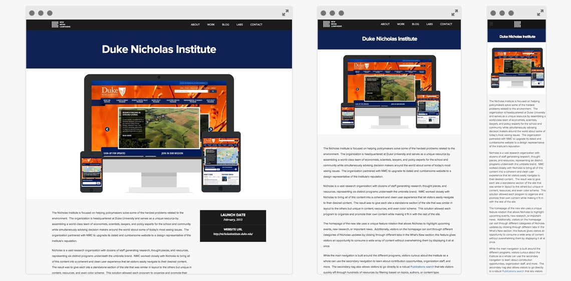
Since late 2011, nearly all of the websites we’ve built for clients have been responsive. The old NMC site however, was still relying on a fixed-width desktop and separate mobile design. It was high time that we followed the mantra we tell our clients and make sure our own website was responsive and looked good on all mobile devices. Our primary focus for the redesign was mobile. You’ll notice our new layout is simple and no-fuss so that it loads quickly and looks great on your phone and tablet.
A Clean and Open Layout
Our client work is our top priority at NMC, meaning work for our own brand often takes the backseat. It was crucial that we have a clean design that we could continuously and easily add updates to without relying on a major redesign every couple of years (which would take way longer than necessary). Our flat, horizontal stripe based design ensures that we can quickly add in new features or content to the site later down the road, without disrupting the flow of the entire design.
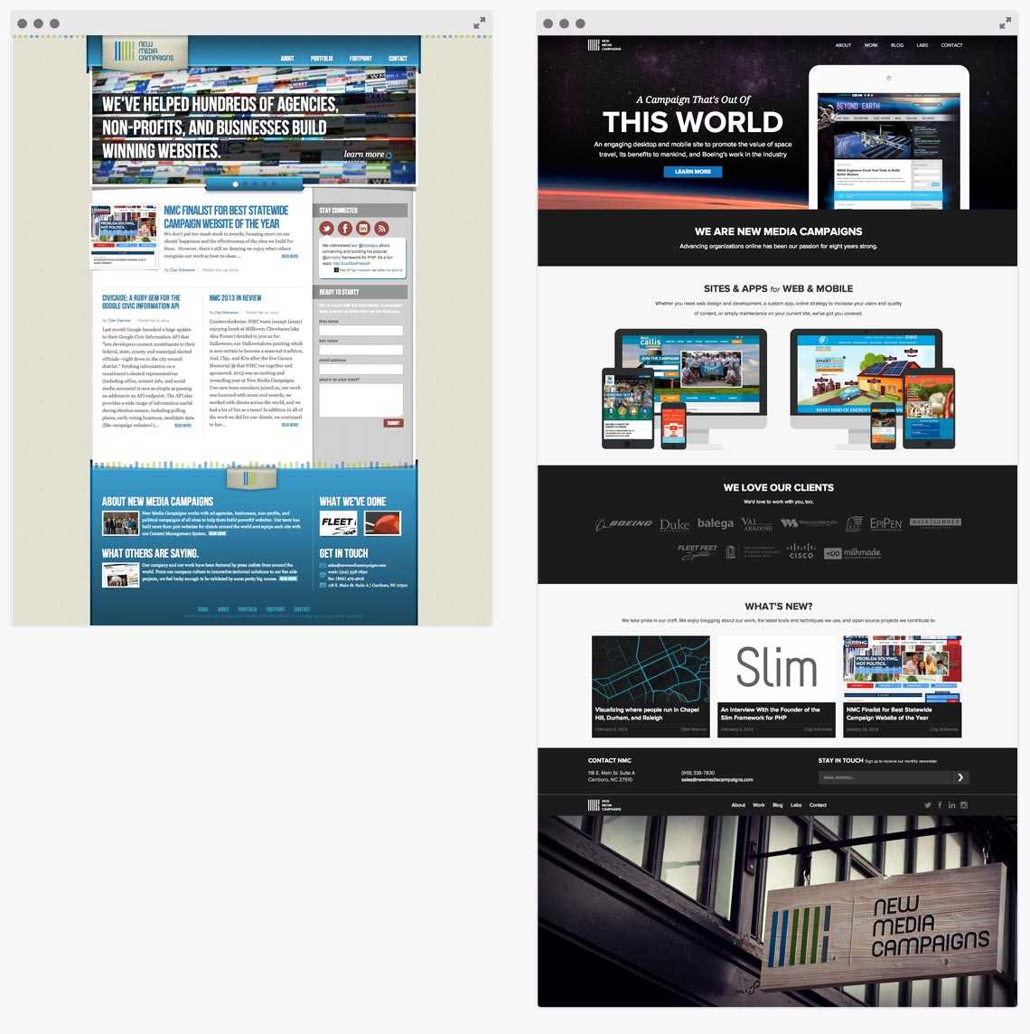
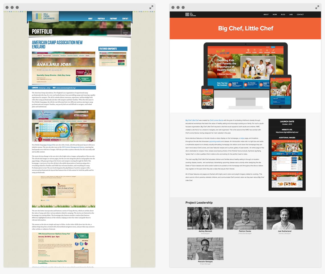
The simple layout and neutral color scheme also makes sure our client work speaks first, rather than our own design. We take pride and love to show of our work, so the new design allows for more room for larger photos, interactive content, and custom layouts for our portfolio pages.
A More Versatile Blog
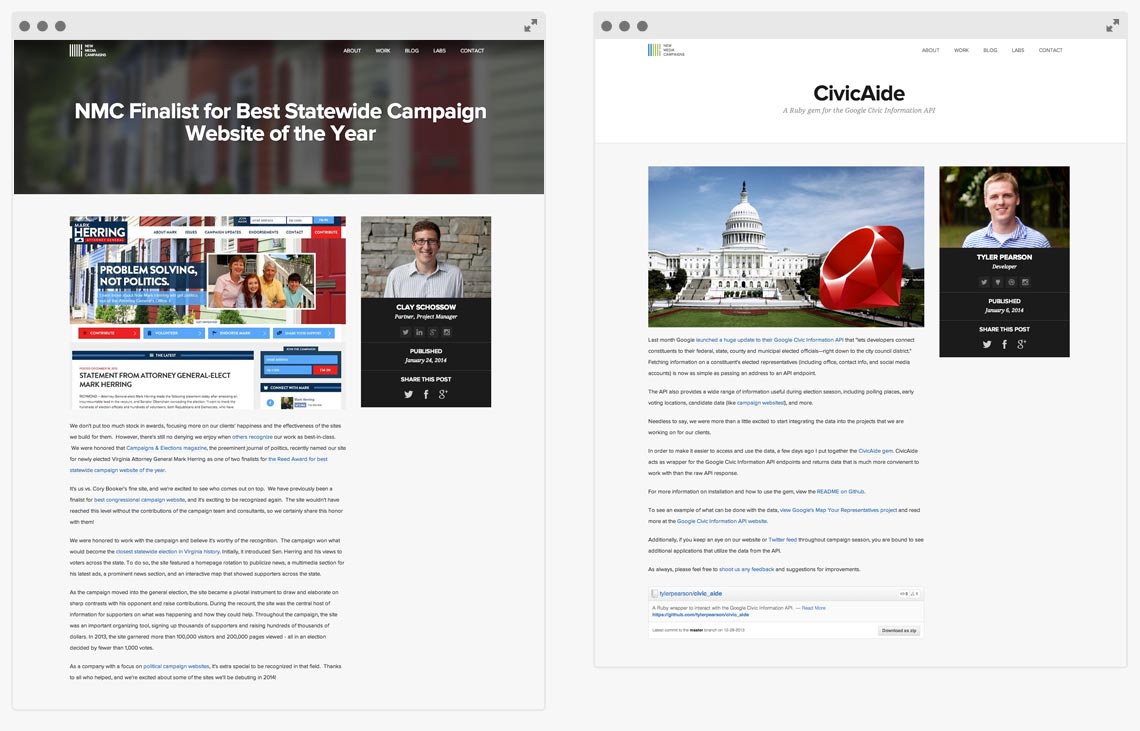
One of the biggest things we felt held back by in our old design was our blog. We were stuck with a small, fixed-width content area that worked okay for text-heavy writing, but wasn’t the best for design related posts and interactive content. Our new design offers several layout options for our blog posts: a clean minimal layout for text-based posts, a banner overlay option for posts with a large visual element, and even a custom layout that we can tailor to best match the content of an individual post. We hope the new wide array of design options will help us write better posts, and they’ll be more fun to read and share!
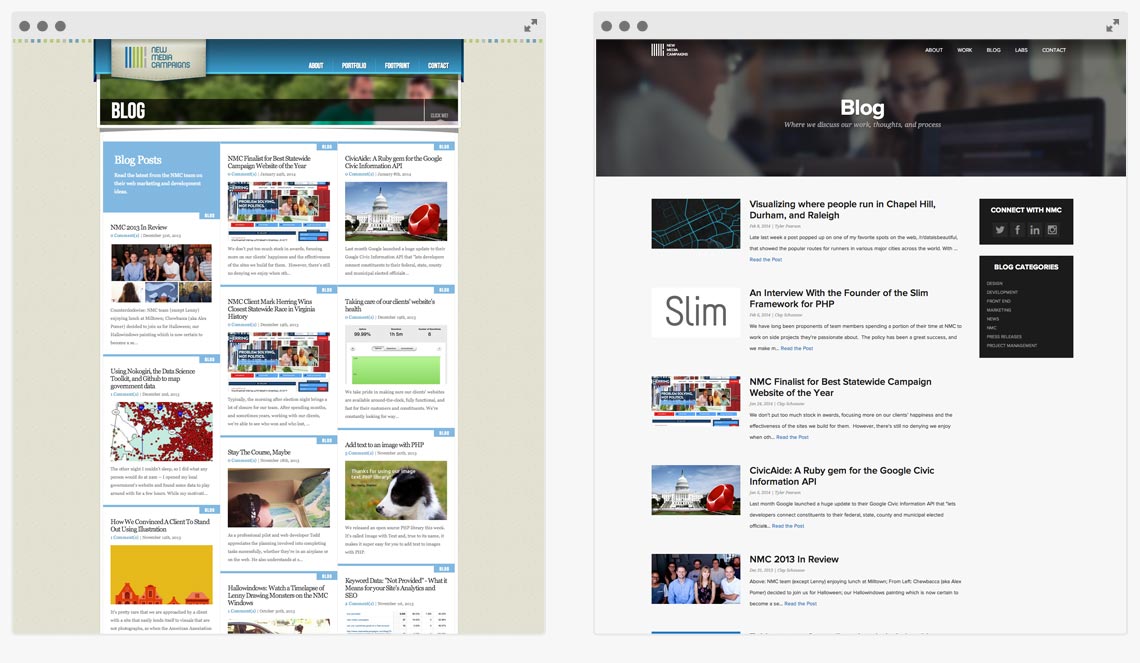
You may have also noticed we swapped out our blog grid for a more traditional blog layout. While we loved our old footprint grid, our new clean blog feed layout gets rid of any extra design distractions to increase legibility and put focus on our content first.
More Focus on our Team
We’ve got a great team here at NMC, and it’s something that really helps us stand out from other agencies. We wanted our new site design to emphasize our amazing team, so now you can view project leadership on portfolio items, more easily connect with the writers of blog posts, and learn more about individual team members on our new team pages. 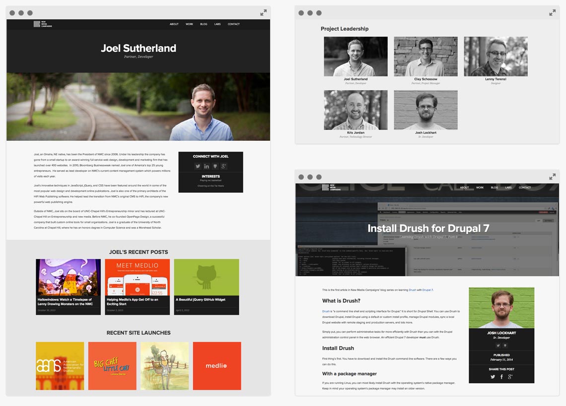
NMC Labs
A brand new feature on the site is our NMC Labs section. In addition to client work, our team spends a lot of time working on some awesome side projects, from open source tools to new apps. We’re excited to now have a special place on the site to showcase these projects! 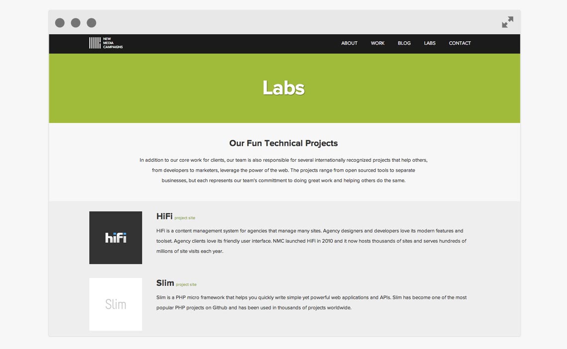
Thanks for taking a look around our new site! We’ve got big plans for some near-future updates, but until then we welcome any feedback and comments you’ve got for us!

Leave the first comment