HiFi Website Featured on Design Shack
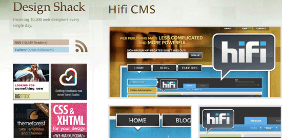
We're very excited to announce that our new Content Management System, HiFi, has been featured on one of the most popular web design galleries, Design Shack. The gallery boasts over 10,000 RSS subscribers and carries a lot of influence in the web design community. Currently, HiFi is holding down a solid 8.5 rating based on visitor votes -- we encourage you to also go vote for the design.
The Design Shack post says the site is featured for its bright colors, oversized deisng elements, repeated use of small tirangles, and the navigation buttons.
While it's an honor for any of our projects to be featured on galleries, this one is particularly sweet for a couple reasons. First, it's our own product getting recognized, which is a really nice bonus. Second, HiFi is positioned as a CMS for designers and developers -- the specific audience that closely follows Design Shack. When we originally designed the site, we had a goal of getting featured on design galleries, as we knew that would drive targeted and relevant traffic to the product.
The strategy seems to have paid off, as HiFi had 4x the typical daily newsletter signups yesterday when we were first featured. In addition to sheer volume, these registrations are likely more targeted than a typical day's. Designers found us through the gallery, browsed the site, liked what they saw, and converted to our newsletter for updates and announcements.
Thanks for all of your votes and support!




Leave the first comment