Another year gone! The past twelve months have been anything but ordinary, and we’re proud of the way that our team has adapted and taken the changes in stride. Without missing a beat, we’ve continued to launch great websites for clients across the country (and world!) who have spent the year reimagining their relationship with the web and all things digital.
During our fourteenth year of business, we tackled projects ranging from law firm websites to event microsites and everything in between. Many of our nonprofit clients stepped up to help their communities as the pandemic took hold, and others pivoted their businesses to focus on virtual services in place of in-person interaction. All in all, we’re beyond grateful for the opportunities that have come our way and look forward to continuing to support our diverse group of clients in the year to come.
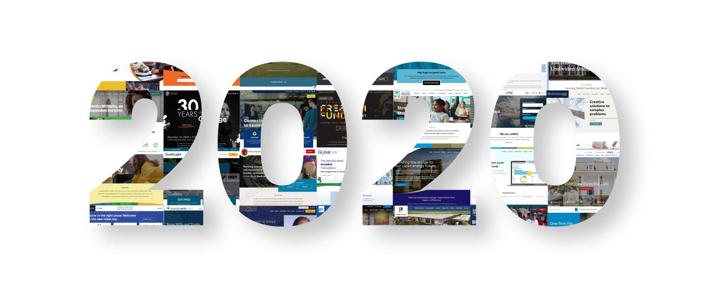
Below we’ve highlighted a selection of our favorite web projects from 2020. We’re proud of the design elements, tools, and features that make each one unique, and we hope that you’ll enjoy scrolling through them as much as we do. Make sure to check out the rest of our portfolio if you’re interested in seeing even more of our work.
Use the following links to jump to a particular project type:
Custom Law Firm Website Design
Saxena White
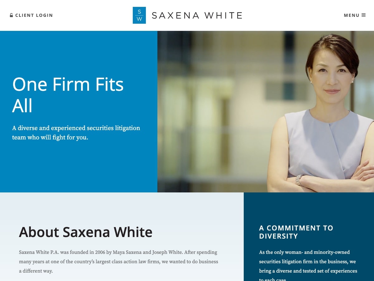
Saxena White is a securities litigation law firm with offices in Florida, New York, and California. We worked with the firm to design a new logo, brand, and website that highlight Saxena White’s polished professionalism along with their modern approach to legal solutions. The new identity is sleek, sophisticated, and consistent across Saxena White’s web presence, print materials, and social media platforms. Read more about the project in our case study.
Brown & James
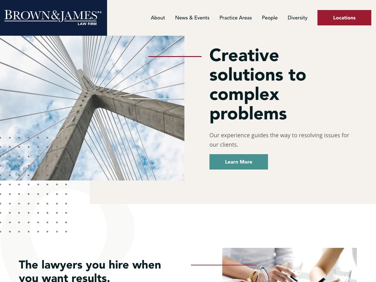
Brown & James is a leading midwestern law firm that takes pride in offering personalized customer service, cost-efficient solutions, and an incredibly diverse range of practice areas. To match the firm’s ongoing growth, we designed a scalable WordPress site that brings together modern design, deep content, and neat tools like a custom PDF generator. Read more about the site and its helpful features in our case study.
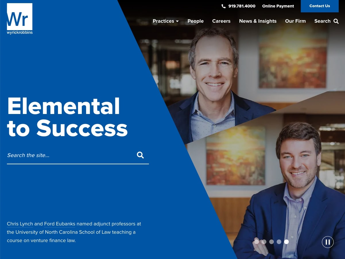
Wyrick Robbins // Wyrick Robbins Practical Privacy
Based in North Carolina’s Research Triangle Park, Wyrick Robbins is a prominent law firm that specializes in the needs of growth-oriented businesses. The firm recognized that a fresh website would play a key role in maintaining their edge in the industry, so they came to us for a distinctive design that would set them apart from competitors. The finished site captures Wyrick’s character and core principles with unique periodic table graphics, in-depth resources, and strategic connected content. Check out our case study for a closer look at the project.
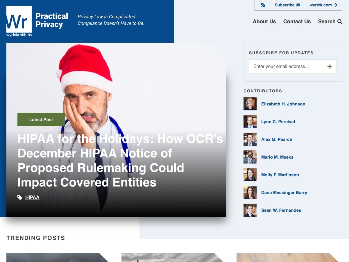
To build on the success of the main Wyrick site, the firm approached us again to create a complementary microsite for their Privacy and Data Security blog, Practical Privacy. The microsite’s design parallels the main site’s aesthetic while establishing an independent space for the blog’s topic-specific content and resources. Read more about the microsite in our case study.
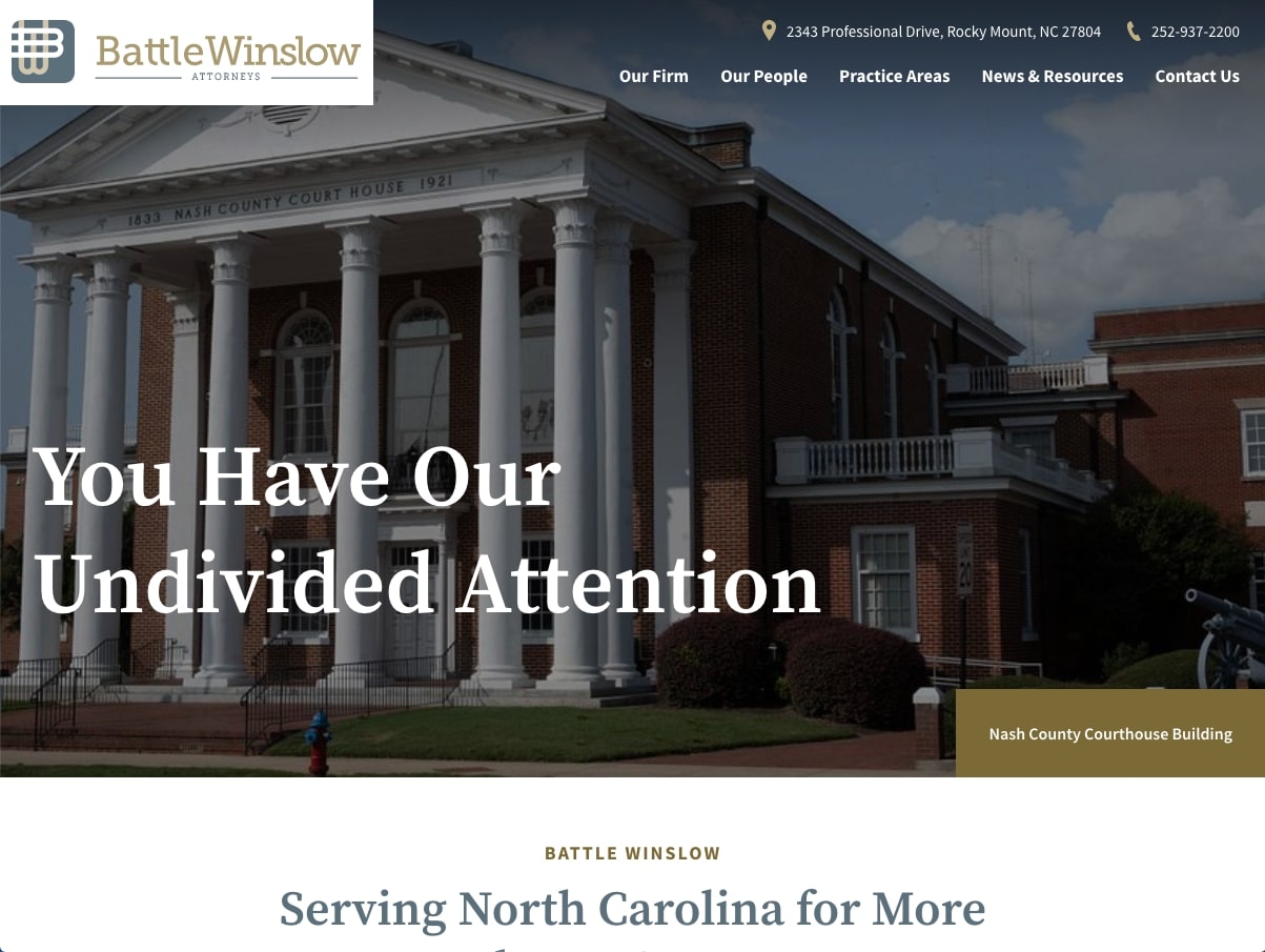
Battle Winslow
Established in 1911, Battle Winslow is one the oldest law firms in the state of North Carolina. The firm turned to NMC for an updated web presence that would showcase their track record of success within an attractive, contemporary design. Site highlights include tabbed attorney bios, detailed practice area pages, and a scalable block-based WordPress setup.
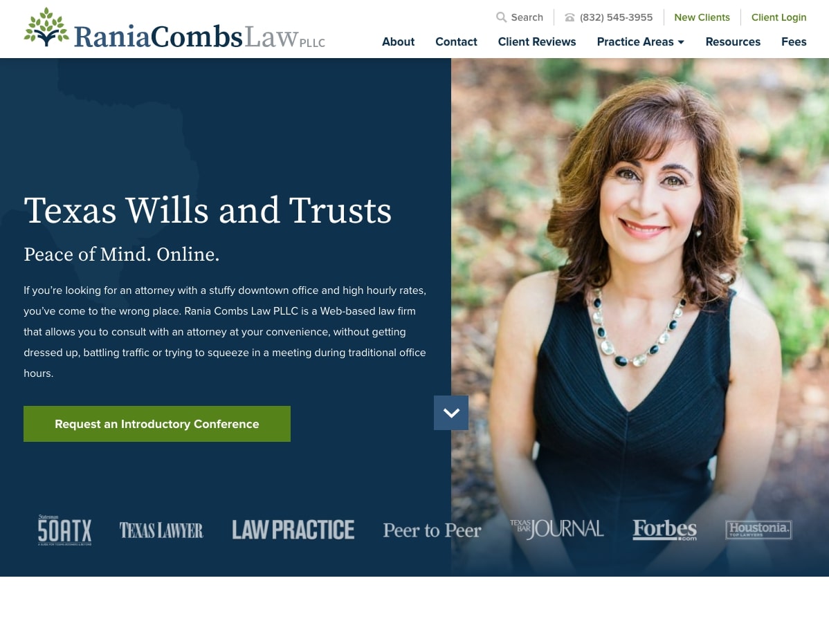
Rania Combs Law
Rania Combs is a solo legal practitioner who prioritizes flexibility and cost-efficient solutions at her online-only firm. She initially approached us to work through some SEO issues that she was facing with her old website (read the case study for more info) but ultimately decided that a new web presence and brand would be the best way to promote her practice online. The site features playful icons, helpful client testimonials, a filterable resource center, and more – all primed to scale with her business for years to come.
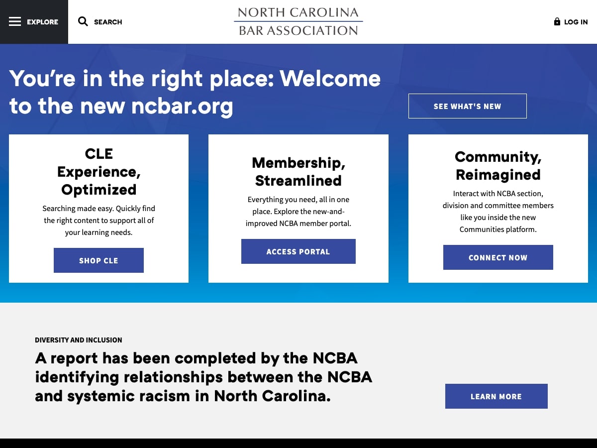
NC Bar Association
The North Carolina Bar Association brings together legal professionals in a community focused on sharing resources, knowledge, and industry expertise. We first worked with the NCBA on a website for their charitable organization, the North Carolina Bar Foundation, so we were thrilled when they came back to us to redesign their primary site, NCbar.org. The site puts user-experience first with a detailed megamenu, clear content areas, and intuitive navigation to important topics like member benefits and continuing education. Read more about the process and outcome in our case study.
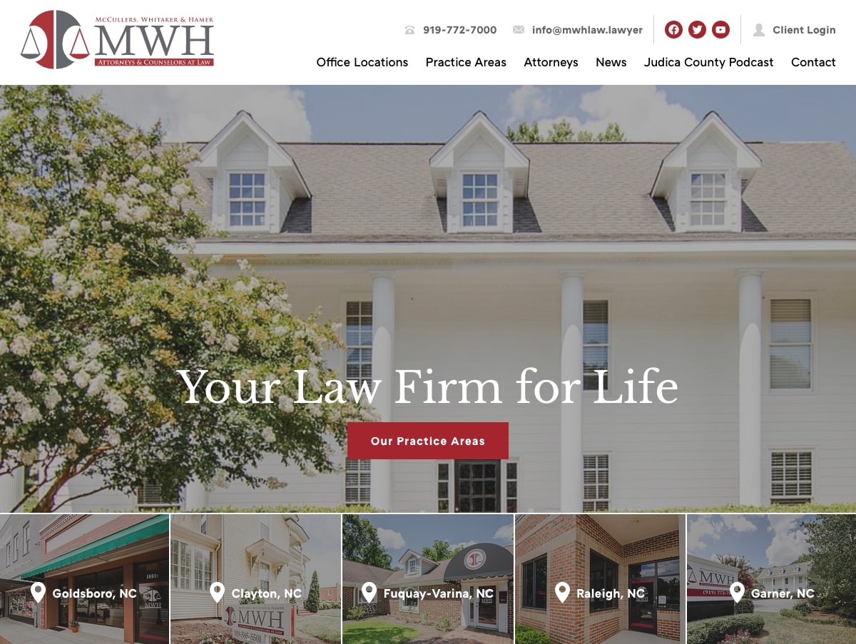
McCullers, Whitaker, & Hamer
Operating from five offices across the state of North Carolina, McCullers, Whitaker, & Hamer is an experienced law firm that works hard to find ethical solutions that meet each client’s needs. In order to avoid a dated look, their new website emphasizes clean lines, strategic whitespace, and defined layouts that organize content neatly and efficiently. The site is rounded out by robust supporting resources like articles, relevant news pieces, and a unique series of video podcasts. Read more in our case study.
Nonprofit Website Design
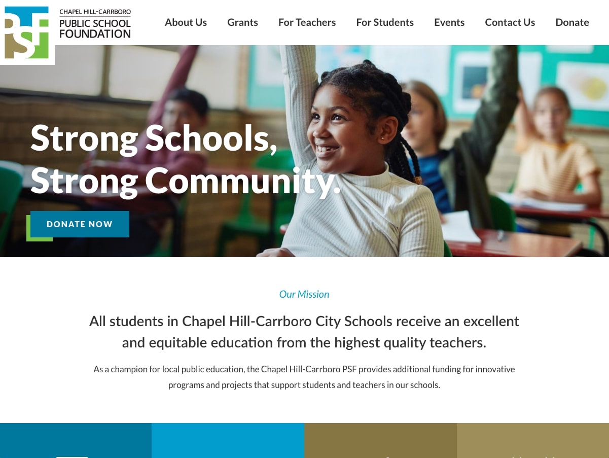
Public School Foundation
The Chapel Hill-Carrboro Public School Foundation is a prominent local nonprofit that provides grants, programming, and support for the district’s students, teachers, and staff. Since its founding, PSF has distributed an impressive $10,000,000 for projects that serve to better public education and ensure an equitable experience for all.
We built the nonprofit’s first independent web presence back in 2010, so we were proud that they chose to work with us again when they had outgrown the original site. The new design incorporates modern features like embedded video, social media integrations, engaging stat bars, and high quality images that highlight PSF’s work in the community. Read more about the project in our case study.
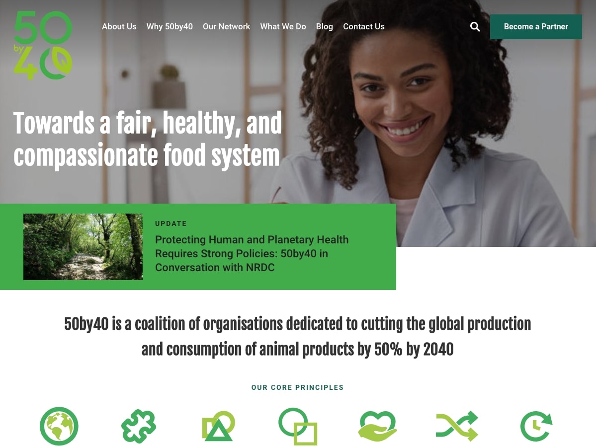
50by40
Based all the way in India, 50by40 is a global nonprofit that partners with organizations to further the goal of reducing the world’s animal product consumption 50% by the year 2040. Their new website brings in custom icons, a filterable partner database, and flexible layouts that will easily scale with the nonprofit as their mission gains momentum. Read more about the project in our case study.
NAACP Freedom Fund
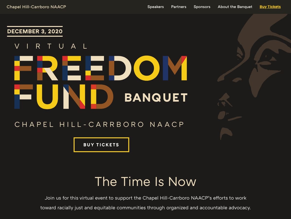
Each year, the Chapel Hill-Carrboro NAACP puts on the Freedom Fund Banquet, a fundraising event that supports their social justice initiatives and work in the community. This year’s event was virtual, so they turned to NMC for an event microsite that would promote the event and centralize details, program information, and links to the ticket sales page on Eventbrite. The resulting site successfully grabs visitors’ attention with a striking dark background, bright typography, and a sleek single-page layout.
IWMF Courage in Journalism Awards
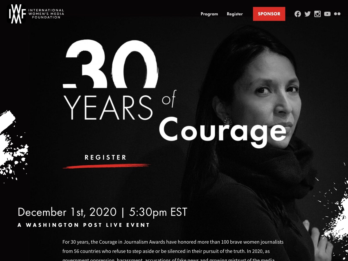
Another event microsite! The International Women’s Media Foundation (an existing NMC client) approached us for a dynamic web presence where they could promote their annual event, the Courage in Journalism Awards. Similar to the site above, the Courage microsite makes use of memorable graphics, a bold black and white color palette, and details about the event’s program and sponsors. Read more in our case study.
MiracleFeet
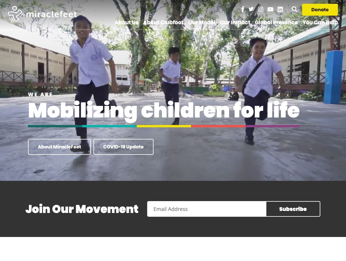
MiracleFeet is an international nonprofit that works to increase access to clubfoot treatment, education, and resources in 29 different countries around the world. We worked closely with the MiracleFeet team to design an adaptable website that would showcase the organization’s impact, goals, and needs while also accommodating a high volume of content and resources.
The finished site makes the most of dynamic features like ambient video, interactive maps, and high quality photography. We’re thrilled with the result, and invite you to read more about the process and outcome in our blog post, Reimagining a Global Nonprofit: A Case Study on MiracleFeet's New Website.
buildOn
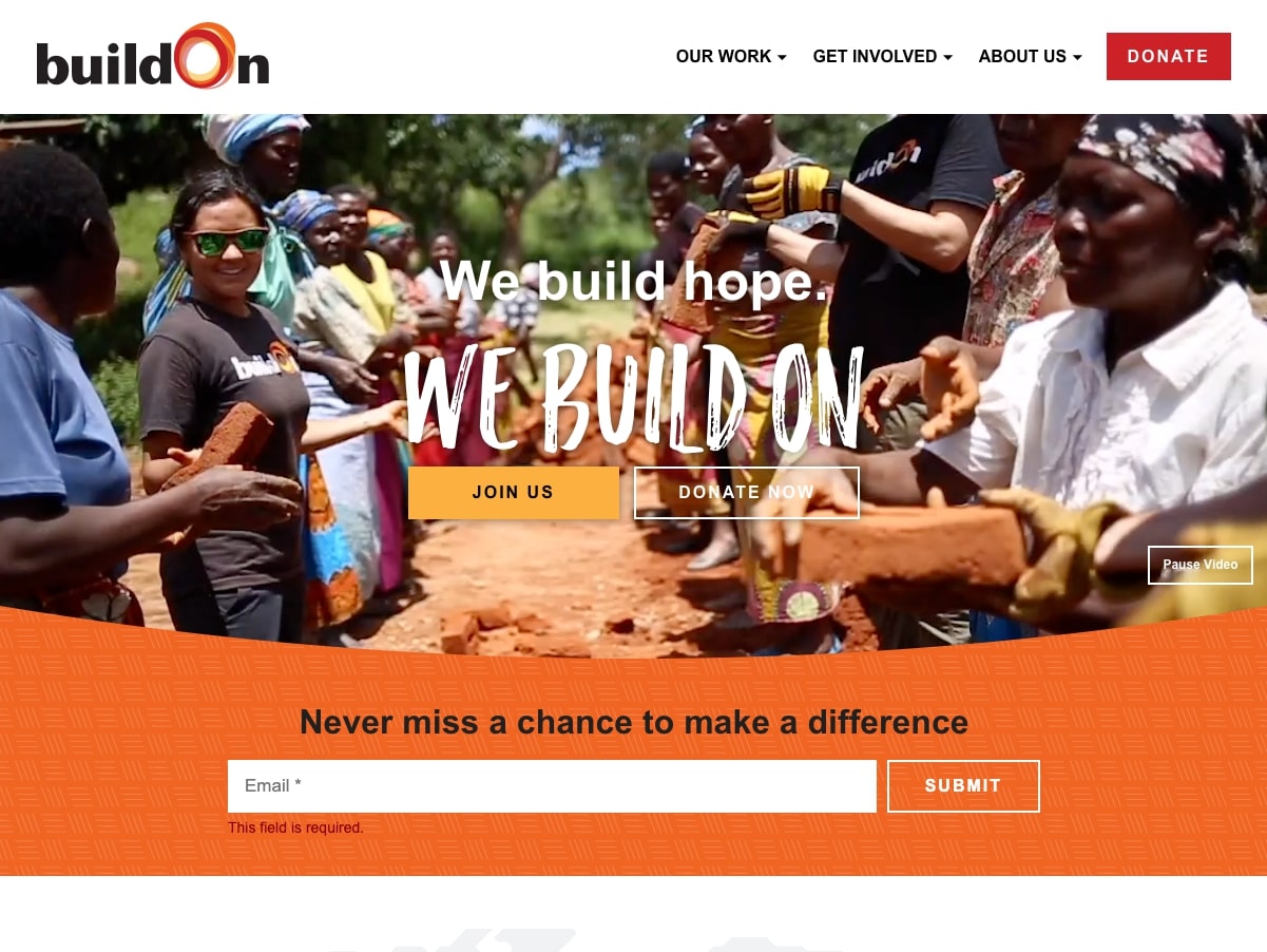
The buildOn movement centers on the goal of ending poverty by promoting education and community service. buildOn works both here in the U.S. and in a number of other countries, so it was important for their new website to emphasize their full range of programs and their global reach.
After a comprehensive discovery process, we came up with a series of layouts that bring together engaging ambient video, visually interesting textures and watermarks, high impact statistics, and custom-styled forms. To learn more about the features that make the site unique, make sure to check out our blog post, Creating a Bold Web Presence for Prominent Nonprofit buildOn.
AI for Teachers
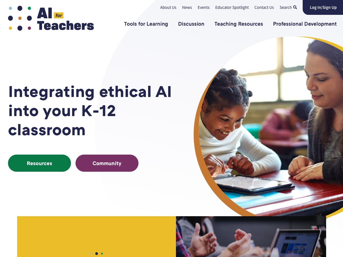
Supported by the North Carolina School of Science and Math, AI for Teachers is a digital initiative that seeks to guide educators as they incorporate artificial intelligence into K-12 learning. AI for Teachers approached us for a brand, logo, and website that would give the organization a recognizable identity and a dedicated space on the web.
The brand and website are refreshingly modern, colorful, and inviting. Key site features include filterable teaching resources, (free!) professional development courses, a discussion board, and a login portal where educators can save and submit new content.
Southlight Healthcare
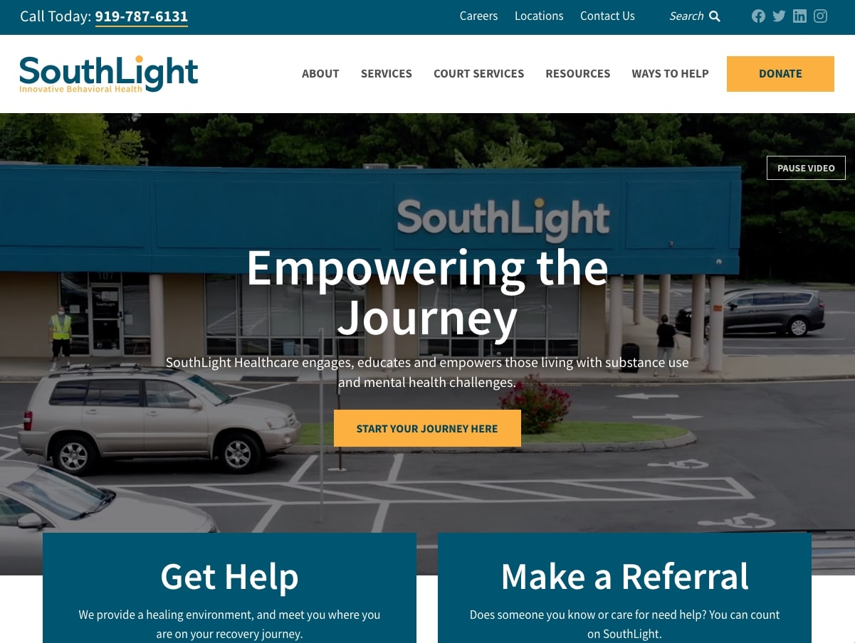
SouthLight is an experienced treatment provider for individuals living with substance use and mental health challenges in North Carolina’s Triangle region. When it came time to refresh their website, the SouthLight team connected with NMC in pursuit of a modern design that would outline their services, programs, and resources within a user-friendly web platform. The finished site accomplishes these goals with a variety of layouts and content blocks that incorporate icons, images, statistics, and more.
Our Common Destiny
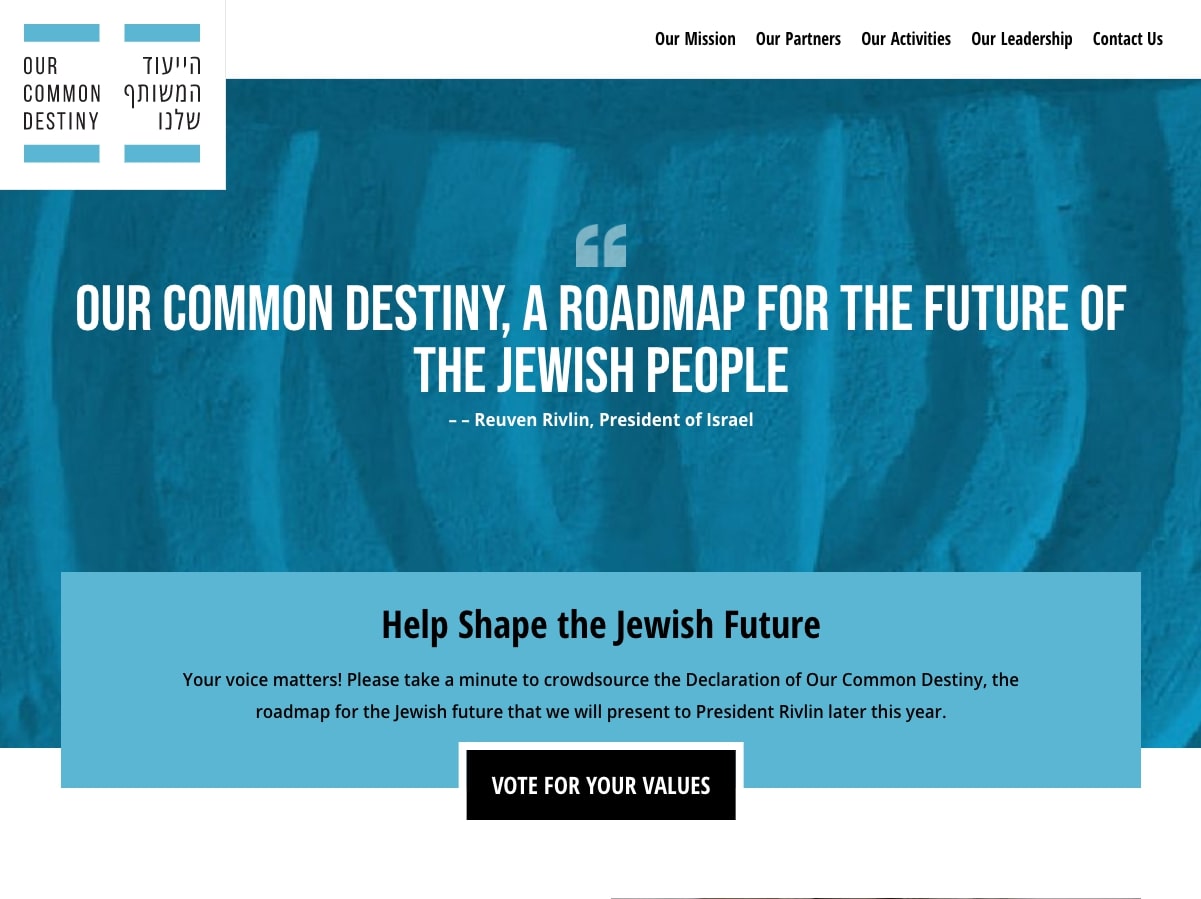
Our Common Destiny is a global movement that seeks to unite Jewish people through shared values and a collective vision for the future. A big part of the movement is gathering feedback through an online survey, so the organization reached out to us to create a website that would help raise awareness for the project and encourage interested individuals to voice their support. The site is defined by efficient organization, eye-catching scroll effects, and multiple calls-to-action that drive traffic to the survey page.
Community Foundation of Lorain County
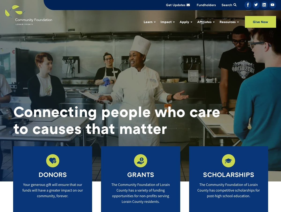
The Community Foundation of Lorain County (Ohio) works throughout the area to develop philanthropy opportunities and connect community members with the causes that they care about. Their new website highlights the nonprofit’s impact and offerings with intuitively structured content, filterable resources, and space-saving features like accordion tabs. Read more about the project in our case study.
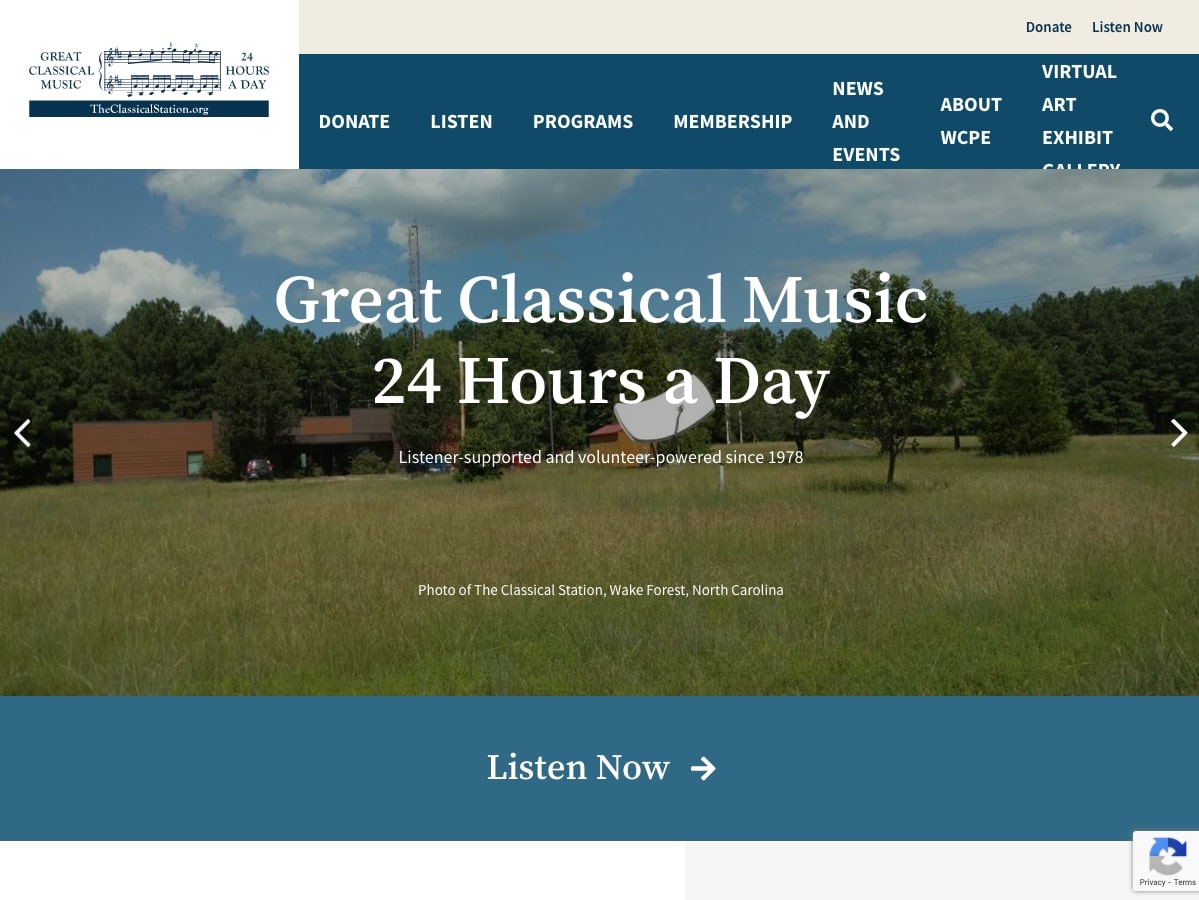
The Classical Station
Founded in 1982, The Classical Station is an established source of classical music for radio listeners in North Carolina and beyond. The listener-supported station takes pride in delivering high quality music 24/7 both on the radio and through their powerful web player online. Notable site features include a live-updating playlist, the on-site pop-up player, a song request page, and information about the station’s history and announcers. Read more in our case study.
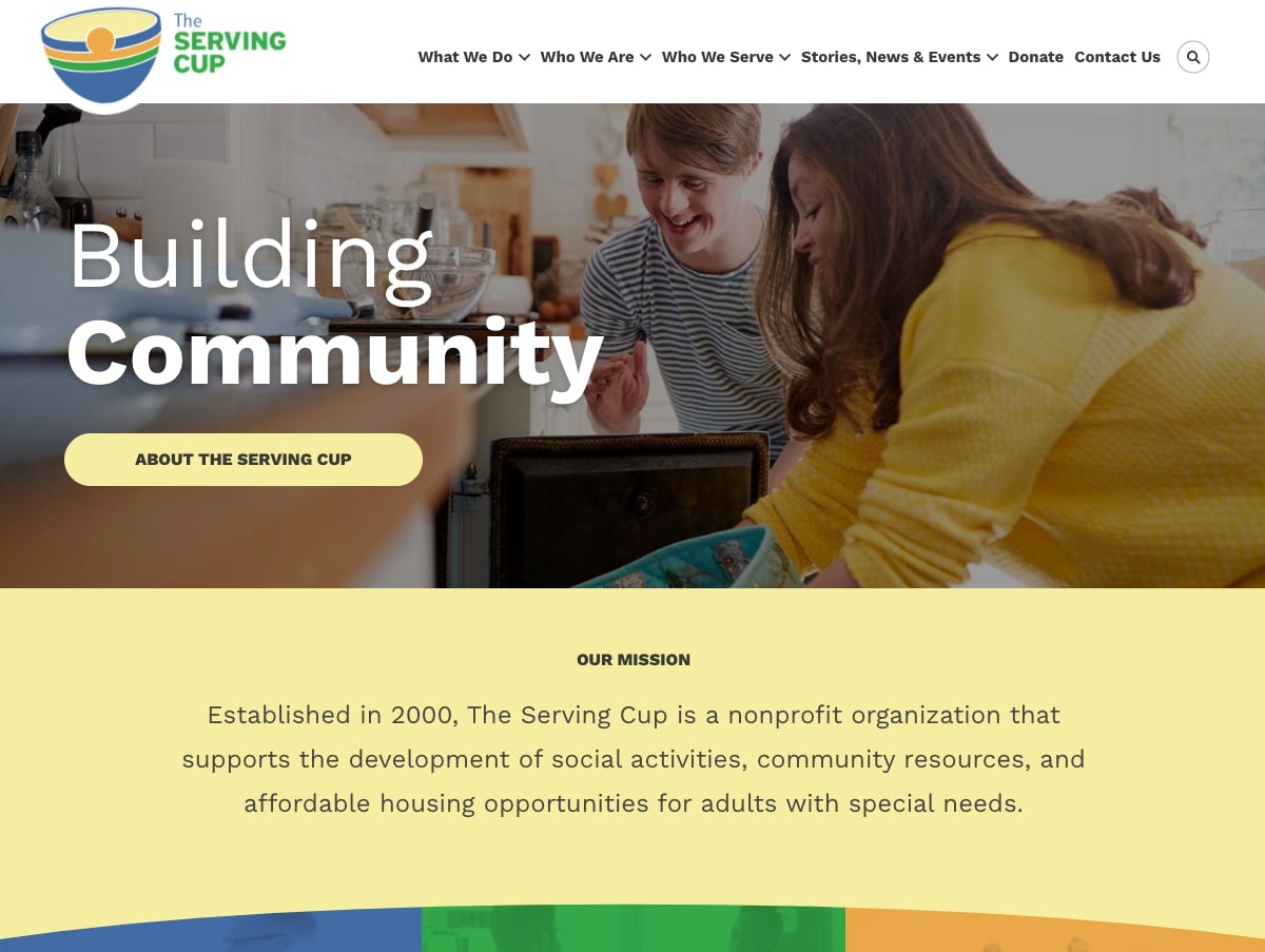
The Serving Cup
The Serving Cup is a Raleigh-based nonprofit that provides resources, social programs, and independent living opportunities to adults with special needs. When the nonprofit decided to expand their web presence, they reached out to us for a new website that would show off their programs and make it easy for site visitors to get involved in a variety of different ways. We love the site’s cheerful colors, fun patterns, and large calls-to-action. Read more in our case study.
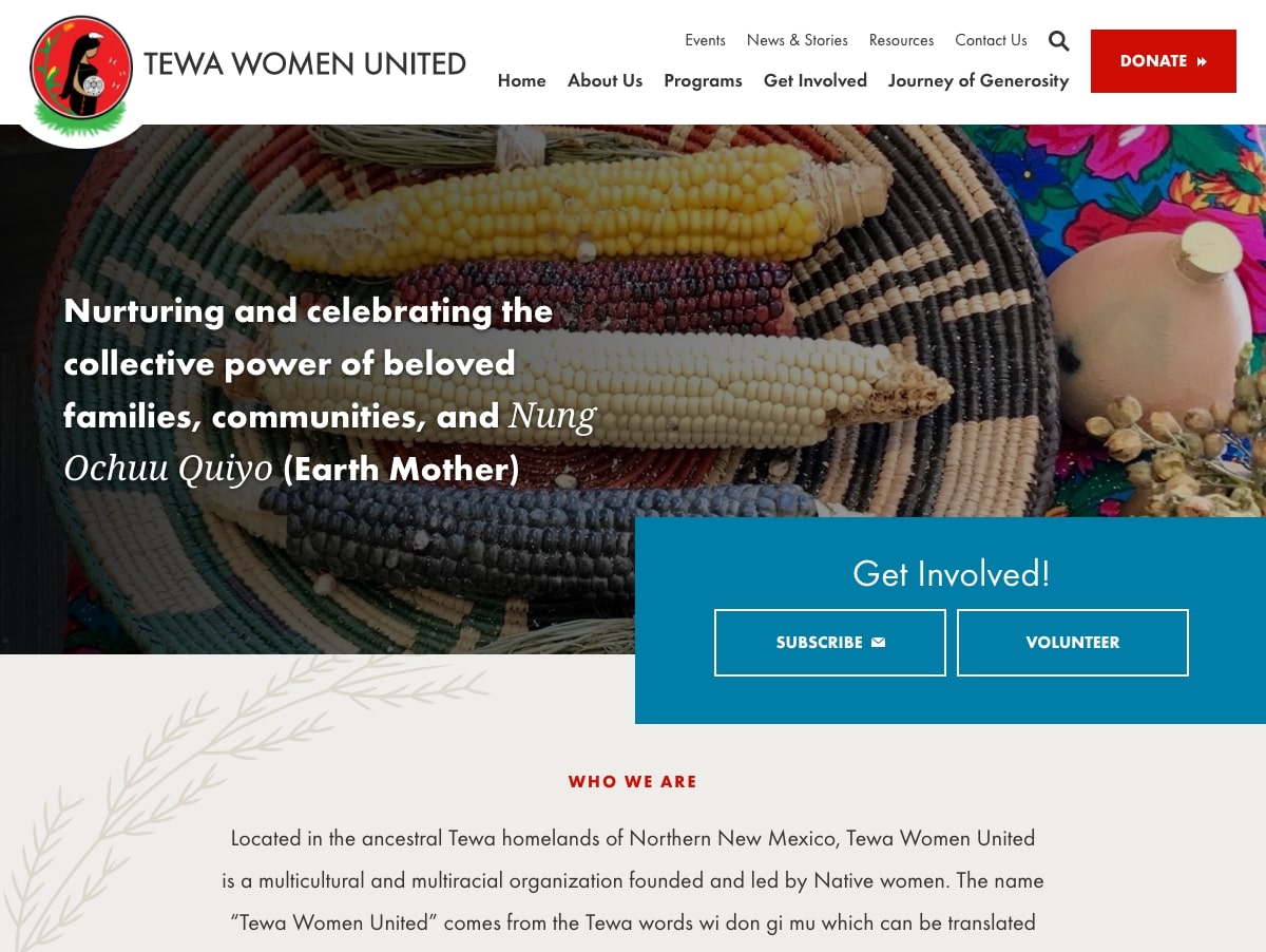
Tewa Women United
Founded and led by Native women in New Mexico, Tewa Women United is a nonprofit organization that empowers women to connect with their roots and strengthen their bonds with Native values. The site uses soft colors, gentle shapes, and clever visual feedback to build an experience that is intuitive, engaging, and informative all at once.
Political Campaign Website Design
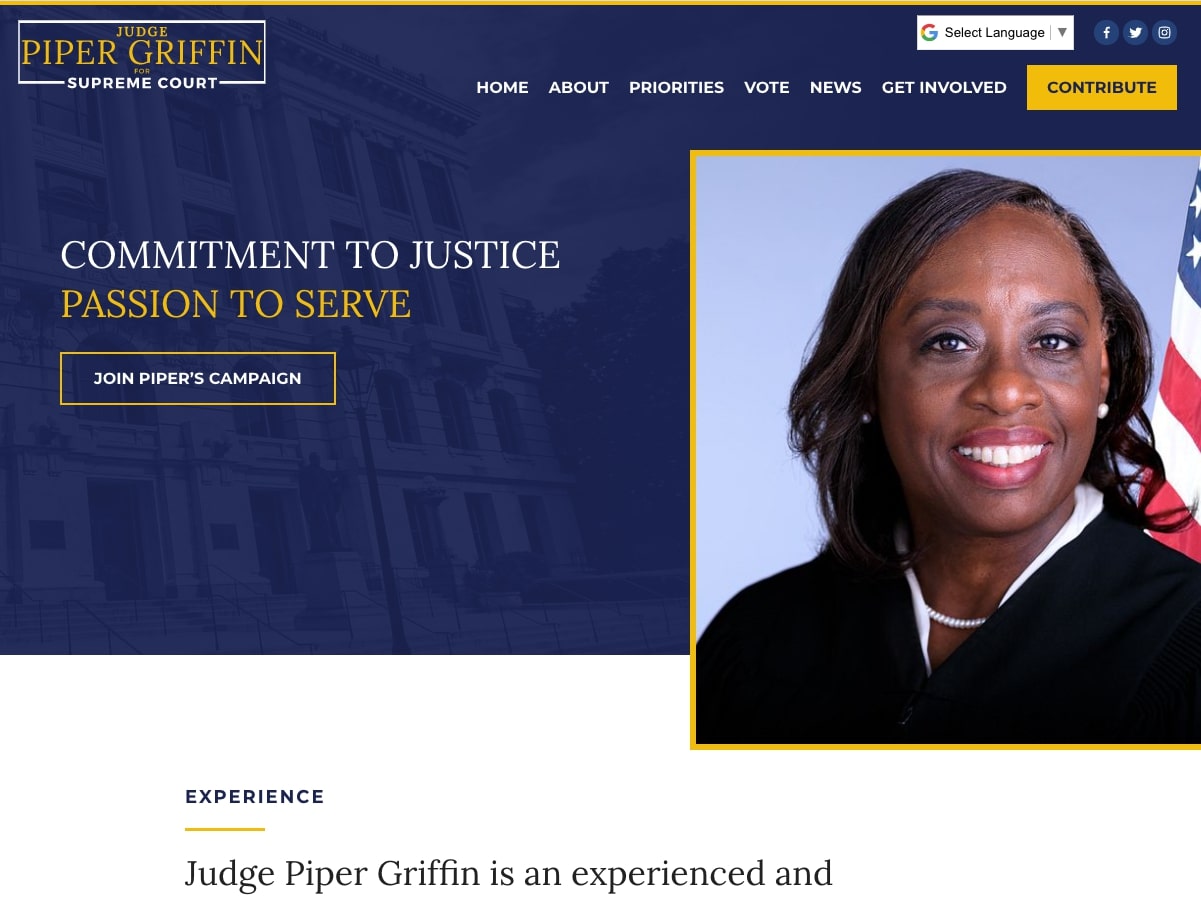
Piper Griffin for Justice
This fall, Judge Piper Griffin ran for a seat on Louisiana’s Supreme Court. She won (congratulations!), and we’re proud to have supported her campaign with a website that clearly communicated her priorities and updated supporters throughout the election cycle. Read more about the project in our case study.
David Holden for Florida
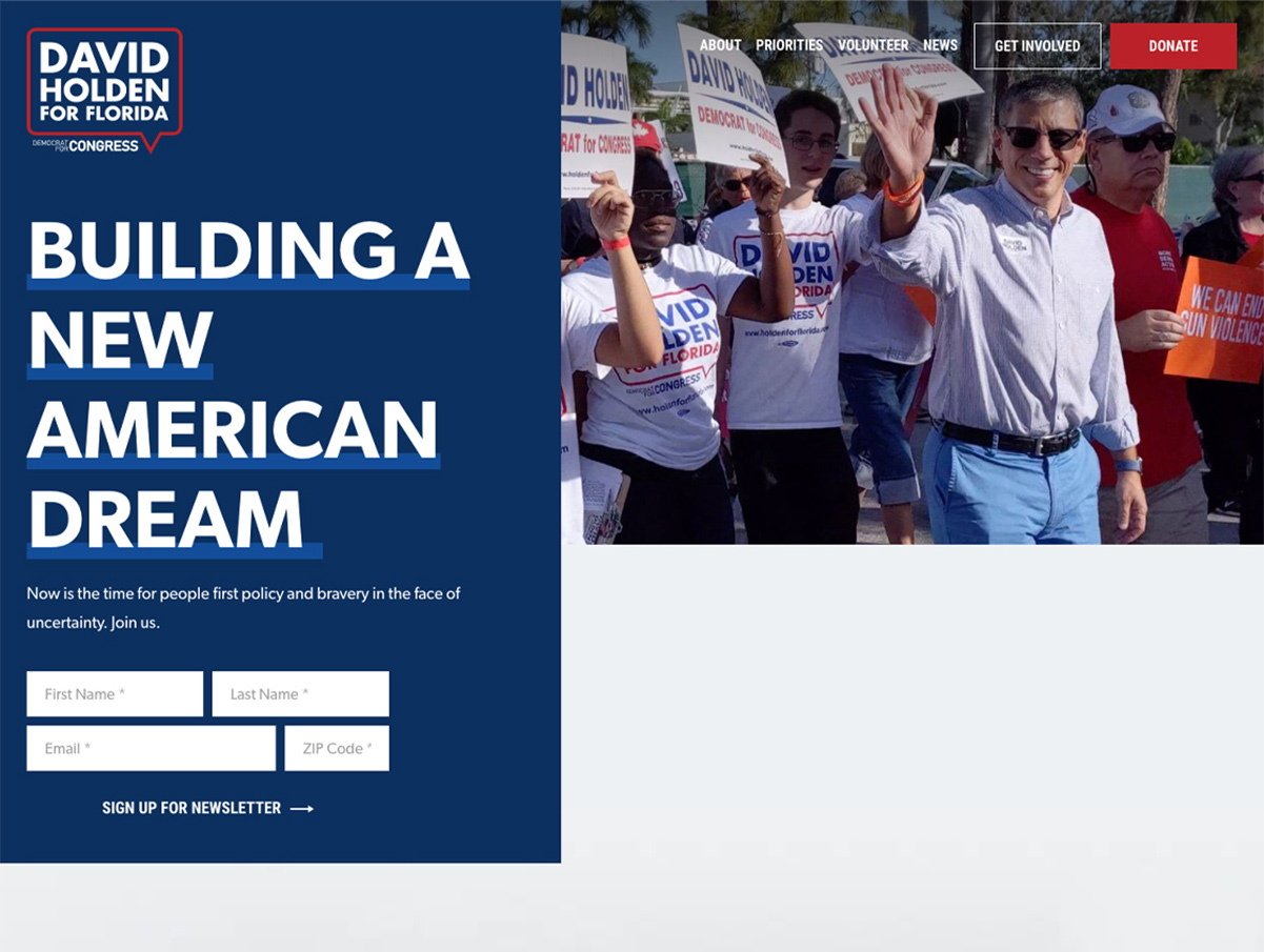
In the leadup to the congressional election, David Holden approached us to design and build a political campaign website that would showcase his priorities, inform potential supporters, and drive donations through an online giving platform. Although Holden was defeated this time around, we were proud to work with his team and hope for a better result next time.
B2B Website Design
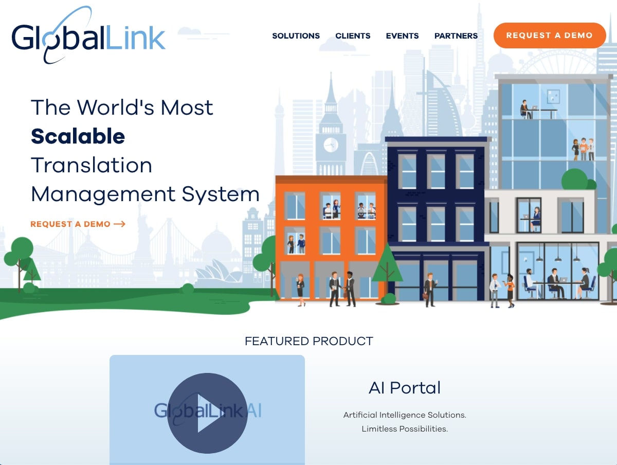
TransPerfect GlobalLink
From TransPerfect Translations comes GlobalLink, a technology suite that offers translation solutions for some of the world’s largest and most recognizable brands. We designed and built GlobalLink’s new website to feature whimsical illustrations, clever animations, and deep interior pages that explain each of the company’s products. Additional highlights include video testimonials, a selection of calls-to-action, and custom-styled forms that make it easy for site visitors to request more information. Read more about the project in our case study.
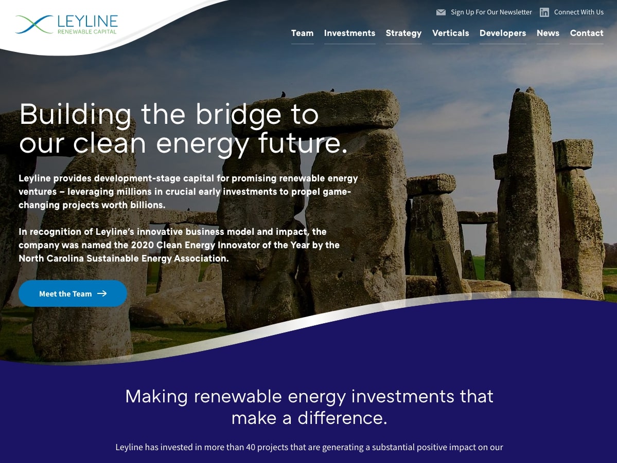
Leyline Capital
Leyline Capital is a Durham-based firm that invests in renewable energy projects throughout the country. Leyline’s website uses dynamic curves, interesting icons, and strategic related content to give site visitors a clear idea of what the firm does and why.
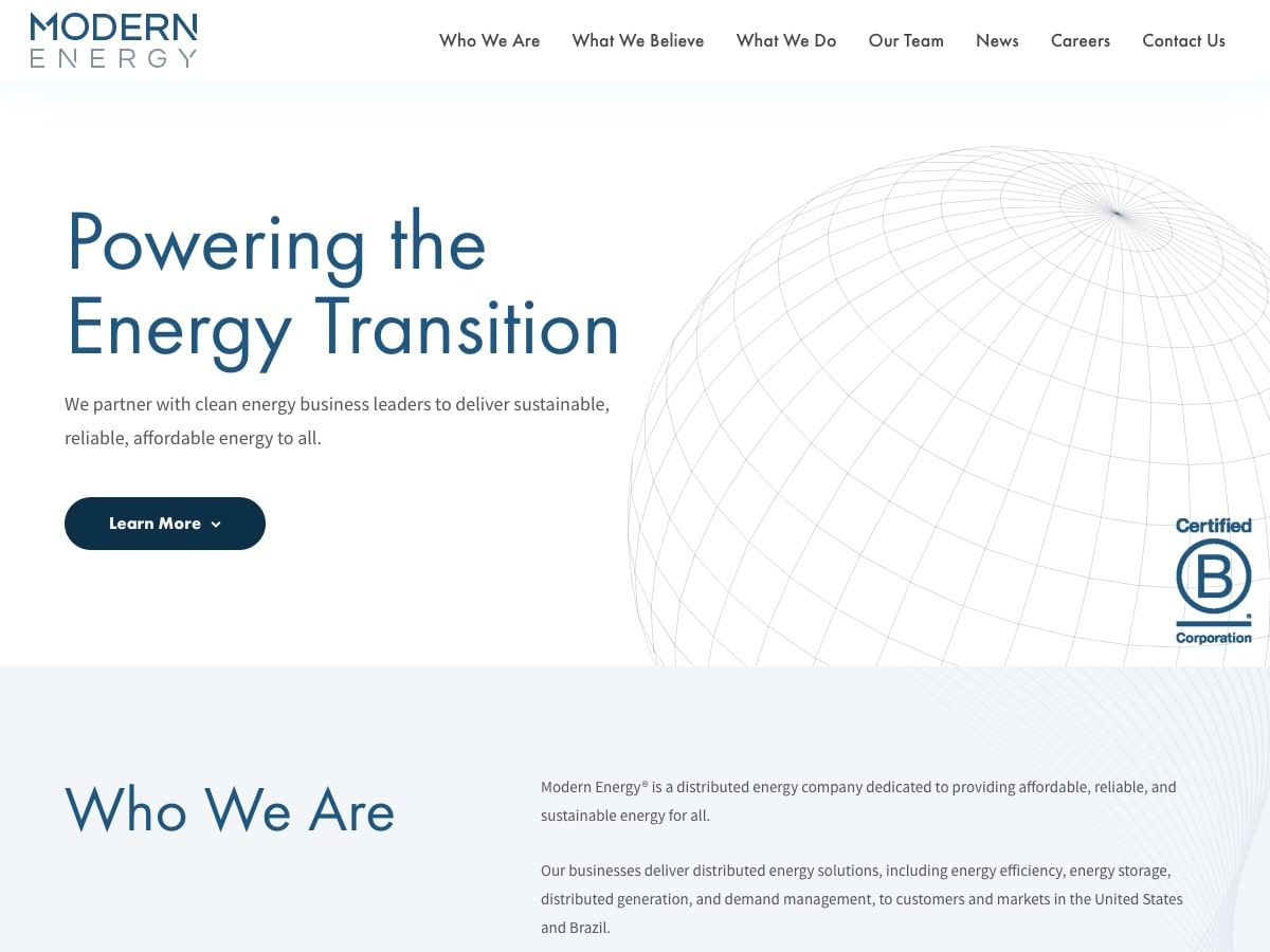
Modern Energy
Modern Energy is a holding company that partners with clean energy businesses to deliver sustainable solutions to customers in the U.S. and Brazil. Their new website emphasizes company information, goals, and investment strategies with a light and bright aesthetic, modern sans serif typefaces, and abstract background graphics that gently frame the content. Read more about the project in our case study.
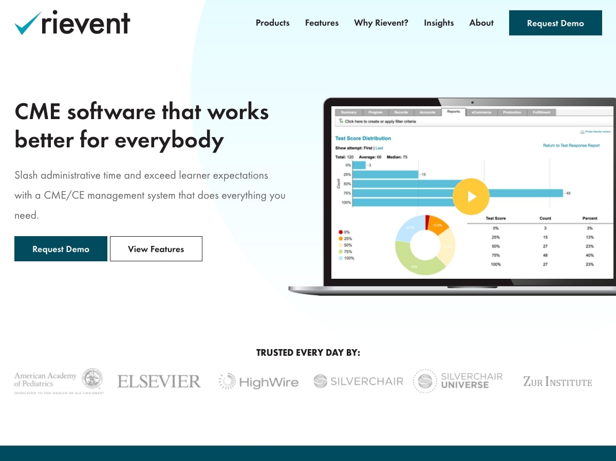
Rievent
Founded in 2000, Rievent is a leading SaaS (software-as-a-service) company that offers technology solutions for continuing medical education (CME/CE) management. Our relationship with Rievent began in 2015, when we revamped their brand and website for the first time. They came back to us this year to refine the site further and develop a new positioning strategy that would support their rapid growth.
The updated site is playful, bright, and interactive – all things that make the platform fun to explore and easy to browse. Read more about it in our case study.
osWell
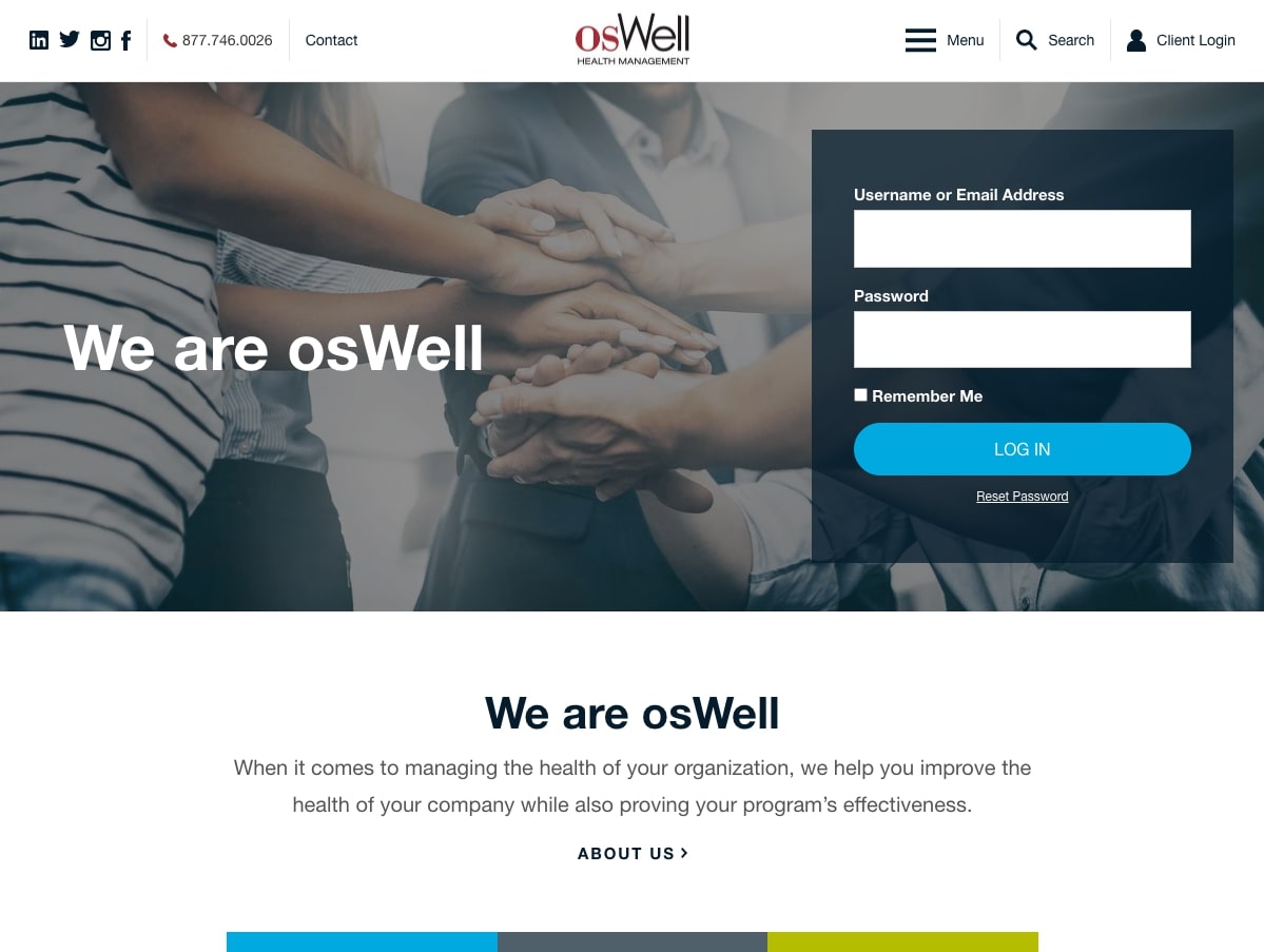
osWell is the health management branch of Oswald Companies, an Cleveland-based insurance brokerage and risk management firm. The osWell site supports a login portal where clients can access a resource library that includes things like detailed wellness guides and downloadable challenge packages. Read more about the Oswald family of websites in our case study.
Real Estate Development Websites
Park Point RTP
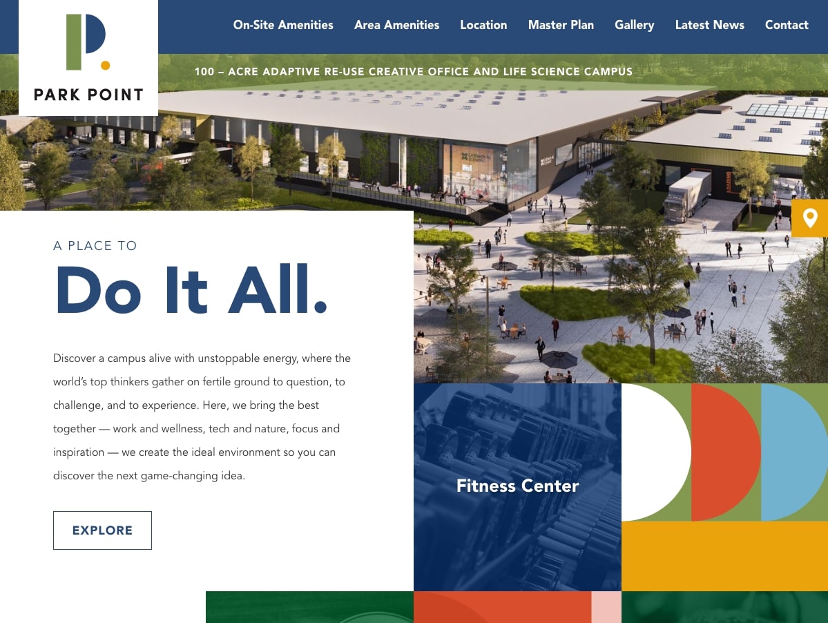
Located in North Carolina’s Research Triangle Park, Park Point is a new professional campus for creative offices and life science companies. The development includes numerous amenities and flexible spaces for colleagues to gather, collaborate, and socialize.
The developers approached us to design and build a website that would show off all that the campus has to offer. We did this by bringing in bright colors, whimsical shapes, and interactive elements like hover effects, scrolling background shapes, and an animated footer pattern. Read more in our case study.
East End Market
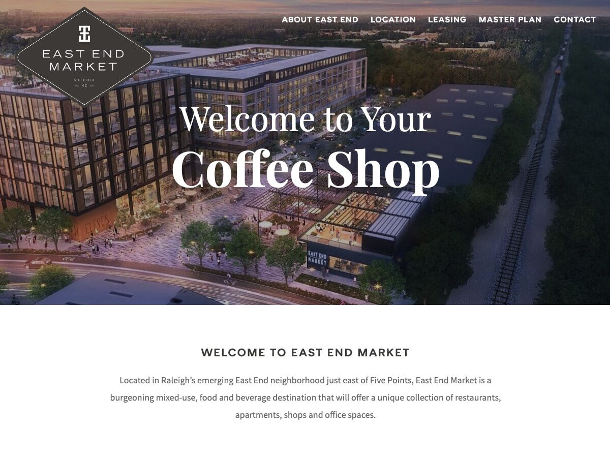
East End Market is a mixed-use development located in Raleigh’s East End neighborhood. Upon completion, the project will combine restaurants, office spaces, shops, and apartment living for a destination that the community is sure to love.
We worked with East End’s developers to design a web presence that would offer basic information about the project while highlighting perks and leasing opportunities. The resulting website uses high quality renderings, custom map graphics, and efficient jump links to help site visitors quickly gather the information that they’re looking for. Read more about the project in our case study.

Leave the first comment